The iPhone 6 Review
by Joshua Ho, Brandon Chester, Chris Heinonen & Ryan Smith on September 30, 2014 8:01 AM EST- Posted in
- Smartphones
- Apple
- Mobile
- iPhone 6
Display
As the primary mode of interaction with the phone, the display is one of the most important areas of evaluation. Of course, the methods of evaluation can be hotly debated. There is a great deal of subjectivity in this area in terms of what someone prefers. However, for the sake of color calibration our tests follow world-wide standards instead of personal preference one way or another. This means that we use the sRGB gamut and 2.2 gamma, which most content is adapted to. While AdobeRGB and other gamuts exist, these are for limited use cases and only applicable to operating systems that are aware of multiple gamuts and can dynamically switch between them depending upon the metadata of the content. In order to accurately test for how well a display conforms to these standards, we use SpectraCal’s CalMAN 5 along with a spectrophotometer for accurate color readings.
For those that are unfamiliar with the display of the iPhone 6 and Apple’s key marketing points on this new model, the improvements are mostly centered on higher resolution, contrast, and better viewing angles. In terms of higher resolution the iPhone 6 moves from the 1136x640 pixels of the iPhone 5/5s generation to 1334x750 pixels. However, this doesn’t improve the pixel density, which remains at 326 pixels per inch.
In practice, I definitely continue to notice the difference in resolution when using the iPhone 6 as opposed to the higher pixel density iPhone 6 Plus and the various Android smartphones with 450+ PPI displays. I definitely don’t find the resolution to be a problem though, as these issues only become significant to me below 300 PPI. I do think that around 450 to 500 PPI is the right place to be when balancing pixel density and power, but Apple’s choice should pay off in the form of better power consumption especially because LED backlights rapidly lose efficiency near the highest current region.
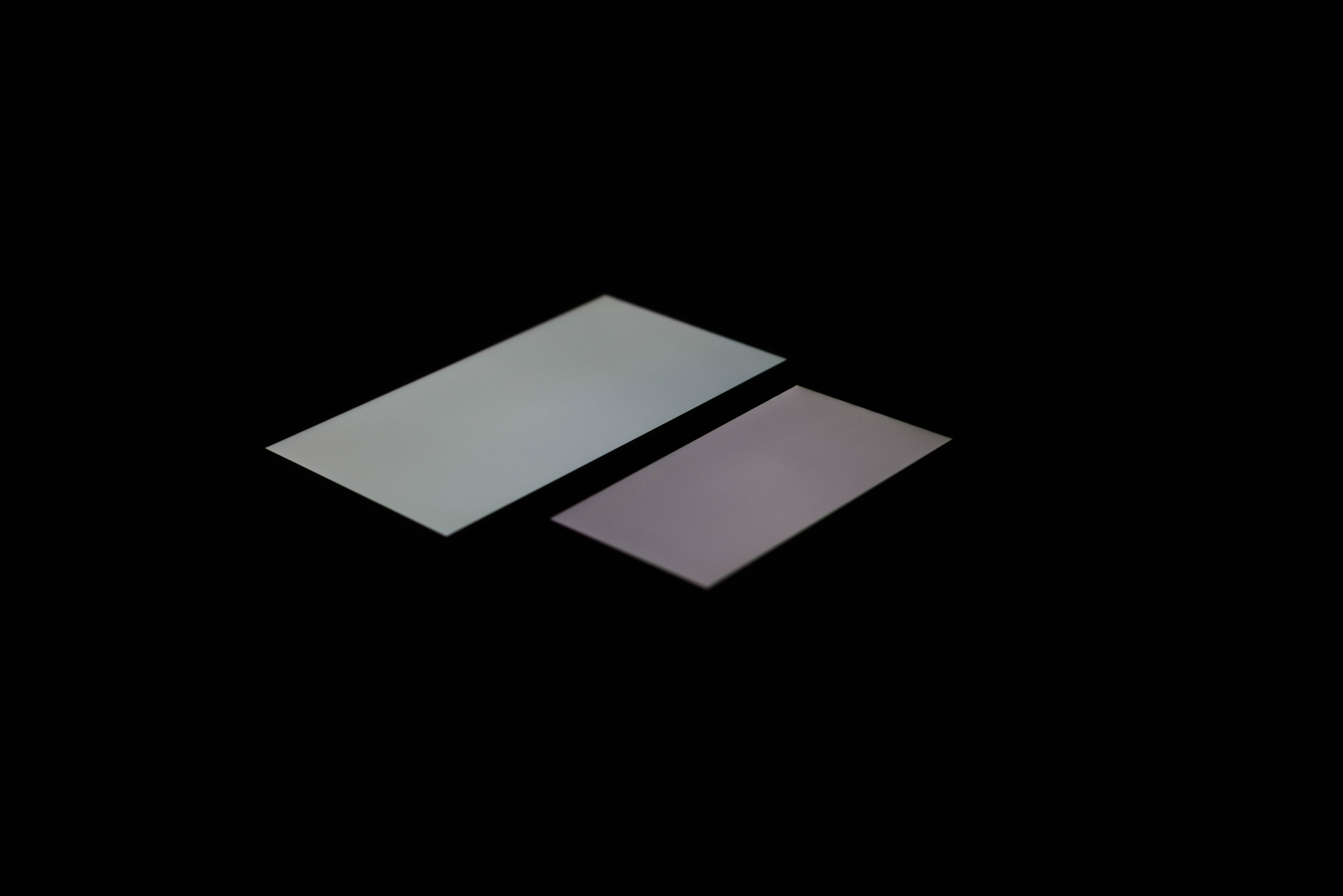
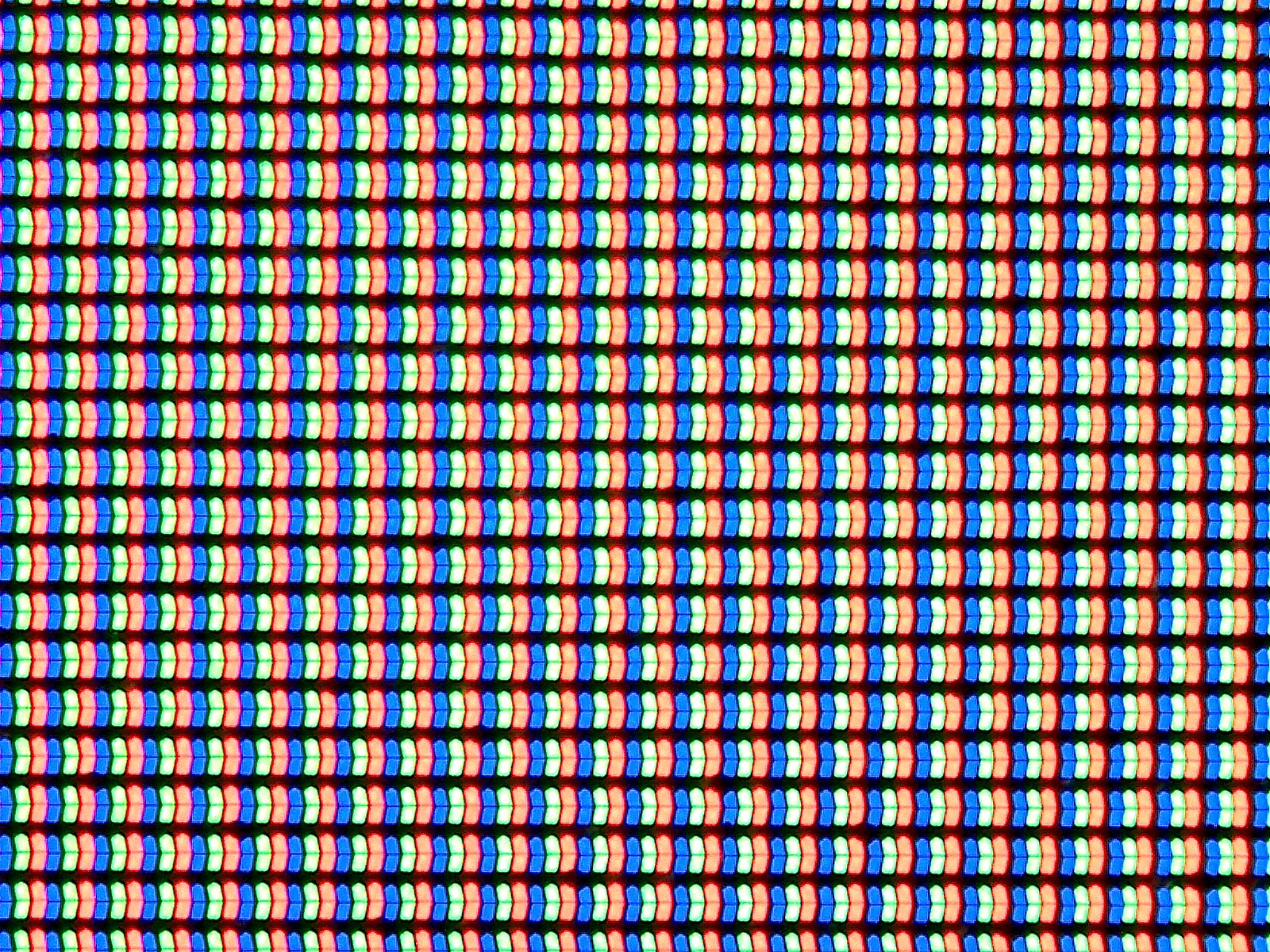

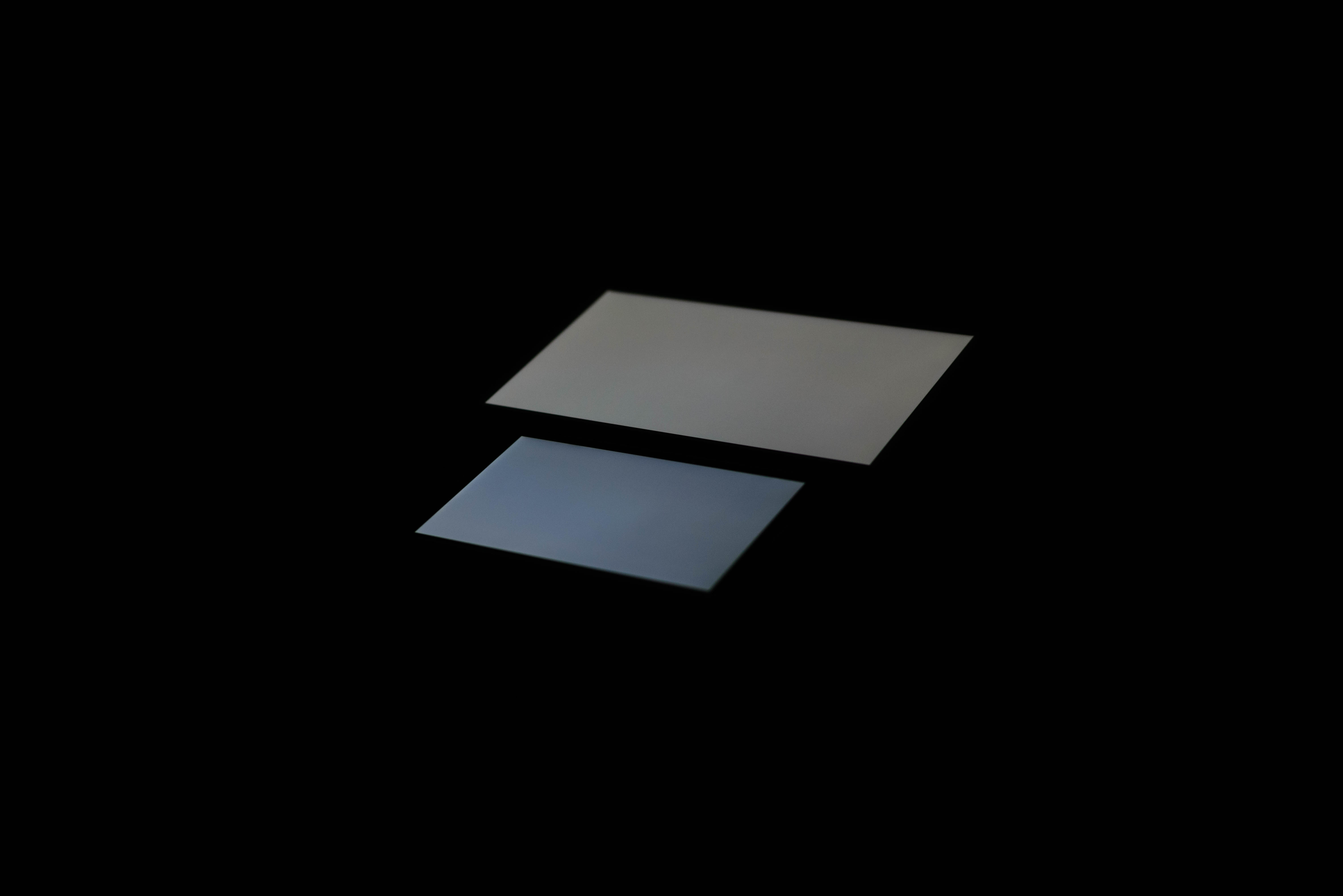
The other issue at hand is that of viewing angles. While Apple is one of the first to really talk about dual domain pixels, this technique is rather commonly used to improve viewing angles. The result is that a pair of pixels will appear to be a chevron, and overall the pixels appear to be squiggly in nature. While this doesn’t really change the readability of the display at extreme angles, colors like white no longer have noticeable red/yellow/blue shifts depending upon the angle that the display is shifted at.
This is definitely noticeable in everyday use, as the iPhone 5s could only avoid color shifting at certain angles instead of every angle. As I predicted in the launch article though, the one caveat seems to be that black has a noticeable shift towards purple in certain angles. There's also a noticeable hatching on close examination, but this doesn't affect image quality. This is definitely better than what I see on AMOLED though, as while AMOLED has much better brightness stability the color shifting is far more obvious and significant.
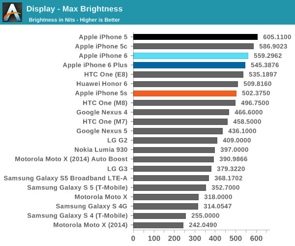
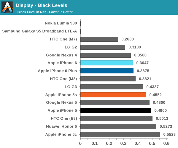
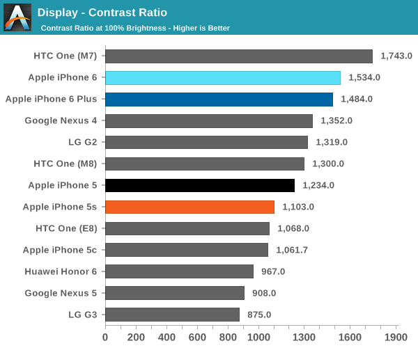
Now that we’ve covered the other two, we can talk about contrast. For this test, we measure brightness of 100% white and black at maximum display brightness, and look at the ratio. While we’re looking into getting patterns that can’t be defeated by dynamic contrast/backlight this should give an idea of best case contrast. In this case, peak brightness is on the high side at 560 nits, with relatively low black brightness at about a third of a nit. The result is one of the best contrast ratios I’ve ever seen. While the HTC One (M7) has a 1743:1 contrast ratio in our tests, some testing I’ve done indicates that the true contrast ratio is realistically around that of the One (M8). I’m not quite sure how this was done, but Apple stated that a new deposition process was used for the liquid crystals. This, along with changes to the liquid crystals themselves, could be responsible for the improved contrast.
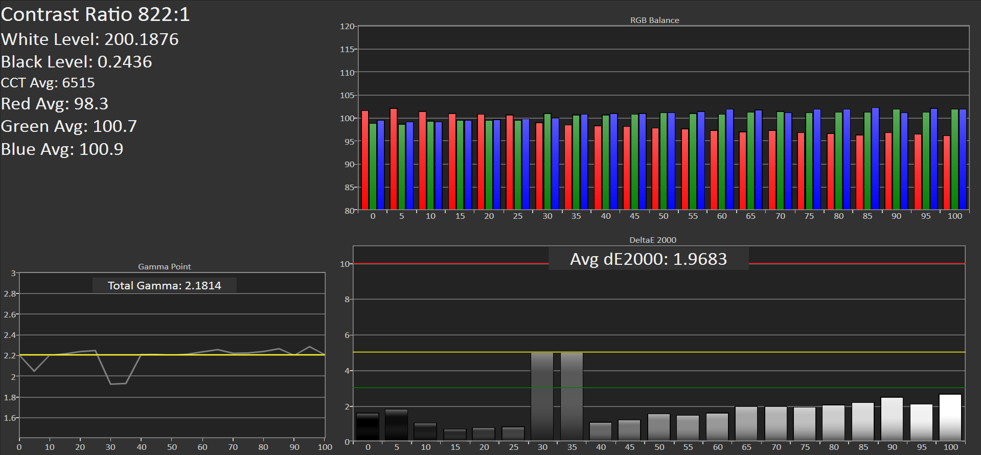
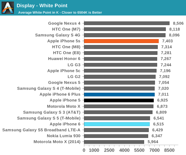
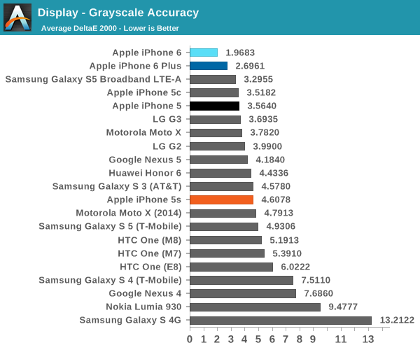
The next part to talk about is grayscale, which is an area where Apple seemed to prefer bluer color balances. I don’t really have much to pick at here, because the level of calibration here is incredible. While there is a noticeable trend of overshooting red at the low end and undershooting red at the high end, this is nitpicking at best. At any rate, this is essentially perfect.
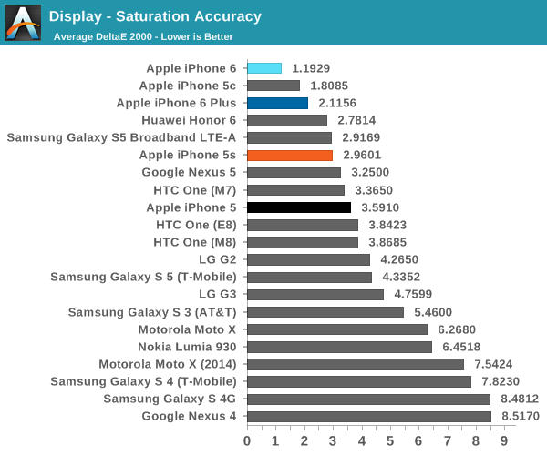
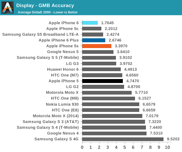
Our next test is the saturation sweep, which tests each primary and secondary color for accuracy in hue and luminance. While it’s true that humans can be relatively insensitive to differences in saturation, it is all too common to see OEMs artificially compress saturations to have vivid colors and be able to claim that they have an accurate display because it matches the sRGB gamut. In this test, the iPhone 6 sets a new record. I really don’t have any objections here because a dE2000 value of 1.19 is a deviation that is almost impossible to notice.
The final test is the Gretag MacBeth ColorChecker, which tests various hues and is usually one of the hardest tests to perform well in. In this regard, the iPhone 6 once again sets a new record for accuracy. This display is effectively calibrated to sRGB, and one would be hard pressed to find a significant deviation when compared to a reference monitor.
Overall, it’s hard to find any criticism for this display. I would normally be incredibly suspicious to see these numbers on a smartphone, but the fact that there’s a hot pixel in the center of the display suggests to me that this was not a cherry-picked unit. The fact that I find this level of calibration to be suspicious speaks volumes about how good this display is. While contrast isn't AMOLED levels of black, there are no purple smearing effects, noticeable uneven luminance near black, or any other idiosyncrasies.


531 Comments
View All Comments
blackcrayon - Tuesday, September 30, 2014 - link
There's also a big difference (heh) between being able to discern a difference, or caring about the difference. I certainly care about the difference between an iPad 2 screen and an iPad 3 and up screen. But I care *far* less about a 326 ppi screen vs a 400 ppi one. The other aspects of the display at that point are more "careworthy" (viewing angles, color, contrast, etc).techconc - Thursday, October 2, 2014 - link
Assuming 20/20 vision, 326ppi is "retina" quality at a distance of 10.5" or greater. 400ppi brings that in to 8.5" or greater. This can be mathematically proven. For you to claim to be able to discern the difference, you either have vision that is greater than 20/20 or you hold your phone much closer than everyone else in normal use. I'm guessing that neither is true and that you're more concerned about the values listed on a spec sheet.Revdarian - Friday, October 3, 2014 - link
You know prior to disregarding his claims you should investigate human eyesight further, i present to you the phenomenom of Hyper Acuity, which is simply that our brains actually do notice certain defects up to 10x smaller than our "hardware" in our eyes suggests that we should be able to notice.techconc - Monday, October 6, 2014 - link
@Revdarian - Yes, I'm familiar with the concept of Hyper Acuity. However, if the argument comes down to "I think there's a difference between these two displays, but I can't really say what it is..." then I think it's also safe to suggest that any such differences simply don't matter. From a practical perspective, today's high end screens (including the iPhone 6 and 6+) have reached the point where any further "improvement" in resolution adds little or no value for normal viewing distances. That said, there are still improvements to be made in terms of color accuracy, brightness, contrast, etc. which are far more noticeable. As such, it's probably not a coincidence that these are the type of improvements that Apple has targeted with their latest displays.Kidster3001 - Thursday, October 2, 2014 - link
I agree. I am ready for an Android upgrade but all the top models have stupid mega resolution. I don't want to pay for it because it provides no benefit. Can't see it, eats more battery.bernstein - Tuesday, September 30, 2014 - link
at least you got one thing right: apple is after the polish not features (with consumers willing to pay huge money for that)mrochester - Tuesday, September 30, 2014 - link
And I wish there were more manufactures who would take this approach. It's a lonely, if extremely lucrative, market for Apple.dmacfour - Wednesday, October 1, 2014 - link
After using an Android for 2 years, I came to the realization that polish, fit and finish, and UI fluidity are important to me.Zakster - Tuesday, September 30, 2014 - link
You need weed !mrubin63 - Tuesday, September 30, 2014 - link
Dude, please consider not skipping your meds!! I hope Apple sues you into the 20th Century. You are so clueless to be not just bizarre, but a bit unhinged mentally.