Dell UltraSharp U2711: Quality has a Price
by Jarred Walton on January 22, 2010 2:00 AM EST- Posted in
- Displays
Brightness and Contrast
For the brightness, contrast, and color accuracy tests, we depend on a hardware colorimeter and software to help calibrate the displays. We use a Monaco Optix XR (DTP-94) colorimeter and Monaco Optix XR Pro software. Dell advertises a typical contrast ratio of 1000:1 and a maximum contrast (using dynamic backlight adjustment) of 80000:1. We're not interested in dynamic contrast, so we used the Adobe RGB setting for the results below. For those that are wondering, the reason we don't like dynamic contrast is that CCFL backlights take time to settle in and provide a consistent output, and if a display is constantly modifying the backlight level you won't get accurate colors.
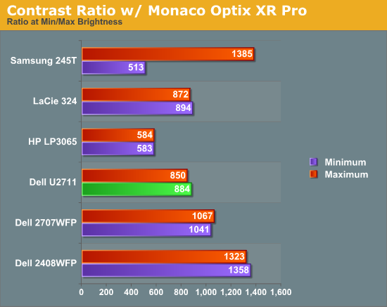
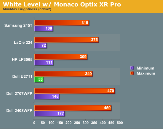
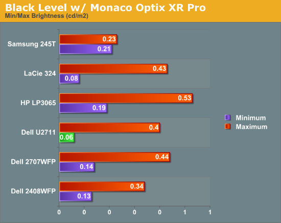
Don't pay too much attention to the white/black graphs, as they are merely reference points for how the displays perform at certain settings. Like many other LCDs, the U2711 has a "normal" brightness level of around 260nits (the Adobe RBS setting defaults to 50% brightness and contrast), which is more than sufficient and is actually brighter than what most users prefer to use in an office environment. You can reach the advertised 350nits (give or take) if you max out brightness and contrast.
We're more interested in the contrast ratio, and here we find that the U2711 doesn't quite reach the advertised 1000:1 but instead comes closer to 850:1. We would have liked to see black levels a bit lower to improve the contrast, but really anywhere above 750:1 is difficult to see the difference, and 500:1 is sufficient for most users. At lower brightness settings, the contrast ratio improves to the point where our 100nits "print" result (~13% brightness) actually reached the advertised 1000:1 contrast ratio.
Power Requirements
Going along with the brightness levels, here are the power requirements we measured at the Windows desktop using the minimum brightness (53nits) setting along with 100nits (13%), 200nits (36%), and maximum brightness (340nits).
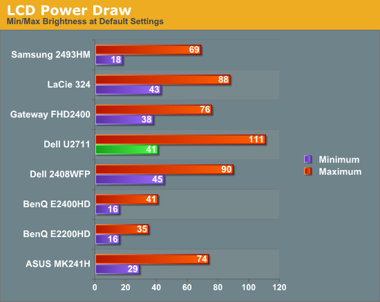
This is another area where we think the U2711 could be improved, but the cost might be too high right now. CCFL backlighting has been the norm since LCDs first came out, and it works but it's not the most power efficient way of lighting up an LCD. LEDs are the new and improved method, but while they can save power they also tend to deliver a lower color gamut. RGB LEDs address that shortcoming but they cost more and appear to use a similar amount of power compared to CCFL (and we've only seen them used in laptops so far). The U2711 draws a minimum of 41W, but a more realistic setting of 200nits will pull 72W. At maximum brightness the display settles down to 111W, but we measured a peak draw of 124W. (When we first cranked up brightness from 36% to 100%, brightness also reached 390nits before declining to 340nits.) We'd like to see LCDs that deliver all the color quality at half the power draw, but right now it's more a question of priorities: if you go green on power, your green colors may end up lacking. And to keep things in perspective, 72W at 200nits for a 27" LCD is still about half the power of your typical 21/22" CRT running at ~200nits!


153 Comments
View All Comments
MadMan007 - Friday, January 22, 2010 - link
Yup I wish more sites would go in to the implications of wide gamut but sadly it seems most just buy in to the MOAR=BETTER marketing hype. Given the depth of some articles at Anandtech it's kind of sad to see only the positives written, almost like marketing material, even if it is ostensibly in the context of professional use and applications.JarredWalton - Friday, January 22, 2010 - link
I have never noticed any problems whatsoever when viewing images on a high gamut display, but perhaps that's because I have calibration tools available. On the U2711, if you're running standard applications, just set the LCD to sRGB instead of Adobe RGB and your LCD will be running in the reduced gamut.Again, I'm not sure how having a wider gamut is supposed to oversaturate colors. Just because a display has a potentially wider gamut doesn't mean you have to use it. Oversaturated reds and blues is a calibration problem, not something inherently wrong with having a higher gamut.
I've heard this complaint before, and I've just never experienced any problems with this. I've even searched for information on what you might be referring to, with no luck. If you use a standard sRGB color space on a wider gamut, you're going to only use 82% of the available gamut. There should be a mapping for reds to reds, blues to blues, etc. that occurs with the display regardless; red shouldn't suddenly map to bright red.
Anyway, if you have a link to somewhere that explains how you encounter this problem, post it and I'll go see if I can replicate this issue (with and without calibration).
10e - Tuesday, January 26, 2010 - link
Sorry Jarred, I have to disagree with wide gamut not oversaturating colors in a practical sense, especially with a monitor that has multimedia aspirations like Dell's latest releases.I also have calibration tools, and one cannot "calibrate out" wide gamut on my Dell 3008WFP and NEC LCD2690WUXI. Wide gamut works fine with color managed applications like Photoshop, or color managed OSes like Mac OS X, but even using the Color Mgmt control panel and loading in the ICM profile in Windows 7 or Vista (or XP) only fixes the oversaturation in Windows Media Player and Picture Viewer, which funny enough ARE color managed. Ty using Media Player Classic and you'll see that it's different from what WMP 11 or 12 show.
This is because color managed apps perform color gamut transformation to correctly "map" sRGB colors to a wider gamut co-ordinate, based on information in the ICM profile. Because a wide gamut screen can effectively show a higher color intensity, a color that is R,G,B 255,0,0 will show a deeper red on wide gamut than standard gamut, because if eight bits per pixel is used, you have the same number of bits defining a wider color space than sRGB. In easy terms, the color difference between red at 254 vs red at 255 is more obvious on wide gamut screens.
Load a photo as your desktop background and load it into Picture Viewer in Vista or Win7 and you will see the difference especially with greens and reds. Even an ocean shot with lots of cyans and turqouises will show up quite obviously. I'm saying to do this, because I have made the same assertion before that wide gamut is not that big a deal, because I was fooled by the built in color viewer of Vista showing me correct colors.
I DO agree, however that using the sRGB mode for PC users and multimedia (console, BluRay) is best. Because otherwise the wide gamut will show up with stronger, unrealistic colors, similar to an old style TV with a color knob.
I have read reviews from other sites that listed wide gamut as being a plus, but I would have to disagree for about 90% of the population out there using tagged and untagged sRGB images.
The0ne - Wednesday, January 27, 2010 - link
You have a perfect example imo. I use this quite often myself for testing."Load a photo as your desktop background and load it into Picture Viewer in Vista or Win7 and you will see the difference especially with greens and reds. Even an ocean shot with lots of cyans and turqouises will show up quite obviously. I'm saying to do this, because I have made the same assertion before that wide gamut is not that big a deal, because I was fooled by the built in color viewer of Vista showing me correct colors."
JarredWalton - Tuesday, January 26, 2010 - link
I'm not sure about video playback... I just tried to compare a movie in WMP11 and MPCHC on a regular gamut LCD, and there's clearly a difference between the two. MPCHC looks somewhat washed out, with lighter blacks and darker whites. I'm not sure if WMP11 is doing some extra post processing or what.AnnonymousCoward - Saturday, January 23, 2010 - link
Jarred, virtually all pictures and video were recorded in sRGB space. With 24 bit color, one pixel might be color 103x50x246. That maps to a different color than it should on a wide gamut monitor. Since wide gamut extends deeper into the red zone, the incorrect mapping will give more saturated reds.JarredWalton - Saturday, January 23, 2010 - link
It only maps incorrectly if your monitor is running in a wide gamut color space (both the monitor and OS) and it doesn't handle an sRGB image as being sRGB. If the applications is color space aware, you don't have a problem. Having a wide gamut monitor doesn't inherently cause the problem; in fact, if you have a regular gamut monitor you get the same effect. It's the images/videos and color space they are created in that can create issues.AnnonymousCoward - Saturday, January 23, 2010 - link
Maybe my understanding is incorrect. The way I see it, regardless of what OS or application is being run, let's say you open a picture on a 72% gamut screen. The color is accurate. Now you crack open the monitor and replace the backlight with one that does 95% gamut. That same picture would appear different and more saturated, right? If so, that would be the case with all sRGB pictures out there, which is nearly every one.Even if software could "up-convert" a low gamut sRGB picture to be high gamut (by lowering the integer color values), for viewing on a high gamut screen, the end result wouldn't be a perfect match since we're dealing with integers.
JarredWalton - Sunday, January 24, 2010 - link
This is not correct. A high gamut screen has the potential to display a wider range of color, but it doesn't inherently do so. The backlight puts out white, and if it's a better white you can get a wider color range (more or less). But if you run in a limited color space, it doesn't make the colors map incorrectly within that color space. The problem only manifests when you view an image that maps to a different color space, and your image viewer doesn't adjust colors appropriately.There's a link above to a site that shows the problem. I can view the "wrong color space" stuff on a low gamut display as well as a high gamut display. So if you want an image to be viewable by your average Joe, you should use sRGB color space. Which, incidentally, the U2711 has a built-in profile calibrated to less than 5.0 delta E.
AnnonymousCoward - Monday, January 25, 2010 - link
I really appreciate the responses =)After looking into this more, I think there are 2 things going on (which happen to relate to the 2 points in my last post). 1) If software isn't color managed, there's an incorrect mapping (see http://tinyurl.com/yk2h9uz)">http://tinyurl.com/yk2h9uz). 2) Even with color management, due to "bits of color" having finite numbers of steps, the conversion for display on a high gamut screen might not be 1:1 (see http://tinyurl.com/y8vocba)">http://tinyurl.com/y8vocba). It seems like #1 is the bigger problem.