A Look At QD Vision's Color IQ And The Philips 276E6 Monitor: Quantum Dots for Wider Color Gamuts
by Brandon Chester on April 28, 2016 8:00 AM EST- Posted in
- Monitors
- Philips
- Quantum Dot
- QD Vision
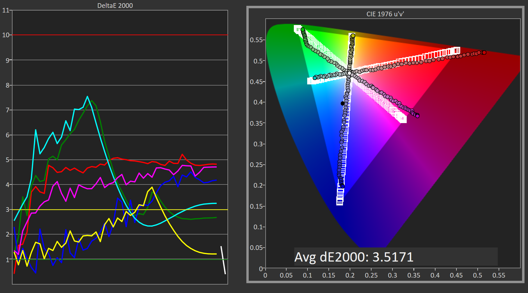
Adobe RGB: Pre-Calibration Testing
Our first tests involve measuring the Philips 276E6 prior to any calibration being performed. These are arguably the most relevant numbers for this sort of monitor, as it's highly unlikely that consumers purchasing $300 monitors will also happen to have a colorimeter or spectrophotometer laying around to calibrate it.
While no calibration is performed before this test, the display is set to a brightness level of 200 nits to keep results comparable between reviews. The white point setting has been left in the default Adobe RGB mode, which for some reason happened to be more accurate than the mode explicitly labeled 6500K.
Greyscale
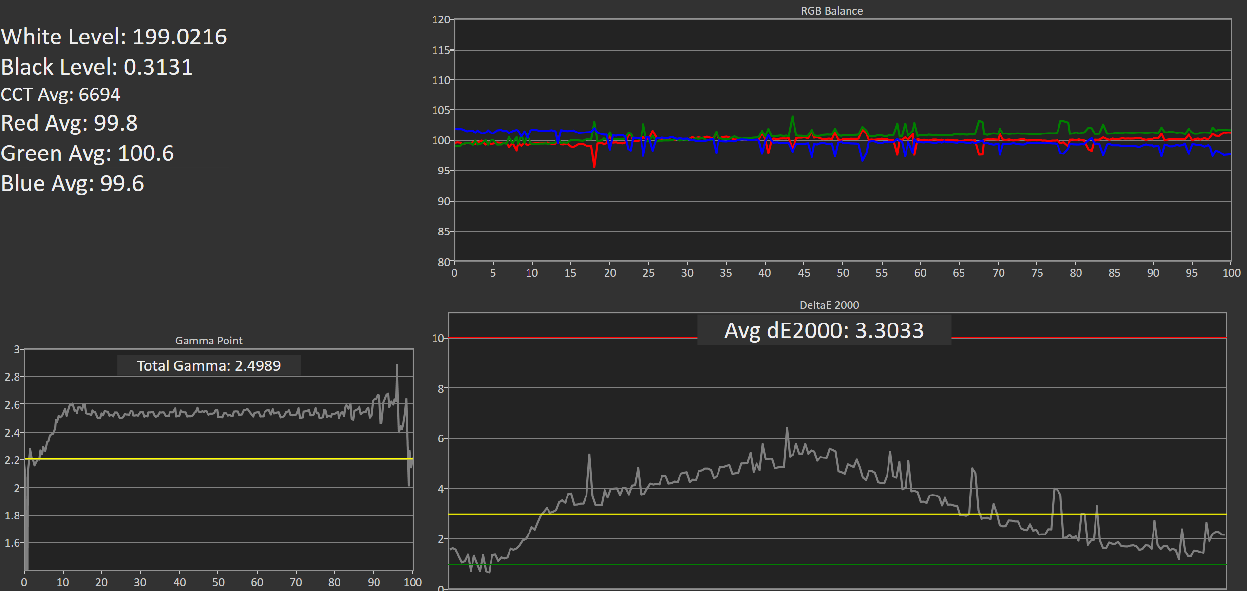
On this unit, greyscale accuracy was where I would expect a low priced wide gamut monitor to be. What's strange is that the gamma was closer to a target of 2.6 despite the fact that I left the monitor in its default power 2.2 gamma mode. It's worth noting that the original unit had a gamma that was much closer to 2.2, but the RGB balance for grey shades was much more red shifted and so the greyscale DeltaE was actually higher than this unit. It looks like there's a fairly large degree of variance between different units of the 276E6.
Saturation Sweep
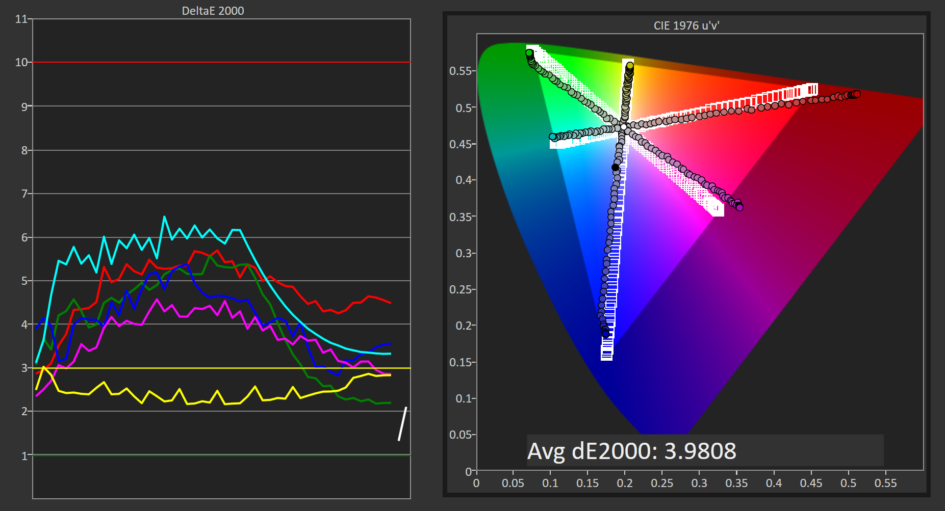
Due to the shifted primaries and improper gamma, the Philips 276E6 doesn't perform as well as it could in our saturation sweep test. Magenta is pulled toward red, while cyan is pulled toward green. For many levels of saturation there are fairly severe errors in magenta and blue, and even more so in green, red, and cyan.
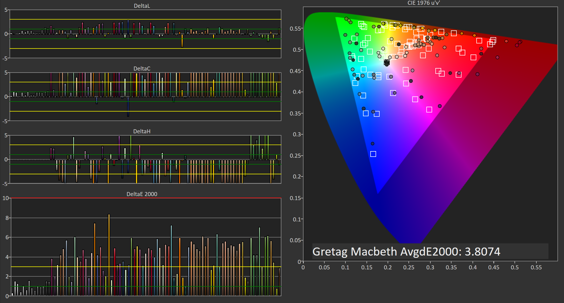
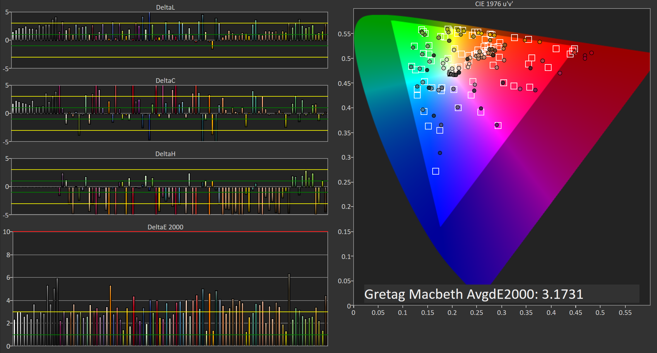
Gretag-Macbeth ColorChecker
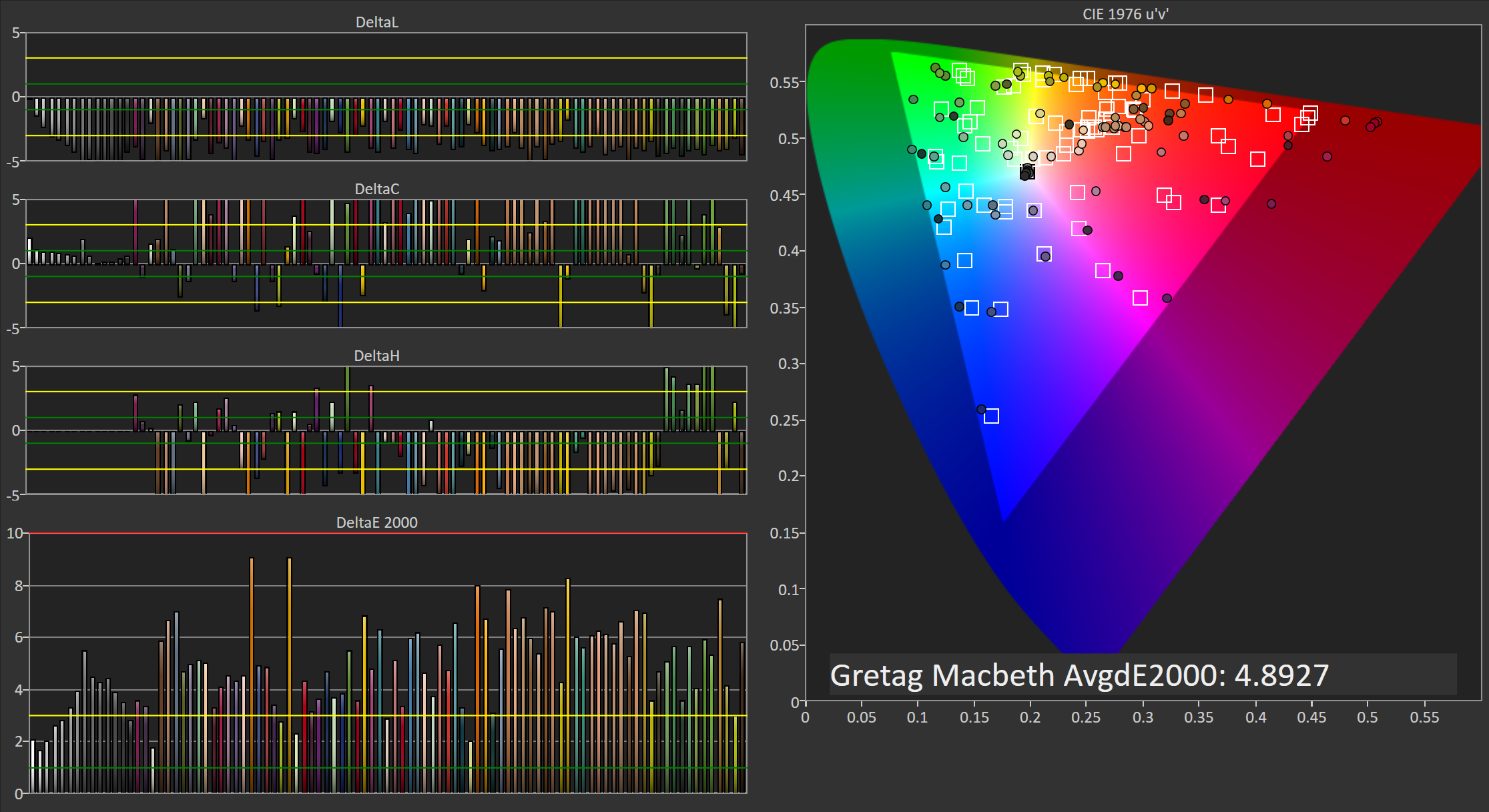
In the Gretag-Macbeth ColorChecker test the Philips 276E6 doesn't perform very well. The average DeltaE is nearly five, with a number of colors actually exhibiting individual errors above six. In this case the oversaturated red primary is causing significant problems with accuracy by also shifting shades of yellow, orange, and magenta toward red. I really have no idea why Philips decided to tune the monitor in this manner, and unfortunately it makes the monitor not very useful for work that depends heavily on color accuracy.
Adobe RGB: 200 Nits Calibration
Our 200 nit calibration target is still the Adobe RGB gamut with a power 2.2 gamma. Since we can't actually alter the display's primaries due to there being no 3D LUT, there will be no way to improve upon the errors with the color gamut and any saturations or color mixtures that rely heavily on accuracy there.
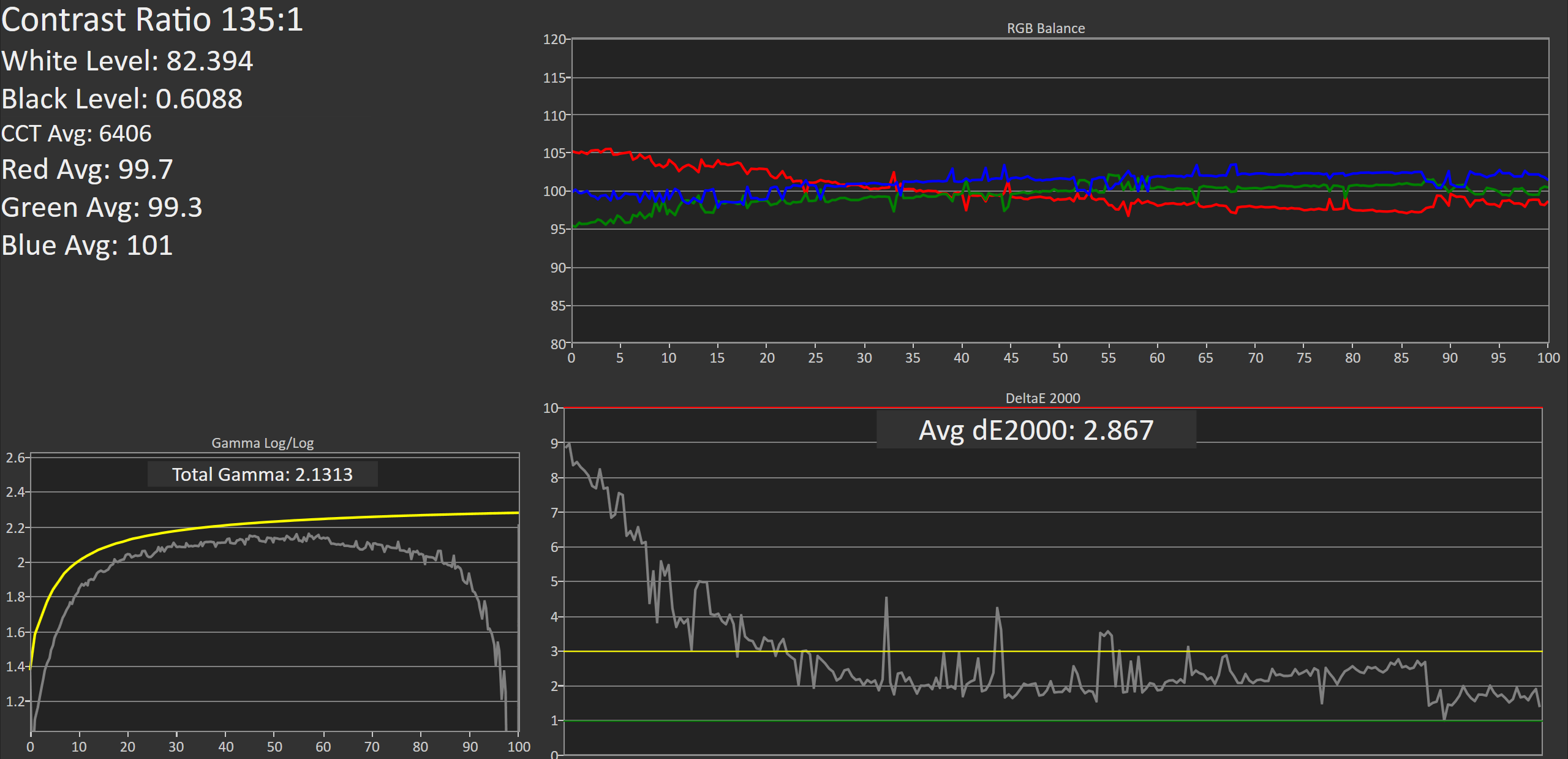
While my earlier testing was done in the monitor's default Adobe RGB mode, for calibration I moved to using the user defined mode which allows control over the white point through a set of RGB sliders. This allowed improvements to be made at the monitor level before making further tweaks by performing the greyscale calibration, which helps to retain tonal range as there are fewer adjustments that need to be made in the GPU's LUT.
Greyscale
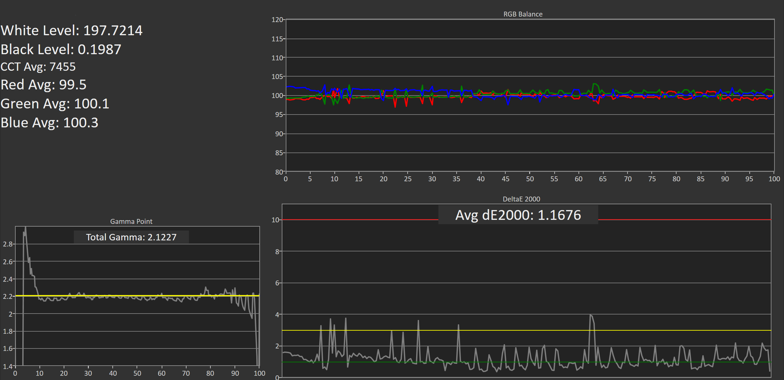
Greyscale accuracy on the Philips 276E6 improves dramatically after calibation. While the gamma is still far too high in the darkest shades, it's much more linear and now tracks fairly close to our 2.2 target rather than 2.6. The greyscale does have a number of areas where one shade will have a much higher error than the surrounding ones, and it may take moving from a 65 point to an even more comprehensive 255-point calibration to eliminate these errors.
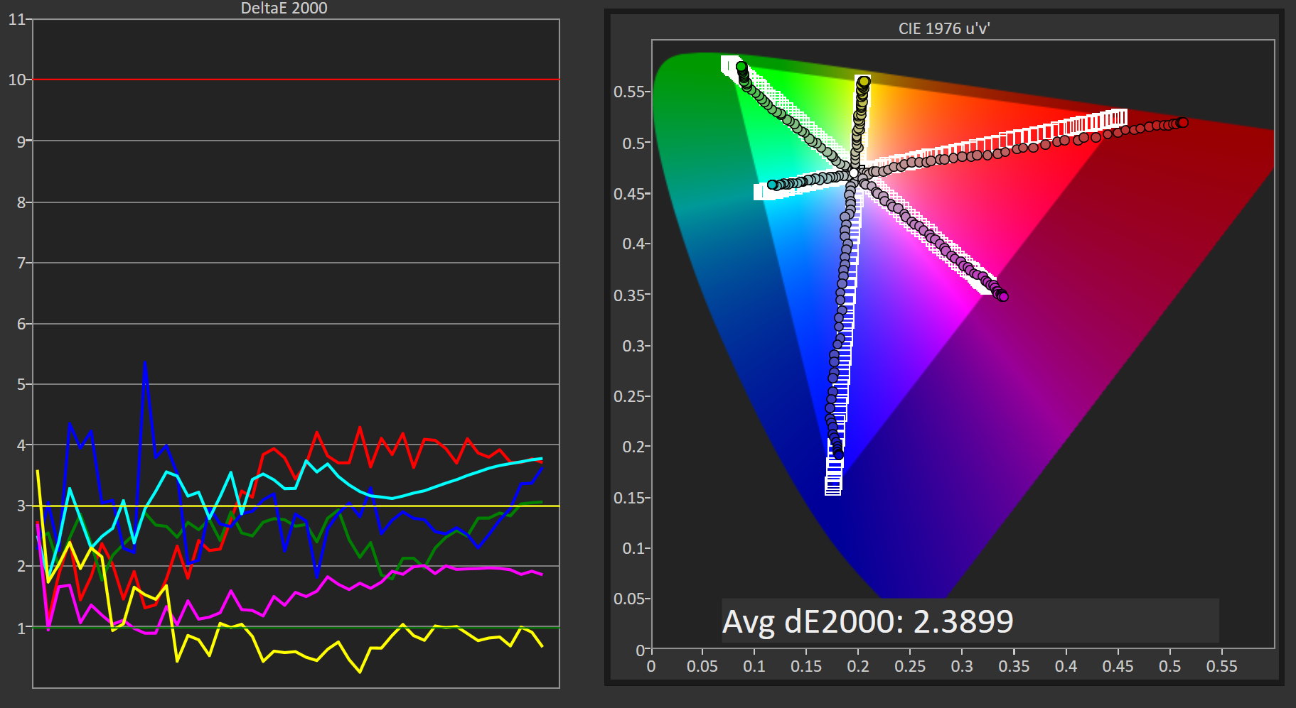
Saturation Sweep
The average error with primary and secondary color saturations is lower after calibrating the 276E6, but there's a caveat. Due to adjustments made to the greyscale, as well as the adjustments made to the monitor directly through the white point settings before calibration, the error in cyan and green is actually much higher in the lower saturations, while the errors for blue, red, and magenta in the more intense saturations are also higher. I'm honestly hesitant to actually describe this as an improvement, and many of the errors are far too severe for the monitor to be usable in color critical applications.
Gretag-Macbeth ColorChecker
Performance in the Gretag-Macbeth ColorChecker test improves after calibration, but much of this is due to the improvement in greyscale accuracy, with many colors still exhibiting very large errors. Unfortunately, even after calibration, the Philips 276E6 isn't really suitable for use as a monitor for photo or video editing.
Adobe RGB: 80 Nits Calibration
For our 80 nit calibration we continue to target the Adobe RGB gamut, but in addition to the lower brightness we also target the sRGB gamma curve rather than a simple 2.2 power function. sRGB's gamma allows for greater detail in the darkest regions of images, and this calibration target closely reflects what one would target on a professional display where images are being edited for print.
Greyscale
As expected, the 276E6 struggles when calibrated using the sRGB gamma target. In the darkest shades of grey the errors are quite high, descending from a DeltaE value of roughly 9 at black to an error of 3 at roughly 25%. Beyond that point the calibration is actually fairly good, and the average overall error is below our target value of 3.0. However, the severe inaccuracy in the dark regions makes it fairly evident that the monitor won't be usable in applications that require strict conformance to the sRGB gamma and luminance specifications.
Saturation Sweep
Surprisingly, the Philips 276E6 performs much better in the saturation sweep with our 80 nit calibration than it does at 200 nits. This may be due to the modifications I have made at the monitor level to correct the white point before doing a greyscale calibration in CalMAN, and given that the white point settings on my two samples were very different it's likely that results with different calibration targets will vary a great deal from unit to unit.
Gretag-Macbeth ColorChecker
Another surprise is the fairly low average error in the ColorChecker test. I can really only ascribe these differences to the changes made when altering the monitor's white point, but it really is interesting to see a display perform better with this arguably more difficult calibration target than with the 200 nit calibration with a simple power 2.2 gamma.


51 Comments
View All Comments
arjojosh - Monday, May 2, 2016 - link
Very good write-up on this topic!!I have a Korean wide gamut monitor, 30" 1600p IPS, without an sRGB mode and it's a gigantic pain in the butt. I did loads of research prior to buying this (maybe three years ago now), and could not find any mention of the problems this would cause. I like the monitor when it's displaying correctly, but overall, it's been a big hindrance to just normal PC/computer usage.
While it's nice to see easy to obtain, good monitors - if the result is what I've been dealing with all this time, than I recommend to stay away from this, and others like it. With no hardware based sRGB mode, you will find yourself extremely frustrated that you can't even browse online with proper photo colors.
Hoping Microsoft starts to address this, if it's even possible, but it's gained so little traction through the years.