A Look At QD Vision's Color IQ And The Philips 276E6 Monitor: Quantum Dots for Wider Color Gamuts
by Brandon Chester on April 28, 2016 8:00 AM EST- Posted in
- Monitors
- Philips
- Quantum Dot
- QD Vision
Display Uniformity
While measurements taken at the center of the display are one thing, the accuracy of images across the entire panel is another. Even if you have a display that is accurate in the center, large errors relative to that may mean that the display actually doesn't show a very accurate image overall. This can cause significant problems with video and photo editing, as it's necessary to use most of your display when doing those tasks to see as much of the image as possible. To examine uniformity, I've used our standard white, black, contrast, and color uniformity tests, which are all based on the patterns from the Gretag-Macbeth ColorChecker test.
White Uniformity
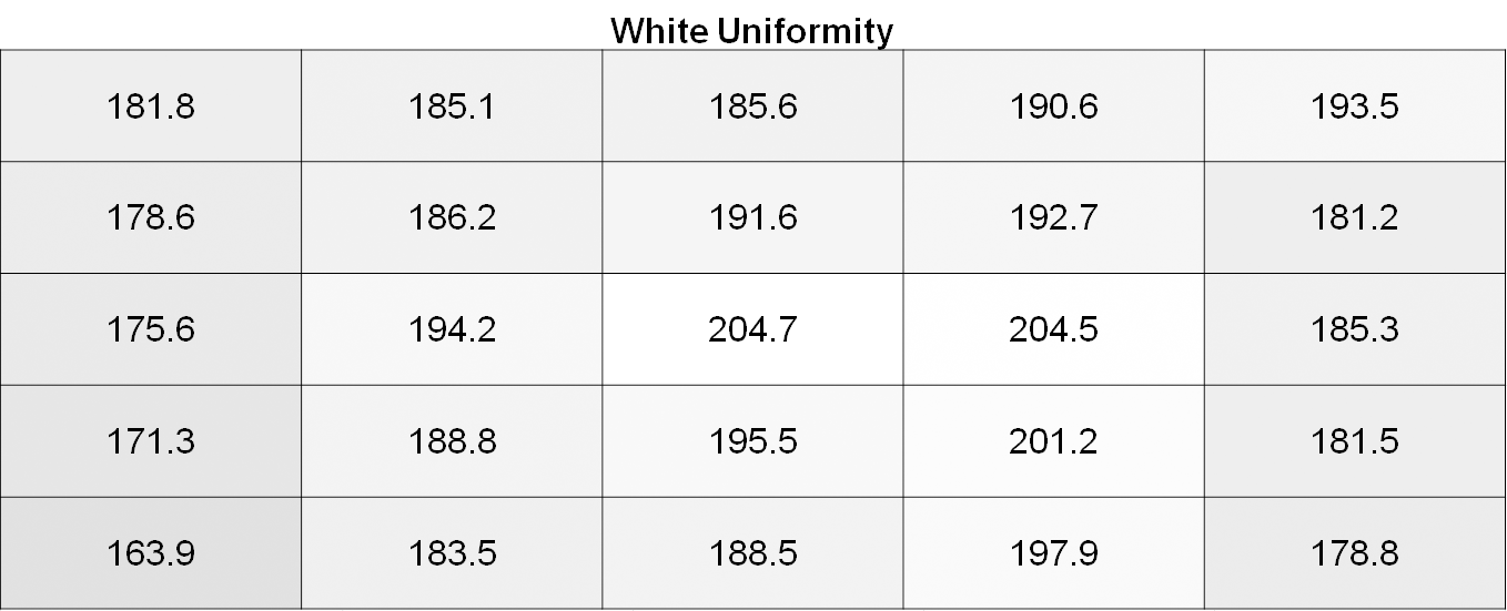
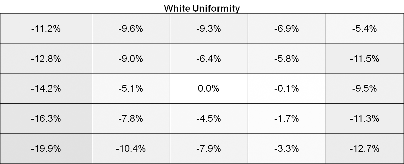
White uniformity is definitely not bad on the Philips 276E6, especially by the standards of $300 monitors. However, it's pretty apparent when using it that the left side of the display is significantly dimmer than the center. Depending on what sort of work you do this may or may not pose a problem, but for color-critical work the brightness variance is probably going to be too high.
Black Uniformity
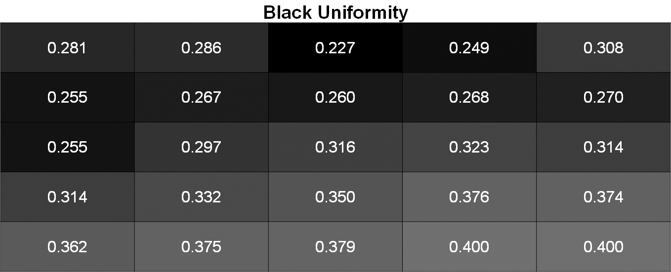
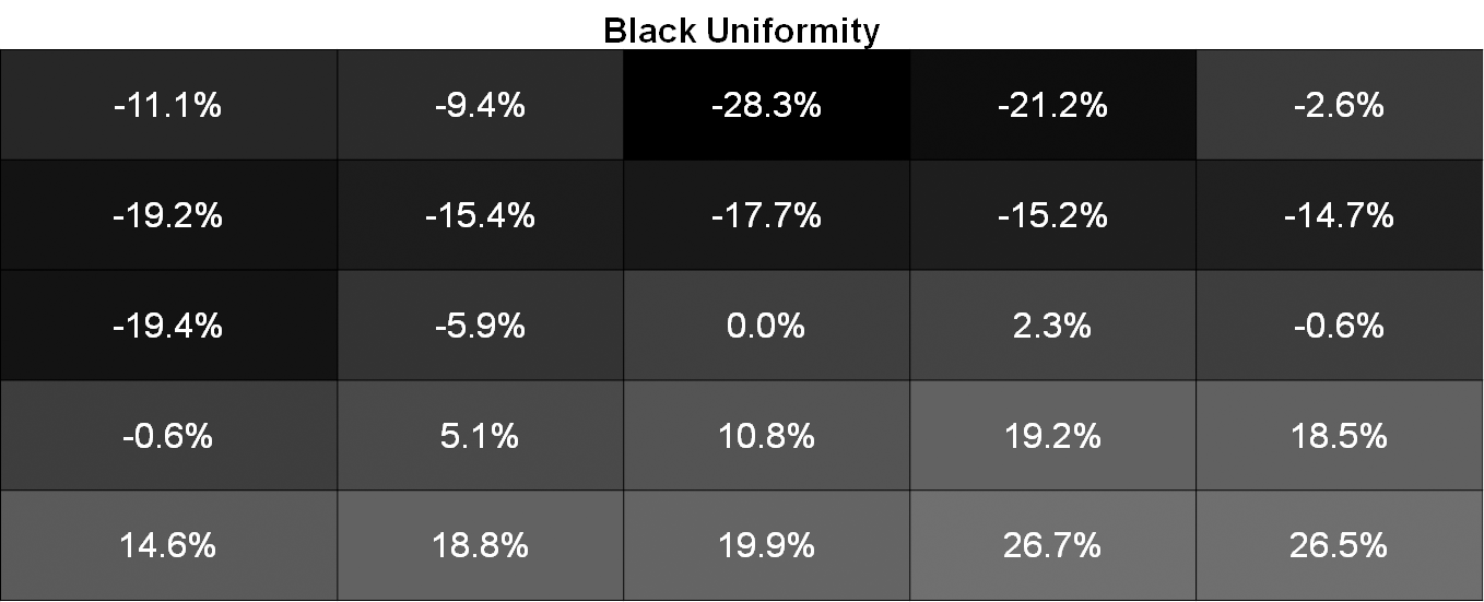
Black uniformity is a bit all over the place. If you divide the display into two sections along its right diagonal you find that the top section is darker than the center area, while the bottom section is much brighter. This is again fairly visible when using the monitor.
Contrast Uniformity
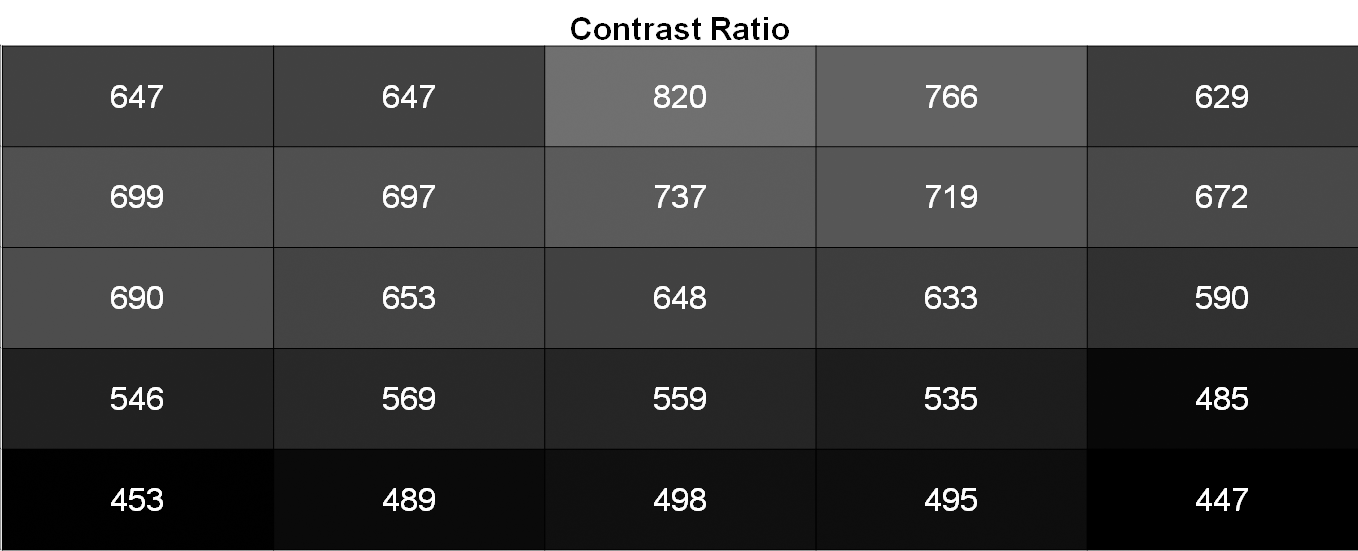
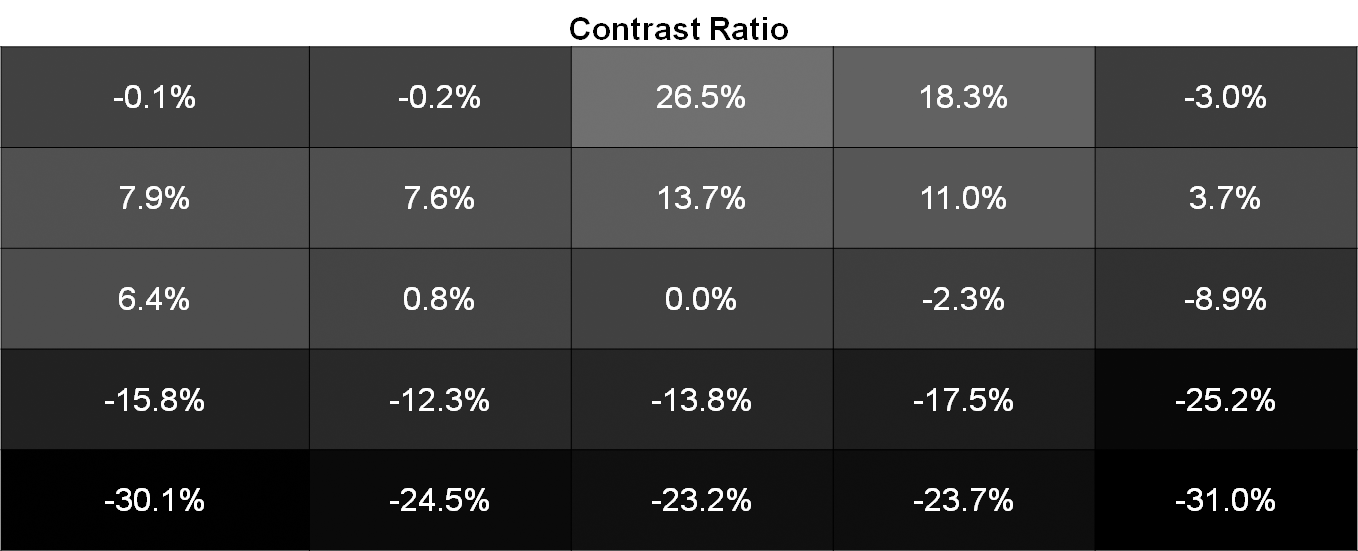
Contrast uniformity is really just a function of the white and black uniformity. In this case there's an area of lower contrast along the bottom of the display, with the rest of the display actually being fairly good aside from a couple areas along the very top. It's just unfortunate that there's so much backlight bleed at the bottom of the panel, as that's really what's causing the issues here.
Color Uniformity
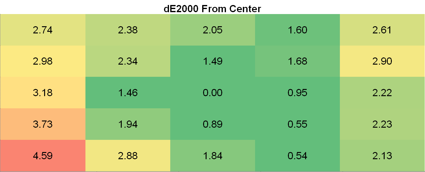
Color uniformity on the 276E6 suffers from the same issues as the brightness uniformity. This is to be expected, as if your luminance level is incorrect your colors will also be incorrect. Even when doing simple things like browsing the web you can tell that the left side of the display is not as uniform as the area right around the center, and it's quite unfortunate because as far as uniformity goes it's only the bottom left part of the panel that really hurts the 276E6's usability as a display for image and video editing.


51 Comments
View All Comments
ImSpartacus - Thursday, April 28, 2016 - link
Fascinating read. Intuitively, I didn't anticipate a downside to a wide gamut monitor, so that's interesting to learn about.Though, honestly, as a layman, I have little use for something with that much potential. Cheap Korean panels, hooooooooo!
nathanddrews - Thursday, April 28, 2016 - link
This is only the beginning. With the advent of Rec. 2020 HDR monitors, we are looking at an even more complex calibration system. Even now, HDR televisions effectively have no way to calibrate to a standard. Supposedly Microsoft is working on a W10 update to improve color support for 10-bit and HDR... but without a sincere, ground-up overhaul of color handling, I don't think it will amount to much.Gotta keep the hope, though. I really want to play some HDR games on OLED.
Michael Bay - Thursday, April 28, 2016 - link
I dread the day my insider preview build will mention color profiling. Bugs will be atrocious!crimsonson - Thursday, April 28, 2016 - link
Dolby and SMPTE have offered each a standard for HDR.nathanddrews - Friday, April 29, 2016 - link
Both of which have no good calibration method yet. Ideally, the unit would come pre-calibrated for both dark and bright environments, HDR10 and DV. Of course, if the player and TV could talk to each other to constrain the nit levels to the calibrated display output... I would be in heaven.BrokenCrayons - Thursday, April 28, 2016 - link
Yup, monitors that attempt to display colors accurately or at higher resolutions seem like sort of a pain in the backside to deal with. Certainly, there's good reasons for them, but I'm perfectly happy using bottom-feeder 1366x768 screens for the moment. Higher resolutions aren't important and neither is color accuracy. It's great to see the technology maturing, but you could stick me with a smeary old passive matrix LCD panel from a mid-90s era laptop and it'd be fine.Solandri - Monday, May 2, 2016 - link
As someone old enough to remember the loss of color gamut moving from CRTs to LCDs, I can't wait for sRGB to die so we can move to a more realistic color gamut like Adobe RGB (which is fairly close to the NTSC standard used for CRTs).The color profile problem is only a problem when displaying pictures with a certain color profile on a screen with a different color profile. The problem goes away if everyone uses the same default color profile.
Unfortunately for 20 years now, the default has been the atrocious sRGB. Decades from now, photos and movies shot in this era will be notable for their lack of color saturation, because they were made for the sRGB color space. I quit shooting JPEGs with my DSLR precisely for this reason - my camera's RAW photos cover Adobe RGB space, so by shooting as JPEG I was throwing away a lot of color information.
willis936 - Thursday, April 28, 2016 - link
Excellent write up. Lots of info for getting people up to speed on color management.Michael Bay - Thursday, April 28, 2016 - link
First in was Mami, and now R;N. Animoo certainly conquered AT in these couple of years.Jacerie - Thursday, April 28, 2016 - link
There's a typo in the title. Quantum is spelled with a U not an O.