A Look At QD Vision's Color IQ And The Philips 276E6 Monitor: Quantum Dots for Wider Color Gamuts
by Brandon Chester on April 28, 2016 8:00 AM EST- Posted in
- Monitors
- Philips
- Quantum Dot
- QD Vision
Contrast, Brightness, and Gamut
Of course, while QD Vision's Color IQ technology looks good on paper, what's equally important is how well the technology translates to the real world. QD Vision's goal to bring down the cost of backlighting suitable for wide gamut displays is unabashedly aggressive, and like other efforts to reduce manufacturing costs, cost reductions need to be carefully balanced to exploit the advantages of new technology without unnecessarily sacrificing quality. To that end QD Vision's first outing in the PC display market is an especially interesting one, as we can see and evaluate first-hand the true gamut capabilities of Color IQ as implemented in Phillips' 276E6 monitor.
Starting things off with a look at some more basic monitor metrics, Philips rates the 276E6 as having a peak brightness of 300 nits and a contrast ratio of 1000:1. This is in line with what you'll typically find on displays of this price, and in general you probably won't be using a monitor at anything close to 300 nits in a typical workspace. As always, measurements for white and black level are done with an i1DisplayPro due to its greater accuracy with levels below 0.2 nits than the i1Pro 2.
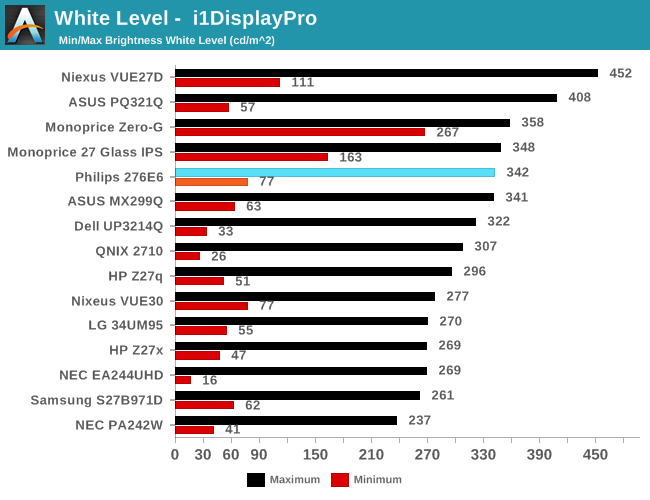
Peak luminance on the Philips 276E6 is relatively high. While we have seen some monitors reach beyond 400 nits, in practice this isn't really important because the ambient environment lighting for a monitor is usually constant, and rarely requires a brightness above 100-200 nits to overcome reflections. As for the minimum brightness, in its standard Adobe RGB mode the display dropped to 77 nits. This is actually fairly bright, and if were any brighter it would be difficult to perform our 80 nit calibration later in the review.
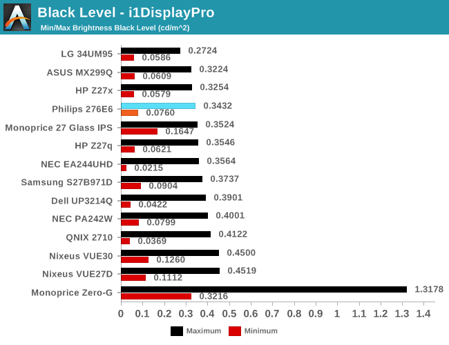
Black levels on the Philips 276E6 are quite good as well. At maximum brightness it's one of the better panels on record, which will pair well with its high brightness. At minimum brightness the gap between it and the next best display is quite a bit larger, but it's important to remember that the Philips 276E6 has a minimum brightness that is also higher than most displays, and so the contrast ratio should end up being quite good in both cases.
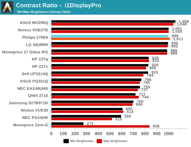
As far as contrast ratio goes, the Philips 276E6 does as well as you'd expect based on its white and black levels. Obviously there are now displays on the market that utilize photoalignment technology to achieve contrast ratios around 1800:1, but 1000:1 is quite a good result for a $300 display, and it's right in line with what Philips advertises so you're definitely getting what you paid for.
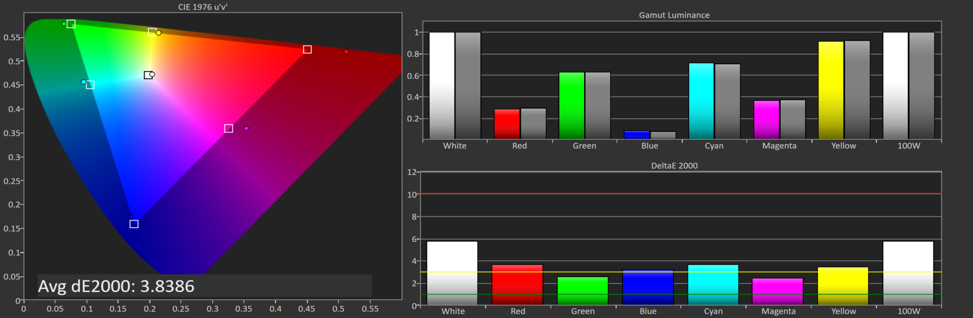
Philips 276E6 gamut DeltaE with default settings
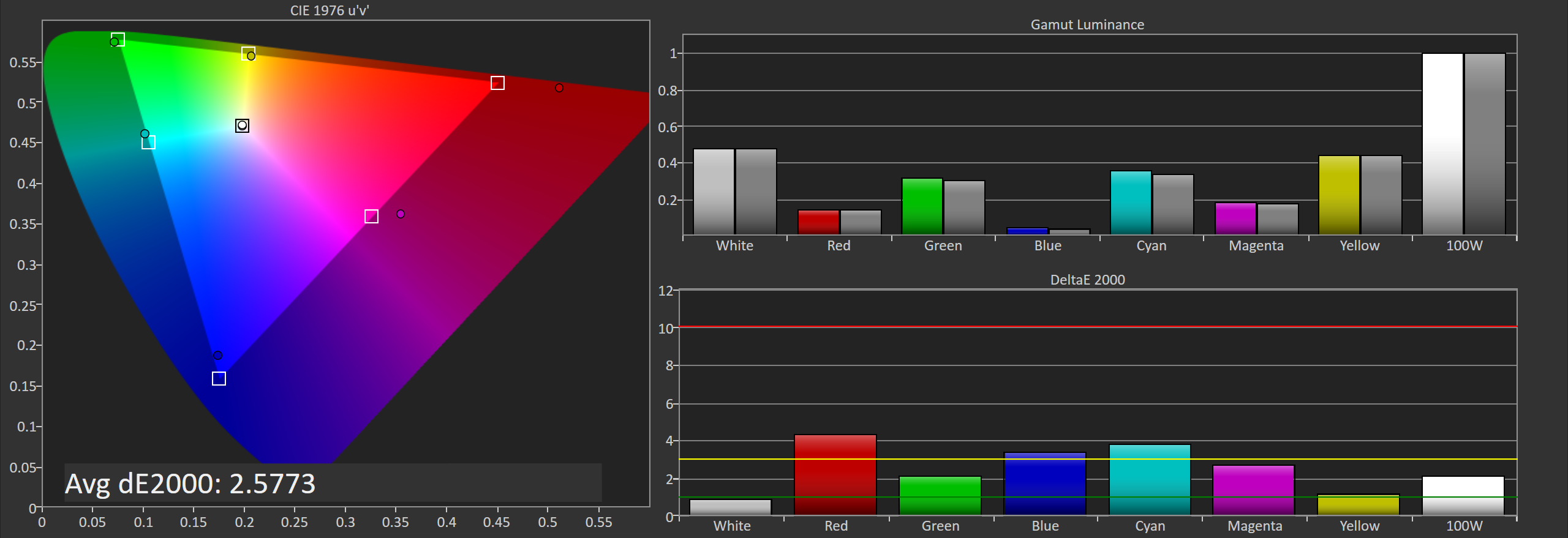
Philips 276E6 gamut DeltaE with OSD tweaks
Gamut accuracy on the Philips 276E6 can vary pretty wildly. On both of the units I tested there were two common errors. The first is color, with the blue primary being undersaturated while the red primary is significantly oversaturated. The second problem is the white point. If your luminance is wrong your colors will also be wrong, and on both monitors it took a lot of fiddling with the OSD to get an accurate white point, and you can see the result of that in the photos above. Out of the box the white error on our second unit causes the DeltaE to approach four.
Generally, you'll be able to eyeball it and figure out which of the white presets is the most neutral, but even if you do you're also dealing with significant errors in blue, red, and the secondary colors that rely on them. Considering that the Color IQ tech is supposed to be highly tunable I really don't know how such large errors could exist in the shipping product, and it's not clear whether this is a technology limitation or a decision on Philips' part. In any case it doesn't look good to have large errors on the most basic of our tests.


51 Comments
View All Comments
ImSpartacus - Thursday, April 28, 2016 - link
Fascinating read. Intuitively, I didn't anticipate a downside to a wide gamut monitor, so that's interesting to learn about.Though, honestly, as a layman, I have little use for something with that much potential. Cheap Korean panels, hooooooooo!
nathanddrews - Thursday, April 28, 2016 - link
This is only the beginning. With the advent of Rec. 2020 HDR monitors, we are looking at an even more complex calibration system. Even now, HDR televisions effectively have no way to calibrate to a standard. Supposedly Microsoft is working on a W10 update to improve color support for 10-bit and HDR... but without a sincere, ground-up overhaul of color handling, I don't think it will amount to much.Gotta keep the hope, though. I really want to play some HDR games on OLED.
Michael Bay - Thursday, April 28, 2016 - link
I dread the day my insider preview build will mention color profiling. Bugs will be atrocious!crimsonson - Thursday, April 28, 2016 - link
Dolby and SMPTE have offered each a standard for HDR.nathanddrews - Friday, April 29, 2016 - link
Both of which have no good calibration method yet. Ideally, the unit would come pre-calibrated for both dark and bright environments, HDR10 and DV. Of course, if the player and TV could talk to each other to constrain the nit levels to the calibrated display output... I would be in heaven.BrokenCrayons - Thursday, April 28, 2016 - link
Yup, monitors that attempt to display colors accurately or at higher resolutions seem like sort of a pain in the backside to deal with. Certainly, there's good reasons for them, but I'm perfectly happy using bottom-feeder 1366x768 screens for the moment. Higher resolutions aren't important and neither is color accuracy. It's great to see the technology maturing, but you could stick me with a smeary old passive matrix LCD panel from a mid-90s era laptop and it'd be fine.Solandri - Monday, May 2, 2016 - link
As someone old enough to remember the loss of color gamut moving from CRTs to LCDs, I can't wait for sRGB to die so we can move to a more realistic color gamut like Adobe RGB (which is fairly close to the NTSC standard used for CRTs).The color profile problem is only a problem when displaying pictures with a certain color profile on a screen with a different color profile. The problem goes away if everyone uses the same default color profile.
Unfortunately for 20 years now, the default has been the atrocious sRGB. Decades from now, photos and movies shot in this era will be notable for their lack of color saturation, because they were made for the sRGB color space. I quit shooting JPEGs with my DSLR precisely for this reason - my camera's RAW photos cover Adobe RGB space, so by shooting as JPEG I was throwing away a lot of color information.
willis936 - Thursday, April 28, 2016 - link
Excellent write up. Lots of info for getting people up to speed on color management.Michael Bay - Thursday, April 28, 2016 - link
First in was Mami, and now R;N. Animoo certainly conquered AT in these couple of years.Jacerie - Thursday, April 28, 2016 - link
There's a typo in the title. Quantum is spelled with a U not an O.