A Look At QD Vision's Color IQ And The Philips 276E6 Monitor: Quantum Dots for Wider Color Gamuts
by Brandon Chester on April 28, 2016 8:00 AM EST- Posted in
- Monitors
- Philips
- Quantum Dot
- QD Vision
Adobe RGB: Pre-Calibration Testing
Our first tests involve measuring the Philips 276E6 prior to any calibration being performed. These are arguably the most relevant numbers for this sort of monitor, as it's highly unlikely that consumers purchasing $300 monitors will also happen to have a colorimeter or spectrophotometer laying around to calibrate it.
While no calibration is performed before this test, the display is set to a brightness level of 200 nits to keep results comparable between reviews. The white point setting has been left in the default Adobe RGB mode, which for some reason happened to be more accurate than the mode explicitly labeled 6500K.
Greyscale
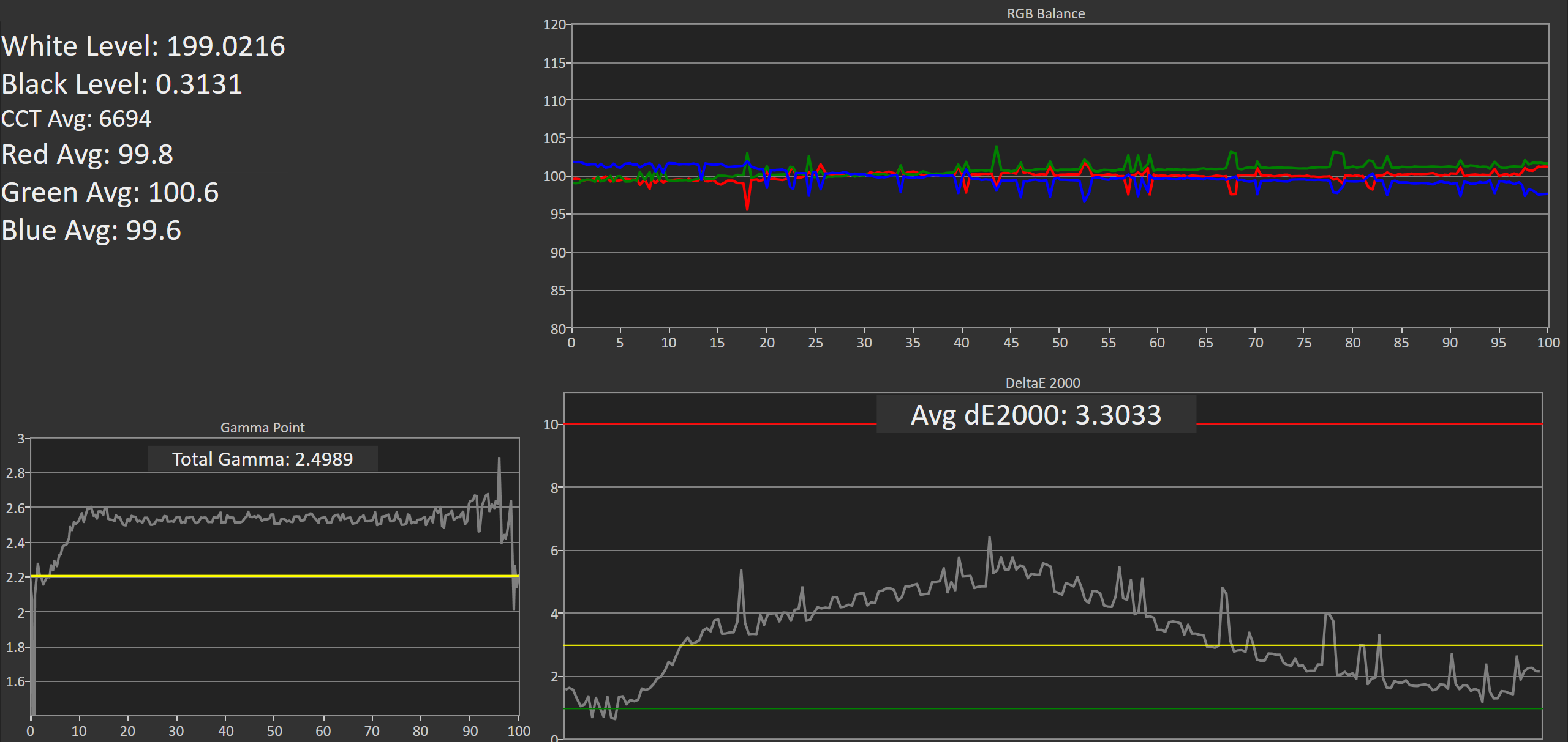
On this unit, greyscale accuracy was where I would expect a low priced wide gamut monitor to be. What's strange is that the gamma was closer to a target of 2.6 despite the fact that I left the monitor in its default power 2.2 gamma mode. It's worth noting that the original unit had a gamma that was much closer to 2.2, but the RGB balance for grey shades was much more red shifted and so the greyscale DeltaE was actually higher than this unit. It looks like there's a fairly large degree of variance between different units of the 276E6.
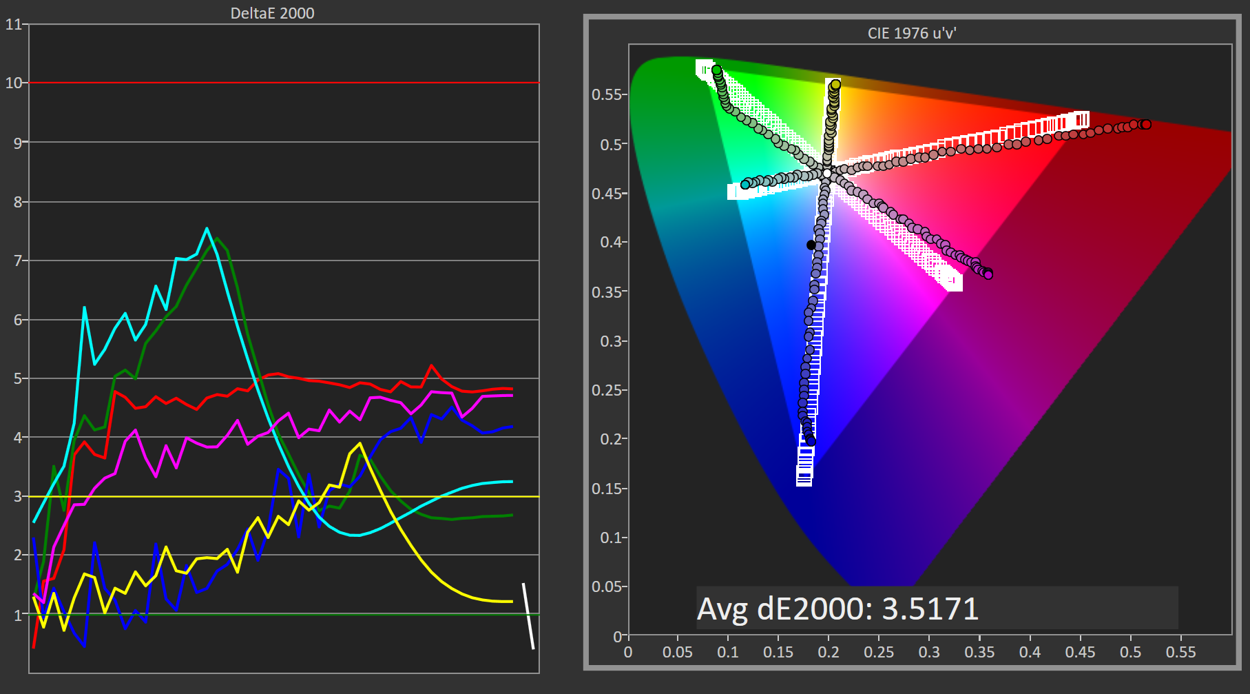
Saturation Sweep
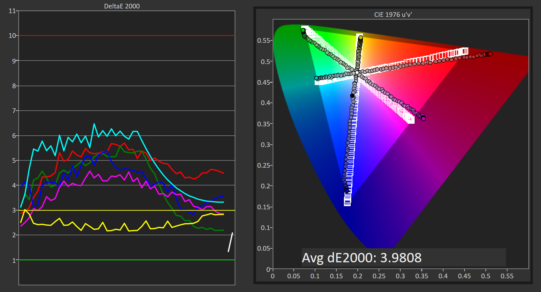
Due to the shifted primaries and improper gamma, the Philips 276E6 doesn't perform as well as it could in our saturation sweep test. Magenta is pulled toward red, while cyan is pulled toward green. For many levels of saturation there are fairly severe errors in magenta and blue, and even more so in green, red, and cyan.
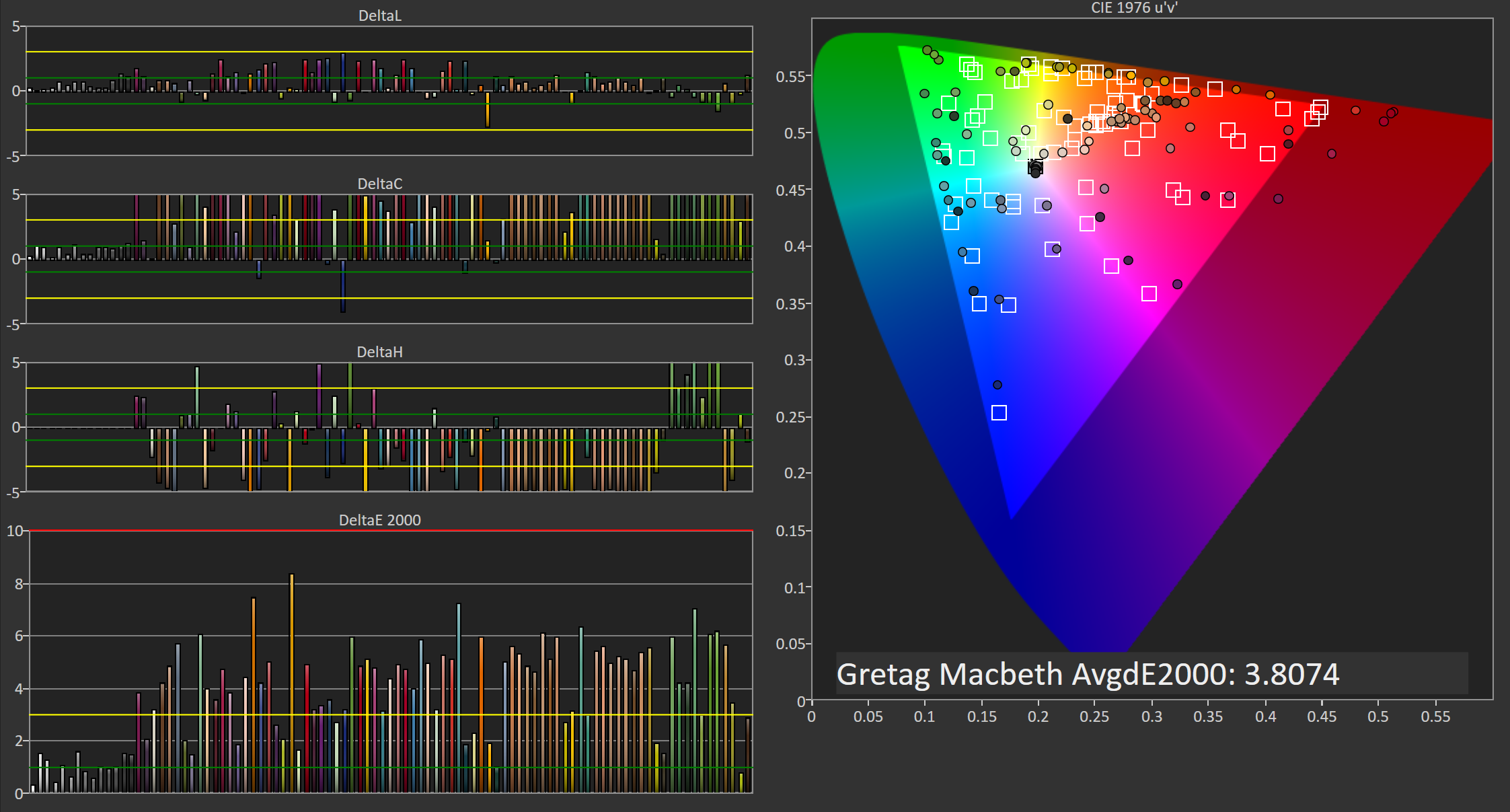
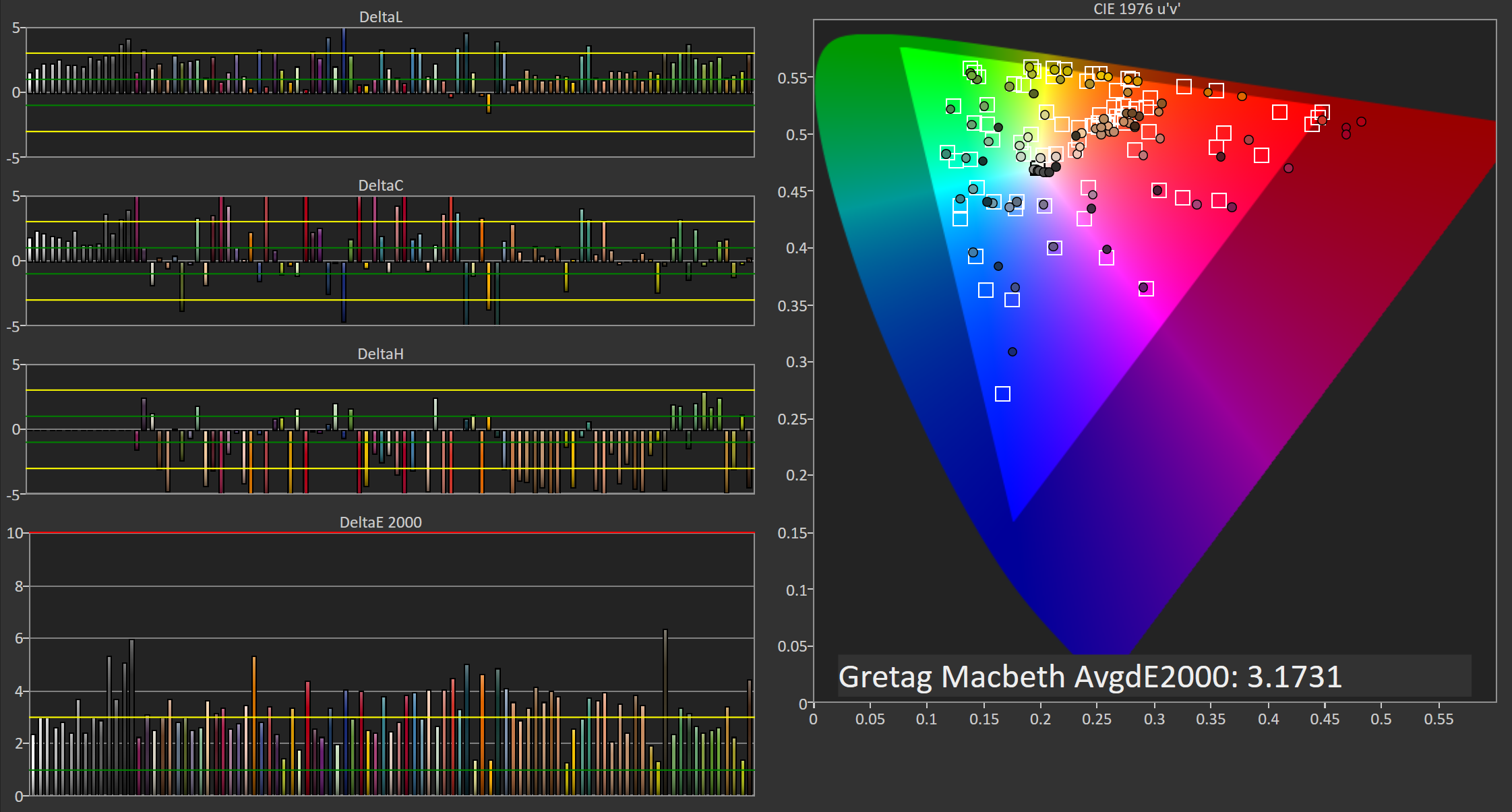
Gretag-Macbeth ColorChecker
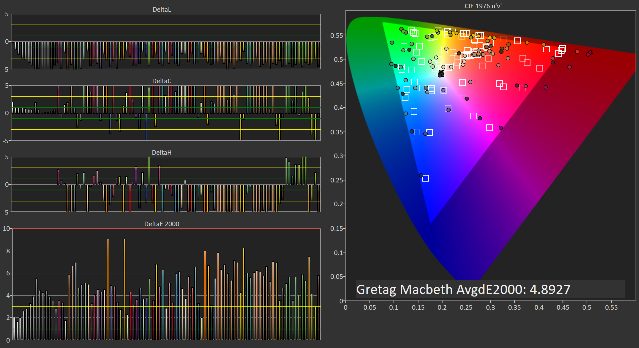
In the Gretag-Macbeth ColorChecker test the Philips 276E6 doesn't perform very well. The average DeltaE is nearly five, with a number of colors actually exhibiting individual errors above six. In this case the oversaturated red primary is causing significant problems with accuracy by also shifting shades of yellow, orange, and magenta toward red. I really have no idea why Philips decided to tune the monitor in this manner, and unfortunately it makes the monitor not very useful for work that depends heavily on color accuracy.
Adobe RGB: 200 Nits Calibration
Our 200 nit calibration target is still the Adobe RGB gamut with a power 2.2 gamma. Since we can't actually alter the display's primaries due to there being no 3D LUT, there will be no way to improve upon the errors with the color gamut and any saturations or color mixtures that rely heavily on accuracy there.
While my earlier testing was done in the monitor's default Adobe RGB mode, for calibration I moved to using the user defined mode which allows control over the white point through a set of RGB sliders. This allowed improvements to be made at the monitor level before making further tweaks by performing the greyscale calibration, which helps to retain tonal range as there are fewer adjustments that need to be made in the GPU's LUT.
Greyscale
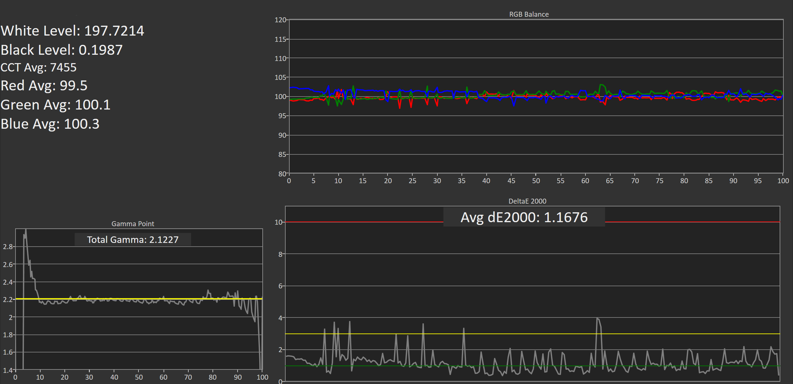
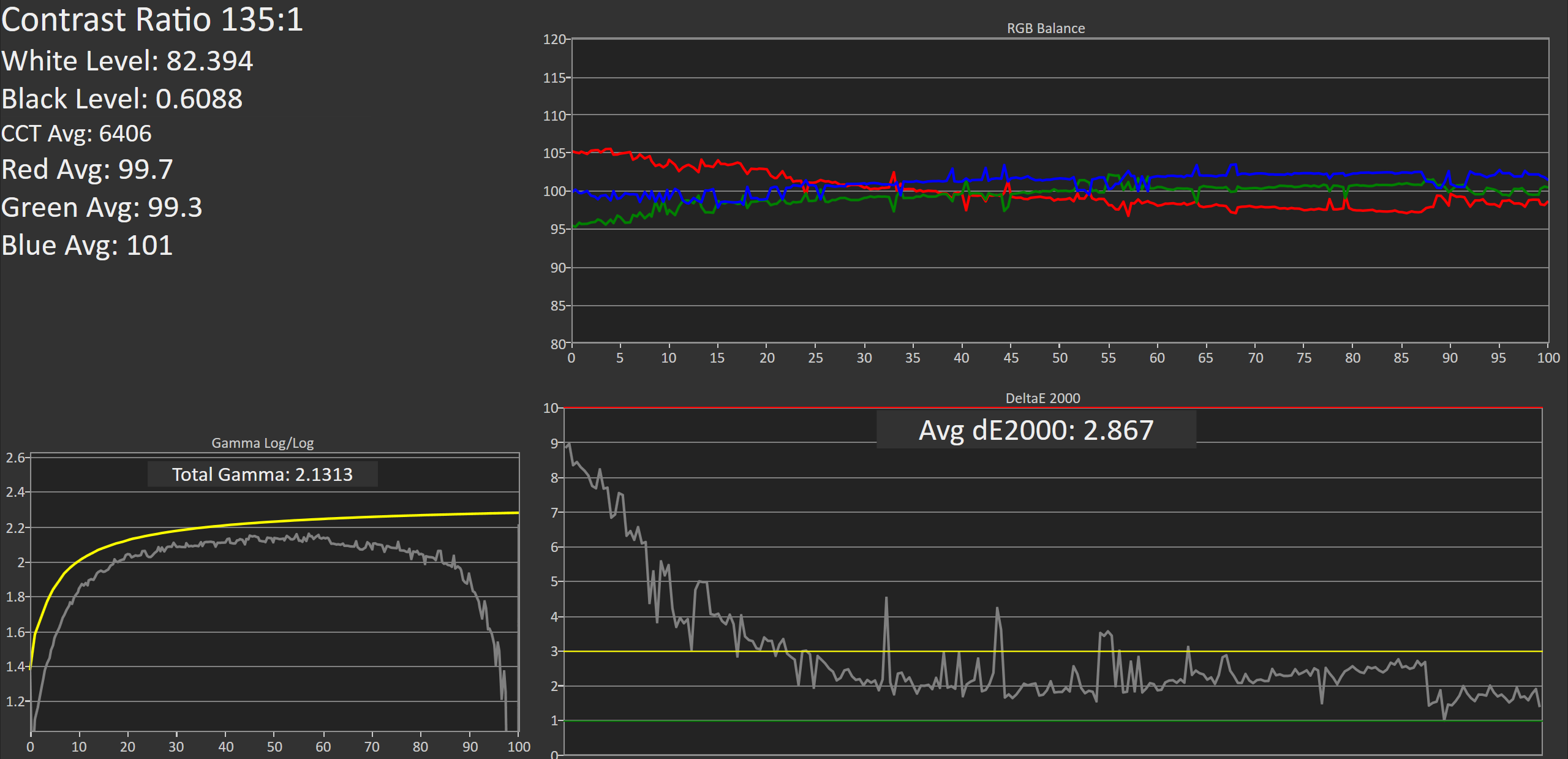
Greyscale accuracy on the Philips 276E6 improves dramatically after calibation. While the gamma is still far too high in the darkest shades, it's much more linear and now tracks fairly close to our 2.2 target rather than 2.6. The greyscale does have a number of areas where one shade will have a much higher error than the surrounding ones, and it may take moving from a 65 point to an even more comprehensive 255-point calibration to eliminate these errors.
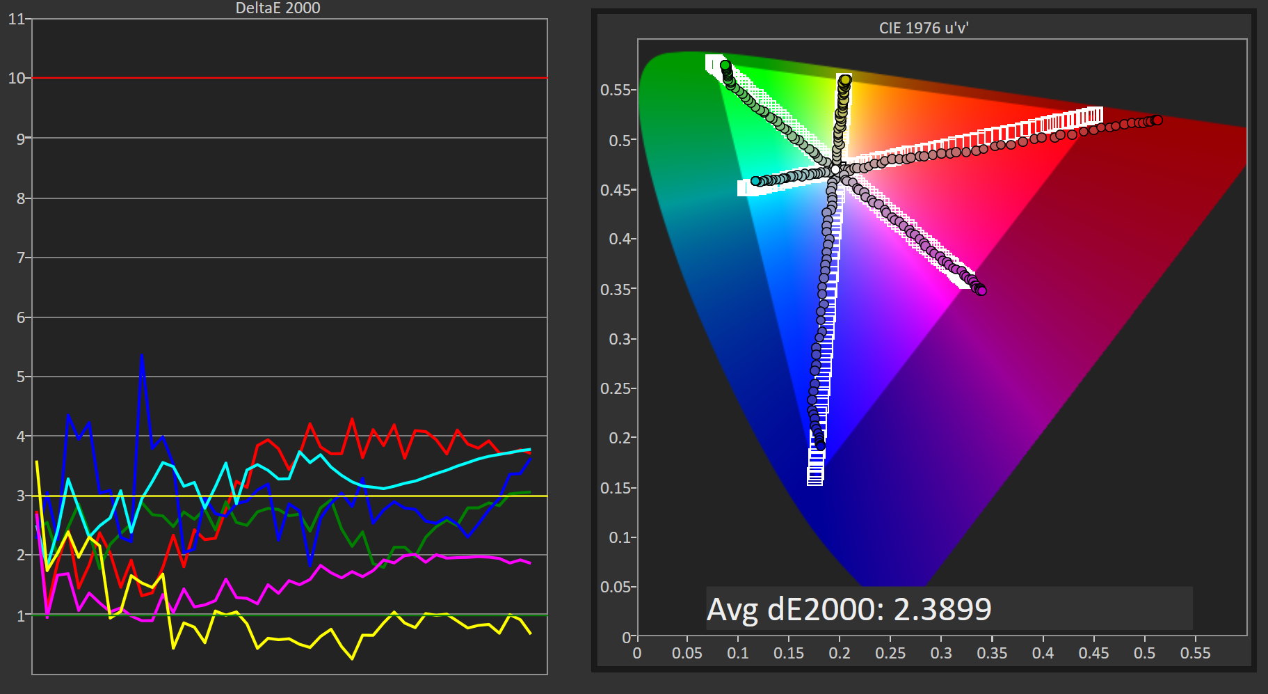
Saturation Sweep
The average error with primary and secondary color saturations is lower after calibrating the 276E6, but there's a caveat. Due to adjustments made to the greyscale, as well as the adjustments made to the monitor directly through the white point settings before calibration, the error in cyan and green is actually much higher in the lower saturations, while the errors for blue, red, and magenta in the more intense saturations are also higher. I'm honestly hesitant to actually describe this as an improvement, and many of the errors are far too severe for the monitor to be usable in color critical applications.
Gretag-Macbeth ColorChecker
Performance in the Gretag-Macbeth ColorChecker test improves after calibration, but much of this is due to the improvement in greyscale accuracy, with many colors still exhibiting very large errors. Unfortunately, even after calibration, the Philips 276E6 isn't really suitable for use as a monitor for photo or video editing.
Adobe RGB: 80 Nits Calibration
For our 80 nit calibration we continue to target the Adobe RGB gamut, but in addition to the lower brightness we also target the sRGB gamma curve rather than a simple 2.2 power function. sRGB's gamma allows for greater detail in the darkest regions of images, and this calibration target closely reflects what one would target on a professional display where images are being edited for print.
Greyscale
As expected, the 276E6 struggles when calibrated using the sRGB gamma target. In the darkest shades of grey the errors are quite high, descending from a DeltaE value of roughly 9 at black to an error of 3 at roughly 25%. Beyond that point the calibration is actually fairly good, and the average overall error is below our target value of 3.0. However, the severe inaccuracy in the dark regions makes it fairly evident that the monitor won't be usable in applications that require strict conformance to the sRGB gamma and luminance specifications.
Saturation Sweep
Surprisingly, the Philips 276E6 performs much better in the saturation sweep with our 80 nit calibration than it does at 200 nits. This may be due to the modifications I have made at the monitor level to correct the white point before doing a greyscale calibration in CalMAN, and given that the white point settings on my two samples were very different it's likely that results with different calibration targets will vary a great deal from unit to unit.
Gretag-Macbeth ColorChecker
Another surprise is the fairly low average error in the ColorChecker test. I can really only ascribe these differences to the changes made when altering the monitor's white point, but it really is interesting to see a display perform better with this arguably more difficult calibration target than with the 200 nit calibration with a simple power 2.2 gamma.


51 Comments
View All Comments
Guspaz - Friday, April 29, 2016 - link
The U2711 was a high-end monitor, and so one of the advertised features was that Dell individually calibrated every monitor at the factory. They included with each monitor a custom calibration report that had the deltaE and such things, with graphs and whatnot. Dell provided a generic ICC profile file for the monitor, so I would imagine that the monitor itself was calibrated so that the ICC profile would match the physical monitor.If I pick option 2 (monitor set to sRGB, Windows set to ICC profile), then how does Windows know that the monitor is expecting the input to be in the sRGB colour space?
Brandon Chester - Friday, April 29, 2016 - link
To the best of my knowledge Dell's factory calibration is at the internal LUT level so you can plug it into any device and have it be accurate (the best type of calibration). The ICC is probably just something generic and I doubt it contains a VCGT for the GPU.I would choose "option 4", which is to say, just leave the OS color management alone because Dell has been playing this game long enough to know that the Windows CMM doesn't work, has made your monitor usable in sRGB without having to mess with it, and given you the option to turn on Adobe RGB when you open Lightroom or some other program.
jlabelle2 - Wednesday, May 4, 2016 - link
- If I pick option 2 (monitor set to sRGB, Windows set to ICC profile), then how does Windows know that the monitor is expecting the input to be in the sRGB colour space? -Option 2 is Option 4 with a display ICC calibration. If you are using a color managed application, it reads embedded profile and therefore will display correctly. On most of the case where it is not color managed (wall paper, Edge, modern Windows app...), the assumption is that you would use sRGB content anyway (web, pictures you received..).
The ICC display profile ensure that you are correcting the latest inaccuracy from the Dell screen compared to sRGB color space (as, even out of the box, calibrated by Dell, it is not perfect).
If you have no calibration probe, your best bet is option 4.
jlabelle - Friday, April 29, 2016 - link
- On my Mac I just set the ICC profile and everything works immediately and perfectly. -For record, it does because ...it does not really take advantage of the wide gamut in your case !
Spunjji - Thursday, April 28, 2016 - link
"for photographers and other professionals... the relatively low resolution poses less of a problem"Higher pixel density is actually huge asset - you can get a better idea of critical image sharpness without zooming in, and getting above 1080p is a massive help for getting more working area between all the toolbars.
So really, having wide gamut /and/ high pixel density would be great. Hopefully they get on that! :)
Brandon Chester - Thursday, April 28, 2016 - link
I definitely agree. Anyone who has done photo editing on a 4K or 5K display can attest to the improvement. I just meant that relative to someone who writes word documents all day, the lower resolution is probably less of an issue.Spunjji - Thursday, April 28, 2016 - link
If I could edit, I'd add thanks for the article - it was a fascinating read and I was certainly not aware that Apple had such a commanding lead in colour calibration support. Food for thought.jlabelle - Friday, April 29, 2016 - link
- I was certainly not aware that Apple had such a commanding lead in colour calibration support. Food for thought.-Let's be honest, having a less confusing way of setting once your display ICC profile (which anyway is done automatically by the software coming with your calibration probe) is NOT having a commanding lead in color calibration support. That is a silly statement.
willis936 - Thursday, April 28, 2016 - link
I'm seeing a lot of gripes about windows color management. Doesn't argyllcms take care of that? Anyone shelling out for wide gamut should also spend the $50 for a cheap colorimeter.Brandon Chester - Thursday, April 28, 2016 - link
1. Cheap colorimeters are so inaccurate that they're basically useless.2. Argyll doesn't solve any of the problems. You need your OS, its frameworks, and its applications to all understand color management and work with the CMM. ArgyllCMS is basically a tool for profiling and creating ICC profiles, it can't make software understand and utilize them.