A Look At QD Vision's Color IQ And The Philips 276E6 Monitor: Quantum Dots for Wider Color Gamuts
by Brandon Chester on April 28, 2016 8:00 AM EST- Posted in
- Monitors
- Philips
- Quantum Dot
- QD Vision
Color Management
Readers may be wondering why I didn't run the Philips 276E6 through our sRGB test bench. The story behind that is a long one, and to tell it I need to first go over some aspects of how color management works, and how the 276E6 exposes a number of problems with color management on current computers.
Color management isn't discussed very often. In my view, there are three reasons behind this. The first is the fact that most consumers have been using displays that don't even meet the sRGB gamut for many years now, and so there wasn't much need to discuss color management in a display-related context. The second is the fact that Windows computer manufacturers have only really started bothering to calibrate their displays within the last two years or so, and prior to that time color management almost didn't matter because you were getting a severely inaccurate sub-sRGB display that wouldn't show anything accurately regardless of what gamut content was made for. The third reason is simply that color management should just work, and it should be invisible to the user. In some contexts, this is true, such as how an operating system manages color conversions between RGB and CMYK when printing. When it comes to displays, the issue can be much more complicated.
Before moving ahead it's important to make sure that the basics regarding color management are clear to anyone who hasn't encountered it before. Put simply, color management is the process of transforming image data between different standards for displaying color. As I mentioned above, an application of this that many people encounter every day without knowing it is the transformation of an image from an additive RGB color space, to a subtractive CMYK color space which printers use. Essentially every operating system handles this without issue, but the same cannot be said about managing different color standards for displays.
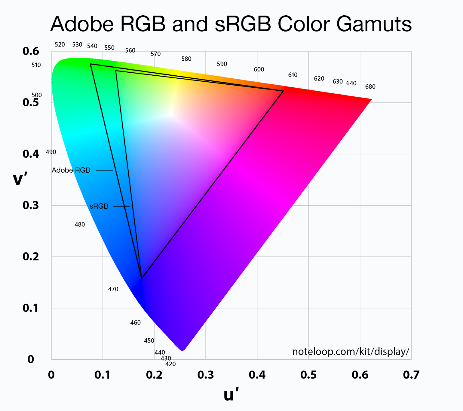
For the purposes of this article it's sufficient to just consider sRGB and Adobe RGB. sRGB is the current standard for all images and graphics displayed on the web, while Adobe RGB is a color space developed by Adobe which extends the green primary of the sRGB color space. Both of these standards define various characteristics about how color should be displayed, including the color gamut, gamma function, white point, luminance, and black level. The Adobe RGB gamut is significantly larger than the sRGB gamut in its reproduction of green and cyan shades, which is why monitors that support it are referred to as wide gamut displays.
Having a display with a different color gamut than that of the one used on the web can pose significant problems. It's up to the operating system, its frameworks and APIs, and the apps built on top of them to properly handle the mapping of content made for the sRGB color space to the monitor's wider color space. To help with this, displays should provide an ICC profile, which is a file that describes information about the monitor's color characteristics. With a proper ICC profile, the system's color management framework will know the specifics of the monitor's gamut, along with the gamma ramps to be loaded into the GPU's lookup table to provide corrections. It's worth going over the process of applying these in Windows and OS X.
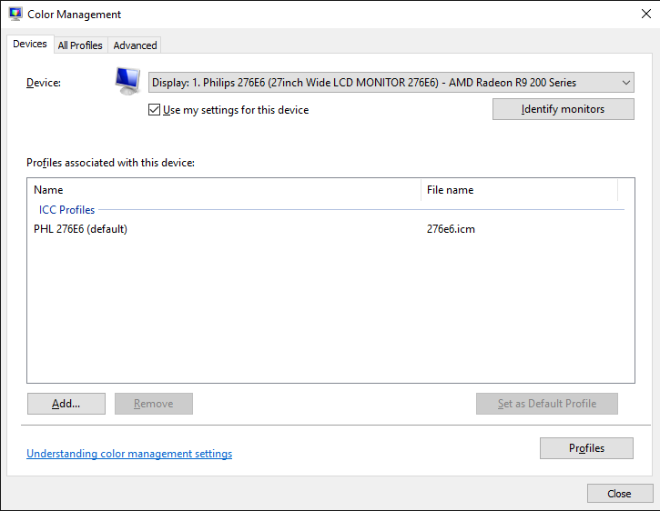
Windows makes the task of setting an ICC profile quite confusing for the average user. To do so, one has to open the Windows Color Management settings, which is still part of the legacy control panel rather than being integrated into the new Settings application that has existed since Windows 8 launched. In the case of the Philips 276E6, you'd expect that you could simply select the default monitor profile, click "Use my display settings", and you'd have every application managing color properly.
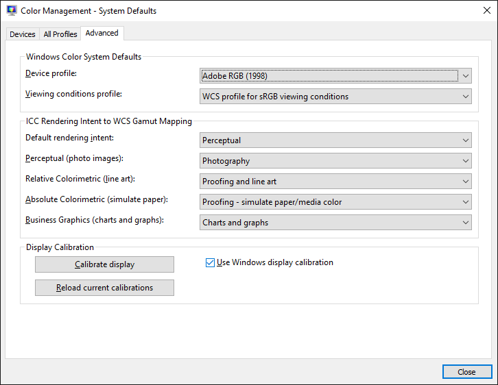
Unfortunately, the process I described above won't change anything about your display's output. For starters, simply checking that box doesn't actually do anything regardless of what profile you've selected, despite the fact that it explicitly says the box enables the settings you've chosen. For whatever reason, you then need to click on the advanced tab, and then click on the button to change the system defaults. From there, you're then brought to what appears to be the screen you began on, but in this case you're managing the default settings for the system which will apply to all users. From here, you should check the box that enables the use of Windows display calibration, which will actually enable the settings you changed in the first window.
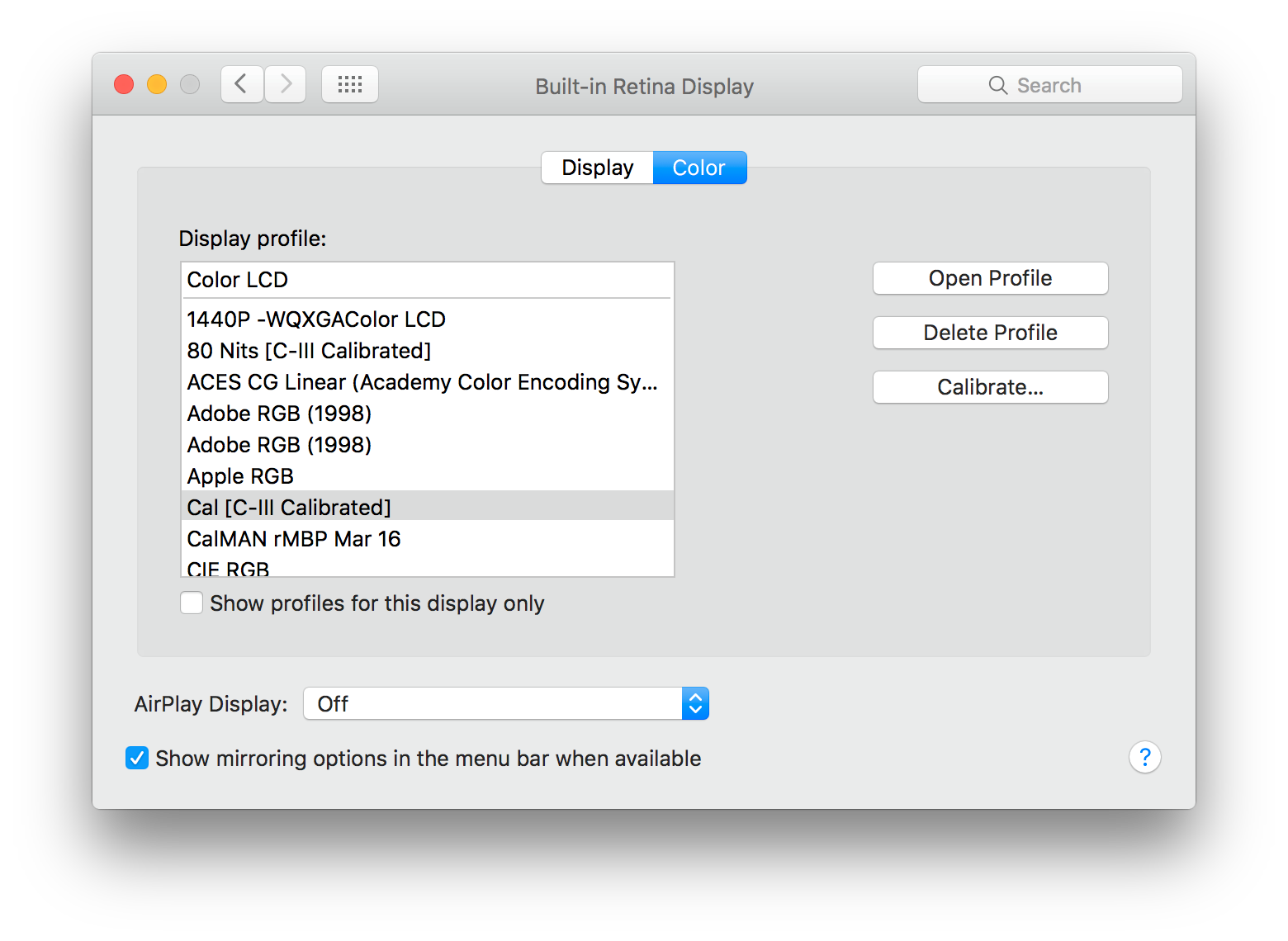
On OS X, the process involves going to the color tab of the display settings page and clicking on the profile you want to use. This instantly sets the profile across the OS. I tend to lean toward the OS X implementation as being the simpler one, as clicking on one thing is simpler than having to navigate a number of menus, toggle checkboxes with inaccurate descriptions, and eventually resort to finding a guide on Google such as this one to figure out how to load an ICC profile properly. In my experience the color management at the OS level in Windows is notoriously unreliable as well, with Direct3D applications being able to load whatever they want into the GPU's LUT if they run fullscreen, and the ICC's LUT often not loading again even after exiting, which requires trying to force it to load by toggling it on and off or just rebooting the entire computer.
Fortunately, there are a number of third party applications to handle the loading of ICC profiles on Windows, which have mainly been created to address the problems with the built in functionality. Users who profile their display with CalMAN will likely opt for SpectraCal's CalMAN Client 3 to manage profiles, and there are many free programs like Color Sustainer and CPKeeper which work reliably and often can reload on a timed basis which allows settings to be properly restored after being overwritten by the bad behavior of most game developers.


51 Comments
View All Comments
jlabelle - Friday, April 29, 2016 - link
- In the second corner we have Android. Not clear to me how much better off they are. They have handled DPI a lot better, which is a good start -If you are speaking of Android, you should compare that in Windows Store with Windows apps from the Store.
For those, the scaling is just perfect and it is handling ANY screen size / resolution / orientation perfectly.
Only issue with scaling are Win32 programs not using hidpi API released 9 years ago with Windows 7 (at a time where Android was not a thing).
- As far as I know there is still no color correction built into Android -
Android is the worse on this because you have virtually 0 color management.
bq. In the third corner we have Apple which seems perfectly positioned for all this (meaning that they will likely drive it).
Again, this is misleading.
For instance, iOS way of handling color management (see test on the iPad Pro) make the use of wide gamut screen virtually useless (for now) as there are no ways for a developer to take advantage of it. What it seems to do is basically apply a ICC profile to target sRGB color space.
Scaling is not a question really as resolution are pretty much hard coded but again, Windows app are scaling perfectly.
OS X has some "native" applications color managed (like Safari) but the same issue occur that the program needs to be color managed otherwise you have the same issue.
For scaling, this is exactly like Windows with hidpi API existing like forever and developer just need to use it. Maybe there are more application which are using it. But that's it.
OS X does not have really (from an OS point of view) an inherent advantage compared to Windows on color management / hiDPI screen.
bq. they're now pushing color accuracy both on the camera side (TrueTone flash, high dynamic range sensors)
actually, Apple is using 1/3" camera sensor, one of the smaller size in the industry (or only found in low end phone like Lumia 640XL...) and therefore the dynamic range is more limited than the competition (because it is mainly directly link to sensor size).
- and the screen side -
nothing exclusive to Apple. For instance, speaking of Windows here and therefore the Surface or the Lumia 950, they both have more color accurate screen that all the various iPad and the iPhone (albeit all are VERY good in color accuracy).
bq. "Our colors look good, and look correct, across ALL our devices --- photos on your iPhone look exactly the same on your iMac. Good luck getting that consistency with photo from your Android phone on your Windows screen."
It is no luck. Just pick the right product. If you pick a Surface and a Lumia 950 for instance, you will have the same great experience. And using a Samsung S6-S7 or accurate Android phone will give you the same.
Seems indeed that advertising is working correctly for people to believe that Apple has inherent advantage here.
- the relevance and interest of QD technology is whether it allows larger gamut to move to iPhone this year or at least soon.
Until developer can take advantage of it, it has not advantage for end user. So as good is the color gamut of the iPad Pro, it is useless from an end user point of view.
Brandon Chester - Friday, April 29, 2016 - link
I've already addressed why your understanding of the situation on the iPad is incorrect in my article specifically about it. Please do not spread serious misinformation in the comments or I will have to remove them; this is already an issue that is confusing to many people.theduckofdeath - Friday, April 29, 2016 - link
I don't get what bigger picture I'm missing here. Yes, LCD tech has evolved a lot over the years. But, it's just the faux marketing these manufacturers always stoop to, to give the impression that they're selling something better than LCD. A few years ago it was LED now it's Quantum Dots. Both insinuating that the backlight isn't the usual old flawed edge lit design.alphasquadron - Thursday, April 28, 2016 - link
As a Windows User(not by choice but because it supports a lot of software and games), it is tiring to see the slow pace at which Windows fixes problems. When are they going to get 4k scaling done correctly. And I remember when I got my new computer and going through the same confusing ICC sub-menus to get the actual settings.Also what was Phillips or QD Vision thinking when they sent a reviewer of tech site that is testing their monitor for color accuracy a fake sRGB mode. I mean he just mentioned that there was no sRGB mode on the monitor so what do you think the first thing he is going to test when he gets the new monitor is. I'm still confused whether the mode actually did change something or if they are just that dumb(or they think reviewers are that dumb).
Murloc - Thursday, April 28, 2016 - link
maybe they messed up while doing a quick fix. I hope.Brandon Chester - Thursday, April 28, 2016 - link
For the record, I spent a long time trying to prove to myself that it did do something. Unfortunately, if it truly were constraining the gamut it would be so completely obvious upon toggling it that you wouldn't even need to make measurements. I did measure anyway, and it truly didn't change the output at all.Guspaz - Thursday, April 28, 2016 - link
All this talk of colour management... It all works so easily on my macbook (load the profile Anand made, and everything looks correct), but on my main PC, it's a mess...I've got a Dell U2711 running Windows 10. That's a wide-gamut display, and I do have an ICC profile for it. The display was also factory-calibrated (it shipped with a printed report on the results).
If I want the most trouble-free setup where most stuff looks correct, which of these is the correct approach:
1) Set monitor to default profile and set Windows to ICC profile
2) Set monitor to sRGB profile and set Windows to ICC profile
3) Set monitor to default profile and set Windows to sRGB profile
4) Set monitor to sRGB profile and set Windows to sRGB profile
I'm guessing option 1 is correct for wide-gamut use, but the crappy Windows colour management would mess everything up. So if I want to just go for sRGB, it seems to me that option 4 is probably correct? Or is option 2 what I want?
This is all so confusing. On my Mac I just set the ICC profile and everything works immediately and perfectly.
Murloc - Thursday, April 28, 2016 - link
yeah MacOS got this down unlike Windows.I wonder how amenable Linux is in this regard.
tuxRoller - Thursday, April 28, 2016 - link
Pretty much as good as Mac, actually.Checkout my comments on the recent 9.7" iPad review (the one that dealt with color management).
jlabelle - Friday, April 29, 2016 - link
See my answer in page 2. I was in your EXACT same case.1) I guess you have a ICC profile so you are able to calibrate the screen yourself with a probe or you have a generic ICC profile from a DELL review (which means that you do not consider production variation and variatin over time) ? this is theoretical ideal situation to take advantage of wige gamut screen…except, I do not advise it for the reason describe below.
2) Hassle free solution : same as above but you constraint yourself with sRGB color space. You will have good color accuracy on color managed application. And even for non color managed application, and even if your ICC profile is not very good, you will have not problem of oversaturation or washed out colors.
3) make no sense at all ! It means that you are saying that the DELL is perfectly accurate according to sRGB color space and gamut. Obviously, it cannot be further from the truth so you will end up with all your colors (EVEN for color managed applications) oversaturated. No, no, NO !
4) This is the equivalent as what the article advice for the Philips : you put the screen in sRGB mode. You do not have any ICC display profile (because you do not have the necessary calibration equipement). So you are assuming that it is correctly calibrated and are saying to the OS that you display is perfect according to sRGB. Actually, this is the standard and you do not need to do anything to be in this situation.
The preferred solution is by far the number 2.
To understand why, let’s reverse the discussion and ask you (or people) why they think they benefit from a wide gamut screen ?
• To surf the web ? No because websites are targeting sRGB anyway
• To view pictures received by email or taken by you ? In most cases, no because mobile phone, compact cameras and even most DSLR are setup to take sRGB pictures
• To view film ? It is slightly more complicated but anyway, there is no content with wide gamut (to make things simple) and anyway no consumer video software that would manage it. So you would end up with over saturated colors permanently. Except if this is your thing…
So then, in which case would you have any benefits ?
IF you have your own DSLR/mirrorless and IF you set it up in aRGB mode and IF you make always duplicates of every single picture in sRGB anyway that you want to share / display on the web / bring or sent to printing.
And even if all those “IF” are fulfilled, you will end up having over saturated colors in most of your applications, when surfing the web, when watching pictures of others… All that just to be able to see, on your own pictures, maybe a tiny difference with side-by-side comparison in 0,001% of the case (I am not making this number, it is the proportion of pictures where I was able to spot a difference).
Long story short : a wide gamut screen makes NO sense currently. And there is a reason why it is said that it only make sense for professional for very specific application. And those people do not come here to ask if it makes sense because they are aware of all this.
Bottom line : choose option 2.