A Look At QD Vision's Color IQ And The Philips 276E6 Monitor: Quantum Dots for Wider Color Gamuts
by Brandon Chester on April 28, 2016 8:00 AM EST- Posted in
- Monitors
- Philips
- Quantum Dot
- QD Vision
Adobe RGB: Pre-Calibration Testing
Our first tests involve measuring the Philips 276E6 prior to any calibration being performed. These are arguably the most relevant numbers for this sort of monitor, as it's highly unlikely that consumers purchasing $300 monitors will also happen to have a colorimeter or spectrophotometer laying around to calibrate it.
While no calibration is performed before this test, the display is set to a brightness level of 200 nits to keep results comparable between reviews. The white point setting has been left in the default Adobe RGB mode, which for some reason happened to be more accurate than the mode explicitly labeled 6500K.
Greyscale
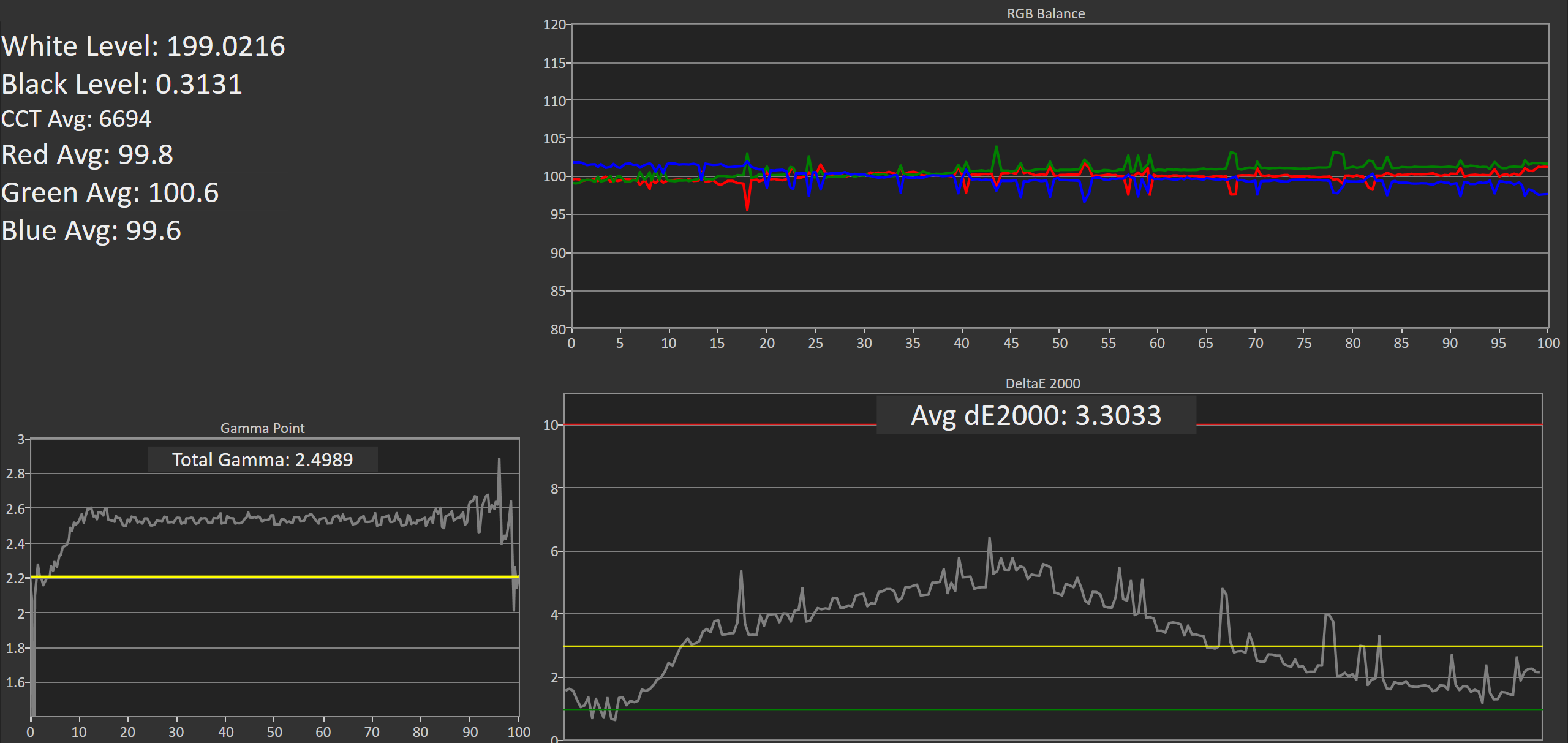
On this unit, greyscale accuracy was where I would expect a low priced wide gamut monitor to be. What's strange is that the gamma was closer to a target of 2.6 despite the fact that I left the monitor in its default power 2.2 gamma mode. It's worth noting that the original unit had a gamma that was much closer to 2.2, but the RGB balance for grey shades was much more red shifted and so the greyscale DeltaE was actually higher than this unit. It looks like there's a fairly large degree of variance between different units of the 276E6.
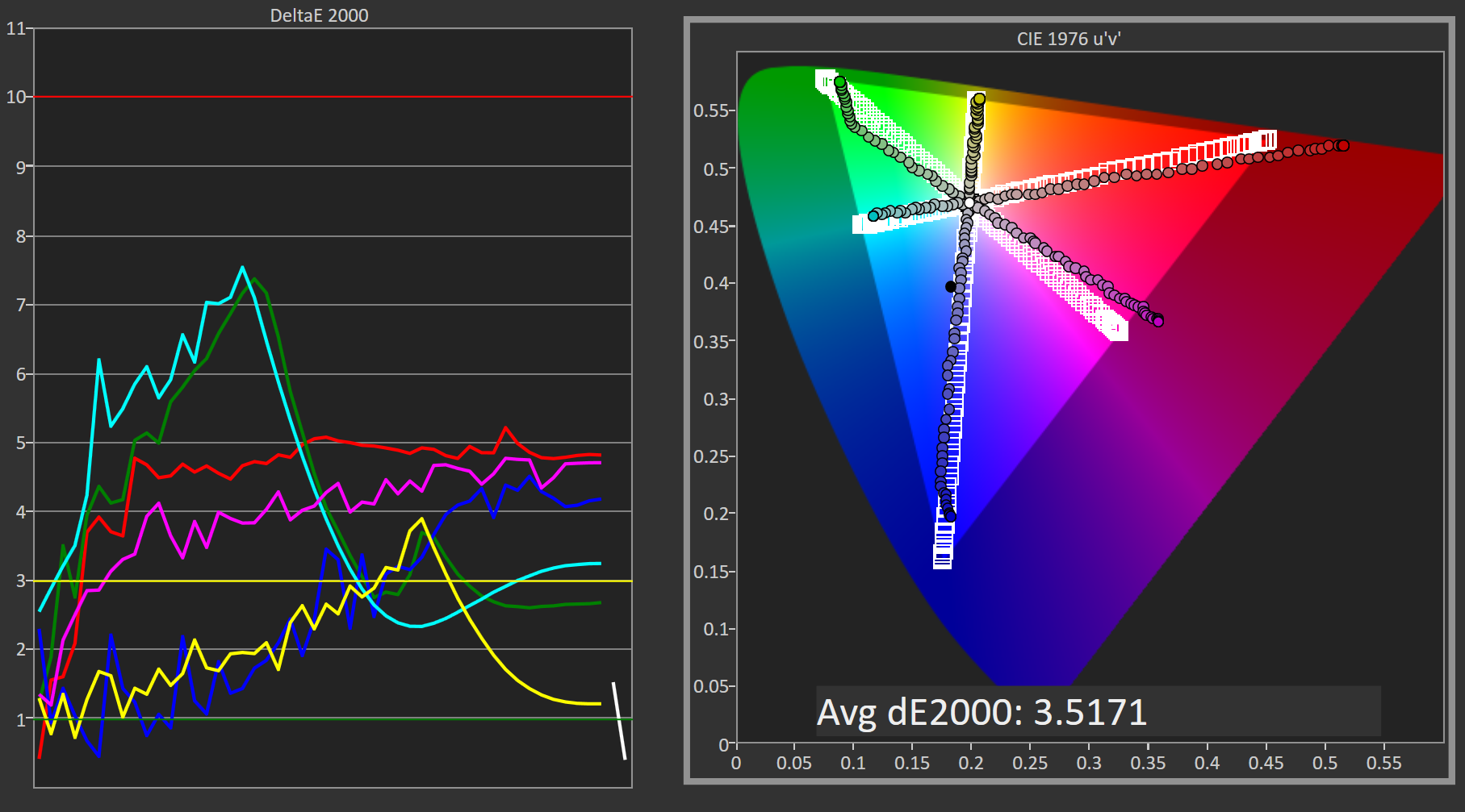
Saturation Sweep
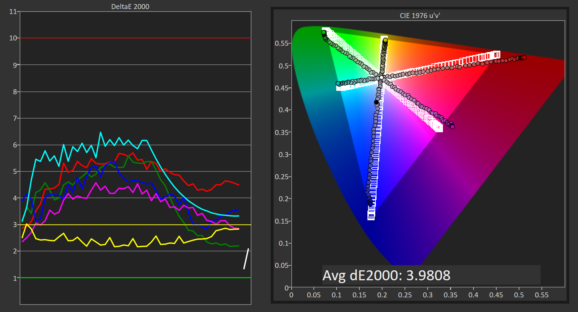
Due to the shifted primaries and improper gamma, the Philips 276E6 doesn't perform as well as it could in our saturation sweep test. Magenta is pulled toward red, while cyan is pulled toward green. For many levels of saturation there are fairly severe errors in magenta and blue, and even more so in green, red, and cyan.
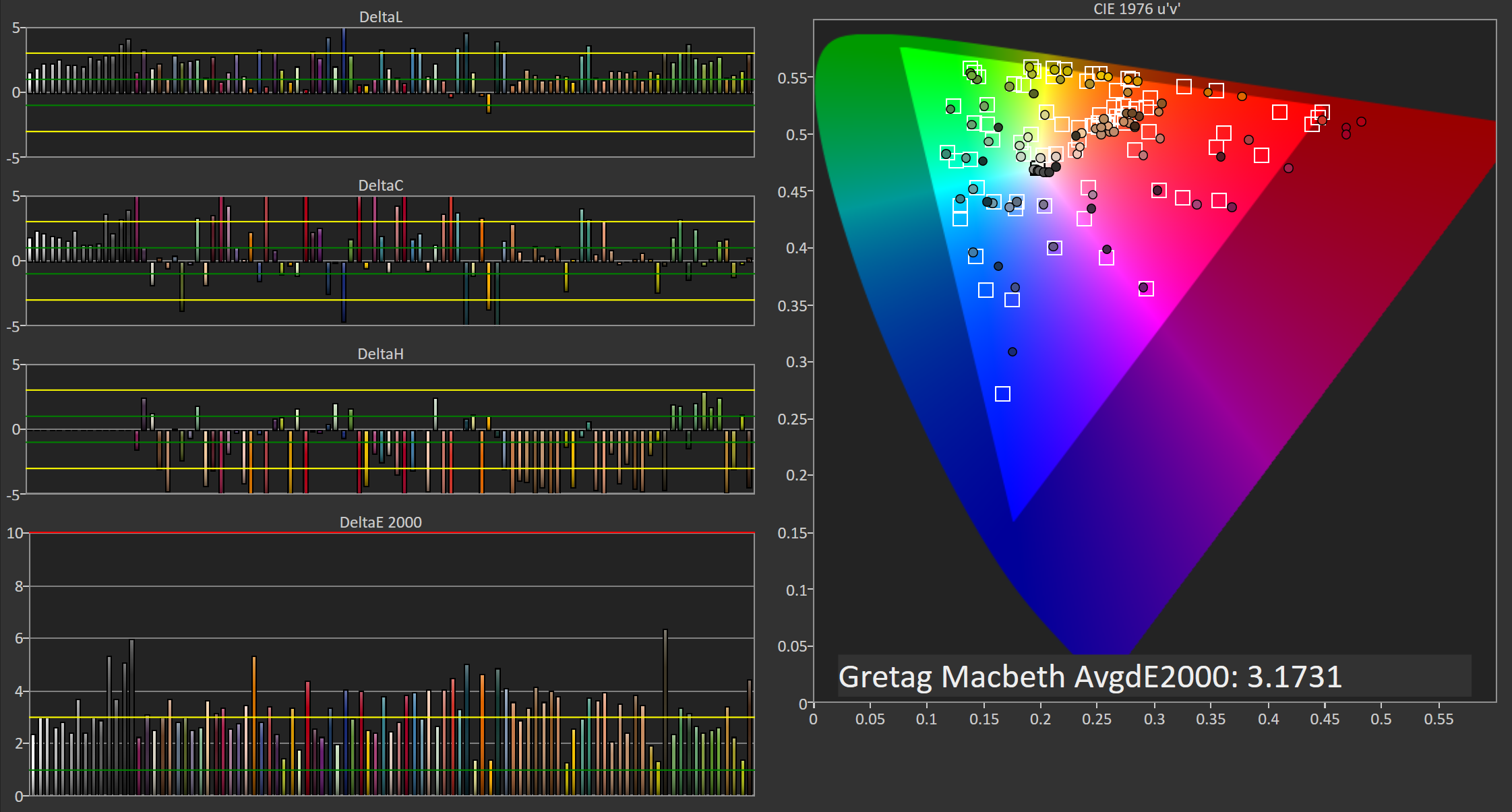
Gretag-Macbeth ColorChecker
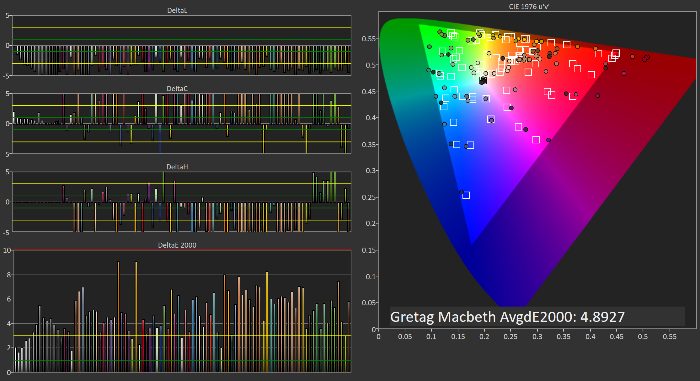
In the Gretag-Macbeth ColorChecker test the Philips 276E6 doesn't perform very well. The average DeltaE is nearly five, with a number of colors actually exhibiting individual errors above six. In this case the oversaturated red primary is causing significant problems with accuracy by also shifting shades of yellow, orange, and magenta toward red. I really have no idea why Philips decided to tune the monitor in this manner, and unfortunately it makes the monitor not very useful for work that depends heavily on color accuracy.
Adobe RGB: 200 Nits Calibration
Our 200 nit calibration target is still the Adobe RGB gamut with a power 2.2 gamma. Since we can't actually alter the display's primaries due to there being no 3D LUT, there will be no way to improve upon the errors with the color gamut and any saturations or color mixtures that rely heavily on accuracy there.
While my earlier testing was done in the monitor's default Adobe RGB mode, for calibration I moved to using the user defined mode which allows control over the white point through a set of RGB sliders. This allowed improvements to be made at the monitor level before making further tweaks by performing the greyscale calibration, which helps to retain tonal range as there are fewer adjustments that need to be made in the GPU's LUT.
Greyscale
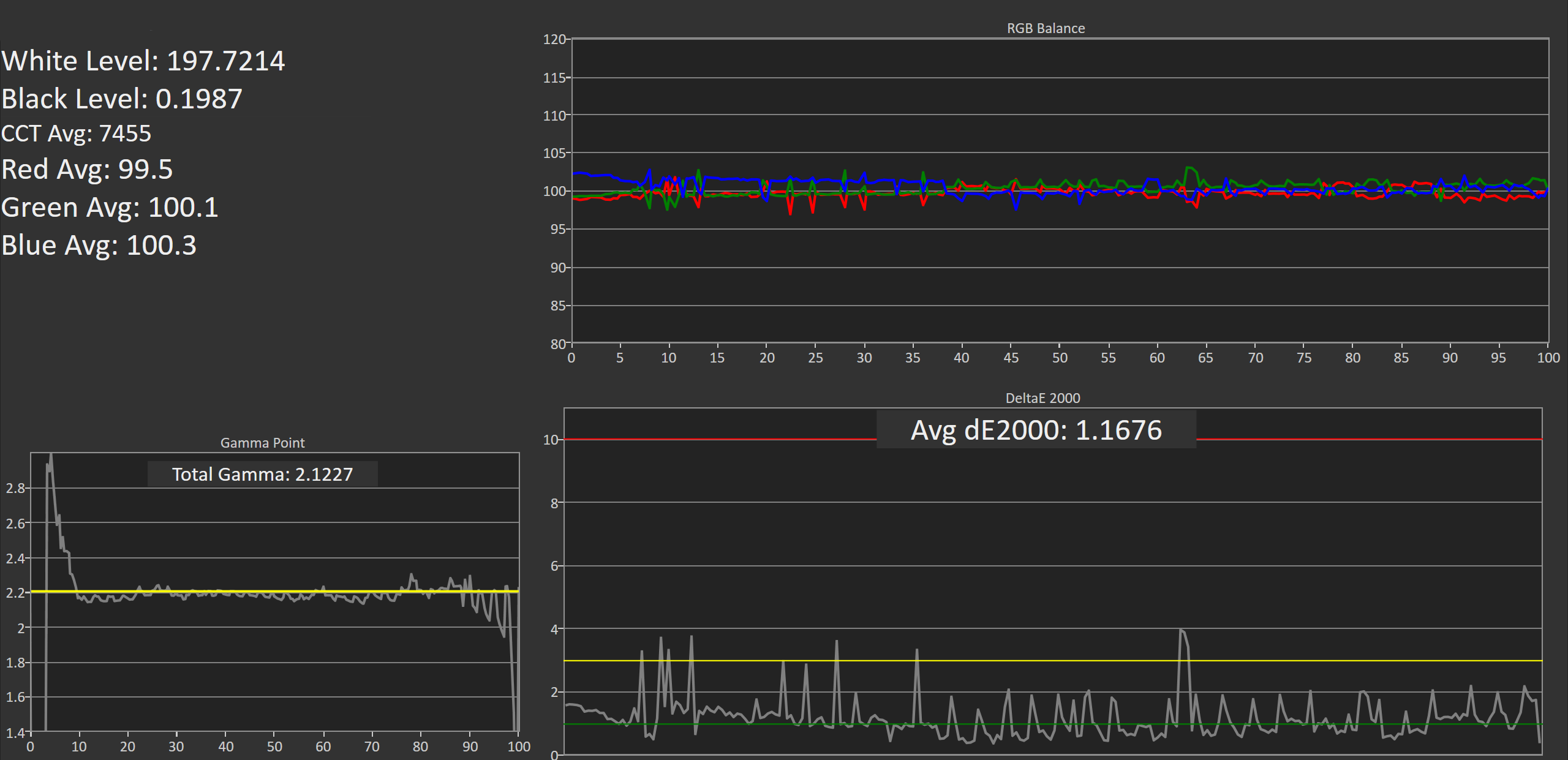
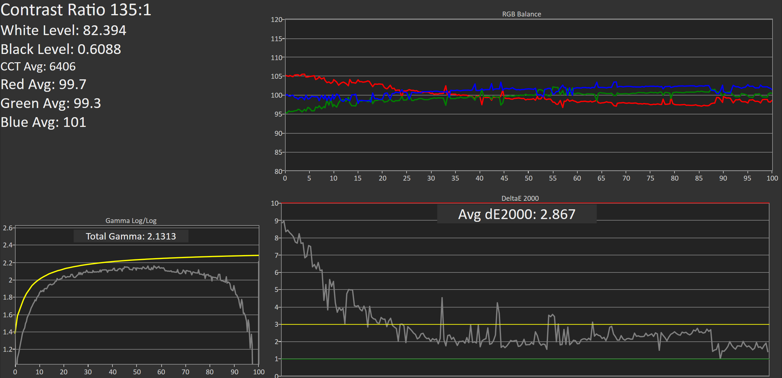
Greyscale accuracy on the Philips 276E6 improves dramatically after calibation. While the gamma is still far too high in the darkest shades, it's much more linear and now tracks fairly close to our 2.2 target rather than 2.6. The greyscale does have a number of areas where one shade will have a much higher error than the surrounding ones, and it may take moving from a 65 point to an even more comprehensive 255-point calibration to eliminate these errors.
Saturation Sweep
The average error with primary and secondary color saturations is lower after calibrating the 276E6, but there's a caveat. Due to adjustments made to the greyscale, as well as the adjustments made to the monitor directly through the white point settings before calibration, the error in cyan and green is actually much higher in the lower saturations, while the errors for blue, red, and magenta in the more intense saturations are also higher. I'm honestly hesitant to actually describe this as an improvement, and many of the errors are far too severe for the monitor to be usable in color critical applications.
Gretag-Macbeth ColorChecker
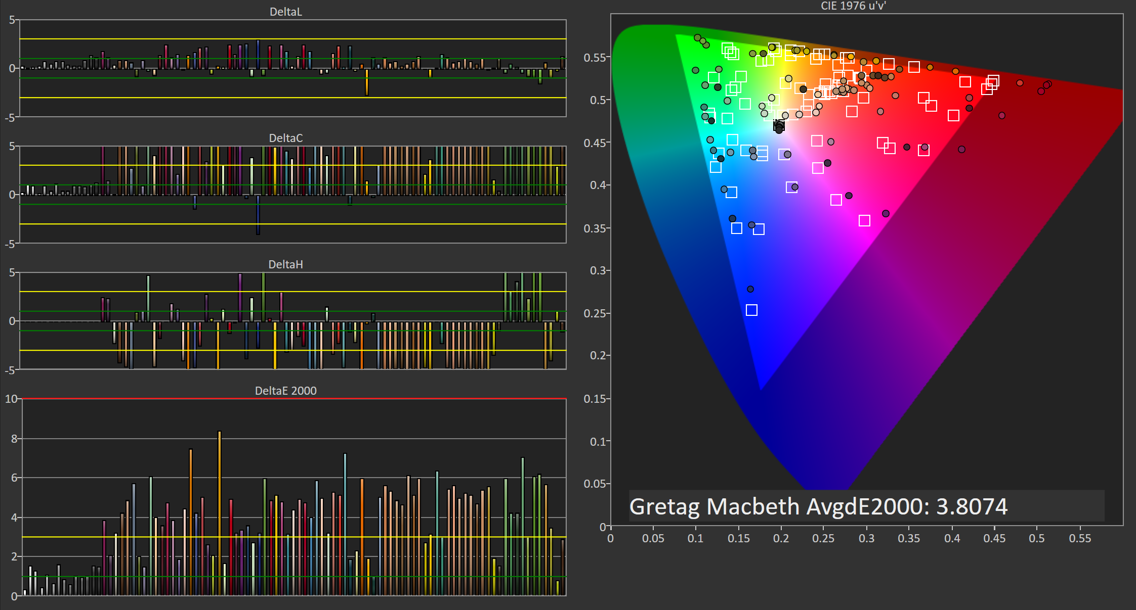
Performance in the Gretag-Macbeth ColorChecker test improves after calibration, but much of this is due to the improvement in greyscale accuracy, with many colors still exhibiting very large errors. Unfortunately, even after calibration, the Philips 276E6 isn't really suitable for use as a monitor for photo or video editing.
Adobe RGB: 80 Nits Calibration
For our 80 nit calibration we continue to target the Adobe RGB gamut, but in addition to the lower brightness we also target the sRGB gamma curve rather than a simple 2.2 power function. sRGB's gamma allows for greater detail in the darkest regions of images, and this calibration target closely reflects what one would target on a professional display where images are being edited for print.
Greyscale
As expected, the 276E6 struggles when calibrated using the sRGB gamma target. In the darkest shades of grey the errors are quite high, descending from a DeltaE value of roughly 9 at black to an error of 3 at roughly 25%. Beyond that point the calibration is actually fairly good, and the average overall error is below our target value of 3.0. However, the severe inaccuracy in the dark regions makes it fairly evident that the monitor won't be usable in applications that require strict conformance to the sRGB gamma and luminance specifications.
Saturation Sweep
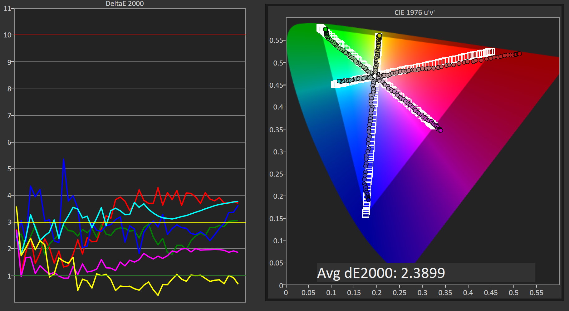
Surprisingly, the Philips 276E6 performs much better in the saturation sweep with our 80 nit calibration than it does at 200 nits. This may be due to the modifications I have made at the monitor level to correct the white point before doing a greyscale calibration in CalMAN, and given that the white point settings on my two samples were very different it's likely that results with different calibration targets will vary a great deal from unit to unit.
Gretag-Macbeth ColorChecker
Another surprise is the fairly low average error in the ColorChecker test. I can really only ascribe these differences to the changes made when altering the monitor's white point, but it really is interesting to see a display perform better with this arguably more difficult calibration target than with the 200 nit calibration with a simple power 2.2 gamma.


51 Comments
View All Comments
jlabelle - Friday, April 29, 2016 - link
- In the second corner we have Android. Not clear to me how much better off they are. They have handled DPI a lot better, which is a good start -If you are speaking of Android, you should compare that in Windows Store with Windows apps from the Store.
For those, the scaling is just perfect and it is handling ANY screen size / resolution / orientation perfectly.
Only issue with scaling are Win32 programs not using hidpi API released 9 years ago with Windows 7 (at a time where Android was not a thing).
- As far as I know there is still no color correction built into Android -
Android is the worse on this because you have virtually 0 color management.
bq. In the third corner we have Apple which seems perfectly positioned for all this (meaning that they will likely drive it).
Again, this is misleading.
For instance, iOS way of handling color management (see test on the iPad Pro) make the use of wide gamut screen virtually useless (for now) as there are no ways for a developer to take advantage of it. What it seems to do is basically apply a ICC profile to target sRGB color space.
Scaling is not a question really as resolution are pretty much hard coded but again, Windows app are scaling perfectly.
OS X has some "native" applications color managed (like Safari) but the same issue occur that the program needs to be color managed otherwise you have the same issue.
For scaling, this is exactly like Windows with hidpi API existing like forever and developer just need to use it. Maybe there are more application which are using it. But that's it.
OS X does not have really (from an OS point of view) an inherent advantage compared to Windows on color management / hiDPI screen.
bq. they're now pushing color accuracy both on the camera side (TrueTone flash, high dynamic range sensors)
actually, Apple is using 1/3" camera sensor, one of the smaller size in the industry (or only found in low end phone like Lumia 640XL...) and therefore the dynamic range is more limited than the competition (because it is mainly directly link to sensor size).
- and the screen side -
nothing exclusive to Apple. For instance, speaking of Windows here and therefore the Surface or the Lumia 950, they both have more color accurate screen that all the various iPad and the iPhone (albeit all are VERY good in color accuracy).
bq. "Our colors look good, and look correct, across ALL our devices --- photos on your iPhone look exactly the same on your iMac. Good luck getting that consistency with photo from your Android phone on your Windows screen."
It is no luck. Just pick the right product. If you pick a Surface and a Lumia 950 for instance, you will have the same great experience. And using a Samsung S6-S7 or accurate Android phone will give you the same.
Seems indeed that advertising is working correctly for people to believe that Apple has inherent advantage here.
- the relevance and interest of QD technology is whether it allows larger gamut to move to iPhone this year or at least soon.
Until developer can take advantage of it, it has not advantage for end user. So as good is the color gamut of the iPad Pro, it is useless from an end user point of view.
Brandon Chester - Friday, April 29, 2016 - link
I've already addressed why your understanding of the situation on the iPad is incorrect in my article specifically about it. Please do not spread serious misinformation in the comments or I will have to remove them; this is already an issue that is confusing to many people.theduckofdeath - Friday, April 29, 2016 - link
I don't get what bigger picture I'm missing here. Yes, LCD tech has evolved a lot over the years. But, it's just the faux marketing these manufacturers always stoop to, to give the impression that they're selling something better than LCD. A few years ago it was LED now it's Quantum Dots. Both insinuating that the backlight isn't the usual old flawed edge lit design.alphasquadron - Thursday, April 28, 2016 - link
As a Windows User(not by choice but because it supports a lot of software and games), it is tiring to see the slow pace at which Windows fixes problems. When are they going to get 4k scaling done correctly. And I remember when I got my new computer and going through the same confusing ICC sub-menus to get the actual settings.Also what was Phillips or QD Vision thinking when they sent a reviewer of tech site that is testing their monitor for color accuracy a fake sRGB mode. I mean he just mentioned that there was no sRGB mode on the monitor so what do you think the first thing he is going to test when he gets the new monitor is. I'm still confused whether the mode actually did change something or if they are just that dumb(or they think reviewers are that dumb).
Murloc - Thursday, April 28, 2016 - link
maybe they messed up while doing a quick fix. I hope.Brandon Chester - Thursday, April 28, 2016 - link
For the record, I spent a long time trying to prove to myself that it did do something. Unfortunately, if it truly were constraining the gamut it would be so completely obvious upon toggling it that you wouldn't even need to make measurements. I did measure anyway, and it truly didn't change the output at all.Guspaz - Thursday, April 28, 2016 - link
All this talk of colour management... It all works so easily on my macbook (load the profile Anand made, and everything looks correct), but on my main PC, it's a mess...I've got a Dell U2711 running Windows 10. That's a wide-gamut display, and I do have an ICC profile for it. The display was also factory-calibrated (it shipped with a printed report on the results).
If I want the most trouble-free setup where most stuff looks correct, which of these is the correct approach:
1) Set monitor to default profile and set Windows to ICC profile
2) Set monitor to sRGB profile and set Windows to ICC profile
3) Set monitor to default profile and set Windows to sRGB profile
4) Set monitor to sRGB profile and set Windows to sRGB profile
I'm guessing option 1 is correct for wide-gamut use, but the crappy Windows colour management would mess everything up. So if I want to just go for sRGB, it seems to me that option 4 is probably correct? Or is option 2 what I want?
This is all so confusing. On my Mac I just set the ICC profile and everything works immediately and perfectly.
Murloc - Thursday, April 28, 2016 - link
yeah MacOS got this down unlike Windows.I wonder how amenable Linux is in this regard.
tuxRoller - Thursday, April 28, 2016 - link
Pretty much as good as Mac, actually.Checkout my comments on the recent 9.7" iPad review (the one that dealt with color management).
jlabelle - Friday, April 29, 2016 - link
See my answer in page 2. I was in your EXACT same case.1) I guess you have a ICC profile so you are able to calibrate the screen yourself with a probe or you have a generic ICC profile from a DELL review (which means that you do not consider production variation and variatin over time) ? this is theoretical ideal situation to take advantage of wige gamut screen…except, I do not advise it for the reason describe below.
2) Hassle free solution : same as above but you constraint yourself with sRGB color space. You will have good color accuracy on color managed application. And even for non color managed application, and even if your ICC profile is not very good, you will have not problem of oversaturation or washed out colors.
3) make no sense at all ! It means that you are saying that the DELL is perfectly accurate according to sRGB color space and gamut. Obviously, it cannot be further from the truth so you will end up with all your colors (EVEN for color managed applications) oversaturated. No, no, NO !
4) This is the equivalent as what the article advice for the Philips : you put the screen in sRGB mode. You do not have any ICC display profile (because you do not have the necessary calibration equipement). So you are assuming that it is correctly calibrated and are saying to the OS that you display is perfect according to sRGB. Actually, this is the standard and you do not need to do anything to be in this situation.
The preferred solution is by far the number 2.
To understand why, let’s reverse the discussion and ask you (or people) why they think they benefit from a wide gamut screen ?
• To surf the web ? No because websites are targeting sRGB anyway
• To view pictures received by email or taken by you ? In most cases, no because mobile phone, compact cameras and even most DSLR are setup to take sRGB pictures
• To view film ? It is slightly more complicated but anyway, there is no content with wide gamut (to make things simple) and anyway no consumer video software that would manage it. So you would end up with over saturated colors permanently. Except if this is your thing…
So then, in which case would you have any benefits ?
IF you have your own DSLR/mirrorless and IF you set it up in aRGB mode and IF you make always duplicates of every single picture in sRGB anyway that you want to share / display on the web / bring or sent to printing.
And even if all those “IF” are fulfilled, you will end up having over saturated colors in most of your applications, when surfing the web, when watching pictures of others… All that just to be able to see, on your own pictures, maybe a tiny difference with side-by-side comparison in 0,001% of the case (I am not making this number, it is the proportion of pictures where I was able to spot a difference).
Long story short : a wide gamut screen makes NO sense currently. And there is a reason why it is said that it only make sense for professional for very specific application. And those people do not come here to ask if it makes sense because they are aware of all this.
Bottom line : choose option 2.