A Look At QD Vision's Color IQ And The Philips 276E6 Monitor: Quantum Dots for Wider Color Gamuts
by Brandon Chester on April 28, 2016 8:00 AM EST- Posted in
- Monitors
- Philips
- Quantum Dot
- QD Vision
Color Management
Readers may be wondering why I didn't run the Philips 276E6 through our sRGB test bench. The story behind that is a long one, and to tell it I need to first go over some aspects of how color management works, and how the 276E6 exposes a number of problems with color management on current computers.
Color management isn't discussed very often. In my view, there are three reasons behind this. The first is the fact that most consumers have been using displays that don't even meet the sRGB gamut for many years now, and so there wasn't much need to discuss color management in a display-related context. The second is the fact that Windows computer manufacturers have only really started bothering to calibrate their displays within the last two years or so, and prior to that time color management almost didn't matter because you were getting a severely inaccurate sub-sRGB display that wouldn't show anything accurately regardless of what gamut content was made for. The third reason is simply that color management should just work, and it should be invisible to the user. In some contexts, this is true, such as how an operating system manages color conversions between RGB and CMYK when printing. When it comes to displays, the issue can be much more complicated.
Before moving ahead it's important to make sure that the basics regarding color management are clear to anyone who hasn't encountered it before. Put simply, color management is the process of transforming image data between different standards for displaying color. As I mentioned above, an application of this that many people encounter every day without knowing it is the transformation of an image from an additive RGB color space, to a subtractive CMYK color space which printers use. Essentially every operating system handles this without issue, but the same cannot be said about managing different color standards for displays.
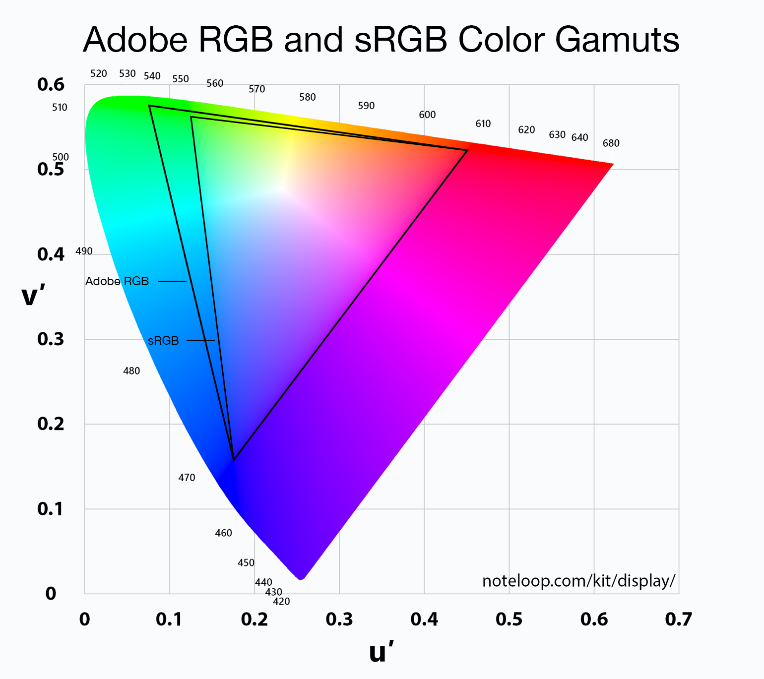
For the purposes of this article it's sufficient to just consider sRGB and Adobe RGB. sRGB is the current standard for all images and graphics displayed on the web, while Adobe RGB is a color space developed by Adobe which extends the green primary of the sRGB color space. Both of these standards define various characteristics about how color should be displayed, including the color gamut, gamma function, white point, luminance, and black level. The Adobe RGB gamut is significantly larger than the sRGB gamut in its reproduction of green and cyan shades, which is why monitors that support it are referred to as wide gamut displays.
Having a display with a different color gamut than that of the one used on the web can pose significant problems. It's up to the operating system, its frameworks and APIs, and the apps built on top of them to properly handle the mapping of content made for the sRGB color space to the monitor's wider color space. To help with this, displays should provide an ICC profile, which is a file that describes information about the monitor's color characteristics. With a proper ICC profile, the system's color management framework will know the specifics of the monitor's gamut, along with the gamma ramps to be loaded into the GPU's lookup table to provide corrections. It's worth going over the process of applying these in Windows and OS X.
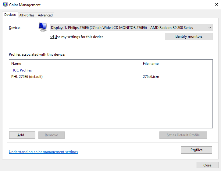
Windows makes the task of setting an ICC profile quite confusing for the average user. To do so, one has to open the Windows Color Management settings, which is still part of the legacy control panel rather than being integrated into the new Settings application that has existed since Windows 8 launched. In the case of the Philips 276E6, you'd expect that you could simply select the default monitor profile, click "Use my display settings", and you'd have every application managing color properly.
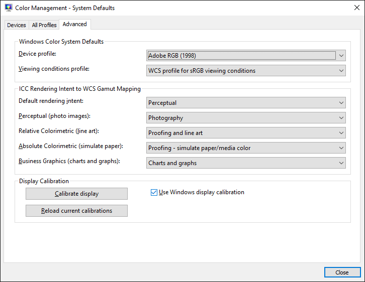
Unfortunately, the process I described above won't change anything about your display's output. For starters, simply checking that box doesn't actually do anything regardless of what profile you've selected, despite the fact that it explicitly says the box enables the settings you've chosen. For whatever reason, you then need to click on the advanced tab, and then click on the button to change the system defaults. From there, you're then brought to what appears to be the screen you began on, but in this case you're managing the default settings for the system which will apply to all users. From here, you should check the box that enables the use of Windows display calibration, which will actually enable the settings you changed in the first window.
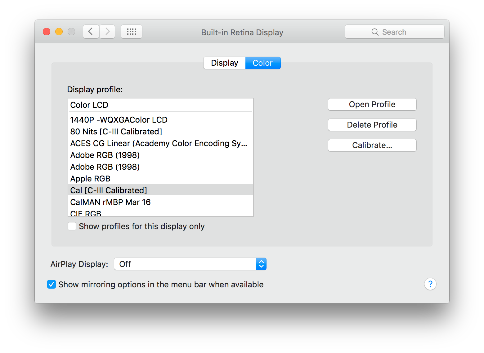
On OS X, the process involves going to the color tab of the display settings page and clicking on the profile you want to use. This instantly sets the profile across the OS. I tend to lean toward the OS X implementation as being the simpler one, as clicking on one thing is simpler than having to navigate a number of menus, toggle checkboxes with inaccurate descriptions, and eventually resort to finding a guide on Google such as this one to figure out how to load an ICC profile properly. In my experience the color management at the OS level in Windows is notoriously unreliable as well, with Direct3D applications being able to load whatever they want into the GPU's LUT if they run fullscreen, and the ICC's LUT often not loading again even after exiting, which requires trying to force it to load by toggling it on and off or just rebooting the entire computer.
Fortunately, there are a number of third party applications to handle the loading of ICC profiles on Windows, which have mainly been created to address the problems with the built in functionality. Users who profile their display with CalMAN will likely opt for SpectraCal's CalMAN Client 3 to manage profiles, and there are many free programs like Color Sustainer and CPKeeper which work reliably and often can reload on a timed basis which allows settings to be properly restored after being overwritten by the bad behavior of most game developers.


51 Comments
View All Comments
Brandon Chester - Thursday, April 28, 2016 - link
Ryan was up very late doing some editing and must have made it when he expanded on my admittedly sparce placeholder title (Monitor Review). My apologies.Infy2 - Thursday, April 28, 2016 - link
The message of this article is for average Windows user to stay away from wide gamut monitors.Murloc - Thursday, April 28, 2016 - link
average user thinks oversaturation looks coolwatersb - Thursday, April 28, 2016 - link
Excellent. Thanks for this in-depth discussion. I know very little about color and color management.Yesterday, I was in an Apple Store and I compared wide-gamut images side by side on the new, 9.7-inch iPad Pro, the 12-inch one, and the 5K iMac. I used iconFactory's blog post for reference images. Wow. http://blog.iconfactory.com/2016/04/looking-at-the...
This is becoming a real thing for popular consumer devices. Interesting times!
theduckofdeath - Thursday, April 28, 2016 - link
The only thing I'm getting from this review is, I have a strong feeling that markets with stronger marketing regulations will soon nerf the Quantum Dot term the same way "LED" displays were a few years ago. The marketing implies that QD is as advanced as OLED while the displays clearly still use edge lighting with all of its issues.saratoga4 - Thursday, April 28, 2016 - link
The marketing on hype on QD is particularly ridiculous given that they're essentially a cost-reduction measure designed to save a few dollars on multi-color LEDs or OLED while (hopefully) being good enough.Murloc - Thursday, April 28, 2016 - link
80$ is not a few.A new thing or a cost reduction are the same thing in this case: consumers will have something they didn't have before.
saratoga4 - Thursday, April 28, 2016 - link
Going from 1 type of LED to 2 types of LED in an array doesn't anywhere near $80. The savings is much larger compared to OLED, but OLED has other advantages beyond gamut that QDs can't match anyway.name99 - Thursday, April 28, 2016 - link
I think you're missing the larger picture.Of course any technology can be cost-cut to the point where it is a joke, and Phillips seem to have done that here. OK, Phillips being stupid, nothing new there. But that's not interesting.
The more interesting aspect is that we are moving towards richer monitor technology. It started with retina (sorry HiDPI !) displays, now we're going to wider gamut. At some point wider gamut is going to move to something like 16 bits per pixel rather than 8 (or occasionally 10 or 12), along with maybe even 4 phosphors. And at some point the standard device frame rate is going to up to 120fps.
OK, so with this hardware background, it's now interesting to contemplate the SW background.
In one corner we have MS. Apparently still incapable of handling color correction after all these years, and incapable of handling the UI. Ad that to their HiDPI support. They seem unlikely to adapt well to this new world...
In the second corner we have Android. Not clear to me how much better off they are. They have handled DPI a lot better, which is a good start. As far as I know there is still no color correction built into Android; but the larger issue is one of how easily their architecture would allow for inserting color correction. Can they do it in such a way that all (or at least most) apps just do the right thing? And would it rely on the phone OEMs to create drivers and lookup tables that most of them would screw up?
In the third corner we have Apple which seems perfectly positioned for all this (meaning that they will likely drive it). They've been happy to push hiDPI (including on OSX as fast as Intel's built-in GPU's allows it ---which wasn't very fast, suggesting that maybe they'd be better off with another vendor for OSX SoCs, but that's a different issue), and they're now pushing color accuracy both on the camera side (TrueTone flash, high dynamic range sensors) and the screen side (new iPad Pro screen, presumably to spread throughout the product line as manufacturing volumes and power budgets allow).
I fully expect them to stay on this path for a while, never actually stating technical phrases like "full Adobe RGB Gamut" but constantly subtly pointing out in their keynotes and advertising "Our colors look good, and look correct, across ALL our devices --- photos on your iPhone look exactly the same on your iMac. Good luck getting that consistency with photo from your Android phone on your Windows screen."
From this point of view, then, the relevance and interest of QD technology is whether it allows larger gamut to move to iPhone this year or at least soon.
jlabelle - Friday, April 29, 2016 - link
- Apparently still incapable of handling color correction after all these years, and incapable of handling the UI. Ad that to their HiDPI support. They seem unlikely to adapt well to this new world... -such statement is not correct and the article describes it pretty clearly. Beyond the way to set it up (which, yes, is somehow confusing), the real issue is simply that many programs are not color managed.
This is not only limited to Windows and OS X is suffering of the same issue so it has nothing to do with Windows per see but the programs you are using.
The issue behind is that some default program on Windows are not color managed. It seems it is the issue with Store app (like it is for iOS apps that make iPad useless for photo editing for instance). So some important apps like Photo and Edge do not take care of that. That is a big issue.
But many programs does.
That is why there are 3 different cases :
1/ Use a screen very accurate within sRGB gamut out of the box - only use sRGB images --> no issue anymore but obviously you will never display any image beyond sRGB
2/ Use a screen with sRGB gamut (or a wide gamut screen that you switch to sRGB mode) with calibrated with an ICC profile set as default (as described) - use only sRGB images --> here, you will have perfect color accuracy for all applications color managed. In case of applications not color managed (Edge, Photo, Chrome...), you will have the color inaccuracy of the screen default (because ICC profile not applied) BUT you will not have images under or over saturated. Therefore, the impact will still be minimal for the user.
3/ use a wide gamut screen : then, you have no other choice that carefully use color managed application --> for every application color managed, display will be fine and you will take advantage of the wider gamut. For all others, the images will appear oversaturated.
It is such an issue that I used to have a wide color gamut DELL U2711 screen.
1/ first, you only have a good accuracy in color managed applications but in others, everything is oversatured.
2/ Second, while shooting FF DSLR in aRGB, I may have seen less than 10 pictures out of 70 000 where you could see in an direct A-B comparison a tiny difference between the sRGB version and aRGB. In real world, it is VERY unlikely to go beyond sRGB.
3/ Third, even if you keep for you aRGB versions of your pictures (to take advantage of your screen), you have to have a sRGB copy because when you share it outside, other people will face the issue on non color managed application that your pictures will be completely washed out. And even many online print shop only take sRGB.
At the end of the day, it is so much a hassle for virtually almost 0 visual benefit (speaking of photo of real color in the nature) that I now have a Dell U2313UH which is a sRGB gamut screen.
Bottom line : wide gamut screen currently is a chore and NOT recommended. And not only Windows, nowhere because even if your browser is displaying correctly the image (Safari, Firefox with a certain flag activated), what is the point then to have a wide color gamut screen to see sRGB pictures ?