Motorola Droid 3 Review - Third Time's a Charm
by Brian Klug on July 30, 2011 12:01 AM EST
Motoblur that isn't
The Droid 3 also comes by default with the newest version of Motoblur, or, well, some unnamed UI skin that sort of looks like Motoblur, but isn't officially called Motoblur in any of the user-facing parts of the software or website. Though one has to view things from Motorola's perspective - Motoblur has become a dirty word as of late - it's still there, and it still looks like Motoblur. All it takes is looking no further than the Build.prop file inside the Droid 3’s system directory to learn that the Motorola UI layer running atop the Droid 3 is still called Blur at its core:
Blur_Version.5.5.959.XT862.Verizon.en.US
For those that followed our Motorola Droid X2 review, this should already be self explanatory - it’s literally the same case with the Droid 3 as the X2. That said, the UI skin on the Droid 3 is notably different from what I saw on both the updated Droid X and newer Droid X2.
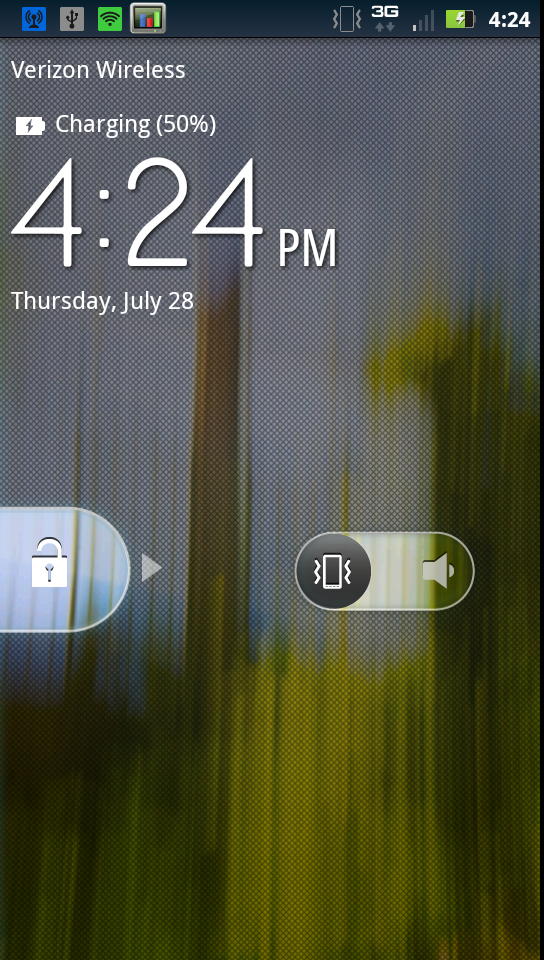
The Droid 3’s Motoblur treatment consists of a different, unique lock screen, and a GPU accelerated launcher plus home screen. Starting with the lock screen, there’s a different (non stock) font, unlock pattern, and a silent/ring switch on the home screen. I saw the lock screen glitch out, but only once when switching between landscape and portrait very quickly.
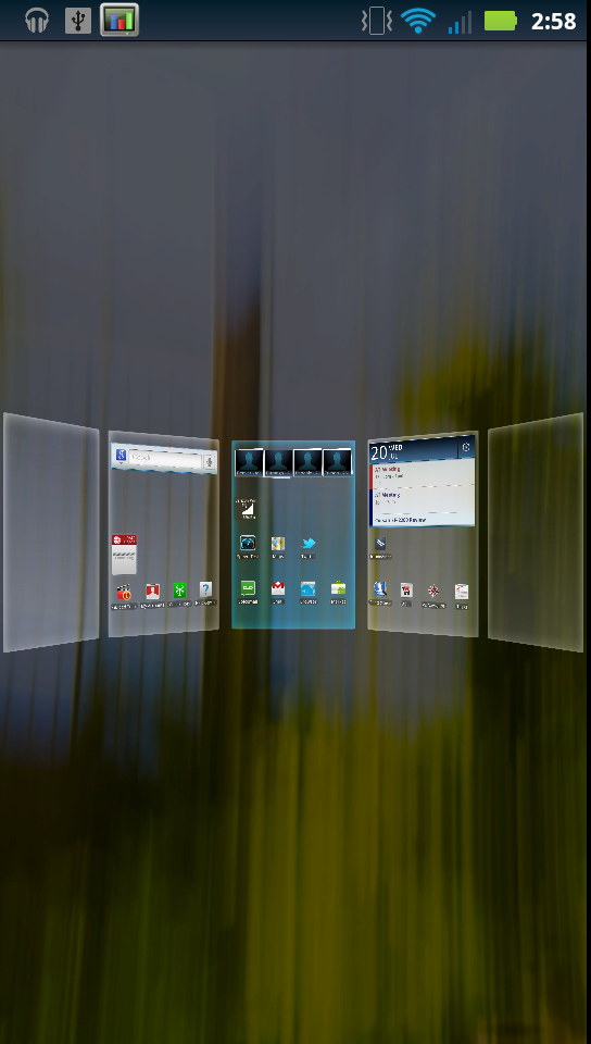
It’s hard to appreciate the 3D/GPU accelerated changes in the launcher without actually seeing the thing, screenshots only go so far in conveying what’s different. Of course, I still would encourage interested parties to check out our video review which does go over the general UI smoothness. There’s a zoomed out view for switching between home screens rapidly as well, which again has a very GPU-accelerated feel to it. Swiping between home screens now is a fluid 3D effect, and after the page stops moving there’s a glow that waves across all the icons and widgets. It’s a bit of not totally requisite eye candy, but I must admit the animation is constantly fluid.
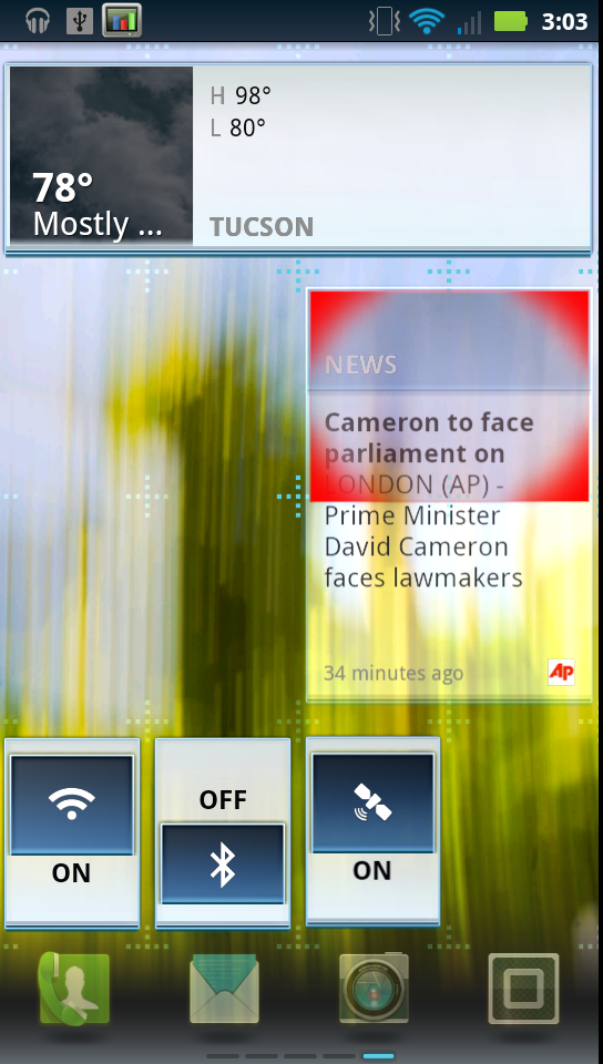
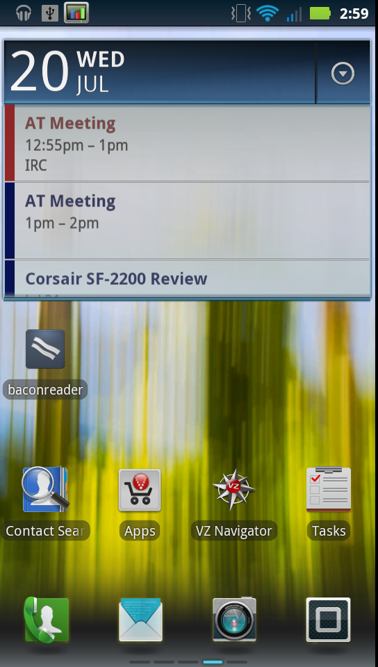
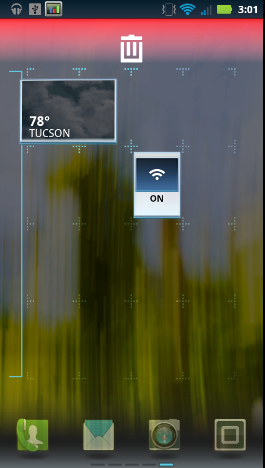
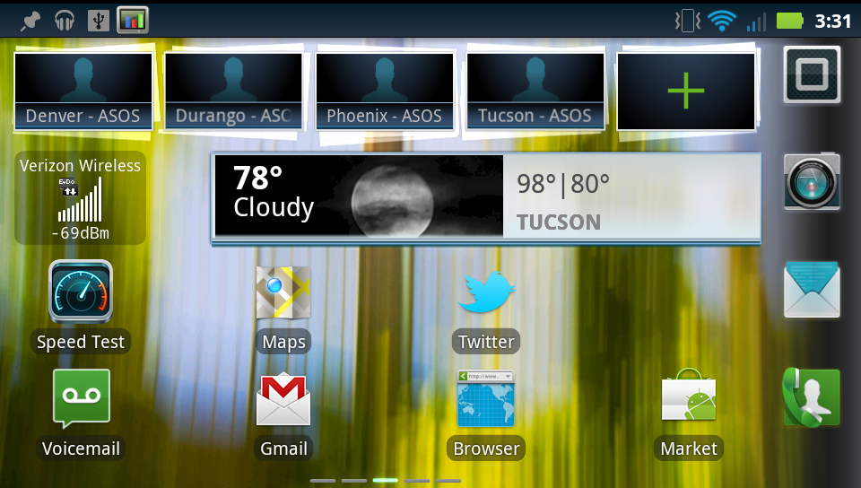
The Motoblur-specific widgets are still here and keep largely the same appearance. What’s different is that the home screen grid also gets a 3D treatment. Move shortcut tiles or widgets around, and they’re given a 3D effect and move around as if being dragged through space. Motorola widgets can still resize, though the handles for changing size are differently styled now, but from what I can tell the same row x column configurations previously permitted are still around. The default set of home screens are also not overly cluttered, only the center three are home to any items out of the box.
The bottom row of icons still lack text labels, something that I am still puzzled by, and I wager still confuses new Android users. For example, the rightmost tile is the application launcher, but the icon just doesn’t really convey the message immediately. It also can’t be moved or replaced, however the other three can after a long press.
Of course, there are also landscape views for everything to accommodate using the phone with the keyboard out.
The same black on white Motoblur color scheme sticks around, with shades of navy blue for other UI elements. It’s the same as we’ve come to expect - again, based on the Android 2.3 update for the Droid X, and the X2’s theme.
The next major UI skin change is the application launcher. It now is divided into pages which slide left and right, instead of one long list which slides up and down. This is a big change for older Droid users who are no doubt already accustomed to the former (and which is also the default Android behavior), and I think might be received by some people as a change that further emulates iOS’ organizational scheme.
What does improve, however, is that the launcher also gets the GPU-accelerated theme. Transitions are fluid when swiping between pages both in portrait and landscape, and just like the home screen there’s a bit of a depth effect which is visible. It’s impressively fluid.
The only place that I think rebooted Motoblur shows some lag is at the portrait-landscape transition. Each time the home screen has to change between portrait and landscape, there’s considerable lag as first the wallpaper, then bottom row of icons, then widgets, and finally application tile assets are re-loaded and rendered. It just is a glaring area that stands out in my mind as being equally unpolished and laggy. Almost everything else is superb.
The other changes are subtle. Thankfully the cellular signal, connectivity, and WiFi indicators still change color like they do in stock Android 2.3 to indicate successful connection with Google’s servers. There’s also the Android 2.3 CRT shutoff animation, though it looks slightly different from the one in mainline Android 2.3.
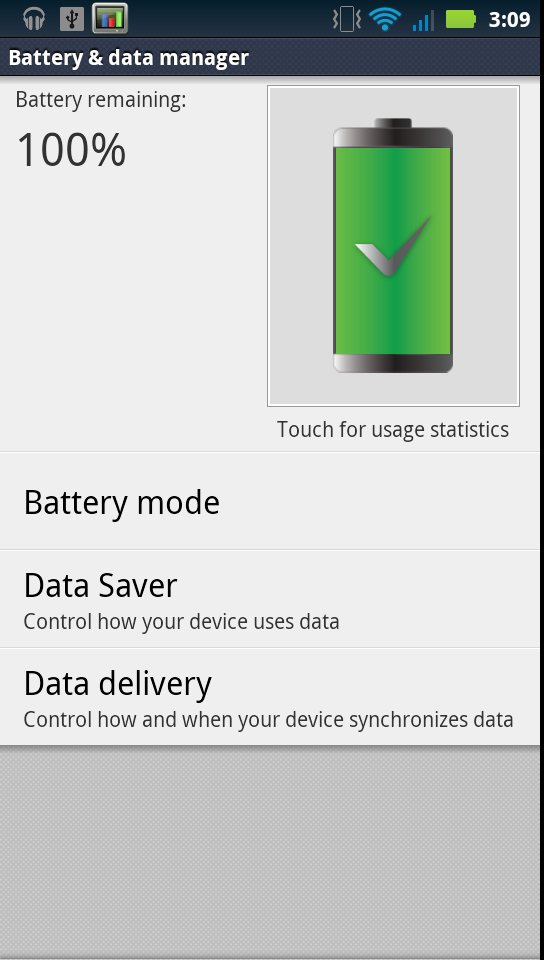
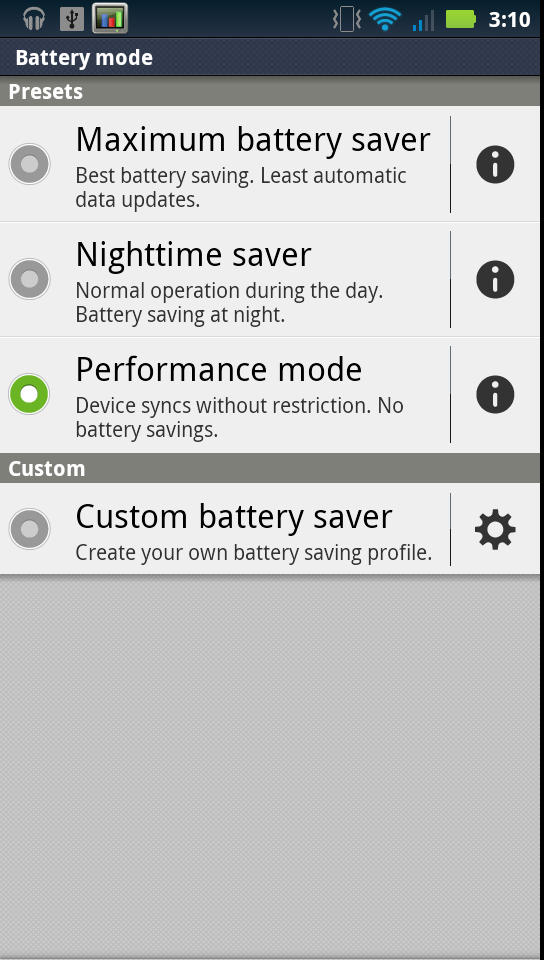
Inside settings, Motorola continues to include a battery manager that by default restricts account synchronization to “normal” working hours. First thing I did was disable this by selecting performance mode, since my hours are anything but normal. Last go around, this setting confused people since, again, email and other accounts are not synced between 10 PM and 5 AM. It’s easy enough to disable, thankfully.
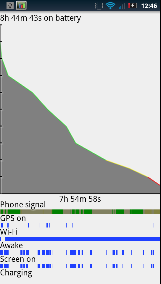
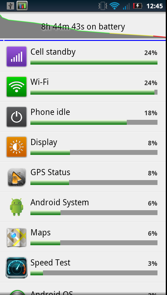
Tapping on the large battery icon dumps you into the Android 2.3 power charts which show estimated use broken down by core function and application, and tapping on the graph still shows a timeline of when different things were on and sucking down battery. I’m glad that virtually all the Android 2.3 enhancements haven’t been eschewed.
I mentioned earlier that the Droid 3 doesn’t include an SD card by default. Instead, there is 16 GB of NAND onboard which is home to three partitions for application storage, internal storage, and of course the Android OS. By default, the size of those partitions are just shy of 2 GB, 11.35 GB, and over 1 GB.
Filesystem Size Used Free Blksize
/dev 219M 76K 219M 4096
/mnt/asec 219M 0K 219M 4096
/mnt/obb 219M 0K 219M 4096
/system 320M 307M 13M 1024
/data 1G 331M 1G 4096
/cache 535M 17M 517M 4096
/data/tmp 2M 8K 1M 4096
/pds 3M 1M 2M 1024
/preinstall 477M 258M 218M 1024
/mnt/sdcard 11G 1G 9G 8192
The Droid 3 comes with its own share of stuff preinstalled as well, including a veritable bevy of Verizon applications (why they can’t consolidate into one massive program seems beyond me), and the usual assortment of preloads that hitch a ride on stock ROMs. Things like slacker, GoToMeeting, CityID, Citrix, Angry Birds (sigh), NFL Mobile, Lets Golf, NFS Shift, and Blockbuster. Of those, only Lets Golf and NFS Shift can be uninstalled, which is better than nothing but still not quite ideal.
The Droid 3 as of this writing has a locked bootloader, so there’s no simple way to toss on an AOSP derived ROM like CM7, or any custom ROM for that matter, at least at this point. Hopefully soon however a Motorola-approved update will appear that will make unlocking as simple as running “fastboot oem unlock” like other devices. It’s disappointing to see the Droid 3 ship in this state, but unlocked bootloaders are indeed in the cards for almost all manufacturers at this point. It’s just a matter of persuading carriers that doing so won’t result in network implosion, and preventing hoards of customers from trying to get warranty replacements on devices they’ve flashed improperly.


84 Comments
View All Comments
EndlessChris - Saturday, July 30, 2011 - link
Great review as always. Looks like this will be my new phone :)RaistlinZ - Saturday, July 30, 2011 - link
Sharp lookin' phone. I like.vol7ron - Sunday, July 31, 2011 - link
I like this too, larger screen, nice looking keyboard, great looking device. It seems to have it all.One thing, does it really have a 0.3MP front-facing camera? I would suspect 1.3MP would be more realistic, especially since there are probably economies of scale for that technology right now.
Thx,
vol7ron
Brian Klug - Friday, August 5, 2011 - link
Vol7ron,It definitely does have a 0.3 MP (VGA) front facing camera. http://developer.motorola.com/products/droid-3-xt8...
I'd like to see 1.3 MP sensors on the front for sure, but at this point it doesn't make sense until both the per-pixel quality is the same (same size pixels) and there are apps that can actually do some HD teleconferencing (like if Skype had support). We're almost there though.
-Brian
Myrandex - Monday, August 1, 2011 - link
It would be for me if it wasn't for this bastardization that Verizon did:The obvious next part of the story is that WCDMA HSPA+ 14.4 Mbps connectivity. Unfortunately, Verizon has locked the retail Droid 3 out of seeing USA-based GSM/WCDMA networks with an MCC (Mobile Country Code) lock.
Why can't Verizon just allow the hardware to perform at its fullest rather than finding some way to lock it down? They have always been terrible about locking their phones in some way.
Jason Cook
themossie - Saturday, July 30, 2011 - link
Tried the Droid 3 in store the day it came out, mixed feelings about the screen.Found it very usable for applications, not usable for serious reading (news, ebooks, etc). First time I've suffered eyestrain from an LCD screen with decent brightness and contrast. Droid 1 works great for this use case.
Brian, Anand and the rest of the AnandTech team - any opinions on this? Anyone else?
themossie - Saturday, July 30, 2011 - link
Also, thanks for the great review - business as usual at Anandtech!steven75 - Saturday, July 30, 2011 - link
Indeed. Can't believe he tried to equate this pentile display with less resolution in a larger screen size (significantly worse PPI) with the retina display. They aren't even close.bplewis24 - Saturday, July 30, 2011 - link
I'll trust the guy who looks at hundreds of phones per year over the hyperbolic masses who troll the internet.I'll also trust my own eyes and science, which prove you wrong.
Finraziel - Sunday, July 31, 2011 - link
Well, I'll also trust my own eyes, and the picture right above where Brian says he doesn't mind pentile too much really makes the droid3's screen look like crap compared to the lower resolution droid2 right next to it. My experience with other pentile screens also suggests there's absolutely no point in increasing the resolution only by using a trick like this, you end up with noticably lower effective resolution. I'd prefer an actually sharp screen over impressive specifications.I really hope when the 720p screen phones come out in the next half year or so they wont be using cheap tricks like this.