The Apple iOS 9 Review
by Brandon Chester on September 16, 2015 8:00 AM EST- Posted in
- Smartphones
- Apple
- Mobile
- Tablets
- iOS 9
Low Power Mode
Low power mode is a new feature in iOS 9, and it's fairly self-explanatory. Android OEMs have been adding similar features for a while now. When your battery hits 20% the normal low battery popup will appear, but it now has a button to turn on low power mode. Apple hasn't specifically detailed what they're doing in low power mode, but they have given a broad overview of what they're doing, and some of the things can be measured manually. Low power mode makes the following changes:
- Brightness is dimmed
- Mail fetch is disabled
- Push notifications are disabled
- Background refresh is disabled
- Background network access is limited
- CPU performance is reduced
- Parallax on the home screen is disabled
- Animated wallpapers go static
With all of these changes, Apple says that low power mode can extend battery life by up to three hours if used for an entire cycle. You can actually enable the mode manually if you want by going to the battery section of the settings application. The low power mode will also automatically disable itself once the device is charged to 80%.
As for some of the specifics, I can confirm that the iPhone 5s will bring the SoC to a state where the max clock is 800MHz, while the display on this specific unit drops from 523nits to 414nits. I hope to get figures for the iPhone 6 and 6s as soon as possible, and I'll update this section once I have them. It's difficult to measure the impact of something like low power mode, as it's still heavily dependent on how you use the device. Regardless, it's good to see Apple bring this sort of feature to iOS, and I would be interested to see which users decide to use it all the time to improve their battery life even if it requires sacrificing apps running in the background and a degree of performance.
An Improved Notes Application
The iOS Notes application has been fairly simplistic since its original incarnation. You can add text, and if you long press you can insert images. Through some copy and paste magic you could end up getting text formatted with different fonts and sometimes features like bullets, but that implies that you had to write it out in another application anyway unless you’re pasting right from the web. In contrast, an application like Google Keep on Android has support for other features, like making checklists of items. Something like Evernote provides even more features that make the iOS stock app look bare in comparison. In iOS 9 the notes application receives a large overhaul, with a number of visual tweaks and new features.

Notes on iOS now supports rich text formatting. You can change whether your text is meant to be for a title, a heading, or a body of text. You can also make text bold, italicize it, or underline it. There’s still no support for fine adjustments like setting a precise text size, and for those controls you’ll still need to rely on a third party application or on Pages. To be fair, it’s not in Apple’s best interest to kill the viability of making third party note applications.
In addition to the font formatting you can also make lists using bullets, dashes, or numbers. There’s also the ability to create checklists, which I have used a few times during the course of writing this review to make sure I haven’t forgotten anything that I want to cover. You’ll also notice in the screenshot above that you can link to locations, webpages, voice recordings, and other content and they’ll be embedded in the note inside a rounded rectangle.
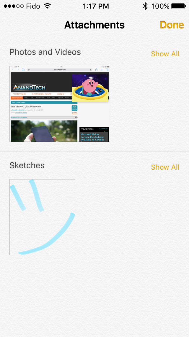

Something else Apple has added is the ability to draw on notes. Clicking on the squiggly line on the bottom navigation bar opens up a drawing section which has different virtual tools to draw with. There's your standard fine marker, a thicker tool like a highlighter, and a pencil. There's also a ruler which can be used to draw straight lines, and both an eraser and undo/redo buttons for any mistakes.
While the ability to draw on pages is interesting, it’s not implemented the way I had hoped it would be. Your sketches are essentially images in the note, rather than being drawings that you can position anywhere. An app like Notability lets you put scribbles wherever you wish, which can be helpful when you want to emphasize something or put yourself a note in a margin. Since your sketches are just images they have to be positioned above or below a line of text, and cannot be put to the right.
The last thing worth mentioning about the new Notes app is that Apple has also added the ability to view all the images, sketches, and attachments that exist within all of your notes. This can be helpful when trying to find a note based on a photo or a link inside it when you aren’t sure exactly what sentence or list you had in the note alongside it.
A Better iPad Keyboard
I've always felt that the iPad has one of the best first party tablet keyboards out there. I think part of it has to do with the 4:3 aspect ratio allowing for keys of greater height in landscape, which means you aren't dealing with rectangular keys that result in uneven movement depending on whether you're moving your fingers vertically or horizontally. The iPad keyboard has also had some unique features that the iPhone doesn't, such as the ability to split it into two parts by pulling outward from the middle. However, when Apple added QuickType suggestions I always felt like there was a lot of wasted space on the left and right sides where there were no suggested words. In iOS 9 the iPad keyboard gets a few feature additions that can greatly improve productivity, and fills in those empty areas in the QuickType bar while doing so.
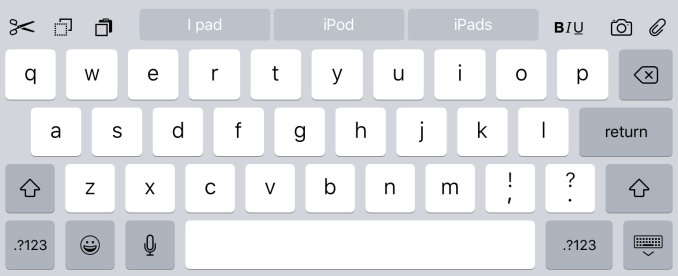
The most obvious addition to the keyboard are the new shortcut keys on the left side of the QuickType suggestions. Depending on the context these buttons will differ, but by default you get a pair of undo and redo keys, and a paste key. If you select text these buttons change to a cut key, a copy key, and a paste key. They also change in different apps, with the Notes application condensing the standard 3 shortcuts into an overflow menu, and adding a button to create a checklist as well as a button to adjust the formatting of text.
On the right side of the keyboard are additional shortcuts that depend on the application you're in. In Notes they are buttons to insert images and access the sketch screen, while in Mail they're for text formatting, adding images, and adding attachments. Many apps don't have shortcuts here at all, and you'll have to open up the keyboard in an app to see what you get.
More interesting than the new shortcuts is the ability to use the keyboard as a trackpad of sorts. It's not something that allows you to bring up a mouse cursor and move it around the screen, but in apps where you're inputting text it allows you to move that input cursor and to increase or decrease the size of a text selection field. To use this trackpad mode you need to place two fingers on the keyboard at the same time until the keys go blank. After that you can move your fingers around and the cursor will track with them. It's a useful way to move the cursor within a sentence to insert a word, or to accurately change the size of a selection by only a letter or two.
One last thing I'd like to mention is that the case of the letters on the keyboard now changes depending on the status of the shift key. This fixes a longstanding issue with the shift key on the iOS keyboard that has existed since iOS 7. The change applies to both the iPad and iPhone keyboards, but I felt it was best to just mention it here.
Ultimately, I think the changes Apple is making to the iPad keyboard go hand in hand with the new multitasking features that I'll be discussing later in the review. They represent the iPad finally growing up and becoming its own device. It was never correct to say that the iPad was just a big iPhone, but from a high level the two devices did provide similar experiences as they used the same applications and operating system. Adding features that are very specific to the iPad differentiates it more from something like the iPhone 6 Plus, and improves its ability to be used to get actual work done.


227 Comments
View All Comments
sonicmerlin - Tuesday, September 22, 2015 - link
Would you be able to use a Safari Content Blocker to create a "text reflow" extension? Basically act like Opera Mobile for Android to specify to websites an artificial width of the iOS device, forcing the page to display words in shorter columns and bigger font?Oxford Guy - Tuesday, September 22, 2015 - link
"OS X Yosemite famously was the first version of OS X to have a public beta"The first version of OS X to have a public beta was the original Public Beta release that predated 10.0. It came after the last developer preview and people had to pay $50 for it.
iam2thecrowe - Thursday, September 24, 2015 - link
"Searching through mail is also much better as well. Previously it would just show you every message that corresponded to the keywords you entered. The search now gives you a list of thread topics that match, and if those aren't sufficient you then have the option to use the older individual message view."I have an iphone 5s i have to use for work. I am actually really frustrated by the new mail search, it worked to my taste before, it brought up what you searched for..... now it brings up a bunch of thread topics, i actually find this useless and have to wait for it to load the individual message view. Since my primary use for this phone beyond being a phone, is email and messaging, this is BS and makes me want to roll back to 8. Vertical keyboard letter spacing has also become larger and now takes getting used to, i find it harder.
Donniesito - Thursday, September 24, 2015 - link
I knew this would turn into a Win vs. Apple thing. I don't understand why people are so vehement when it comes to this particular "debate." I use these machines on a regular (nearly daily) basis:The point in listing my hardware isn't to brag (nothing I have is TOP of the line) -- it's to point out that every platform, every OS and every device has a place. Just use what you want to use, and if you've never used something, broaden your horizons and try it. Just have fun with technology, be productive in whatever way you need. I enjoy all technology -- so lighten up people. Sheesh.
Gaming rig - runs Windows 10.
DAW and Video Editing system - Mac (OS X).
Media Server - Linux
Raspberry Pi - Screwing around with different OS's
Nexus 7 (2012) - Used it until the internal SSD started going south, a known problem
iPod Touch - iTunes (all my music)
iPad Air 2 - Productivity AND fun stuff :-P
Samsung Galaxy S4 - phone
araczynski - Thursday, September 24, 2015 - link
4x4 Folders, that is the only change that I am happy happened. Rest of the stuff I could care less about, well, ok, the two finger keyboard slider is neat.Don't see why it couldn't be a 6x5 Folder though, there's plenty of space there...
beggerking@yahoo.com - Tuesday, October 13, 2015 - link
Dual tasking is not true multitaskingThommot - Thursday, December 10, 2015 - link
The ads have arrived — and not just in the articles, but ultra-intrusive ads in the article list. Thank you Apple, you made the decision for me kg lot shelling out another £600 ever on your devices. I switched back to Guardian.app and don't bother with other news sources.