iPad 4 (Late 2012) Review
by Anand Lal Shimpi on December 6, 2012 4:40 PM ESTGPU Performance
The 4th generation iPad integrates a quad-core PowerVR SGX 554 (MP4). The 554MP4 doubles USSE2 count over the previous generation PowerVR SGX 543MP4 used in the iPad 3, while keeping ROP and TMU counts the same. The result is a pure doubling of peak theoretical shader performance:
| Mobile SoC GPU Comparison | |||||||||||
| PowerVR SGX 543 | PowerVR SGX 543MP2 | PowerVR SGX 543MP3 | PowerVR SGX 543MP4 | PowerVR SGX 554 | PowerVR SGX 554MP2 | PowerVR SGX 554MP4 | |||||
| Used In | - | iPad 2/mini | iPhone 5 | iPad 3 | - | - | iPad 4 | ||||
| SIMD Name | USSE2 | USSE2 | USSE2 | USSE2 | USSE2 | USSE2 | USSE2 | ||||
| # of SIMDs | 4 | 8 | 12 | 16 | 8 | 16 | 32 | ||||
| MADs per SIMD | 4 | 4 | 4 | 4 | 4 | 4 | 4 | ||||
| Total MADs | 16 | 32 | 48 | 64 | 32 | 64 | 128 | ||||
| GFLOPS @ 300MHz | 9.6 GFLOPS | 19.2 GFLOPS | 28.8 GFLOPS | 38.4 GFLOPS | 19.2 GFLOPS | 38.4 GFLOPS | 76.8 GFLOPS | ||||
The theoretical numbers validate Apple's "2x faster GPU" claims, but as always we'll turn to Kishonti's GLBenchmark to see how achievable that performance increase is.
We'll start out with the raw theoretical numbers beginning with fill rate:
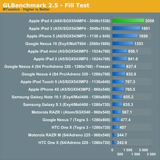
The peak fill rate test shows a ~16% increase in performance over the previous generation 543MP4. Since there's no increase in number of TMUs we're seeing the results of a higher clocked GPU in the iPad 4's A6X.
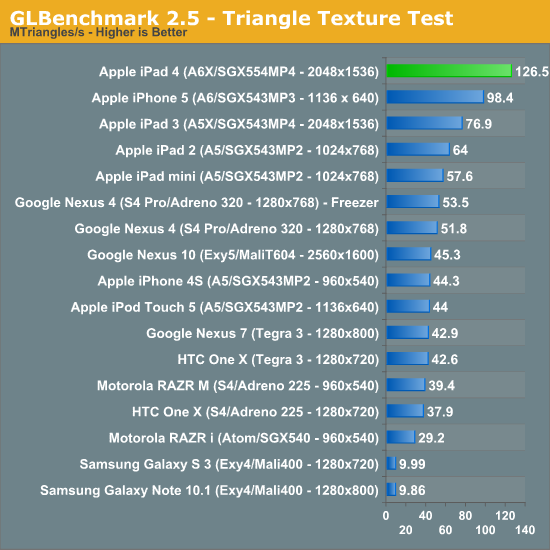
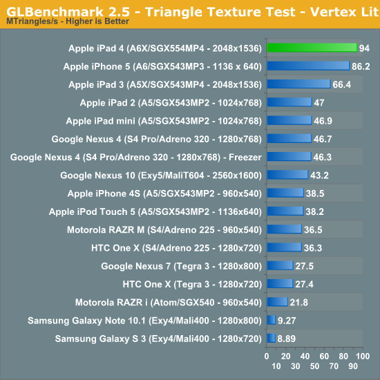
There's a pretty hefty improvement in triangle throughput - we're seeing more than a 60% gain compared to the iPad 3.
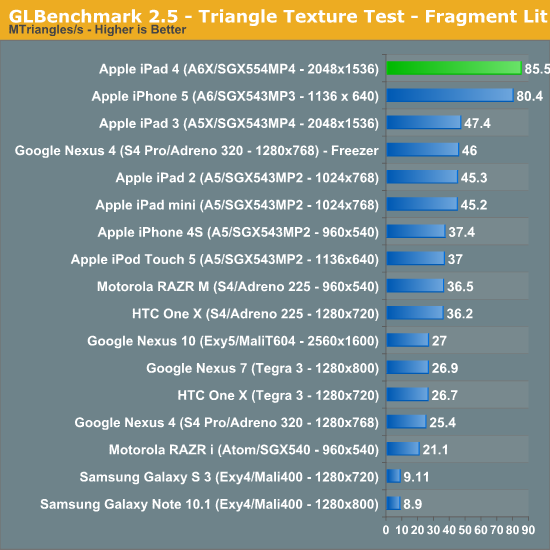
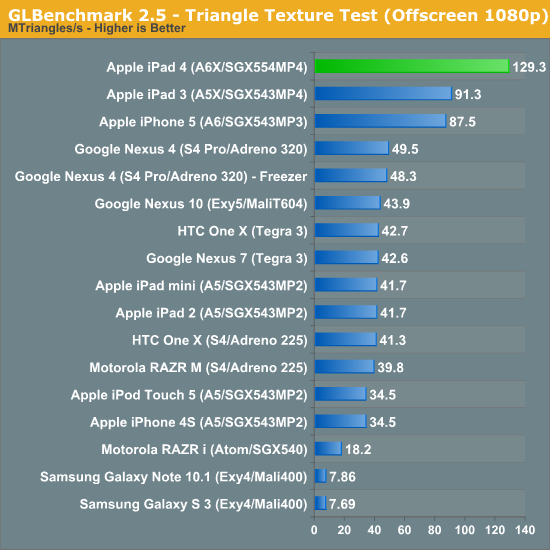
At native resolution the fragment lit triangle texture test shows a big gain over the iPad 3 (~80%).
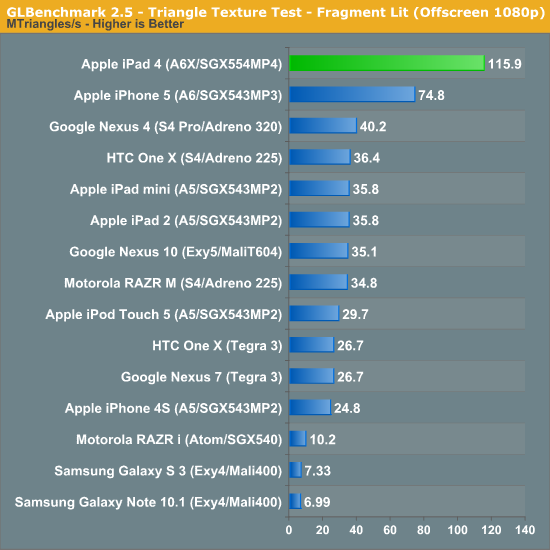
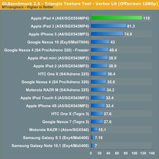
In both of the final triangle throughput tests the iPad 4 manages a 40 - 45% increase in performance over the iPad 3:
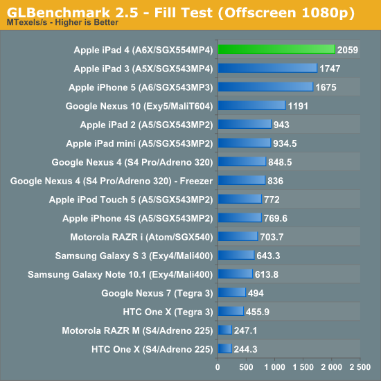
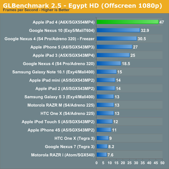
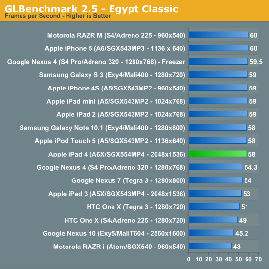
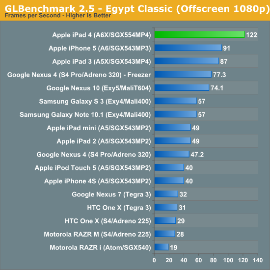
With the synthetics out of the way, we can look at simulated game performance using the Egypt HD and Egypt Classic benchmarks. Remember the on-screen tests are run at native resolution with v-sync enabled, while the offscreen tests are run at 1080p with v-sync disabled for an architectural apples-to-apples comparison.
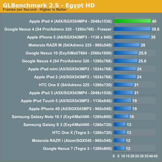
Despite sub-2x gains in a lot of the synthetic tests, Egypt HD shows us what's possible in a simulated game: the new iPad is roughly twice the speed of the previous gen model when running at the panel's native resolution. How we've seen this implemented in many cases is with titles finally running at native resolution on the iPad 4 vs. some lower, scaled resolution on the iPad 3.
The Egypt Classic test is a much lighter workload, as a result most of these devices hit 60 fps at their native resolution:
Although Egypt HD is a bit overkill for today's games, Classic undershoots by a good amount. The offscreen test however does provide some guidance as to whether or not these devices would be able to hit 30 fps on an appreciably heavier workload:


113 Comments
View All Comments
vkn - Friday, December 7, 2012 - link
I for one appreciate these tests. There is no easy way to judge displays in showrooms. I now have a system of playing the the same hd videos on each device and evaluating subjectively (which sucks)darwinosx - Thursday, December 6, 2012 - link
You don't know anything. Apple has been doing this on displays for a very long time. Since you are obviously a teenager, probably longer than you have been alive.jabber - Friday, December 7, 2012 - link
Yes funny that.I saw this with NFC.
Before the finer points of the iPhone5 came out tech journos were all "NFC!!! NFC!!!! ITS THE FUTURE!!!"
Then the 5 came out with no NFC and it was overnight a switch to "Oh......NFC isn't really all that important! Whats NFC again?"
name99 - Sunday, December 9, 2012 - link
Really? Show us RESPECTED tech journalists who were, to use your language "all NFC! NFC! NFC!" about the iPhone5.I don't remember Gruber obsessing about this. I don't remember Anand saying this was an essential iPhone5 feature. I don't remember Horace Dediu caring about this.
Apple has made it quite clear, since they shipped the iPhone 4S, that they view BT4 as a better solution for most of the things that NFC is supposed to do. Given the extreme lack of interesting things being done with NFC, that seems like a good call.
Your claim is as ignorant as being surprised that the new iMacs shipped without an optical drives.
Death666Angel - Saturday, December 8, 2012 - link
Me personally, I don't agree with Anand. The eyes are pretty good at adapting to colors. So unless you have a calibrated PC monitor or something to compare to, you will not notice when colors are off, unless they are off by a big, big margin. I haven't seen a lot of that in the android camp and when it crept up, there were easy fixes by the community.cheinonen - Sunday, December 9, 2012 - link
Eyes are very adaptable to what is put in front of them, just like ears are with sound over time. That's why all the measures are done by instruments that aren't subject to the adaptability of our vision system. The dE numbers are designed to tell you how visible an error is. With the older 1976 and 1994 formulas, any dE below 3 was thought to be invisible in motion, with < 1 invisible when side-by-side. The dE2000 formula used in these charts is more accurate (in terms of weighing luminance, hue, and saturation errors), but smaller errors are more visible, so a dE of 3 is now worse than a dE of 3 in the old formulas. The dE numbers have a basis in vision science, though, and let you know if an error is visible.How well you'll notice, or care, about a color error likely depends on your exposure to correct colors. If you've spent years looking at a calibrated display, then you'll notice the errors almost instantly. If you've never seen one, you won't notice as you have no idea what it should look like. The whole point of calibration is just so when you see something, or design something, everyone else sees it the same way.
Also, a global fix for color errors isn't likely to work well, as all displays are slightly different and would need to be calibrated individually. You could make some adjustments, but not make them perfectly accurate.
name99 - Sunday, December 9, 2012 - link
To add to this point, I am not an obsessive about color. I don't do design work, or know Pantone numbers by heart or anything. But it was obvious enough to me that colors (in particular photos of faces in Contacts) looked different on my mac and my iPhone 1 that I submitted a bug to Apple about it.This is, to put it bluntly, the difference between Apple and other people. Other (supposedly technical) people see that a photo of a friend looks slightly different on their phone from their computer --- it's a little too dark or too red or whatever --- and they shrug and say "well, it's always been like that". Apple people say "Why the hell should we put up with this? It's possible to do better." It's this mindset that leads to useful improvements based on actual use cases, as opposed to useless improvements based on spec-boasting.
Focher - Saturday, December 8, 2012 - link
Not sure what the problem is. Everything is tested and reported. It's up to you to decide which attribute(s) matter to you.If anything, we should really appreciate that AnandTech reviews those attributes. In addition to Apple actually making the display quality a market differentiator for vendors who play in this space, AnandTech deserves credit for ensuring we see which manufacturers are delivering improved display attributes.
name99 - Sunday, December 9, 2012 - link
It's silly to claim that Apple has "just started" promoting color calibration.Color calibration was added to the original Mac OS in 1993 (ie WAY before OSX) and every year since then Apple has worked to move it a little pervasively into the system as CPU and GPU speed increases have allowed for more on the SW side, and as tighter control of manufacturing have allowed for more on the HW side.
sprockkets - Thursday, December 6, 2012 - link
Screw the ipad. We want the Nexus 10 review!