ASUS PA246Q 24" ProArt Monitor: No Adjustments Needed?
by Chris Heinonen on July 2, 2012 1:30 PM ESTASUS PA246Q - Display Uniformity
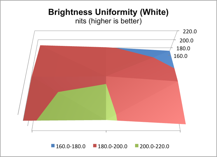
The large viewing angles allowed by an IPS panel only truly help if colors are accurate at the edges of the screen and not just in the center. On the PA246Q the lower-left of the panel seems to be brighter than the rest of it, as it is close to the same level as the center of the screen but the right and top sides of the panel are a bit dimmer. Even with those sides being dimmer, that is better than most displays where all sides are dimmer instead of just 50% of them. So white uniformity is better than average, but not perfect.
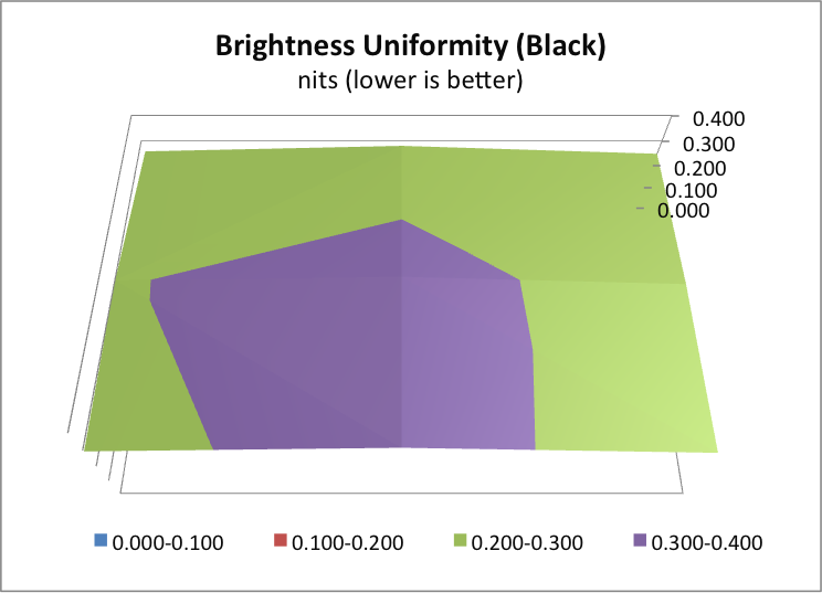
Black uniformity shows the same pattern, only in this case as the lower-left is brighter, it has worse performance that the upper right. If these black levels look worse than the previous black levels we discussed, these are set with the backlight at the level needed for 200 nits of white, which was around 40 brightness on this display.
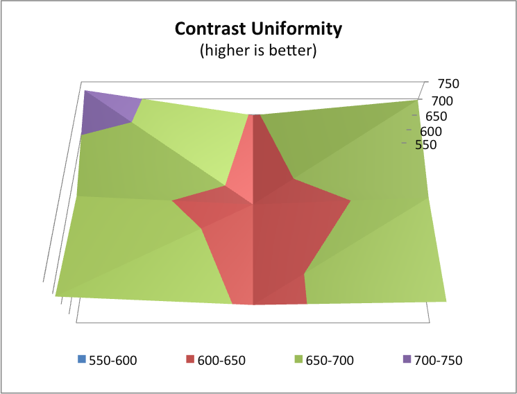
Because I have the data, I added another chart this time, Contrast Uniformity. This simply takes the previous two charts and shows the relative contrast across the screen. Surprisingly the worst contrast was in the dead center of the display, so perhaps if I were to go back and do this chart for other displays I would find the contrast number we use is a worst-case-scenario. In any case, I plan to use this going forward as well since we already have the data, and we can see how close the contrast ratio is across the screen. Here the standard deviation is only 4.26%, which is lower than both the white and black uniformity deviations. So if you are dimmer in white, you’ll be darker in black by a comparable degree it seems.
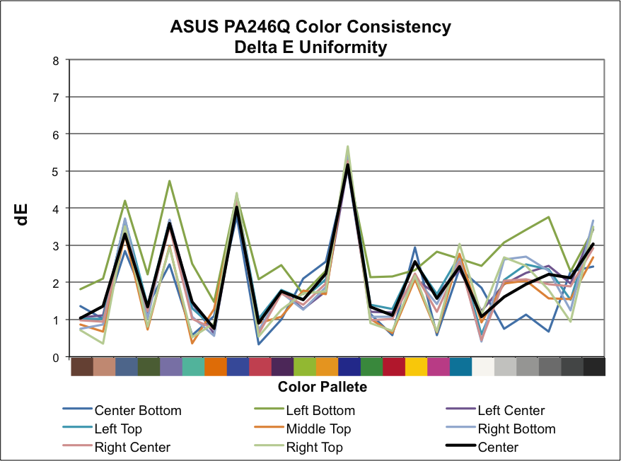
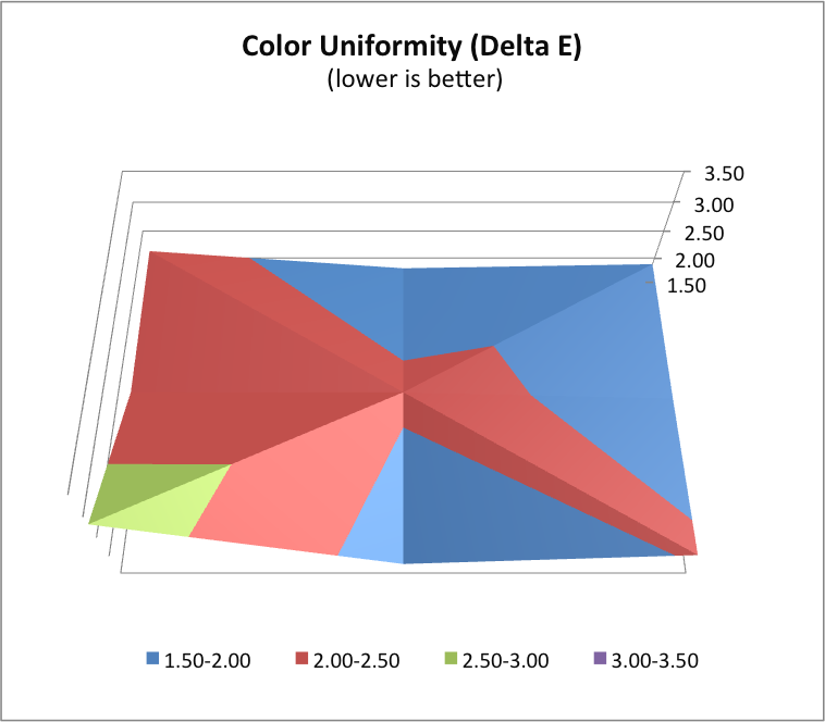
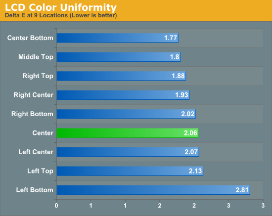
Finally we can look at the dE uniformity of the PA246Q. Broken down by color the dE values are close for the most part, though the lower-left section of the screen is clearly way off on the grayscale and in most other colors relative to the rest of the screen. Surprisingly the center-bottom of the screen outperforms the center, which is what we calibrate to as our target, which is a bit strange. The average deviation for each sample is almost half a dE, which is a pretty large deviation when you consider that the average dE is right around 2. Overall the PA246Q seems mostly uniform, but with a couple outliers here that tend to skew the data.


52 Comments
View All Comments
Leyawiin - Wednesday, July 4, 2012 - link
Just submitted my order - time for a quality monitor for the first time in my life!cheinonen - Thursday, July 5, 2012 - link
As I mentioned above, they're very different monitors. The PA246Q is a 10-bit panel with a full AdobeRGB color gamut from CCFL backlighting, and the PA248Q is an 8-bit panel with LED backlighting and only the sRGB gamut. It's a more mainstream panel than the PA246Q so for non-print and photo editing users, it might be a better choice, but they aren't practically the same other than size, resolution, and vendor.appliance5000 - Saturday, July 7, 2012 - link
The reviewed monitor is an 8 bit panel interpolated to simulate a 10 bit panel - a little dubious.Oxford Guy - Thursday, July 5, 2012 - link
Is this actually a 10-bit panel?Also, since sRGB mode on some wide gamut monitors works (U2410) and is completely broken on others, whenever you review a wide gamut monitor you should separate its performance in terms of sRGB content and AdobeRGB content. The way you lump them together with a "color quality" chart makes little sense. For those dealing with sRGB content, having a monitor exceed the sRGB space can actually lead to poor quality if the monitor doesn't have an effective sRGB emulation mode.
I would take a look at how prad.de and tftcentral separate sRGB and AdobeRGB modes in their reviews.
cheinonen - Friday, July 6, 2012 - link
I will take a look at that. I've only had a couple come through with AdobeRGB support so far, so I haven't setup a separate test section for it, but I can do that in the future.appliance5000 - Saturday, July 7, 2012 - link
I hear you on the srgb - I have an nec p221w (which is an excellent spectraview compatible monitor for about $400.00. With hardware cal the delta e is well under 1 for adobe rgb at a brightness of 140 cd/m2. I highly recommend it)But, being a wide spectrum (97% adobe rgb) srgb seems tough to calibrate for print. My question is : Isn't s-rgb used mainly to proof for web use, particularly for non color managed environments, in which case a delta e of 3 - 5 is fine? The point being that most people pull a monitor out of the box and turn it on for 5 years - there's no way to know what they're looking at.
aranyagag - Tuesday, December 11, 2012 - link
it clears eizo monitor test and other monitor tests which are supposed to weed out 8 bit monitors. Also I have an sRGB camera, which shows proper colours when the monitor is placed in rgb mode-- laparoscope.Dug - Wednesday, July 11, 2012 - link
I had always thought AdobeRGB was just a higher gamut allowing you to see for instance a raw file shot in AdobeRGB at its full potential. The problem is the assumption that this is better.I've found that most print shops don't have the correct profiles, don't use the embedded profile, etc.
I've gone down the expensive road of getting the correct monitor, printer, and color profiling both to print myself.
In all honesty its a pain in the ass with very little gain.
If everything isn't done just right then you end up with dull colors.
If everything is done right, there is a difference, but I wouldn't necessarily call it better. It may be more accurate, because you've been told it is, but it is subtle.
If you have to email, show on web, print to a printer without correct profile, etc you've wasted all your time if using AdobeRGB.
I kind of relate it to calibrated televisions. If anyone saw a true calibrated television, they probably wouldn't like it. It's very dull. Everyone likes a little extra contrast and run a little hot.
Sense the entire world runs on sRGB, I say stick with it. There's less chance for error and it will look good on anyone's monitor and printer.
CrimsonFury - Thursday, July 12, 2012 - link
Still using my 8 year old Lacie 22" CRT until something better comes along. 4:3 2048x1536 @85Hz. Still waiting for an LCD with that sort of pixel density around 24" in size.I dislike 27" and above screens, I find them too large for a comfortable viewing position. Also on the high res 27" - 30" panels pixels per inch are still lower than my old 22" CRT
AnnonymousCoward - Saturday, July 14, 2012 - link
Looks like a great attempt at a quality monitor. But when are we gonna get past the 60Hz barrier??? At least 80Hz framerate would be so much better.