A Look At QD Vision's Color IQ And The Philips 276E6 Monitor: Quantum Dots for Wider Color Gamuts
by Brandon Chester on April 28, 2016 8:00 AM EST- Posted in
- Monitors
- Philips
- Quantum Dot
- QD Vision
Display Uniformity
While measurements taken at the center of the display are one thing, the accuracy of images across the entire panel is another. Even if you have a display that is accurate in the center, large errors relative to that may mean that the display actually doesn't show a very accurate image overall. This can cause significant problems with video and photo editing, as it's necessary to use most of your display when doing those tasks to see as much of the image as possible. To examine uniformity, I've used our standard white, black, contrast, and color uniformity tests, which are all based on the patterns from the Gretag-Macbeth ColorChecker test.
White Uniformity
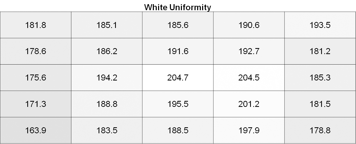
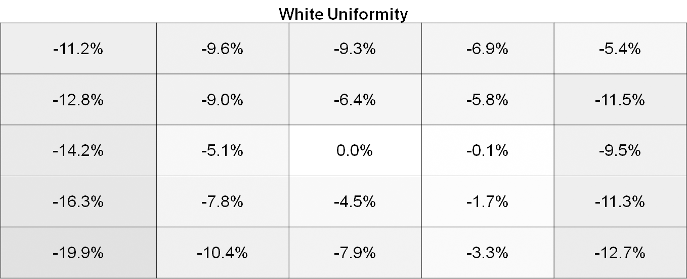
White uniformity is definitely not bad on the Philips 276E6, especially by the standards of $300 monitors. However, it's pretty apparent when using it that the left side of the display is significantly dimmer than the center. Depending on what sort of work you do this may or may not pose a problem, but for color-critical work the brightness variance is probably going to be too high.
Black Uniformity
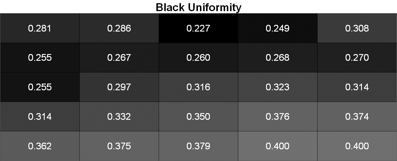
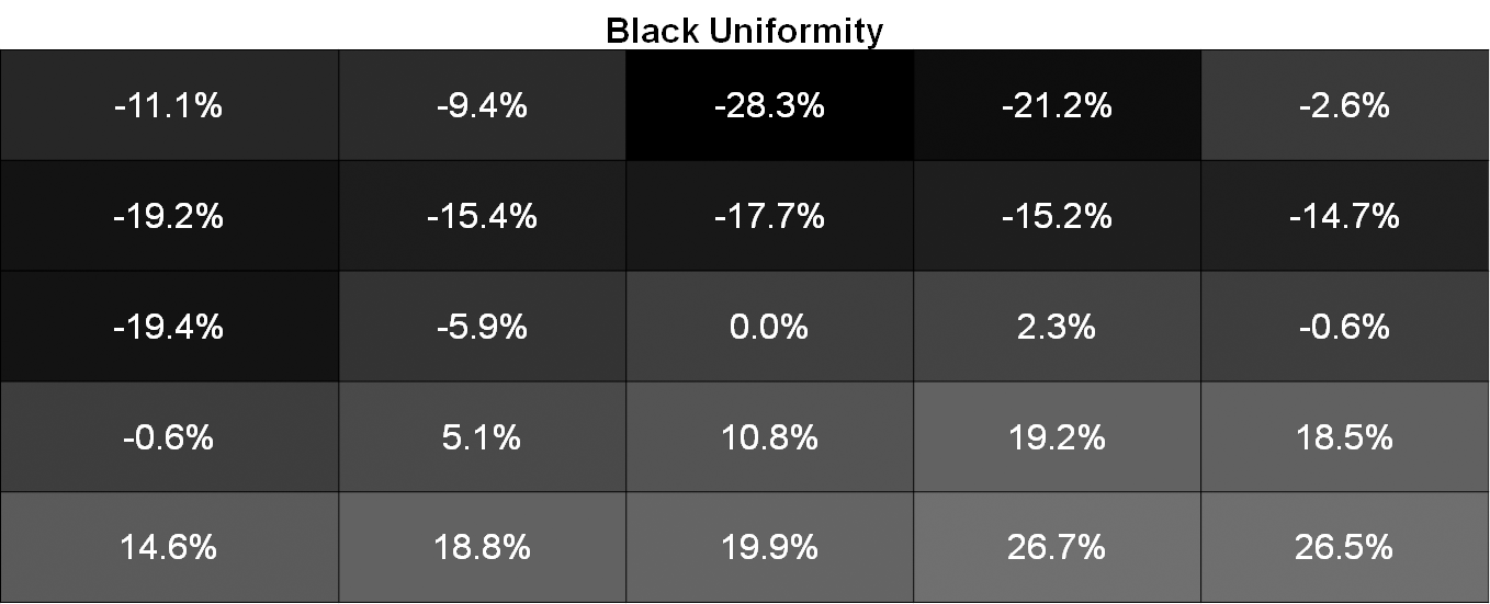
Black uniformity is a bit all over the place. If you divide the display into two sections along its right diagonal you find that the top section is darker than the center area, while the bottom section is much brighter. This is again fairly visible when using the monitor.
Contrast Uniformity
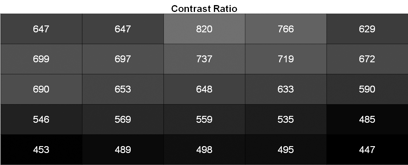
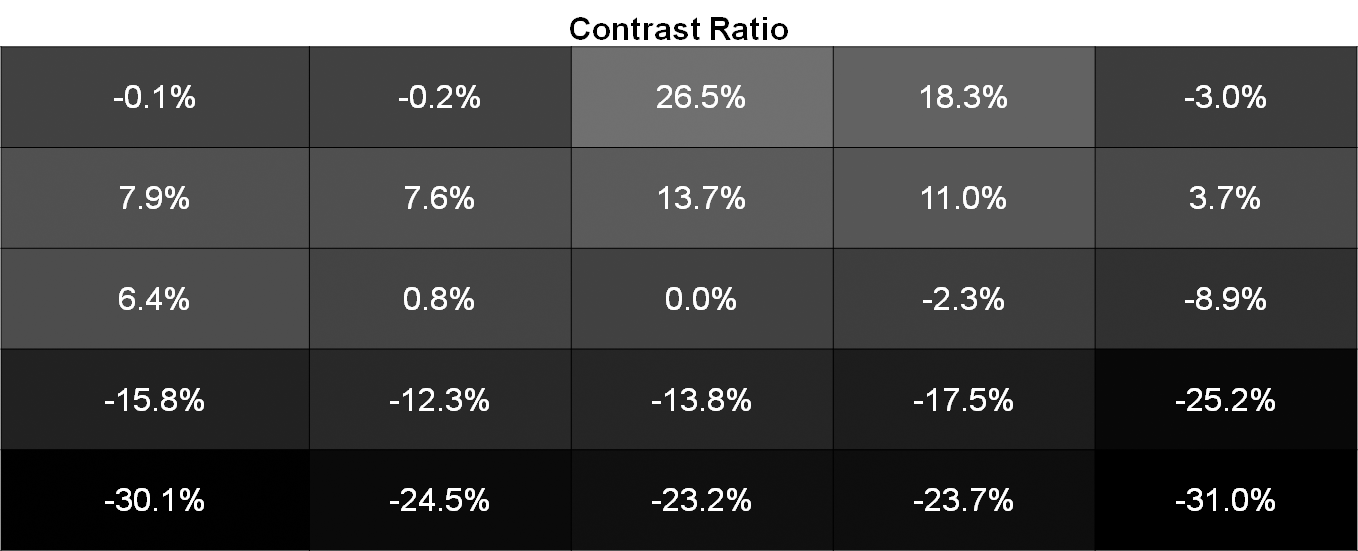
Contrast uniformity is really just a function of the white and black uniformity. In this case there's an area of lower contrast along the bottom of the display, with the rest of the display actually being fairly good aside from a couple areas along the very top. It's just unfortunate that there's so much backlight bleed at the bottom of the panel, as that's really what's causing the issues here.
Color Uniformity
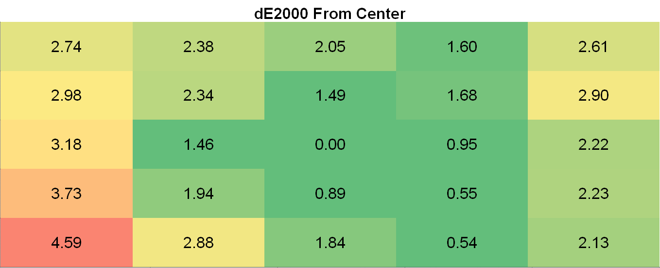
Color uniformity on the 276E6 suffers from the same issues as the brightness uniformity. This is to be expected, as if your luminance level is incorrect your colors will also be incorrect. Even when doing simple things like browsing the web you can tell that the left side of the display is not as uniform as the area right around the center, and it's quite unfortunate because as far as uniformity goes it's only the bottom left part of the panel that really hurts the 276E6's usability as a display for image and video editing.


51 Comments
View All Comments
willis936 - Friday, April 29, 2016 - link
I'm skeptical of your first claim without seeing data.As for the second that's why packages lime dispcalgui exist.
Brandon Chester - Friday, April 29, 2016 - link
Again, that doesn't help the fact that software needs to support it. I think you're confusing greyscale calibration and color management here. If there was some easy way to fix color management across all Windows programs this would not be such a long standing issue.UrQuan3 - Thursday, May 12, 2016 - link
"Cheap colorimeters are so inaccurate that they're basically useless."I'm going to have to go with willis936 on your first comment. It sounds rather like someone driving a Ferrari saying that a Mustang has so little horsepower it is useless. To the average car owner, they're both godlike. In practice, a little $100-200 colorimeter makes a large improvement on almost any monitor. Expensive calibration for expensive monitors. Of course, use the best gear when doing a review.
I wonder how you would review calibration tools? That does not sound easy.
Pork@III - Thursday, April 28, 2016 - link
Too bad against full cover CCFLAzurael - Friday, April 29, 2016 - link
It's possible to get a 27" 2K display for $300 equivalent in Europe... I've got a Hannspree HQ271HPG which even with VAT is £200. I wouldn't say it's the best thing in the world (stuck with HDMI 1.4 & DL-DVI and hiding >1cm behind a piece of glass) but it is IPS, it calibrated up nicely (to sRGB) and the backlight consistency is much better than most cheap monitors on my sample (although it does have a bit of bleed visible at the very edges on a totally black screen.)Gunbuster - Friday, April 29, 2016 - link
I know it's a cheap monitor but dear lord, did they have to make the bezel so chunky that it looks like a 22" in photos?Haravikk - Friday, April 29, 2016 - link
Why does this include a VGA port?I'd also much prefer down-facing ports, and some kind of cable management, monitors that don't include these always confuse me.
zodiacfml - Saturday, April 30, 2016 - link
Thanks for always including a tutorial and in-depth look of color management. I quite understand the challenges of the industry.You are correct that Philips should be applauded for taking the first step as this will take time to improve as OLED/AMOLED of Samsung has improved throughout the years. For now, the Philips seems useful for increasing saturation/vividness of content for entertainment.
Questions:
1) Isn't better for Philips to target a higher color space despite coming short for now (as conversion from a bigger space to smaller seems straightforward)? The Adobe RGB doesn't improve from the sRGB space in the "reds" where the most benefit from quantum dots can be had. I believe this primary color should be given attention as content to show this is widely available in photos such as flowers, sunsets, and red sports cars. I have seen too many red subjects looking flat like plastic.
2) How does color spaces Rec. 2020 and Pro Photo RGB relate to each other? They seem to have the same coverage but obviously for different applications.
zodiacfml - Saturday, April 30, 2016 - link
I did some reading and found the problem already which is color bit depth. What are the currently supported bit depths supported by video cards and monitors?Oxford Guy - Monday, May 2, 2016 - link
AdobeRGB is obsolete.