A Look At QD Vision's Color IQ And The Philips 276E6 Monitor: Quantum Dots for Wider Color Gamuts
by Brandon Chester on April 28, 2016 8:00 AM EST- Posted in
- Monitors
- Philips
- Quantum Dot
- QD Vision
Display Uniformity
While measurements taken at the center of the display are one thing, the accuracy of images across the entire panel is another. Even if you have a display that is accurate in the center, large errors relative to that may mean that the display actually doesn't show a very accurate image overall. This can cause significant problems with video and photo editing, as it's necessary to use most of your display when doing those tasks to see as much of the image as possible. To examine uniformity, I've used our standard white, black, contrast, and color uniformity tests, which are all based on the patterns from the Gretag-Macbeth ColorChecker test.
White Uniformity
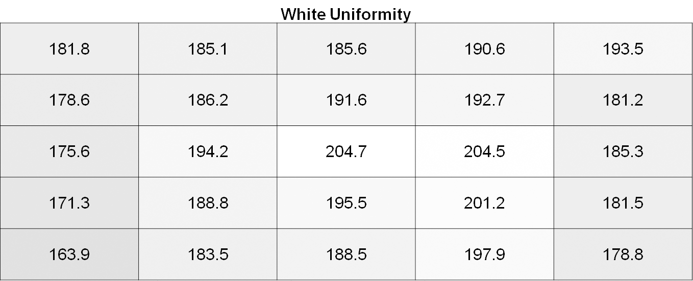
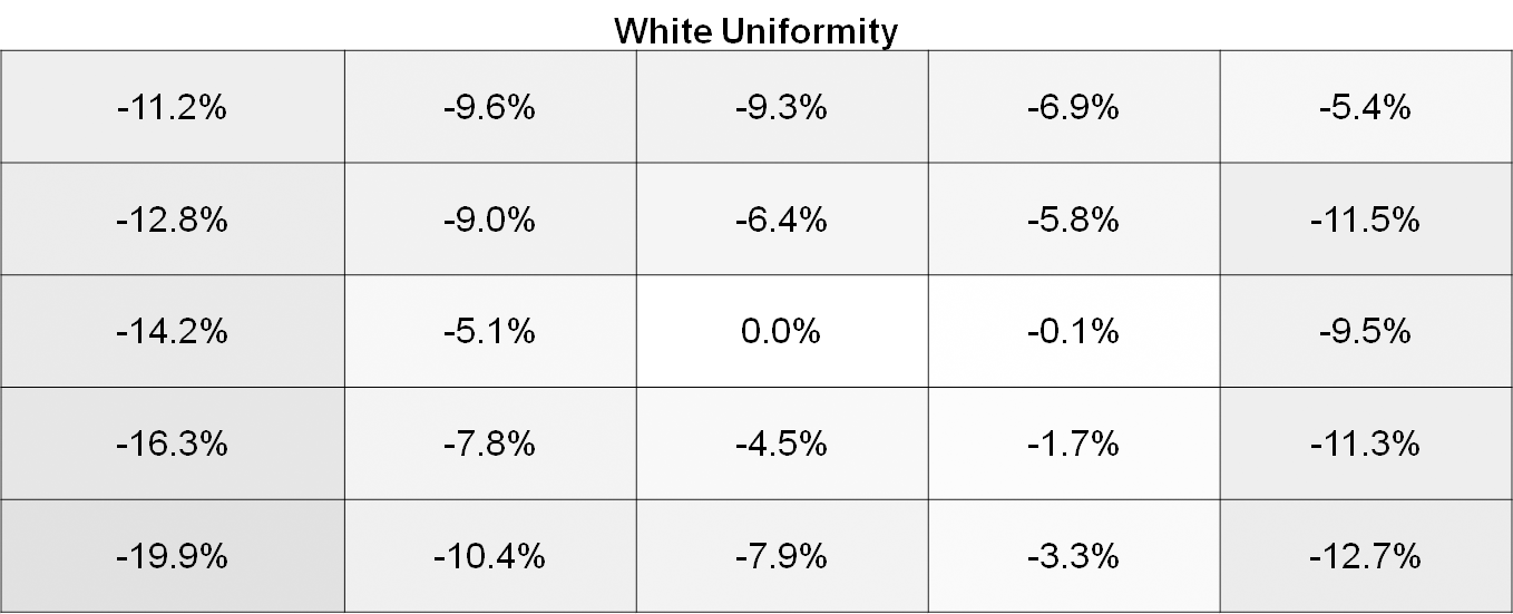
White uniformity is definitely not bad on the Philips 276E6, especially by the standards of $300 monitors. However, it's pretty apparent when using it that the left side of the display is significantly dimmer than the center. Depending on what sort of work you do this may or may not pose a problem, but for color-critical work the brightness variance is probably going to be too high.
Black Uniformity
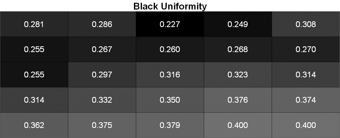
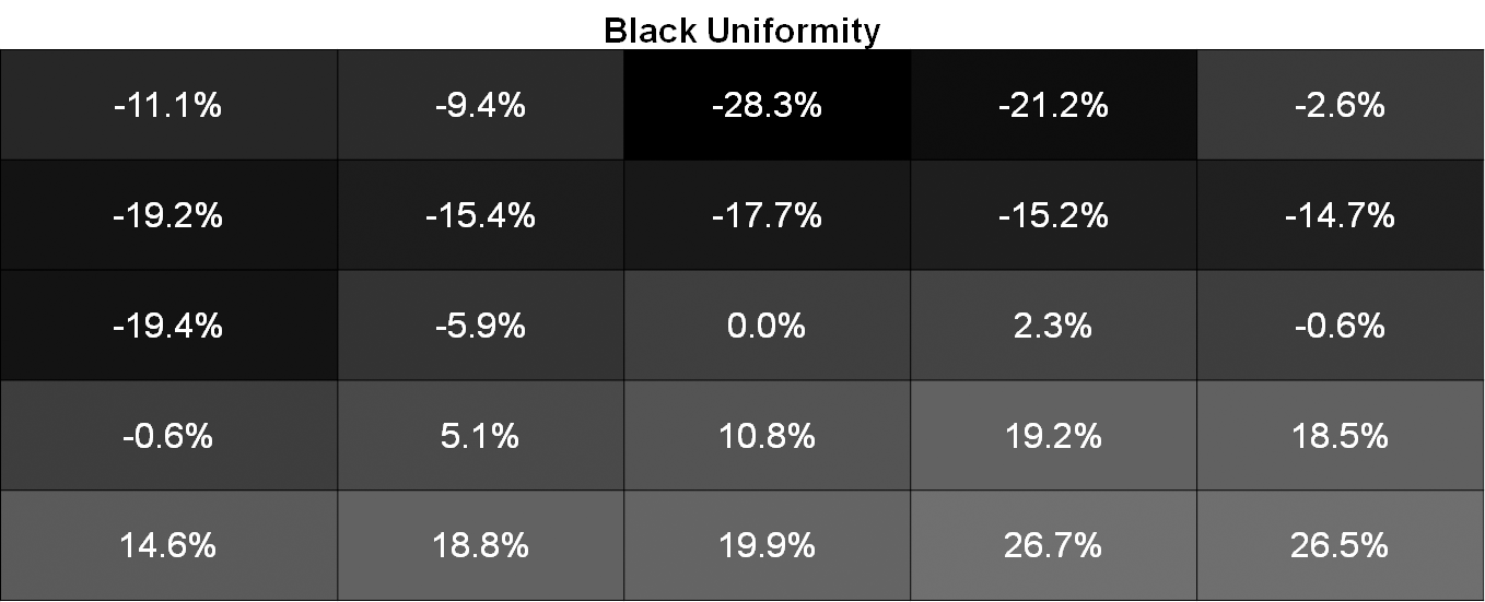
Black uniformity is a bit all over the place. If you divide the display into two sections along its right diagonal you find that the top section is darker than the center area, while the bottom section is much brighter. This is again fairly visible when using the monitor.
Contrast Uniformity
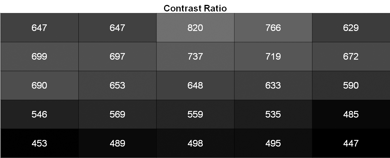
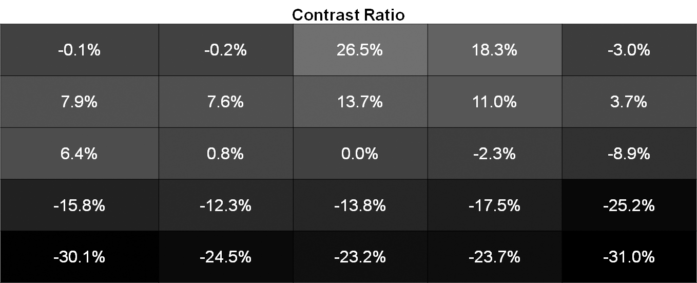
Contrast uniformity is really just a function of the white and black uniformity. In this case there's an area of lower contrast along the bottom of the display, with the rest of the display actually being fairly good aside from a couple areas along the very top. It's just unfortunate that there's so much backlight bleed at the bottom of the panel, as that's really what's causing the issues here.
Color Uniformity
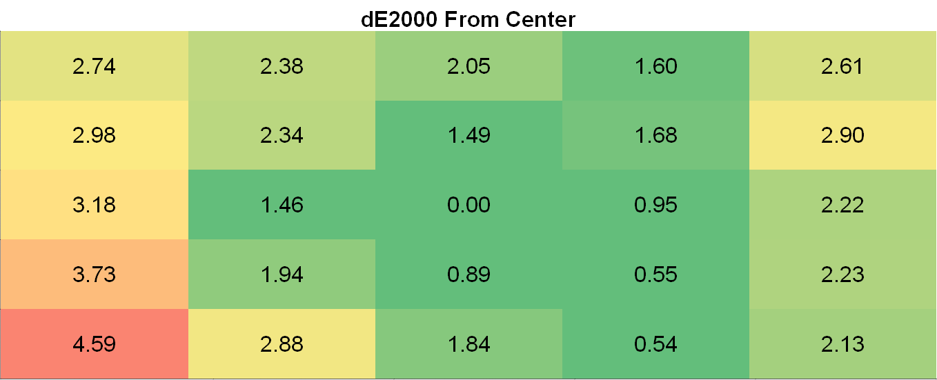
Color uniformity on the 276E6 suffers from the same issues as the brightness uniformity. This is to be expected, as if your luminance level is incorrect your colors will also be incorrect. Even when doing simple things like browsing the web you can tell that the left side of the display is not as uniform as the area right around the center, and it's quite unfortunate because as far as uniformity goes it's only the bottom left part of the panel that really hurts the 276E6's usability as a display for image and video editing.


51 Comments
View All Comments
Brandon Chester - Thursday, April 28, 2016 - link
Ryan was up very late doing some editing and must have made it when he expanded on my admittedly sparce placeholder title (Monitor Review). My apologies.Infy2 - Thursday, April 28, 2016 - link
The message of this article is for average Windows user to stay away from wide gamut monitors.Murloc - Thursday, April 28, 2016 - link
average user thinks oversaturation looks coolwatersb - Thursday, April 28, 2016 - link
Excellent. Thanks for this in-depth discussion. I know very little about color and color management.Yesterday, I was in an Apple Store and I compared wide-gamut images side by side on the new, 9.7-inch iPad Pro, the 12-inch one, and the 5K iMac. I used iconFactory's blog post for reference images. Wow. http://blog.iconfactory.com/2016/04/looking-at-the...
This is becoming a real thing for popular consumer devices. Interesting times!
theduckofdeath - Thursday, April 28, 2016 - link
The only thing I'm getting from this review is, I have a strong feeling that markets with stronger marketing regulations will soon nerf the Quantum Dot term the same way "LED" displays were a few years ago. The marketing implies that QD is as advanced as OLED while the displays clearly still use edge lighting with all of its issues.saratoga4 - Thursday, April 28, 2016 - link
The marketing on hype on QD is particularly ridiculous given that they're essentially a cost-reduction measure designed to save a few dollars on multi-color LEDs or OLED while (hopefully) being good enough.Murloc - Thursday, April 28, 2016 - link
80$ is not a few.A new thing or a cost reduction are the same thing in this case: consumers will have something they didn't have before.
saratoga4 - Thursday, April 28, 2016 - link
Going from 1 type of LED to 2 types of LED in an array doesn't anywhere near $80. The savings is much larger compared to OLED, but OLED has other advantages beyond gamut that QDs can't match anyway.name99 - Thursday, April 28, 2016 - link
I think you're missing the larger picture.Of course any technology can be cost-cut to the point where it is a joke, and Phillips seem to have done that here. OK, Phillips being stupid, nothing new there. But that's not interesting.
The more interesting aspect is that we are moving towards richer monitor technology. It started with retina (sorry HiDPI !) displays, now we're going to wider gamut. At some point wider gamut is going to move to something like 16 bits per pixel rather than 8 (or occasionally 10 or 12), along with maybe even 4 phosphors. And at some point the standard device frame rate is going to up to 120fps.
OK, so with this hardware background, it's now interesting to contemplate the SW background.
In one corner we have MS. Apparently still incapable of handling color correction after all these years, and incapable of handling the UI. Ad that to their HiDPI support. They seem unlikely to adapt well to this new world...
In the second corner we have Android. Not clear to me how much better off they are. They have handled DPI a lot better, which is a good start. As far as I know there is still no color correction built into Android; but the larger issue is one of how easily their architecture would allow for inserting color correction. Can they do it in such a way that all (or at least most) apps just do the right thing? And would it rely on the phone OEMs to create drivers and lookup tables that most of them would screw up?
In the third corner we have Apple which seems perfectly positioned for all this (meaning that they will likely drive it). They've been happy to push hiDPI (including on OSX as fast as Intel's built-in GPU's allows it ---which wasn't very fast, suggesting that maybe they'd be better off with another vendor for OSX SoCs, but that's a different issue), and they're now pushing color accuracy both on the camera side (TrueTone flash, high dynamic range sensors) and the screen side (new iPad Pro screen, presumably to spread throughout the product line as manufacturing volumes and power budgets allow).
I fully expect them to stay on this path for a while, never actually stating technical phrases like "full Adobe RGB Gamut" but constantly subtly pointing out in their keynotes and advertising "Our colors look good, and look correct, across ALL our devices --- photos on your iPhone look exactly the same on your iMac. Good luck getting that consistency with photo from your Android phone on your Windows screen."
From this point of view, then, the relevance and interest of QD technology is whether it allows larger gamut to move to iPhone this year or at least soon.
jlabelle - Friday, April 29, 2016 - link
- Apparently still incapable of handling color correction after all these years, and incapable of handling the UI. Ad that to their HiDPI support. They seem unlikely to adapt well to this new world... -such statement is not correct and the article describes it pretty clearly. Beyond the way to set it up (which, yes, is somehow confusing), the real issue is simply that many programs are not color managed.
This is not only limited to Windows and OS X is suffering of the same issue so it has nothing to do with Windows per see but the programs you are using.
The issue behind is that some default program on Windows are not color managed. It seems it is the issue with Store app (like it is for iOS apps that make iPad useless for photo editing for instance). So some important apps like Photo and Edge do not take care of that. That is a big issue.
But many programs does.
That is why there are 3 different cases :
1/ Use a screen very accurate within sRGB gamut out of the box - only use sRGB images --> no issue anymore but obviously you will never display any image beyond sRGB
2/ Use a screen with sRGB gamut (or a wide gamut screen that you switch to sRGB mode) with calibrated with an ICC profile set as default (as described) - use only sRGB images --> here, you will have perfect color accuracy for all applications color managed. In case of applications not color managed (Edge, Photo, Chrome...), you will have the color inaccuracy of the screen default (because ICC profile not applied) BUT you will not have images under or over saturated. Therefore, the impact will still be minimal for the user.
3/ use a wide gamut screen : then, you have no other choice that carefully use color managed application --> for every application color managed, display will be fine and you will take advantage of the wider gamut. For all others, the images will appear oversaturated.
It is such an issue that I used to have a wide color gamut DELL U2711 screen.
1/ first, you only have a good accuracy in color managed applications but in others, everything is oversatured.
2/ Second, while shooting FF DSLR in aRGB, I may have seen less than 10 pictures out of 70 000 where you could see in an direct A-B comparison a tiny difference between the sRGB version and aRGB. In real world, it is VERY unlikely to go beyond sRGB.
3/ Third, even if you keep for you aRGB versions of your pictures (to take advantage of your screen), you have to have a sRGB copy because when you share it outside, other people will face the issue on non color managed application that your pictures will be completely washed out. And even many online print shop only take sRGB.
At the end of the day, it is so much a hassle for virtually almost 0 visual benefit (speaking of photo of real color in the nature) that I now have a Dell U2313UH which is a sRGB gamut screen.
Bottom line : wide gamut screen currently is a chore and NOT recommended. And not only Windows, nowhere because even if your browser is displaying correctly the image (Safari, Firefox with a certain flag activated), what is the point then to have a wide color gamut screen to see sRGB pictures ?