The Apple Watch Review
by Joshua Ho & Brandon Chester on July 20, 2015 8:00 AM EST- Posted in
- Wearables
- Apple
- Mobile
- Apple Watch
WatchOS: Apps and Glances
In general, the third party app ecosystem seems to be a bit weak at this point as I suspect most developers haven’t quite figured out the model for how apps should look like and how they should work on the watch. For example, Twitter currently only shows trending tweets and a timeline. However, features like direct messages, mentions, replies, and other notifications are missing from the main application. Instead, these are solely surfaced through notifications, so if you accidentally dismiss the notification you have to use your phone to respond to such things. Even the timeline feature isn’t fleshed out properly, as scrolling through about five tweets is all it takes before you have to tap a button to load more tweets when the user shouldn’t have to worry about doing such things. It seems like a small problem, but simple things like this can have major effects on the user experience.
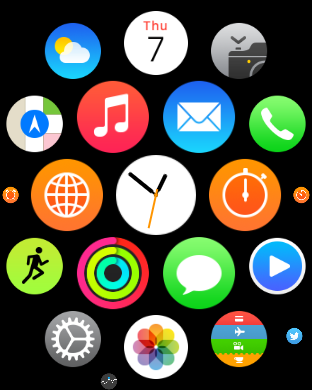
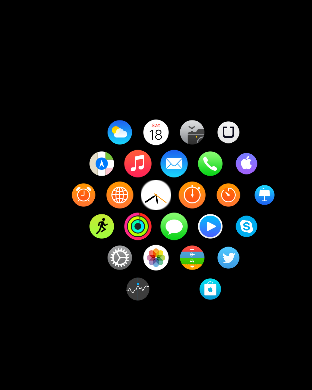
Speaking of apps, reaching the app drawer is accomplished by pressing the digital crown once, which is equivalent to the home button as pressing the digital crown twice sends you back to the previously used application and a long hold of the crown will activate Siri. The resulting app drawer will probably be a bit strange to people that are used to more conventional app drawers from operating systems like iOS and Android, but this design works well. Panning around the app drawer is simple, and it’s relatively easy to go back to the center of the app drawer if you get lost while panning around for whatever reason. It’s also helpful to be able to zoom in and out to find the right application, then zoom in so it’s possible to tap the icon on the app drawer. At first I definitely had some problems with the apparent size of the icons at maximum zoom but with time it became pretty obvious to me that the touch targets are sized well to make it basically impossible to accidentally launch the wrong application at the maximum zoom level.
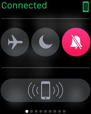
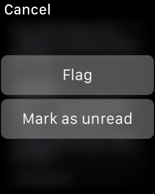
Although the app drawer is a logical place to place most applications, swiping up on the watchface reveals the glances menu, which by default will contain a quick settings menu for airplane mode, do not disturb mode, and silent mode. There’s also a button that makes the paired iPhone play the same pinging noise as Find My iPhone, which is surprisingly helpful in my experience as it’s pretty easy to just rely on the watch for notifications around the house and leave the phone in random places instead of in a pocket. Other than this panel, in practice I didn’t actually use this feature all that much as most of the information at a glance isn’t really all that necessary with the use of complications, but it’s nice to be able to use it for media controls, enable power reserve mode, and various other interactions that can be separated out from an application for quick access on the watchface.
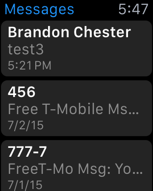
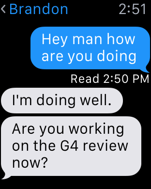
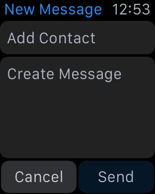
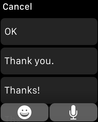
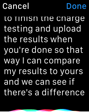
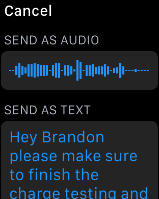
I’ve already mentioned third party applications, but first party applications are really the indicator of the potential of the watch platform at this state. The two most important applications of the watch platform are really email and messaging. When it comes to messaging, the UI is deeply familiar to anyone that has ever interacted with messaging on a smartphone, especially an iPhone. You can access each conversation with a person by tapping on their name, which gives you the conversation. Scrolling is accomplished with the digital crown, which is really far superior to touch screen scrolling because of just how valuable each pixel of display real estate is. Reaching the bottom of the list gives you an option to compose a reply, which can either be done using a list of preset messages or using Siri voice dictation. In the case of the preset messages, Apple is leveraging the same prediction engine that they have with the iOS keyboard to roughly guess what you’d want to say in reply to something.
In practice, I suspect a lot of people will be able to use this to send the reply that they were hoping to use, but I ended up using voice dictation a lot. Voice dictation for its part works well, but has its limits. If I didn’t use any obscure jargon or acronyms, Siri voice dictation is almost flawless. However, if the words I tried to use weren’t in Siri’s dictionary, it was almost guaranteed that whatever I was going to get would be wrong. So discussing dinner plans is quick and painless, but discussing anything related to AnandTech would usually require taking out the iPhone to write out the full message.


Email is similarly well-done, even if there are some limits to what Apple is able to accomplish. You’re given access to read your inbox, although it doesn’t look like there’s any ability to change the inbox that you want to read on the watch itself and there’s only folder that can be synced at any given time. Although this isn’t really a big deal as you can read all email from all inboxes as-is, it does feel like the UI would be much more full-featured if a force touching the inbox screen would allow viewing email by account and subfolders of each account like the iPhone email application.
At any rate, tapping an individual email will bring up the email or the thread of emails, and reading through the email can be done by scrolling through the email with the touchscreen or the digital crown. The same email can be opened from the lockscreen as a part of iOS' continuity feature, which is a great solution for when drafting a response to an email. WatchOS 2 should also bring the ability to dictate replies, which might be useful but will require testing to see how it works in practice.
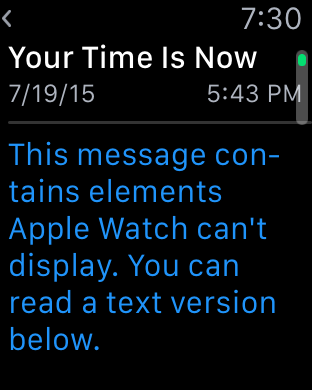
Within the inbox, scrolling up until you hit a “detent” with the digital crown will cause the email application to check for new mail, which works as you’d expect. Going back through the application is done by swiping right on the display, which is intuitive and obvious given the similarity to the iOS UI and animations used. The one issue here is that email can only be read in plaintext, which can present a lot of formatting issues in some cases. For the most part actual emails with value are easily read with plaintext, but I suspect that it would be helpful if there were a better conversion to “reader mode” for content with images or HTML in the UI for future iterations of the OS.
These are probably the hardest cases for a watch to cover, given the utter lack of a proper keyboard and no real way of providing input outside of dictation and a selection of predicted responses. For all other first-party apps, I don’t have any particular issues and design is pretty much as good as I can reasonably expect from a wearable interface. Something like a weather application isn’t really all that difficult to execute well on a wearable given that such information can be easily conveyed in a watch form factor. However, the use of Force Touch in the weather application is done well and allows for multiple different types of information like weather conditions, temperature, and the chance of rain throughout the day in addition to a ten day forecast of conditions and temperatures. Other applications like the calendar app are similarly well-executed although the month view is restricted to only the current month and the day view to the current week presumably to avoid the case where the user ends up 20 years in the past with no one-touch method of getting back to the current day.
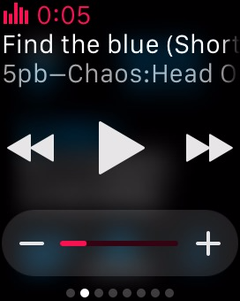
One app that translates much better to the Apple Watch's limited screen size than I expected is the music application. There are really two sides to the app. For most users it will act as a remote control of sorts for the music playing on your iPhone. Since the Apple Watch has a glance for music controls, you can easily access the now playing section of the app right from your watchface. This allows you to pause, play, and go to the previous song or the next with a swipe and a single tap. In addition, you can use the digital crown to adjust the current volume of the audio, which is a great application of the precise adjustments that the crown allows beyond just scrolling through lists.
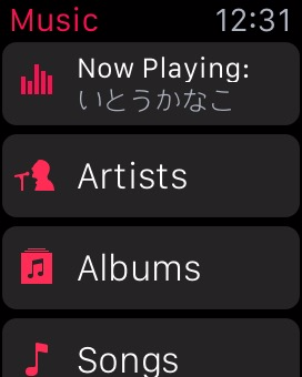
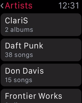
When going into the application itself, you'll notice that it's very similar to the music app on the iPhone. There's not many other ways to lay out a list of artists or albums than a scrolling list, especially on such a small screen size, but it makes the app feel instantly familiar. Swiping on the screen or using the digital crown allows you to scroll through albums or artists, and from there you can go into lists of songs and change what track is playing. I've actually found this to be one of my favorite functions of the watch, because it completely removes the need to pull out a phone, unlock it, open the music app, leave the now playing screen, and then scroll through a list of albums to find the track I want to play.
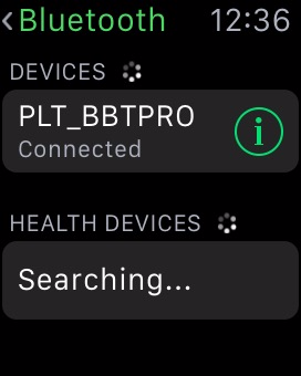
The music app is also one of the few apps that can be used while the Apple Watch is away from its companion iPhone. While it has no 3.5mm headphone jack, Bluetooth headphone users can pair their headphones with the Apple Watch, or alternatively, Apple now sells some of their own pairs as part of the Beats headphone line. In either case, when paired up with a set of Bluetooth headphones, the Apple Watch works as a stand-alone device and behaves a lot like an iPod.
When using the Watch as a stand-alone music player, there are a number of stipulations on the amount of music you can include. The first is that you can only include a single playlist. Since you can customize playlists to your liking this isn't a big deal. However, the amount of space you can use for music on the watch is limited to 2GB, the same amount as an iPod Shuffle. Alternatively, you can select a limit of 250 songs.
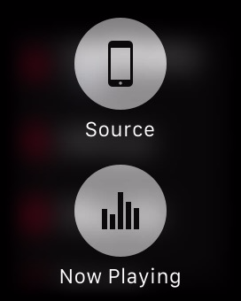
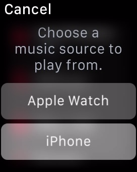
Managing which playlist syncs over and how much space you allow music to take is done using the Apple Watch app on the iPhone, which means the music and playlist you send to your Apple Watch must exist on your iPhone as well. Accessing your local Apple Watch music library simply involves force pressing anywhere in the application. Once you do, you'll be prompted to pair your Bluetooth headphones with the watch if you haven't done so by then, as there's no way to play local music via the speaker. After you've moved to your local library, you can use the app the same way you did when playing music from your iPhone, and can switch back to that mode with another force press.
I think the ability to play back local music ties in very well with the fitness aspects of the Apple Watch, as users who are out for a jog can listen to music without having to have a phone bouncing around in their pocket or strapped to their arm. For general users I don't think it will be quite as useful, as you'll typically have your iPhone with you and will have much more space to store music on that.


One Apple app that is surprisingly limited is the iTunes Remote app, which can be installed on the watch if you have the corresponding iPhone app from the App Store. While I expected it to essentially be the same as the music app but for controlling iTunes playback, it ends up being much more limited than that. You're only able to play/pause the currently playing song and go to the next track, along with being able to adjust the volume slider in iTunes. This means you can only continue to move forward through your list of songs, which doesn't give you much control over what song is playing. These limitations seem like a lack of effort on Apple's part to make the application functional, which is a shame because there's a perfectly good template for it in the music application. My guess is that engineering resources have been more focused on the continued development of watchOS and on the apps that pair with the applications built into iOS, with App Store apps being put on the backburner.
In summary, I think Apple has done a good job of integrating notifications and applications on watchOS into an interface that is sensible and intuitive. Some parts of the interface leverage existing user knowledge in order to be discovered and used, such as the notification shade that comes down from the top. Others do require a bit of discovery, but much of it is the natural exploration that any user would perform with a new device such as pressing buttons and swiping around.
The Digital Crown also has the benefit of providing a similar function to that of the home button on iOS devices, and with it having the same functions such as long pressing to access Siri it's easy for users to begin using to navigate and access parts of the operating system. Force touch provides a smart way to access different sections of an application, but in the beginning it does require some random pressing around the UI to figure out what menus it brings up in a certain app or area.
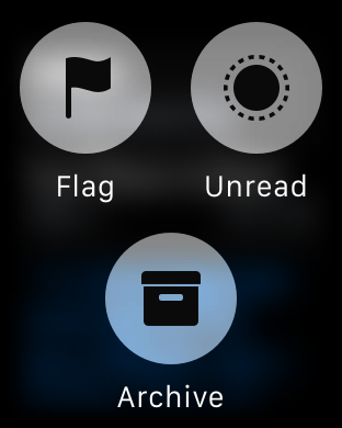
The notifications and applications themselves are also handled well, but Apple's less than optimal interface for multiple notifications for third party apps also creates certain situations where using the watch is actually slower than just taking out your iPhone. Many of the issues with the notifications and third party apps in watchOS are also a result of the current situation for third party developers. At the moment, the number of applications that support actionable notifications on the watch is very small, which means that at times the watch can serve as a communication device, but at others it just ends up being a notification device.
It's clear that at this point in time developers are experiencing a period of uncertainty as to how apps should be made for this new platform. Piled on top of that is the fact that applications have to execute all code on the iPhone itself, and are working with limited or non-existent APIs to access to hardware features like the digital crown and microphone. As developer support for watchOS increases and watchOS 2 brings developers support for native apps and greater access to the Apple Watch's hardware most of these issues should disappear, and Apple's first party applications like messages, mail, and music are great showcases for the potential of the Apple Watch and watchOS.


270 Comments
View All Comments
Murloc - Monday, July 20, 2015 - link
First!Murloc - Monday, July 20, 2015 - link
the reviewer has no hair??ianmills - Monday, July 20, 2015 - link
HAHAHAHA exactly. The apple watch is reviewed by someone who is self-concious enough to shave their arm hair. This explains why the review is so positive. Some people find self-esteem in odd places...supermoon - Monday, July 20, 2015 - link
That's just what some people's wrists look like bruh, including mine. what are you grasping at??dsumanik - Monday, July 20, 2015 - link
This entire article (photos and content) has been 'photoshopped' by apple PR. Hair and skin smoothed, bokeh added....look at how the watch is posed in the shots, it is amateur photography heavily post processed....in a lame viral marketing attempt.ANANDTECH STOP TRYING TO SELL US SH*T.
APPLE SAMSUNG CORSAIR WHATEVER
IF I WANT A COMMERCIAL, ILL GO TO THE MFG WEBSITE.
PS.
EVERYTONE IN INTERNET LAND THE REVIEWERS FORGOT TO TELL YOU THAT THIS WATCH DOES
NOTHING.
ZIP.
ZILCH.
NADA.
WITHOUT AN IPHONE.
IT COSTS $400 + AN IPHONE EASILY PUSHING THE PRICE OVER 1K.
PS
GO SEE IT IN THE STORE, ITS CHUNKY AND PRETTY CHEAP LOOKING, NOT LIKE APPLE'S WEBSITE PHOTOS AT ALL.
GO SEE FOR YOURSELF.
12K FOR THE 'EDITION' ?????????????
LOOKS LIKE IT BELONGS RIGHT AT HOME IN THE WALMART ELECTRONICS SECTION!
LOL!
navysandsquid - Monday, July 20, 2015 - link
Hate on brother lol butt hurt much its ok enjoy your droid turbo lolRyan Smith - Monday, July 20, 2015 - link
"This entire article (photos and content) has been 'photoshopped' by apple PR. Hair and skin smoothed, bokeh added....look at how the watch is posed in the shots, it is amateur photography heavily post processed....in a lame viral marketing attempt."While we do use Photoshop for editing (once you get past basic cropping, you probably want Photoshop), to be clear here these photos haven't received any significant processing. The only work we do on our photos is lens/sensor correction and auto toning.
The fact of the matter is that Josh is an excellent photographer (the best one among us, in fact), which is how he's able to pull off these amazing shots. So the fact that you think it has been heavily edited is flattering in a sense; we didn't have to edit them, we were able to take those photos naturally in the first place.
And no, no one from Apple PR has touched the photos. Or the article.
BittenRottenApple - Monday, July 20, 2015 - link
Worship the holy apple.The apple way, selling over expensive crap to stupid consumers that like to
get robbed.
This has been a disastrous launch in every respect. The iwatch is such an
ugly piece of crap, it is truly unbelievable how a company, formerly known for
its remarkable design, dares to put out such a crap ton of shit. Some
characteristics are glaringly obvious and inherent to it: over expensive,
hardly innovative, limited functionality and usability (need of an iPhone to
make it work), looks exactly like a toy watch and so on.
There are of course way better smart watches out there, especially from the
likes of Samsung, Sony, Motorola, Asus, LG, simply put, there is no need for
another piece of over expensive junk.
Regardless of what the casing and strap are, it's still maybe $8 worth of electronics at best, a painfully tiny screen, awful battery life, absolute dependence on an iPhone for proper function, and in reality adding extra time to decide if the message your phone just pinged your wrist with is worth pulling the phone out for to reply with.
The smart watch is a dumb idea in its current form. The Apple icrapWatch (tm) with its "Wealthy - Rich - Look how obscenely rich I am" case material tiers (seriously, the upgrade from plastic to red leather band is $7k? Not even a gold band available to justify that $17k price?) is the ultimate expression of that.
Maybe in 5 years or so a transparent OLED screen over a traditional watch with these sensors to pop-up notifications long enough to be noticed but not need to be charged every two hours is when it'll make sense, but for now it's a useless gimmick that nobody really needs.
Let's face it, the Apple Watch is a total and utter failure. The one called Sport edition doesn’t even has a dust, shock and water resistant exterior and thus fails in nearly every "sports" related usage scenario, albeit still costing nearly as much as an iPad, or, you know, a real watch, which works for years to come.
And the luxury one? Oh god, 17k+ for this utter crapicious experience. If you’re a millionaire, donate that 17k+ to the EFF, the communist party, an union or consider that such an amount of money could save lives in many third world countries or help to preserve nature. Besides that, it doesn’t even look that luxurious compared face to face to Rolex standards, more like some sort of ugly, chubby toy enclosed in a thin, and tiny gold case. The functionality provided, if one even dares to call it that way, are utter crap too, nothing new, nothing exciting here, nothing Samsung, LG, Pebbles haven't been offering for years on a far superior basis. For example the Pebbles watch which costs
less than 79$ and has 8 days of battery life, shows many of the notifications and info someone might need, all the while being water and dust proof, with changeable wristbands. Seriously, fuck this overpriced, environmentally obscene, eco terroristic icrapWatch (TM).
Yet another fine addition to the long list of "Terrible Products Apple Makes to Gouge Money out of People".
The new icrapWatch (tm) is a testament to Apple's collapsing technical acumen. They eliminate all ports providing no cable based connectivity at all? This craven stupidity should send the last adherents running. But running to what? Windows isn't even a viable option anymore, since it now is the most widespread commercial NSA gathering tool available, closely followed by Android, iOS and OS X.
It's a sad day for people who need real smartwatches. Jony Ive is a pompous, clueless hack who should be fired and shot on the spot (or torn apart by a horde of rabid dogs) for introducing crippling regressions like this one.
Look at this POS: No USB port, which won’t require an adapter to do anything. So if you aren’t going to require an adapter anyway, why not make that nonexistent port a modern port one: Thunderbolt. Thunderbolt can carry USB, video, Ethernet, external storage... ALL AT ONCE. And it can be daisy-chained, which would be hugely important when the icrapWatch (tm) would have ONLY ONE PORT. So WTF is Apple doing in not making its nonexistant port into a thunderbolt port?
And again, are you kidding me? No thunderbolt connector? Now every sorry user of this pos doesn’t have to find a thunderbolt to USB C, a USB C to USB to HDMI, a USB to USB 3.0 period, a USB C to USB connector for apple’s time machine and also does not manage to don't short circuit all that with the AC/DC to USB C connectors, seriously ? Not worth 200$ new pile of hairy connectors for the brand new icrapWatch (tm), and that is called a revolution nowadays? No ********** way, the Pebbles is way superior, period.
By the way, they're perpetrating no connectors at all. Thunderbolt is a much-needed step to a modern I/O standard. No connector is an outdated, abused standard that was designed primarily for Rolex watches. It's not suitable for external storage, video, or anything else requiring bulk data transfer with minimal CPU overhead. A nonexistant connector at all is a regression, a major step BACKWARD.
Starting at $349.00----Less than $8.00 worth of hardware = ~$341.00 premium to use icrapWatch OS instead of windows. (Honestly the most expensive component of this icrapWatch (tm) is probably the screen.)
Anyone with real work to do will not even be able to buy this thing. My friend’s last Air was neat in that it was small and lasted all day, but it was so under-powered, it was frustrating. I can only imagine how limited this machine will be.
Who cares about price, weight and size, when this product is crippled by a hopelessly defective design? You can't hook up a power adapter and external storage at the same time. You can't hook up an external display and external storage. Hell, you can't even plug in a thumb drive!
This product is the most asinine piece of shit Apple has produced, and that includes the (thankfully) short-lived Shuffle that could only be controlled by a gimped Morse code.
$270 less gets you the new Pebbles which will eat the crapWatch's lunch.
If you need to do a lot of processor intensive work, than you would not even go near this thing. It would be useless to you. If you need to crunch spreadsheets or are heavy in corporate analysis, this icrapWatch (tm) would also be useless to you.
This is the kind of icrapWatch (tm) that Apple sells a lot of. This icrapWatch (tm) is largely useless for anything other than email and facebook. It cannot store many files, it cannot process much information, and it has no external port. There is nothing wrong with using this icrapWatch (tm) for casual tasks, but it is CERTAINLY not a productivity machine.
It is what it is. A status symbol/statement. Or some other statement. A statement that you just bought a $349 or icrapWatch(tm) with a $341 or more case so you can show off in front of your hipster isheep friends.
I hate to stick to Apple only facts here, but Apple said that the current Samsung Smatwatch is 24% thicker than this new icrapWatch (tm). That does NOT mean that the new icrapWatch (tm) is 24% thinner than the current Samsung Smatwatch , it means that it is ~20% thinner than the current Samsung Smatwatch. They clearly phrased it that way to make it sound more impressive and hence dupe the consumer, aka stupid isheep.
So, it's a toy watch plus with a display and no over expensive dongle so you can’t do everything a Pebbles can do, at more than four times the price while looking posh.
And here I thought technology was about function over form. I get it, functional art; art I can do things my phone does, but in a space that anyone can see me doing it, stylishly. Crippled and non standard in-house branded "business" software does great, can't do anything really artistic on it except maybe GarageBand or stock filter photo edits to my innumerable selfies, but it's got that partially eaten fruit on the back that screams "money I'm too stupid to keep or invest wisely."
Take my money!
I wouldn't hold my breath.
This is apple's marketing strategy: mind-numbing markup on dirt-cheap, mediocre icrapWare (tm). They throw together a cheap little toy like icrapWatch (tm), pretty it up with silver or gold paint, and ride the wave of ignorance, outrageous markup, and marketing that they've been using as a business model for many, many years now. The only thing Apple has ever made that's less worthless than all the other crap their conspirators like Hon Hai Precision Industry Co., Ltd excrete all day and night by taking advantage of child labour are iOS and OS X which, besides being notoriously crippled and constrained walled gardens, aren’t even worth the hassle unless you also dumped thousands of dollars into other apple products.
Many apple owners I’ve encountered never stop trying to belittle and demean others because they don’t have a Macbook or an iPhone (or an icrapWatch (tm) for that matter) and then try to act like their overpriced apple products are overall better when they are certainly not, by any standard.
Luxury cars, while still worthless crash grabs, usually offer some quality and features that are actually somewhat superior to cheaper competing vehicles and models.
icrapWatch (tm) such as this start already expensive as hell with little performance to warrant such outrageous costs. Apple isn’t the luxury car of anything. It’s the luxury car DESIGN with a 4-cylinder under the hood and a tape-deck in the sound system, all with the price tag of "luxury". They sell laptops made cheap in china, using child labour and the same hardware you can find in SO many other laptops, slap their OS on it, put it in a thin case, and then markup the price by 300% to 600%. These are the facts. This icrapWatch (tm) in question is nowhere NEAR worth that kind of money. I mean, smartwatches in general are overpriced, but apple has made their entire business model out of extreme markups backed by clever marketing with little actual technological superiority of any kind. Every single apple product on the market can be outperformed in every way by comparable products. Apple icrapWatches (tm) can be outperformed by smartwatches that are FAR FAR cheaper while relying on older tech. The only thing that apple has that nobody else does is OSX and iOS, their operating systems. These are mediocre operating systems, but they are literally designed to be limited on anything it determines to be "non-apple hardware". Other operating systems can be installed on just about any computer you can slap together, whereas OSX is specifically and deliberately designed to be non-functional on ANYTHING that isn’t made by apple. It’s nothing but a cash-grab.
Apple is indeed playing run-of-the-mill capitalism, they try to capitalize on the ignorance of the average consumer with marketing campaigns designed to make you assume you're getting your money's worth.
There are millions of consumers who are on the fence, who are actually interested in buying something that's worth the money they spend. Those people deserve factual information and do not deserve to be exploited for their ignorance on the topic. So excuse me if I have a problem with it. College students especially, who don’t have a lot to spend in the first place, are being taken advantage of in every area of their life. Buying a smartwatch should be one less area of exploitation. This is why I have a problem with apple and with many other companies and services that attempt to capitalize on ignorance.
Years down the road when the batteries in this model are dead and you have to keep it plugged in just to use then you'll have no way to plug in a flash drive or an external hard drive. I don't care how sexy it looks: sometimes and more often than not less means a serious lack of functionality.
We can only hope that consumers send this piece of diabolic garbage to oblivion, as they did the idiotic iPod Shuffle that could only be controlled with Morse code over a proprietary headphone wire.
The Apple Iphone 1 and Ipad 1 might have been innovative at their time,
but since then, the bitten apple has been continuously rotting from the inside
outwards, always swarmed by millions of Iworms which regale themselves with its
rotten flesh, not forgetting all other Americans who support apple by means of
their tax dollars to finance its bought US Treasury/Government bond interest rates.
Last but not least, every Apple product includes a direct hotlink to the NSA,
free of charge, something that might make it a good value, after all.
Ceterum censeo Applem esse delendam.
twanto - Monday, July 20, 2015 - link
"There is nothing wrong with using this icrapWatch (tm) for casual tasks, but it is CERTAINLY not a productivity machine." I was really hoping it could handle some spreadsheets and a bit of 3D rendering, but I guess not.This post was either satire or the greatest literary achievement by someone with a bonus chromosome 21.
Schickenipple - Tuesday, July 21, 2015 - link
Word. If you are trying to create spreadsheets on your watch, or any screen that small, you are an idiot.