The Android 5.0 Lollipop Review
by Brandon Chester on December 1, 2014 10:00 AM EST- Posted in
- Smartphones
- Android
- Tablets
- Android 5.0
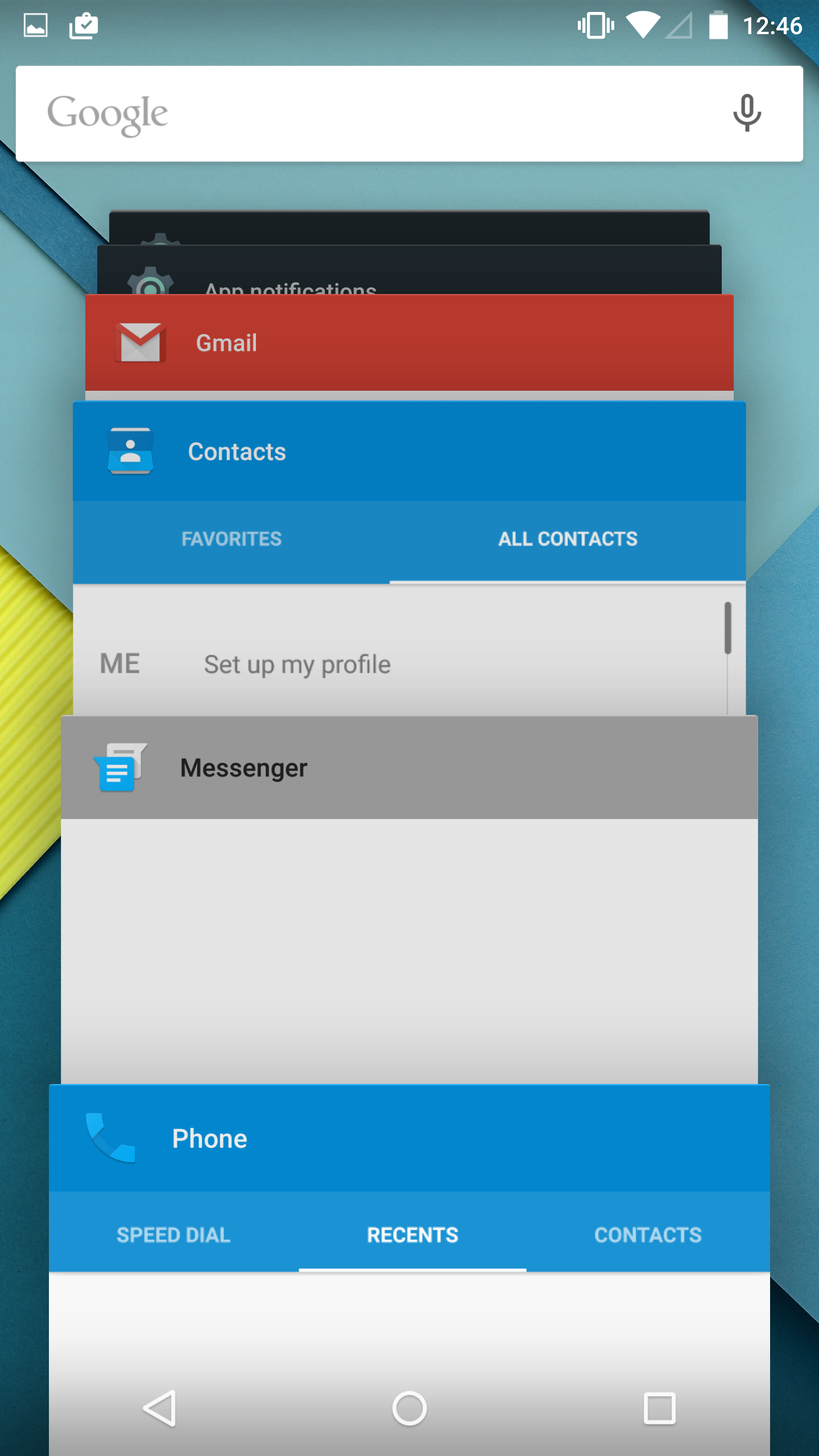
Notification Drawer
Android was the first of the major smartphone operating systems that we have today to implement the idea of a Notification Drawer. The idea of a screen to store all notifications that can be accessed from anywhere is something that both iOS and Windows Phone 8 have borrowed from Android. Although today it seems like the utility of such a design should be self-evident, it clearly was not, as iOS had previously resorted to intrusive alerts that displayed in the middle of the screen and interrupted the user. The designers behind Android's Notification Drawer certainly deserve a lot of credit for improving the state of notifications on mobile devices. In Android Lollipop the Notification Drawer has been redesigned to display like a list of cards, and has been simplified to include the quick settings page alongside the notifications themselves.
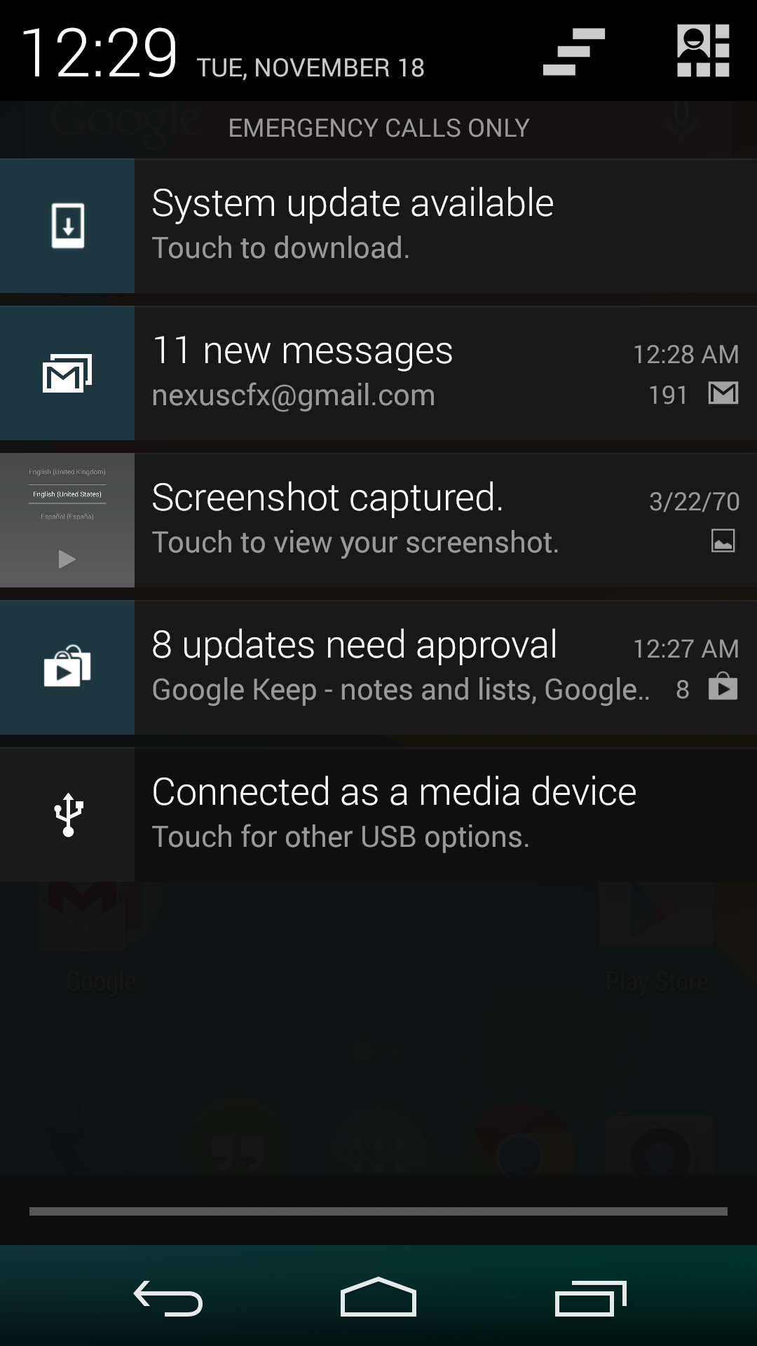
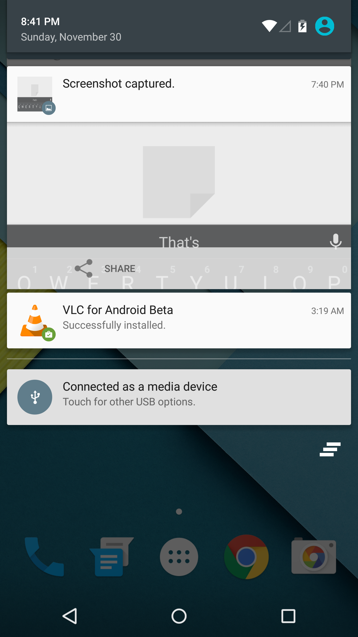
I never quite understood the animation for Notification Drawer in previous versions of Android. If you pull out the drawer in a desk, the first objects you see will be the ones that are closest to the side of the drawer with the handle. This is how the animation for pulling down Notification Centre on iOS functions. But on Android, pulling down Notification Drawer was like pulling down a magic bar that revealed notifications from top to bottom, as though they were already there and the bar somehow revealed them as it went over them. It just didn't really make any sense. In Android Lollipop, Google is clearly displaying each notification as its own separate card, and pulling down the drawer causes them to all expand and slide out from one another. Now it's not much of a drawer, but it's an extremely intricate animation that looks amazing and fits in perfectly with the Material Design aesthetic.
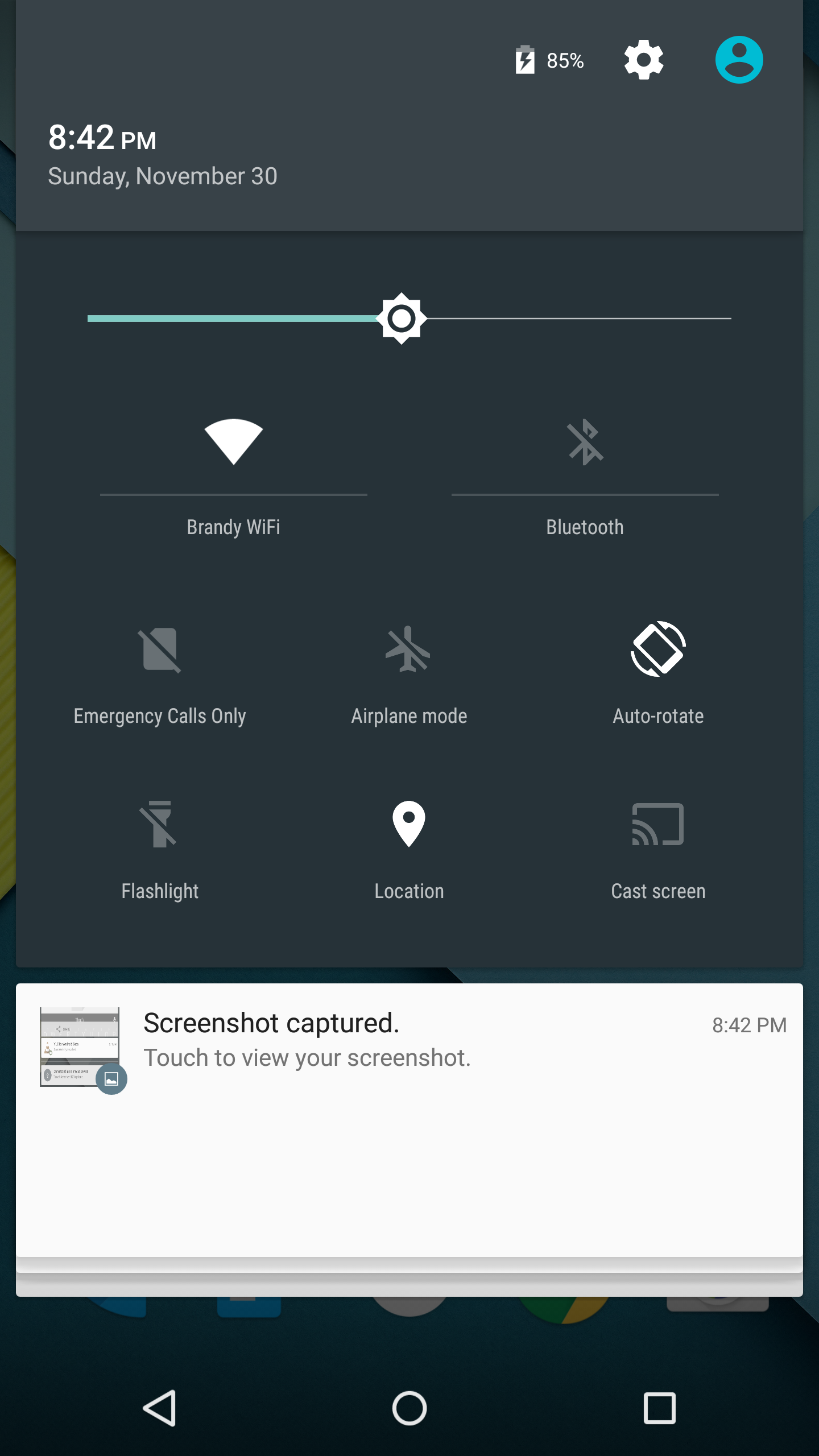
As you'll see above, the quick settings have been integrated into the same section as the notifications themselves. It's now accessed by simply swiping downward a second time after bring down the drawer. I think this works much better than the separate pages that Google was doing previously, which felt more like a way to just throw in quick settings without having to change the design of the drawer beyond the addition of a button. For the most part the settings are the same, but the brightness control is now a slider that can be accessed without having to press anything, and there are a few additions like the Cast screen and Auto-rotate toggles. Google has also finally included a built-in flashlight feature, which may not be welcomed by the developers of ad-ridden flashlight applications, but will certainly be welcomed by users.
The last thing to take note of is the icon in the top right corner. This would normally have your Google avatar, but in my case it's just one of the generic contact icons. Tapping this brings you to the menu where you can add, manage, and switch between multiple user accounts, which is a new feature for phones running Lollipop.
Overall I'm very happy with the new Notification Drawer. It looks better and does more than its previous iteration. My only issue is that it seems that the button to clear all notifications that appears beneath the last notification will not show up if there are too many cards. Swiping upward collapses the list of cards, allowing it to be displayed, but I think Google would be better off just putting it back up top where it was previously so it can always be shown.
Recent Apps
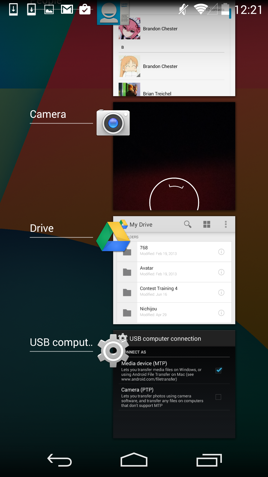
Like the Notification Drawer, Recent Apps also receives a design overhaul in Android Lollipop. What was once a list of square application previews is now something like a stack of cards which displays the full view of every application, although the perspective limits your view to the upper half. The new design also works well with the new animation when accessing it from within an app, which shows the application falling down beneath the navigation buttons and becoming the first card in the stack.
Functionally, it works the same as previous versions of Android for the most part. There is one significant change, and it's specific to Google Chrome users which I would expect is a sizable portion of the Android user base. In Lollipop, tabs in Google Chrome now appear as separate cards in the Recent Apps switcher. This is an interesting move on Google's part because in a way it knocks down a lot of the segregation between native apps and web apps, as web apps will be displayed in the list along with everything else. The only downside to this feature is that it can make it hard to keep track of tabs, and I've actually disabled it in the settings section of Chrome in favor of having the tabs within Chrome itself because I simply have too many tabs open at a single time to have to search for them among every recently opened application.


126 Comments
View All Comments
nevertell - Monday, December 1, 2014 - link
And no comment on the move to 64 bit target platforms ?Brandon Chester - Monday, December 1, 2014 - link
That's just a result of the move to ART. I didn't want to just carbon copy Andrei's article, but it's linked in there and it's definitely worth the read.Maleficum - Friday, December 26, 2014 - link
It's the other way around: Android absolutely needs AOT-type compiler (ART) to decide between aarch32 and aarch64 prior to starting the process. If an app contains even a single JNI call to an aarch32 subroutine, the whole app HAS TO be compiled to aarch32, because no mode switching is allowed within a process.Your saying "apps are primarily written in Java" and Andrei's article are also misleading in just stating what Google claimed: 85% apps are written in Java.
Google most probably isn't lying with that, but the fact is: most TOP apps AREN'T written in Java.
I once checked top 25 apps in the US store: only two of them were written purely in Java.
What this means? 64-bit will remain just a gimmick on Android for the upcoming 4 years thanks to the fragmentation.
For 64-bit NDK apps, the devs HAVE TO set Lollipop as the minimum requirement since it REQUIRES AOT.
And will they do that? You know the answer.
OreoCookie - Monday, December 1, 2014 - link
Also, it seems much less clear whether and how much of a speed boost you actually get (as evidenced by the benchmarks run on the Nexus 9 where basically there is no difference between running Android in 32 and 64 bit mode).Krysto - Monday, December 1, 2014 - link
And what benchmarks are those? So far all the benchmarks I've seen are done in the 32-bit mode.kron123456789 - Monday, December 1, 2014 - link
Geekbench 3, for example.Martuv93 - Monday, December 1, 2014 - link
I haven't seen anyone do an AArch32 vs AArch64 showdown on Android yet.The Denver CPU is also a very weird thing so it might not benefit from the move to AArch64 in the same way for example the Exynos 7 Octa will.
kron123456789 - Monday, December 1, 2014 - link
I'm not even sure that Exynos 7 Octa will support AArch64))http://anandtech.com/show/8537/samsungs-exynos-543...
And, yes — Exynos 7 Octa and so-called Exynos 5433 are the same SoC.
garretelder - Thursday, December 4, 2014 - link
Good news! Now it's about time to upgrade to a TOP phone (see rankings such as http://www.topreport.org/phones/ for instance).extide - Friday, December 5, 2014 - link
Almost the same, the Exynos 7 does not have AArch64 disabled, like the 5433