Microsoft BUILD: Windows 8, A Pre-Beta Preview
by Brian Klug & Ryan Smith on September 13, 2011 12:05 PM EST- Posted in
- BUILD
- Windows
- Microsoft
- Windows 8
- Trade Shows
The Metro UI Continued
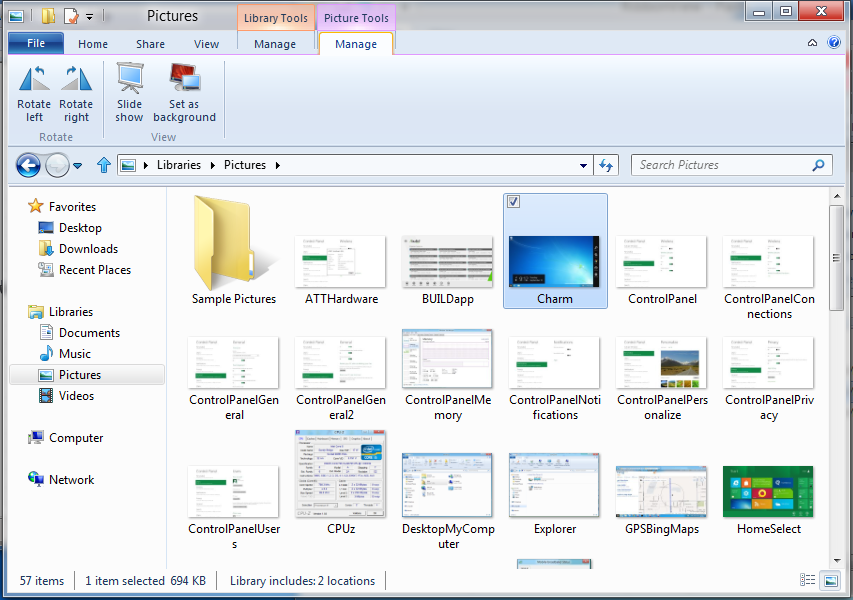
Next up is the control panel, which doesn’t entirely supplant Windows’ traditional control panel, but instead offers high level features in a Metro-friendly interface. The left side scrolls up and down and exposes categories, the right side serves as the interaction area for playing with all the toggles.
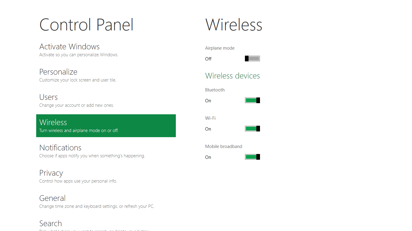
Interesting settings inside the control panel are things like privacy toggles for location services, which is akin to what we’ve seen on virtually every mobile platform, notifications through the push notification service which no doubt bears similarity to WP7, toggles for the onscreen keyboard (more on that later), and more. Under General are two new features - Refresh your PC, and Reset your PC.
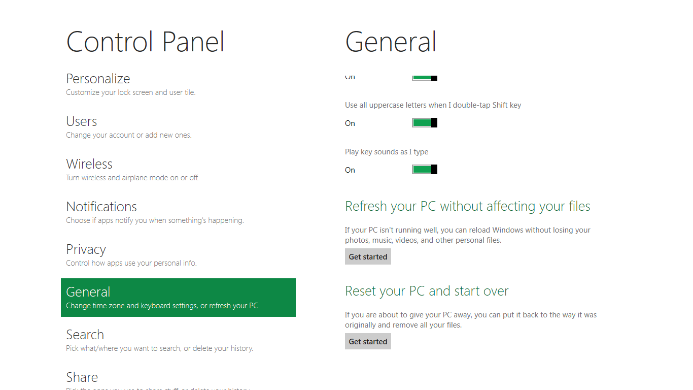
The second is reasonably self explanatory, it resets the entire OS to its original shipping state using a built-in recovery partition part of the install. The first is a bit more interesting, as it restores Windows and configuration settings while leaving user-specific files like photos, music, and videos intact. Microsoft has noted that this option leverages the management tools used for imaging PCs in an enterprise environment, but now in a desktop setting.
There’s also a category marked ‘devices’ which is the settings pane for controlling peripherals like printers, human interface devices, and TVs. It doesn’t replace the device manager, but acts in practice as a high-level one for the devices that are used by the Metro/Start interface. At the very bottom is ‘more settings’ which literally takes you back to the old Windows 7 control panel.
This is the start menu, so just like in Windows 7 and Vista, you can simply start typing to get an immediate list of files and applications that match the string. Results are categorized into one of three bins - apps, settings, and files. Of course you can also just type the application name and hit enter like previous editions of Windows.

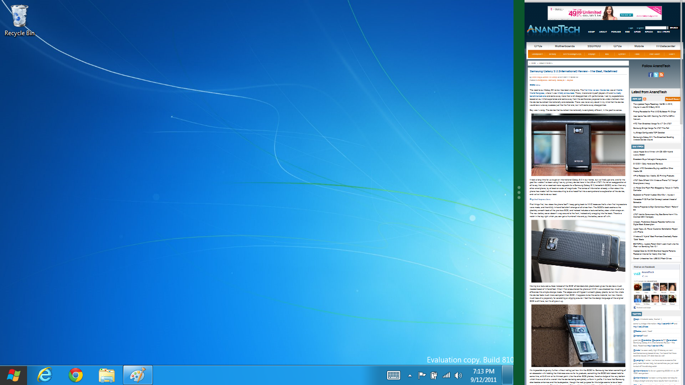
That really brings me to where the real windows desktop “lives” in Windows 8 right now, and there are a couple ways to invoke it. The first is that when a traditional desktop application is launched, either through a tile or search result, the Metro UI disappears and gives way to a Windows 7-esque desktop environment. The second is either by using the Windows Explorer or Desktop tiles, and the third is by good-ol Windows+D. Any of these get you to the desktop so to speak, which at this point looks almost exactly like Windows 7. There’s a good chance this isn’t finished yet and is going to change soon, but for now things look very familiar.
Down in the bottom left is the Start button, which gets a new look, and tapping or clicking here brings you back into the Metro start screen. It was at this point that things really occurred to me - the new start screen completely replaces the Windows 7 start menu in its entirety.
I’m reminded after seeing a lot of Windows 8 of two things. It’s almost like Windows Origami experience for UMPCs, but crossed with Windows Phone 7’s Metro design language and fluidity, all while retaining the desktop layer underneath. The question is whether Windows can successfully tailor itself to so many different form factors and retain the desktop power that users need and expect.
The last new UI elements we’ve been shown belong to the desktop part of the OS. These two features are the freshly included explorer ribbon and new queued copy dialogs.
The new Windows 8 explorer window includes two modes. In collapsed mode, the window is essentially the Windows 7 explorer pane, with the inclusion of an up a directory button and simplified bottom pane.

With the window expanded however, the ribbon appears. It’s starting to make sense that the ribbon really accommodates a touch-centric workflow, where right click is cumbersome or impossible. In its stead, controls in the ribbon are the one stop shop for file management.
There are also some contextual elements that pop up as well, for example when dealing with a .zip, compressed folder tools appears, and when photos are selected, picture management tools appear. For now the Ribbon isn’t mandatory, and the ability to collapse it up and retain valuable horizontal space should assuage the concerns of hopefully at least some of its critics.
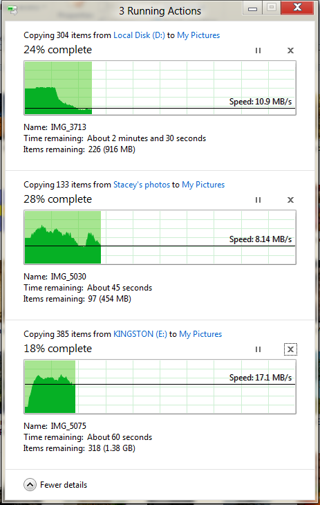
The next major explorer change is the new and improved file copy dialog, which gives an optional detailed graph of copy throughput, and the ability to pause, resume, or stop file copy actions. We've only just started using this build and need more time to really play with larger file copies, but thus far the functionality does work and is welcome.


235 Comments
View All Comments
martin5000 - Tuesday, September 13, 2011 - link
I'm try to like metro, but I can't. I just hate it.futurepastnow - Tuesday, September 13, 2011 - link
Sadly, I agree. I hate this. I look at the Metro tiles, and imagine them on my 24" non-touchscreen desktop display, and it makes me sick to imagine using my computer that way. People described the more colorful Windows XP theme as "Fisher Price" when it was new, but this really is like a computer for toddlers.I like almost everything I've read about Windows 8- the new file copy window, the technical improvements. But I want the desktop and only the desktop. If I can't disable Metro- and I mean 100% never-have-to-see-it disabled- then I'm not using this on a desktop or laptop PC. It makes sense on tablets. Nowhere else.
crispbp04 - Tuesday, September 13, 2011 - link
Live tiles are 1000x more useful than static windows 3.1 style icons. You're resisting progression. And as stated below it's just a shell. Microsoft always supports those who resist change, hence being able to upgrade from windows 1.0 through windows 7 and run the same 25 year old applications. You'll love and embrace windows 8.Ratman6161 - Tuesday, September 13, 2011 - link
If you multitask heavily (I currently have 13 different windows open) those tiles are going to spend the entire day hidden behind other windows aren't they? I don't even bother with background images on my system since I rarely see my desktop anyway.I think the task bar at the bottom of the screen showing all my open applications is far more useful than having to go back to the desktop for things.
In the past, Microsoft came under a lot of fire on mobile devices because people said they were trying to cram a desktop interface into a phone or PDA. Now they are making the same mistake in reverse - trying to make a desktop look like a phone.
I'm with futurepastnow - this will simply not work for me for the work that I do.
Alexvrb - Tuesday, September 13, 2011 - link
Then don't use it. Windows 8 still has Explorer. Turn Metro off.DeciusStrabo - Wednesday, September 14, 2011 - link
That's just it. You can't. It's starts Metro, and Metro in turn is your Start Menu and Launcher. Metro _is_ the Explorer. Literally. Metro resides in explorer.exe.I love the Metro UI. For mobile devices. For a desktop? It's more harm than use.
piiman - Wednesday, September 14, 2011 - link
According to MS you can turn it off.BenDTU - Thursday, September 15, 2011 - link
At least in the developer preview you can't. There's no option to do so. Metro is your start menu.Wraith404 - Thursday, September 15, 2011 - link
To Disable the wretched Metro failure, I mean feature:run regedit from the developer command prompt.
HKEY_CURRENT_USER\Software\Microsoft\Windows\CurrentVersion\Explorer
set the key RPEnabled to 0
LoneWolf15 - Thursday, September 15, 2011 - link
THANK YOU.(I never use all caps, but this time, emphasis was necessary)