Nexus S and Android 2.3 Review: Gingerbread for the Holidays
by Brian Klug on December 14, 2010 4:08 PM EST- Posted in
- Smartphones
- Samsung
- Nexus S
- Gingerbread
- Android 2.3
- Mobile
Android 2.3 - Gingerbread
With NFC out of the way, the next major thing which makes the Nexus S special is, of course, Gingerbread. As an aside, what an apt codename for Android 2.3 given its launch just weeks before the holidays. The new version of Android brings a ton of new stuff to the table and smooths over a few rough spots, so let’s dive in.
User Interface - Lots of Contrast
First up is the most obvious change from 2.2 (Froyo) to 2.3 (Gingerbread) - UI changes, a significant change in iconography, and a number of speed improvements. Probably the most striking UI change is how much black there is everywhere, starting with the notifications bar. The background of the notifications bar is completely black, and the cellular connectivity and WiFi connectivity icons change colors.
Green indicates an active connection to Google services for syncing your google account, and grey indicates no connection. When you connect to data or change your data connection, there’s a brief transition period when the icons are grey (as expected) due to the loss of connectivity. It’s just a bit confusing at first since the icons never did use to change color. The AM/PM suffix is gone from the current time, and the icons are simplified to be just grey on black. Overall, it’s a vastly more attractive, high contrast look which potentially improves battery life on AMOLED devices.
Pulling up the menu on the home screen also reveals some changes. The menu window is transparent like it was with Android 2.2 but given the black treatment the transparency seems more pronounced. There’s also now a shortcut to manage apps in this menu. Virtually all the menus throughout Android have this same white on black style now.
The dialer, launcher, and browser soft buttons at the bottom of the launcher also get some green. Green, orange, and black seem to be Google’s favorite colors for Gingerbread at this point.
The other major UI change is what happens when you reach the end of a list and tried to overscroll. Previously, when you scrolled to the end, scrolling just stopped. Now, when you hit the top or bottom of some list and overscroll, you get a glow animation at the top or bottom appropriately. I’m reminded of how plastic fogs as you bend it - keep trying to scroll down and it’ll glow more and more orange.
Gingerbread brings some GPU acceleration to task as well. Although not everything is hardware accelerated, almost all animations are, and there’s a definite difference in feel as a result. Things like the application launcher cube and the corresponding fade-in, fade-out which always felt like they chugged along on the Nexus One are way sped up. Not everything is perfect, however. Scrolling in most lists still sends the CPU to 100%, and the browser still doesn’t feel as smooth as it should, but the UI in Gingerbread does feel faster.
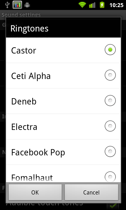
It isn’t really a UI thing, but Gingerbread also includes totally new default notification sounds that are much, much better. The new notification sound is awesome, as are the new ringtones. Previously there was something strangely harsh about all the sounds, the new ones are much more appealing.
Last but not least is the awesome power-off animation. It looks like an old CRT turning off, the contrast of the AMOLED display makes it look believable. Check out our video overview to see it in action.
Applications Manager
The revamped applications manager now shows a bit more information in each pane. For example in the ‘downloaded’ tab, there’s now a bar at the bottom showing how much internal storage is being used and how much remains free. USB storage (which curiously still has a microSD logo) shows how much applications use if they’re on external storage.
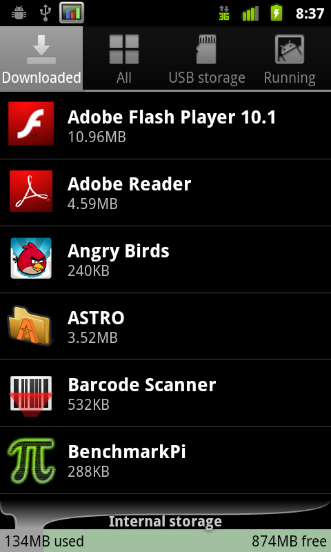
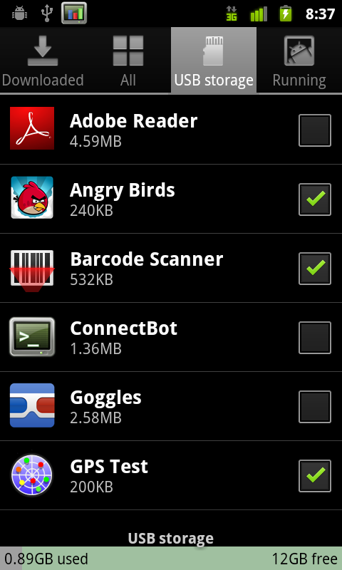
Every application that can be moved shows up here, and the checkbox corresponds to whether they’ve been moved over to external space.
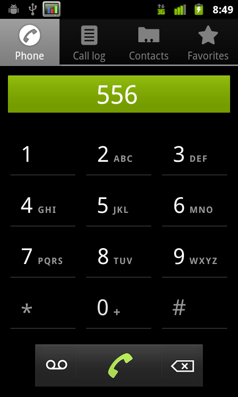
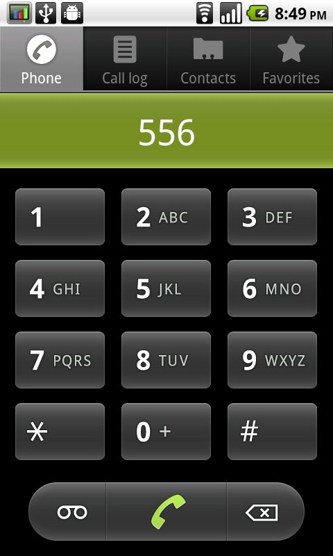
Nexus S (2.3) dialer, versus Nexus One (2.2.1) dialer
The dialer also receives a facelift, getting the high-contrast black treatment the same as most of the 2.3 UI. The buttons are more subtle and glow green when touched instead of orange. Notice how everything that used to be rounded is now square - that’s the other subtle UI change throughout Gingerbread.
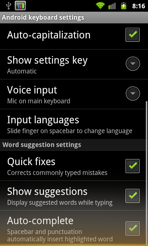
Keyboard
I’ve been harping on about Android’s stock keyboard since about day one. It’s had a venerable run as the platform’s prime keyboard, but lacked multitouch and never really felt optimal. As a result, virtually every device vendor ships with a multitouch keyboard of their own (like Motorola), or bundles Swype (which is awesome). I think Gingerbread’s keybord is finally awesome enough that we might not need the former of those two. Side by side really says what’s changed best:
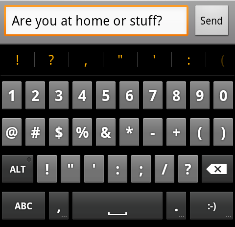
Nexus S (2.3) stock keyboard, versus Nexus One (2.2.1) stock keyboard
The keyboard takes up less vertical space, there’s more of a margin between keys in the horizontal and vertical direction, and the font is now more readable. Oh, and it’s multitouch. The result is that you can finally do things like shift+<character> or hold down a key for accented characters and simply slide your finger over.
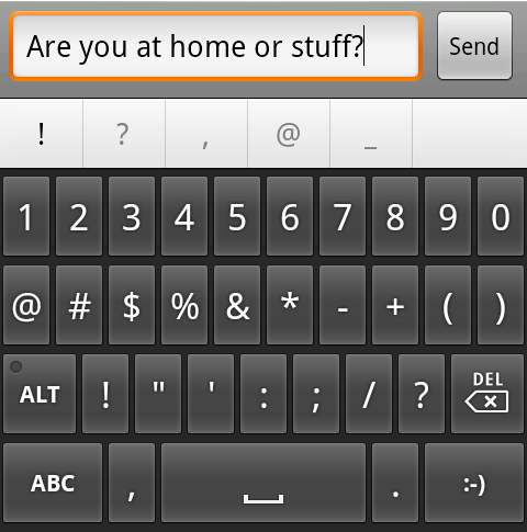
The spacebar now glows orange when Android predicts that one word best fits from the characters you’ve typed. Pressing space inserts that word, and a space, whereas before it was never really clear what you could do.
Overall usability with the new stock Android keyboard is much improved. I can finally type at full speed and use multitouch combos, but the real improvement comes from the subtle change in shape. Though vendors will still probably stick swype on retail devices, the multitouch keyboard in Gingerbread honestly eliminates the need to do much more.
There are also new selection aides for both going back to a word suggestion or replacement, and selecting text to copy and paste with. Tap on a word, and you get the selection icon.
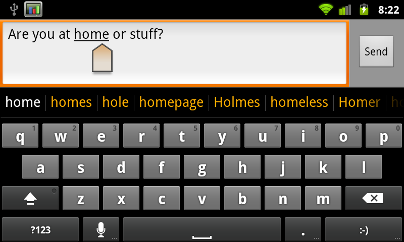
You can drag that around to select words which are then underlined appropriately. If you long press and tap select word, you’ll get two selection handles which can be dragged around to highlight text.

Tap again and you’ll get a dialog to cut, copy, or paste. It’s definitely an improvement. This selection workflow doesn’t require a trackball anymore, which is undoubtedly a contributing reason for why the Nexus S lacks one.
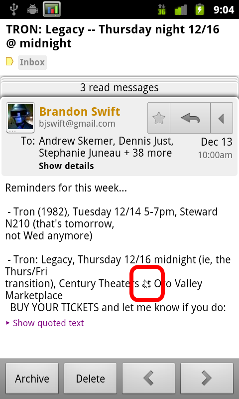
There’s a bit of a rough spot when selecting text from an email, which is a bit of a puzzle. The workflow curiously still involves having to hit menu, more, select text, and then drawing a line across text you want highlighted. What’s odd is that between selecting text and drawing that line, Android literally draws a mouse cursor in the window. I’m not sure what that’s doing there, but it puzzles.
You do get the same selection handles though, which works perfectly. Tapping on the text in a non-editable field simply copies it to the clipboard instantly.
SIP calling Support
Chances are that most people don’t know what Session Initiation Protocol (SIP) is. I used SIP briefly a long time ago and had to refresh myself even, but SIP essentially is a protocol for setting up voice and media streams between devices. For most intents and purposes, that boils down to VoIP, which is what’s done with Gingerbread. The idea is to get a SIP account from a provider which will route calls to PSTN callers, and serve as a gateway for other SIP account holders to call you. With a SIP account, you basically get an internet phone number, and the ability to call normal PSTN numbers for a small fee.
I set myself up with a simple account from voip.ms and configured the Android client to use it. SIP account settings are inside call settings, at the bottom under ‘internet call settings.’ You can choose whether to send all calls over your SIP number, ask each time, or only do it when calling other SIP accounts.
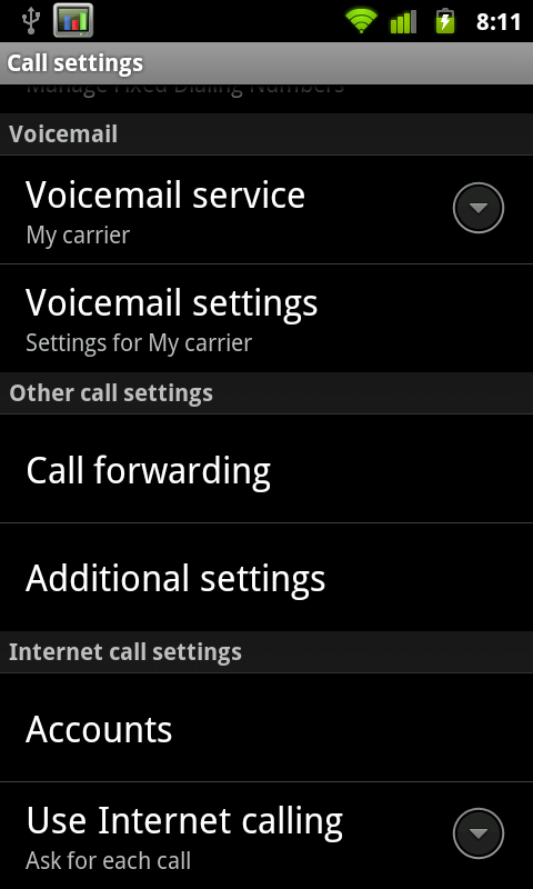
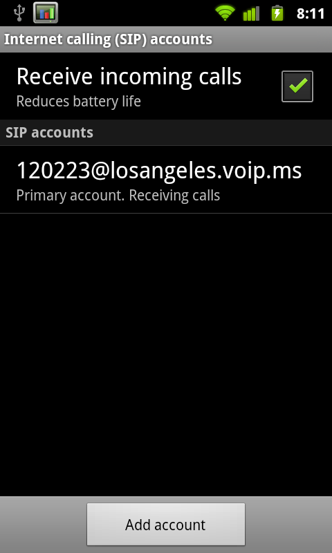
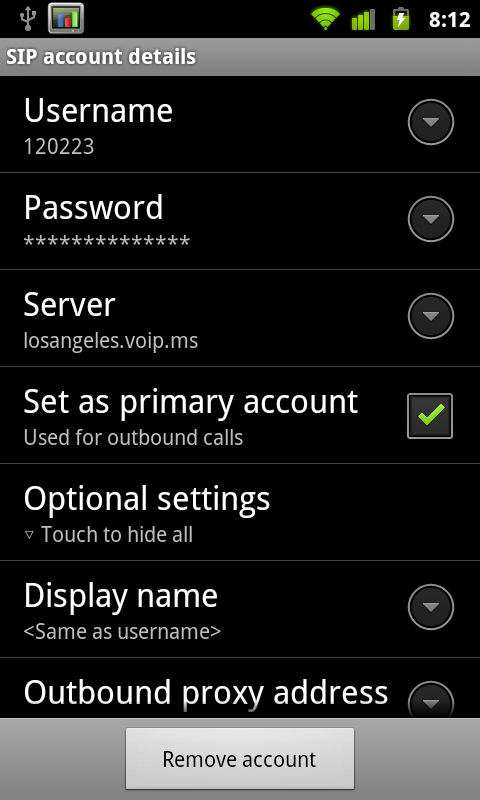
Inside settings you can configure whether or not you want to have an active registration for receiving incoming calls. Of course, keeping that open uses some battery life. Inside the SIP account settings are fields for your credentials, server, and basic configuration. There isn’t any choice about what codec you’re going to use.
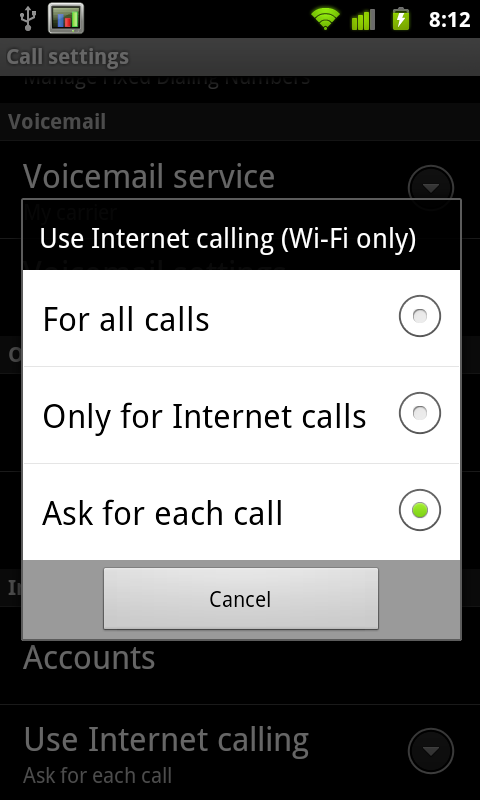
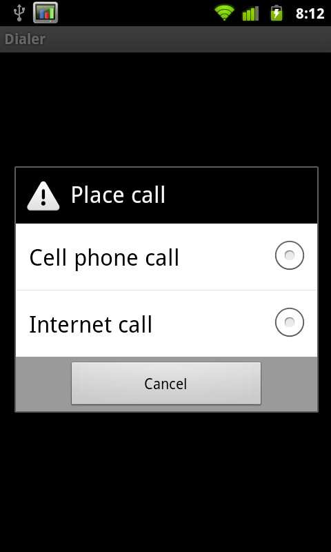
With this enabled, when you go to make a call (if you so chose) you’ll be prompted whether you want to connect over cellular telephony or through VoIP. The disappointing part is that VoIP calling only works over WiFi. Yeah, that’s a completely arbitrary limitation.
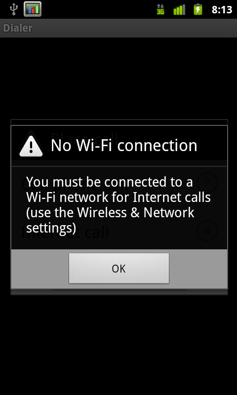
It’s a disappointment that we’re back to playing this game appeasing carriers by putting arbitrary limitations on features. Nokia doesn’t do it on their devices, and yet European carriers haven’t bled themselves to death. I’m sure this limitation will be gone within 10 minutes of someone rooting Android 2.3 on the Nexus S, so why bother?
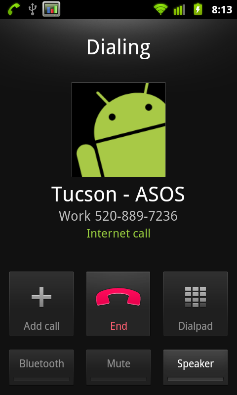
Overlooking the limitations, SIP calling works, and works just fine. It’s integrated into the Android platform natively, just like it should be. Calls come in and go out just like they would if you were calling through cellular voice. I thought voice quality was fine, and people I called said I sounded fine as well. Of course, a lot of that depends on your SIP provider and what routes they have for PSTN, so your mileage may vary. One thing I did notice is that SIP on speakerphone is way, way too quiet, more on that later.
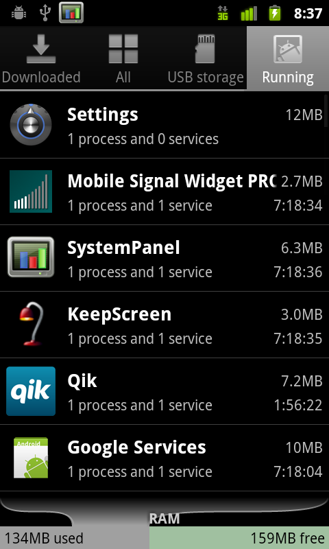
Battery Manager
Probably my favorite change is how much improved the battery use window is. I thought Android previously had a very useful breakdown of battery use based on total consumed CPU time and metrics like how long you’ve had the screen on, but the new graph is even better. From battery use, there’s a graph at the top. Tapping on it brings up a much larger graphical view of consumption.
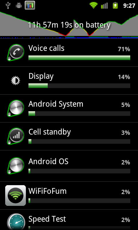
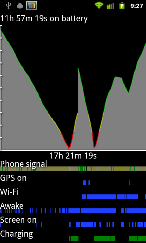
The line corresponds to battery charge. Below it are timelines for signal, GPS, WiFi, screen and device activity. At the very bottom is charging. The result is that you can see how different activities affect the battery, and what uses more charge based on the slope of the line. This is something I’ve done previously with System Panel which shows similar information, but lacks phone signal, GPS, and WiFi tracking.
There’s the total running time for the plot on the x axis, and the total time the phone has been on battery along the top. Every platform needs something like this.
Other Changes
There’s a subtle tweak to the downloads manager, but nothing major, and the stock camera now has a few more features. I’ll discuss the camera changes in the camera section. The rest of the changes are under the hood so to speak. There are updated OpenGL ES drivers which provide more efficiency and faster 3D performance, a concurrent garbage collector for the Dalvik VM which now only takes 3 ms, a kernel update, Khronos OpenSL ES and Khronos EGL support, and a host of new sensor support. The Nexus S notably includes a gyro, and the Android 2.3 stack now includes support for a ton more sensors, including barometer. There’s also native support for front-facing camera, which I’ll show in the camera section.
Android 2.3 also supposedly adds WebM and VP8 support, though I’ve had no success playing back any test videos and am working on encoding some smaller ones to try on the Nexus S. One video played back using the android video player had audio but had no video, other videos played back in the browser showed controls but never started playback.
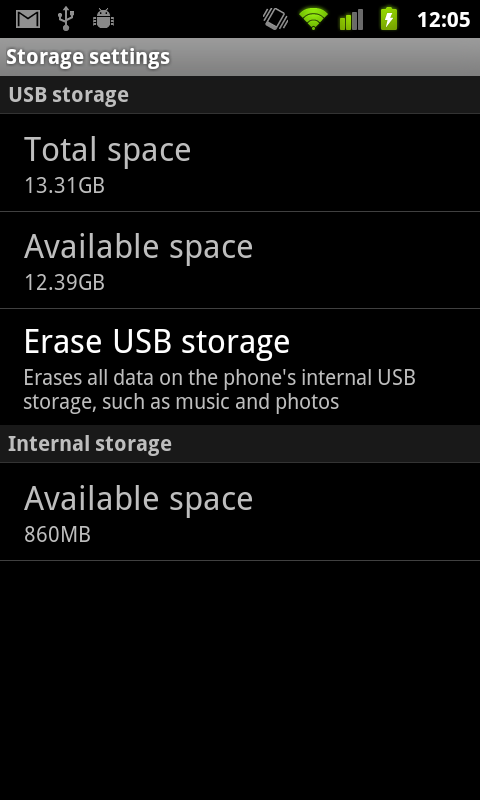
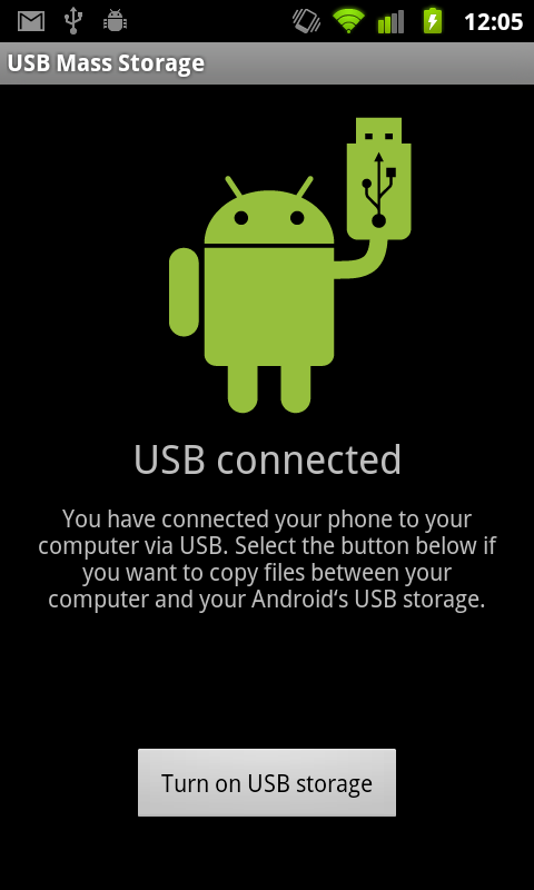
The other new thing is support for devices with no external storage. Instead, internal storage can be partitioned to work like a virtual SD card. In the Nexus S, there’s 16 GB of iNAND, which is SanDisk’s combination of MLC NAND, a NAND controller, and DRAM on a single die, all of which expose themselves over eMMC or eSD. SanDisk’s documentation notes 12 MB/s and 30 MB/s sequential writes and reads, respectively, though there’s no information about how small size reads and writes fare. In essence, iNAND is an embedded storage solution. On the Nexus S, 1 GB is partitoned to act like traditional “internal storage,” and 15 GB are partitioned as “USB Storage” which in principle acts just like external storage used to.
Overall Gingerbread brings a lot of notable improvements, the majority of which are pretty much immediately obvious. New keyboard, a tweaked graphical style, better copy and paste, better power and applications management tools, SIP VoIP calling natively, NFC compatibility, support for devices with extra large screens such as tablets, and interestingly EVDO Rev B support in the telephony manager. If you’re interested in all the changes, check out the official Android SDK 2.3 platform notes (http://developer.android.com/sdk/android-2.3.html). That said, there are still a few things I wish Gingerbread included.
There are a few places in the UI where the old silver-colored UI shines through that could’ve benefited from some of the new black/contrasty goodness. The address bar in the browser and the messaging application both have lots of chrome instead of black. It’s also a bit puzzling why there isn’t any new first-party support for video chat given the front facing camera. Google could have leveraged its already-popular chat infrastructure (Google Talk) to provide a seamless video chat experience across mobile and desktop. Instead, there’s really nothing to do with the front facing camera other than take pictures of yourself or use a marketplace solution to video chat, all of which I’ve enjoyed marginal at best success with.
Small Fixes
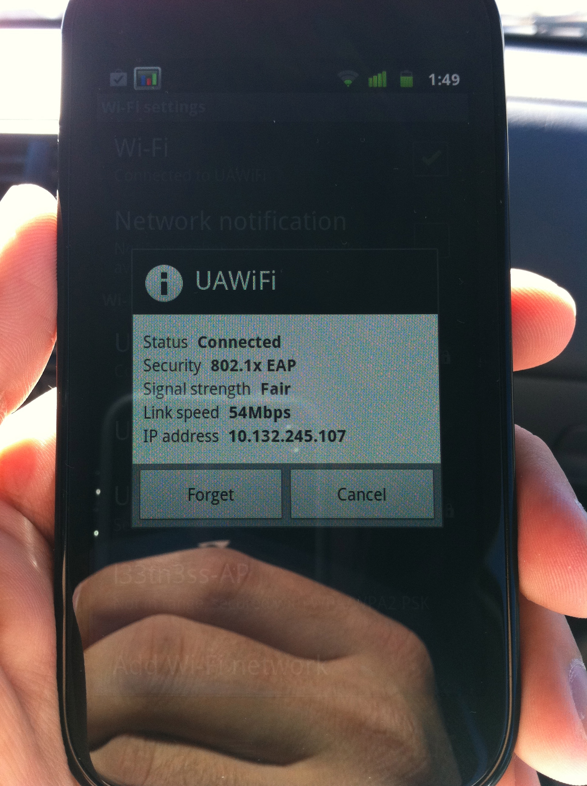
There are a few other changes that I consider fixes which Android 2.3 has that aren’t directly noted. Chief among them are working 802.11x EAP support, which I can confirm works perfectly. I tested on an enterprise-level 802.11x network which uses PEAP with certs and had no problems authenticating, staying online, and even handing off.
The other notable thing I tested was to find out whether the messaging (SMS/MMS) database is any better. In Android 2.1 and 2.2, I found over and over again that the whole thing would slow down after getting a day or more worth of texts inside. For me, that translates to a couple hundred. To test, I sent myself 200 messages and had friends bombard me best they could with everything they could muster. All total just over 500 in under an hour. The messaging application remained speedy and hasn’t become unbearably slow like I’m used to saying. As best I can tell, this seems way improved if not entirely fixed.
Finally here's a video I put together with all the changes and a comparison with the Nexus One loading the AnandTech homepage:


73 Comments
View All Comments
tipoo - Tuesday, December 14, 2010 - link
HTC then Samsung, I wonder who will be next to make a Nexus phone...Motorola, maybe? I think they went with Samsung this round because they have the most capable processor right now.blueF - Tuesday, December 14, 2010 - link
Well the benchmarks show that the current iteration of the snapdragon are on par if not better than hummingbird. I think they chose Samsung for a few reasons, with the most important being they are the OEM of the best amoled screens available. Honestly I would have preferred another HTC nexus due to the superior phone shell. The galaxy phones and their stupid right side lock button is close to a deal breaker for me. Also the head phone jack on the bottom is beyond stupid.vol7ron - Tuesday, December 14, 2010 - link
This was me during this article:"Nexus S... yes, yes.. good stuff. Whoah! Look at that myTouch!"
Can't wait to see that myTouch review, thanks for putting those figures up there.
deputc26 - Wednesday, December 15, 2010 - link
Hmmm where'd the page load times for popular websites vs. other leading phones go?That and battery life are the most relevant benchmarks as to whether or not I buy a phone.
tipoo - Tuesday, December 14, 2010 - link
Yeah, the 1 definitely was constructed better.OscarGoldman - Wednesday, December 15, 2010 - link
"the head phone jack on the bottom is beyond stupid. "Nope, not when the thing lacks an audio line out (which IS stupid). With the jack on the bottom, they can at least make a dock to drop the phone into in your car. That's a lot better than having to plug in a wire that's dangling across your dashboard, every time you want to listen to music.
Reviews need to call these phone manufacturers out for failing to provide an audio line out on the bottom of every phone. Even with the headphone jack on the bottom, you still have to screw around with two volume controls; the one on the phone, and the car radio. And you're running everything through the crappy headphone amp on the phone.
tiredad - Wednesday, December 15, 2010 - link
I'm a little confused by so many reviews being against the jack placement; usually giving the lame reason that it's not what everybody else does. You think Apple thinks that way?I look at my phone to select a track etc. and then i put it in my pocket upside down so the placement is perfect. Not that this is much of a serious matter.
BTW since this is my first post i have to thank this site for providing the most consistent, unbiased and professional reviews i've found to date. When i read a review i want the facts and opinions separated and i don't want any pro one company or another and that's what you give... so cheers guys.
daveloft - Wednesday, December 15, 2010 - link
I prefer the connectors at top so I can throw my phone in the cup holder and not have to put it in upside down.steven75 - Thursday, December 16, 2010 - link
Lack of line-out is one of those things that would be hard to give up if I decided to move from iOS to another mobile OS.I use my iPhone for audio in the car at least twice daily and having line-out audio and charge capability through a single cable is simply awesome.
My stock radio even allows adjusting the level of the aux-in (separate from the volume) so that it matches the volume of all the other sources.
Unfortunately Bluetooth is still a sub-par solution because although you don't need any cables, sound is still inferior quality and you kill your battery on anything but a very short trip.
daveloft - Wednesday, December 15, 2010 - link
Those benchmarks you refer to are probably Quadrant and the reason why a Snapdragon device like the G2 performs better than the Galaxy S was because it had 2.2 while the Galaxy S had 2.1.Also Quadrant scores are heavily influenced by file system speed. The file system on the G2 is much better than the Galaxy S. This why you see so many Galaxy S users applying lag fixes which change the file system. When Galaxy S devices use the lag fix to swap the file system for something like EXT4, their Quadrant scores jump by as much as 50%. Throw in 2.2 or 2.3 and you get the highest scoring device available.