HP Z27q Monitor Review: Aiming For More Pixels
by Brett Howse on December 22, 2015 8:00 AM ESTAdobeRGB Calibration
AdobeRGB tests are done with the same workflow as sRGB, but with the target gamut set to AdobeRGB. As with the sRGB, precalibration results are done for 200 nits, and then calibrated results are done for 200 and 80 nits.
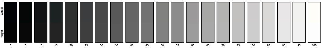
Grayscale
Set to AdobeRGB, the pre-calibration results are quite a bit improved over the sRGB values. They are so good that there is actually little reason to calibrate this display if you are using it for AdobeRGB. The average error rate on grayscale is only 1.08, and the gamma curve is almost perfect. The white point is very close to correct as well.
Saturation
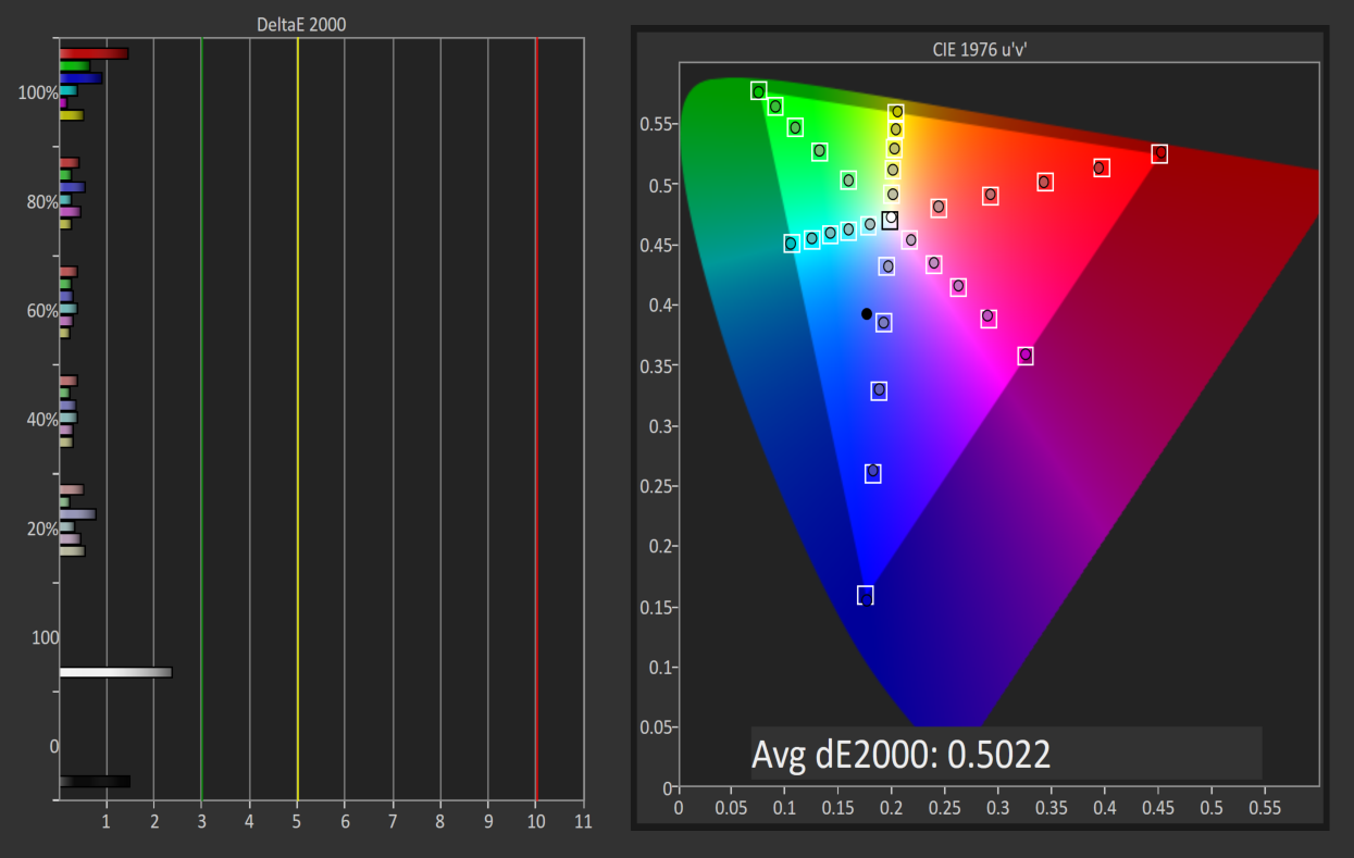
Saturations are very good again, with an average error of just 0.5. This is a great result for an uncalibrated display, and you can see that it easily covers the much wider gamut of AdobeRGB here.
GMB

I feel like a broken record a bit, but the pre-calibration results for GMB are fantastic, with an average error of just 0.462. HP has done a fantastic job on the AdobeRGB LUT for this display.
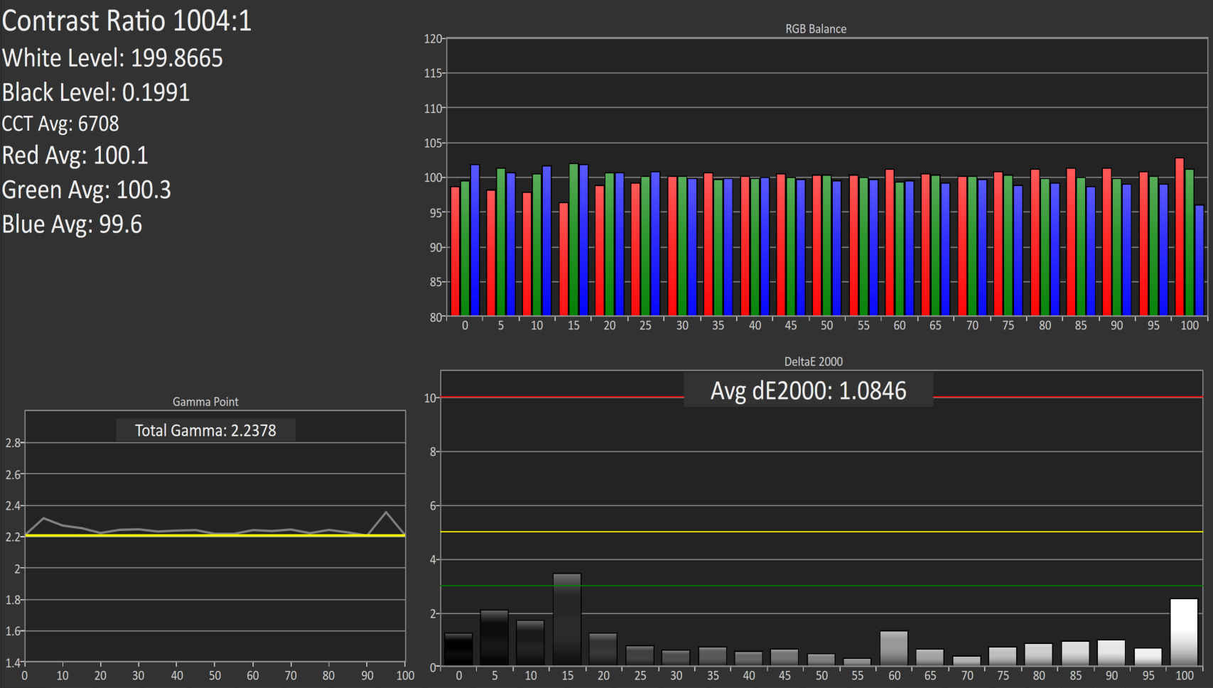
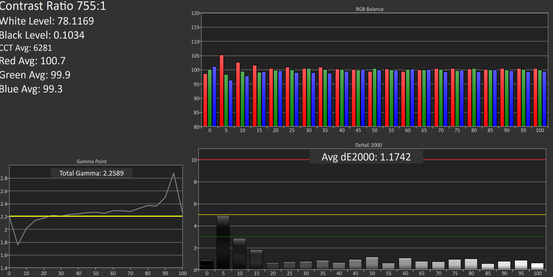
200 cd/m2 Calibrated
Since the pre-calibration measurements were so good, there would be very little if any need to calibrate this display, but for completeness that has been done.
Grayscale
Although the couple of spikes for grayscale have been corrected, the overall result is actually slightly worse than out of the box. The gamma jumps up, and the white point is off. The results were better before, so if I was using this I would throw this out and leave it at stock.
Saturation
With the white point slightly moved, the overall error rate has actually gone up. It’s still excellent, but not as excellent as before.
GMB

The final test also has a higher score, which at 0.67 is still excellent, but the calibration did nothing to help this display on AdobeRGB gamut. Let’s see how it does at 80 nits.
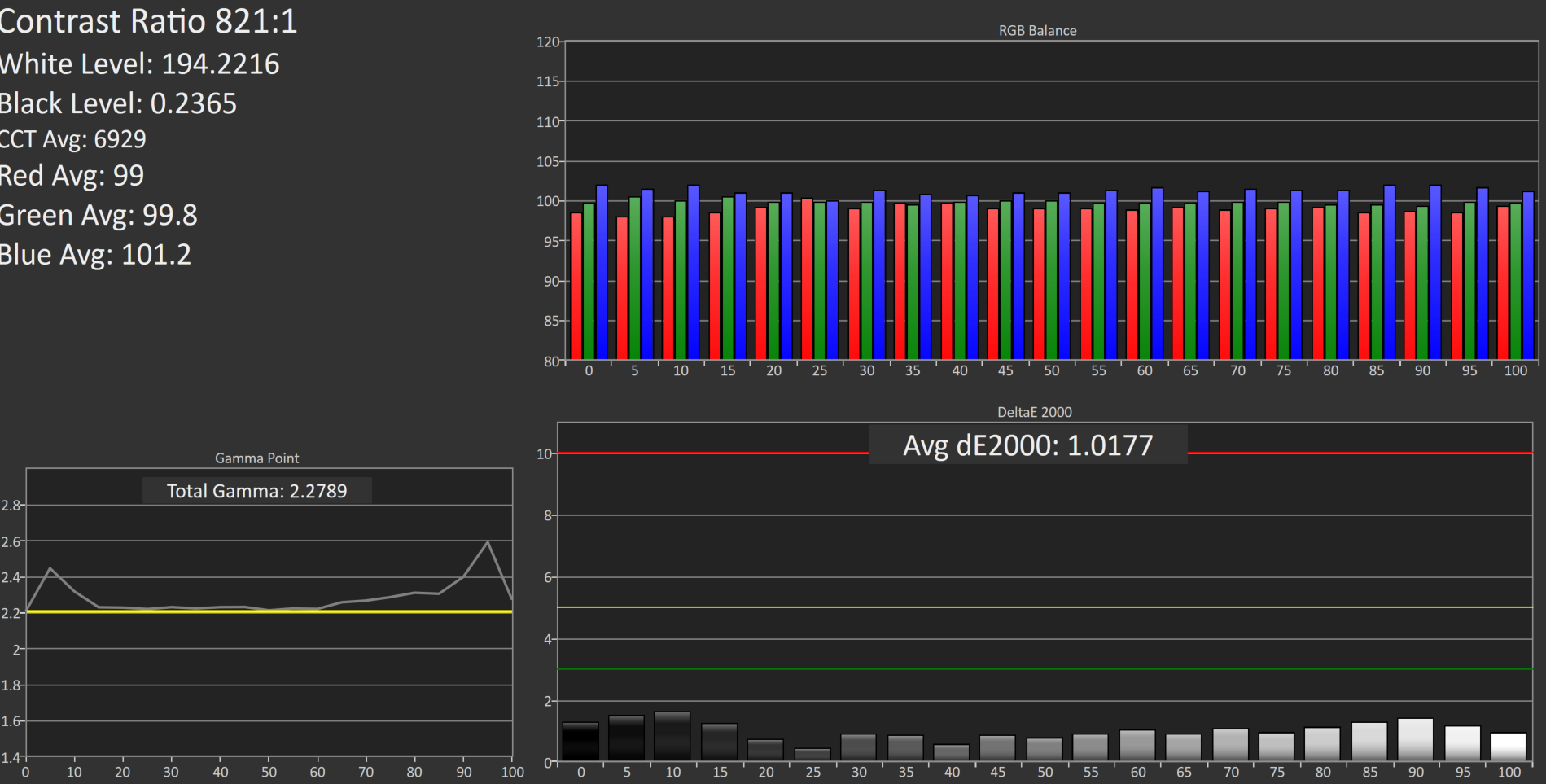
80 cd/m2 Calibrated
Setting the display to 80 nits, it was then calibrated again.
Grayscale
Overall the result is very good again, although the gamma is not as flat as it was before calibration. The white point and average error rate are both very good though.
Saturation
Much like at 200 nits, the pre-calibration measurements are actually better again, but the end result even with the slightly worse scores is still a very accurate representation of the AdobeRGB color space.
GMB
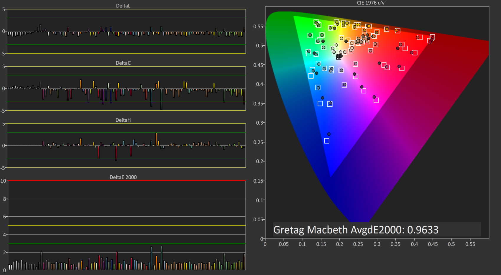
A result of 0.96 is very good, and the Z27q pretty much had no issues with any of the colors in our Gretag Macbeth test.
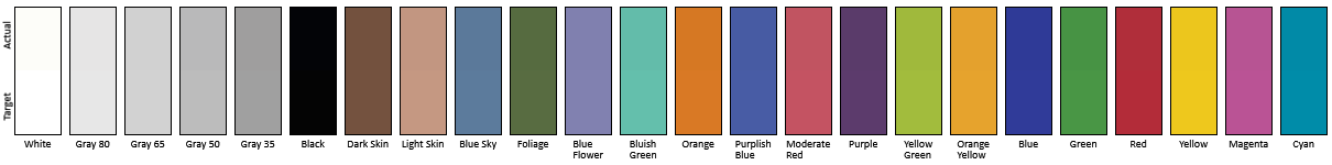
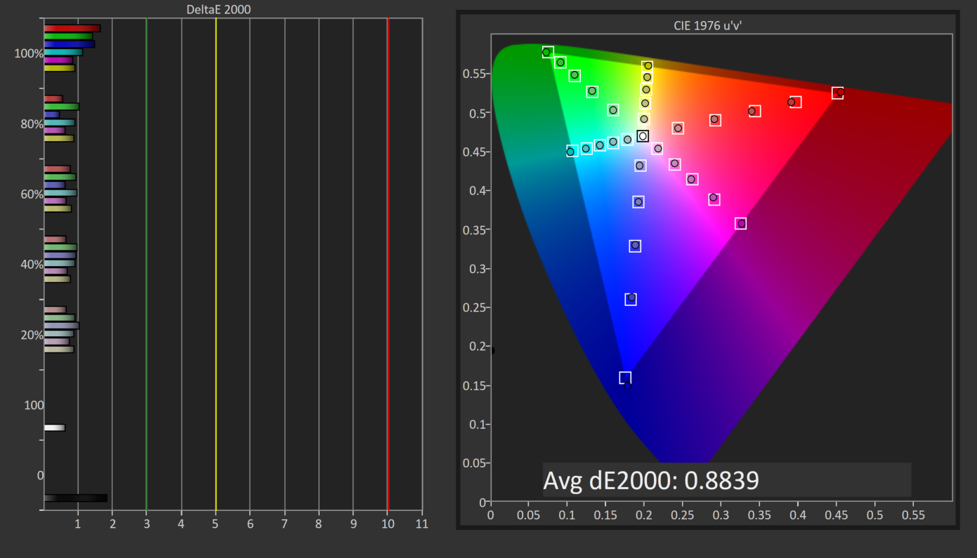
Relative Color Comparator - Displayed color on bottom, correct color on top
The results from AdobeRGB are even more impressive than the sRGB space. The Z27q can easily hit pretty much 100% of this target gamut, and the built in LUT is incredibly accurate when targeting AdobeRGB. This is one of the rare times were calibration pretty much did nothing.


92 Comments
View All Comments
theduckofdeath - Wednesday, December 23, 2015 - link
Yes and no. It's very much about paying extra to be an early adopter. In many cases small scale means higher price because it requires a lot more manufacturing accuracy.Prices of these 4 and 5 k displays will plummet in a couple of years. Though, to be fair, it's no rush as GPU's really aren't able to display much else than static images, text and video on this resolution today.
CaedenV - Tuesday, December 22, 2015 - link
less material used, plus higher output capability, plus a more reliable process. It all adds up to far less cost, and far FAR less waste, so the product costs much less.Think of it this way... a 6" 16:9 display has 15.37 square inches of material. A 27" display with the same aspect ratio has an area of 311.53 square inches.
Lets say that the phone display costs ~$50 (just for the sake of nice round numbers... I have no idea what a high end cell phone display costs). That would break down to $3.25 per square inch... extrapolating that to the larger display it would scale up to $1,012.50.
But there is a difference between a cell phone display and a computer monitor. A cell display is merely the display, and the backlight with minimal controllers and other electronics, and no housing... the monitor has a USB3 hub ($), a stand ($$), a housing ($), a controller supporting multiple inputs, resolutions, frequencies, and scaling ($$$), a power supply ($), higher shipping costs per unit ($), higher storage costs per unit ($) etc.
Plus, lets not forget about issues of manufacturing. Lets say that for every 1000sq" there is a defect that makes a device unusable. That means that for every ~67 cell phone displays, there is one bad apple, so the average cost of each display rises ~1/67th, or 75 cents per unit.
But if that same kind of manufacturing ratio is applied to the larger screen, then that means that one out of every 4 displays is going to be bad, which means a 25% increase in screen price (+$253 per unit! way more than 75 cents!).
TL;DR... smaller things are going to cost less.
Frenetic Pony - Tuesday, December 22, 2015 - link
Size of the display matters more than PPI of the display in terms of cost.DominionSeraph - Tuesday, December 22, 2015 - link
Could you possibly have taken worse photos? Bland, poorly lighted in intensity and color, and at really unflattering angles.The first pic looks crooked because of the angled countertop back. The second IS crooked.
This doesn't look like a professional review of a $1000 monitor, it looks like a Craigslist ad for a $15 one.
ImSpartacus - Tuesday, December 22, 2015 - link
Whew, being a little toasty, eh?It's clear that the photography is subpar, but it might be helpful to provide some explanations to fix the noted issues.
Anandtech is all about learning stuff that you didn't previously know, so I'm sure the reviewer would appreciate some learning in the "opposite" direction under these circumstances.
K_Space - Tuesday, December 22, 2015 - link
Agreed! Helpful feedback goes a long way:1) intense flash photography tends to create harsh shadow and poor exposure of the background. Use a DIY or cheap soft box (or point flash toward a WHITE ceiling). You can manually reduce flash power or simply stand back more.
2) Use a virtual grid in the optical view finder. By default intensely geometrical shapes like the first picture will likely bring out all the faults in the lens designs (definite barrel distortion in the first picture). Simple correction in LR. Lots of freebie tools do a similar job if you are not Adobe inclined.
3) Use a white background; this will also help create a reference point for white balance.
fanofanand - Tuesday, December 22, 2015 - link
In the last year I see comments regarding the photography in nearly every article, to the point where someone pointed out Josh's lack of arm hair (weird thing to notice). I don't expect a technical journalist to also be a professional photographer. It's the review that's important, not the photos....K_Space - Tuesday, December 22, 2015 - link
Except there is nothing professional about the tips above (mind you the OP was a bit harsh). It's at best a bit of tidying up. Good presentation never hurt's anyone. Certainly the review is important and in Brett's defence these pix are still better than some of the shots you get in TFT central and I wouldn't fault their reviews either.RT81 - Tuesday, December 22, 2015 - link
I'd almost prefer they'd err on the side of having photos like this rather than the alternative. Sometimes reviewers go overboard with the slickness of the photos to where I wonder if they'd be better off just working for the marketing department of the manufacturer. I find it nice to see frank, no-nonsense, non-shopped photos of hardware in-situ. That monitor sure as hell isn't going to look nice and new after a month or two sitting on MY desk.damianrobertjones - Tuesday, December 22, 2015 - link
Totally agree. Someone there MUST be able to use a camera. It is a tech site after all.