HP Z27q Monitor Review: Aiming For More Pixels
by Brett Howse on December 22, 2015 8:00 AM ESTAdobeRGB Calibration
AdobeRGB tests are done with the same workflow as sRGB, but with the target gamut set to AdobeRGB. As with the sRGB, precalibration results are done for 200 nits, and then calibrated results are done for 200 and 80 nits.
Grayscale
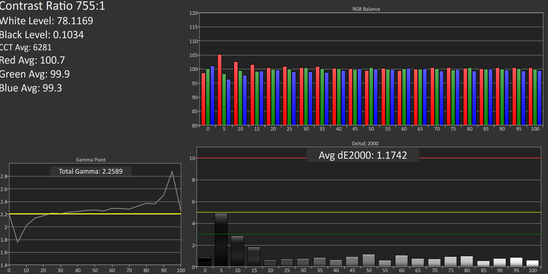
Set to AdobeRGB, the pre-calibration results are quite a bit improved over the sRGB values. They are so good that there is actually little reason to calibrate this display if you are using it for AdobeRGB. The average error rate on grayscale is only 1.08, and the gamma curve is almost perfect. The white point is very close to correct as well.
Saturation
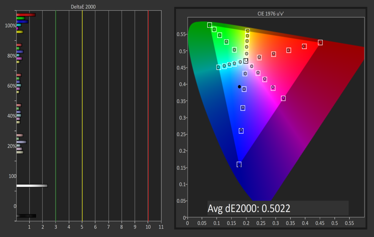
Saturations are very good again, with an average error of just 0.5. This is a great result for an uncalibrated display, and you can see that it easily covers the much wider gamut of AdobeRGB here.
GMB

I feel like a broken record a bit, but the pre-calibration results for GMB are fantastic, with an average error of just 0.462. HP has done a fantastic job on the AdobeRGB LUT for this display.
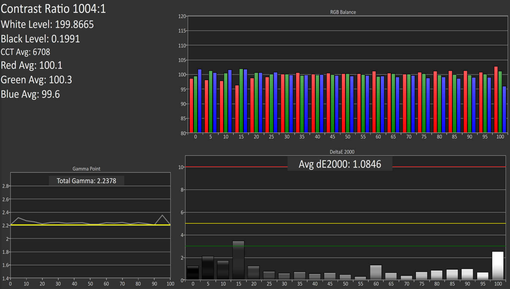
200 cd/m2 Calibrated
Since the pre-calibration measurements were so good, there would be very little if any need to calibrate this display, but for completeness that has been done.
Grayscale
Although the couple of spikes for grayscale have been corrected, the overall result is actually slightly worse than out of the box. The gamma jumps up, and the white point is off. The results were better before, so if I was using this I would throw this out and leave it at stock.
Saturation
With the white point slightly moved, the overall error rate has actually gone up. It’s still excellent, but not as excellent as before.
GMB

The final test also has a higher score, which at 0.67 is still excellent, but the calibration did nothing to help this display on AdobeRGB gamut. Let’s see how it does at 80 nits.
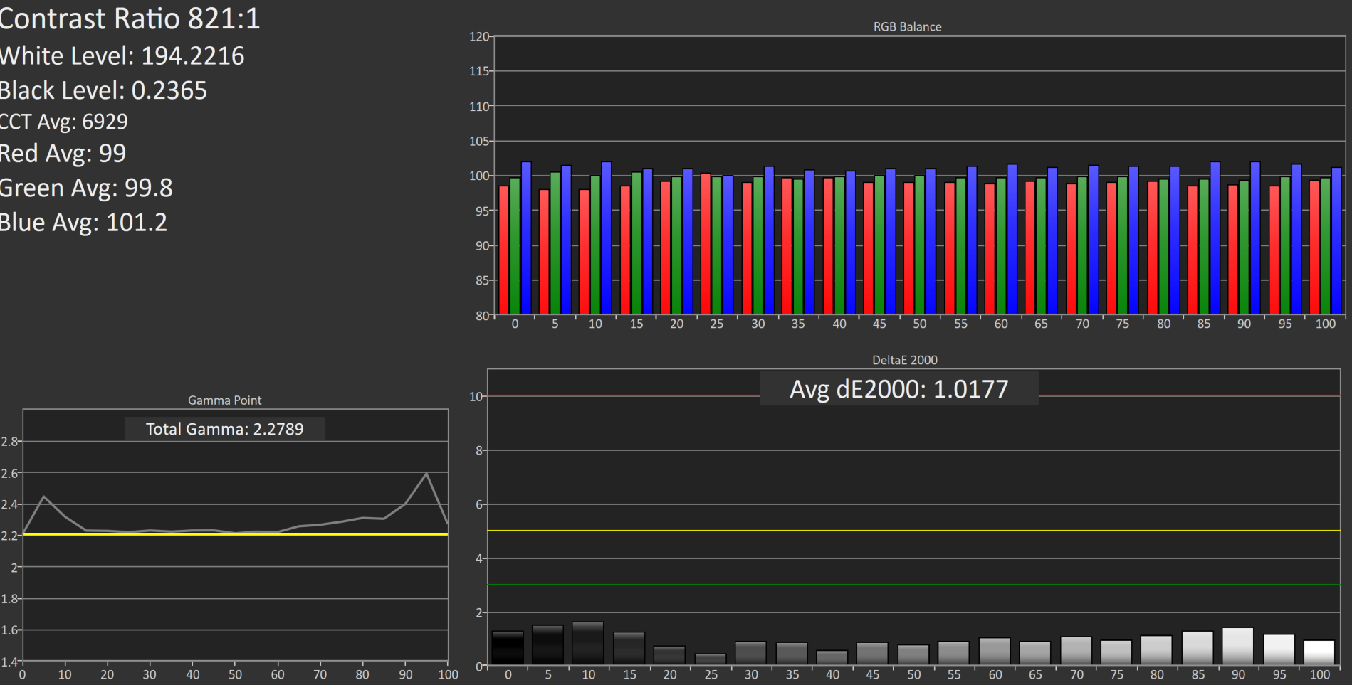
80 cd/m2 Calibrated
Setting the display to 80 nits, it was then calibrated again.
Grayscale
Overall the result is very good again, although the gamma is not as flat as it was before calibration. The white point and average error rate are both very good though.
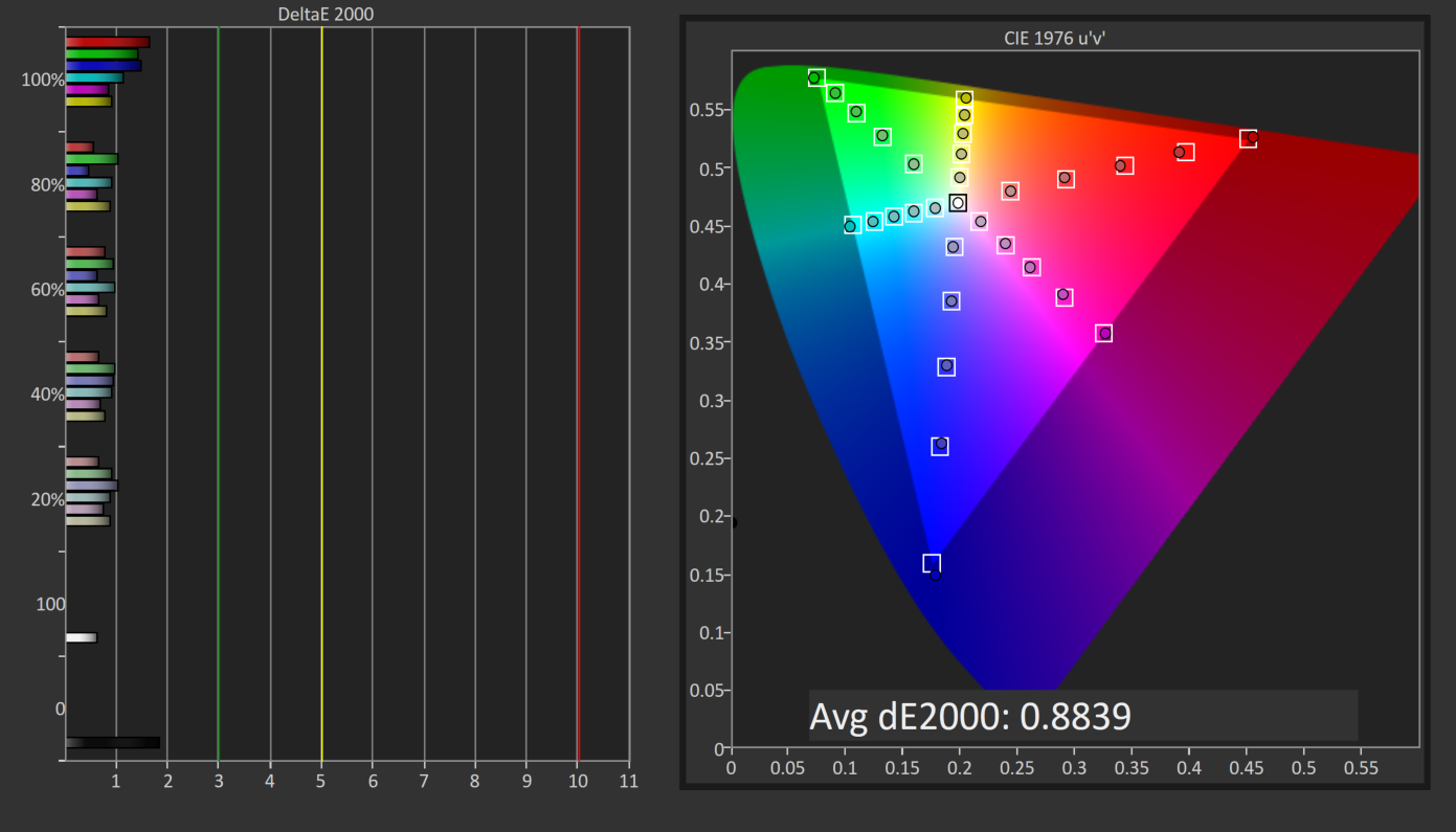
Saturation
Much like at 200 nits, the pre-calibration measurements are actually better again, but the end result even with the slightly worse scores is still a very accurate representation of the AdobeRGB color space.
GMB
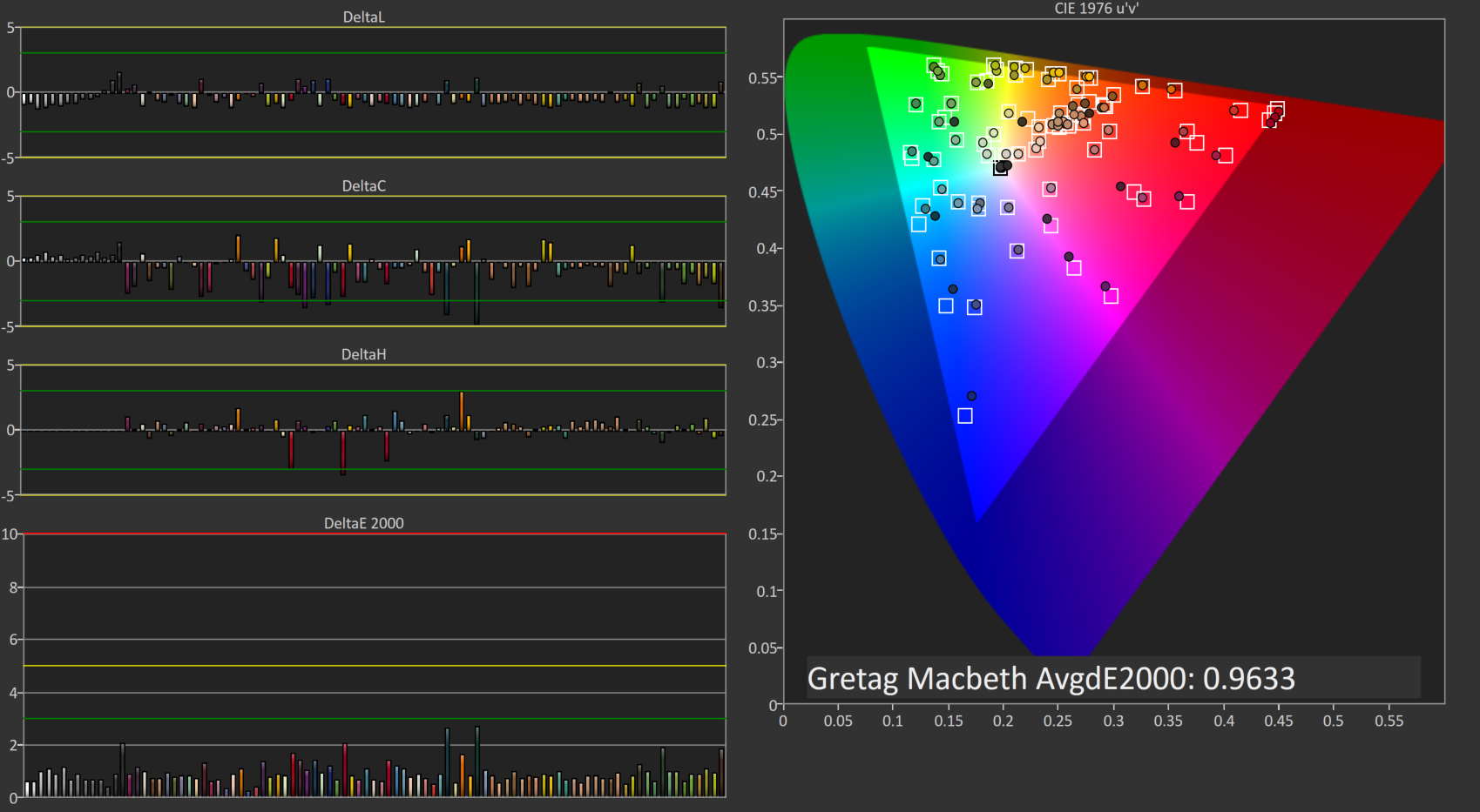
A result of 0.96 is very good, and the Z27q pretty much had no issues with any of the colors in our Gretag Macbeth test.
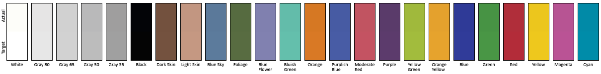
Relative Color Comparator - Displayed color on bottom, correct color on top
The results from AdobeRGB are even more impressive than the sRGB space. The Z27q can easily hit pretty much 100% of this target gamut, and the built in LUT is incredibly accurate when targeting AdobeRGB. This is one of the rare times were calibration pretty much did nothing.


92 Comments
View All Comments
usernametaken76 - Tuesday, December 22, 2015 - link
It would look like native res 2560x1440. That's not really "pretty damn big" it's more along the lines of "just right."stephenbrooks - Thursday, January 7, 2016 - link
Depends how big someone likes text to be and how far away they prefer their monitor to be. I was given a 2560x1440 27" monitor and chose to run it at 125% scaling, so I guess I'd ask for 250% scaling on the 5K version! (Incidentally, even going from 100% to 125% makes text noticeably smoother)PixyMisa - Tuesday, December 22, 2015 - link
200% is actually about right for a 27" 5K monitor. I haven't tried it with Windows, but that's exactly what my retina iMac does.I have a 4K 28" monitor on my PC at 150%, and 5K is 1.33x the resolution of 4K.
I use 200% scaling on my 15" 4K notebook too (okay, yes, I'm a retina screen junkie) and that looks great, but you sit closer to a notebook screen than you do to a desktop screen.
sharath.naik - Friday, January 1, 2016 - link
5k is actually 1.7x the resolution of 4k. That's nearly twice.PEJUman - Tuesday, December 22, 2015 - link
I went from 1600p 30" to 4k 27" and finally settled on 4K 40", which I feel is the perfect PPI for 100% scaling. Incidentally, the 1600p 30" have very similiar PPI. I think 5K needs to be in the 50" range.I have better than 20-20 vision and still thinks 125-175% scaling is a little wasteful on the overall effective real estate.
bug77 - Tuesday, December 22, 2015 - link
I have yet to see one, but I also have the feeling even 4k is too much for 27".timbotim - Tuesday, December 22, 2015 - link
4k on 27" is -just- OK, works out at 163PPI. I have a 24" 4K which is 183DPI and that is too small; for me anyway, but I'm an old git, so I would imagine it's OK for the younger enthusiasts. But this thing is 215PPI, and I've tried DPI scaling and found it wanting.bug77 - Tuesday, December 22, 2015 - link
Scaling is ok, everyone can set it to their liking (assuming it works). My concern is I'm not going to see pixels without closing in to ~4"/10cm. For pro-photo editing that may be ok, but for me, it's just more work for the video card, work that I won't see anyway.sharath.naik - Tuesday, December 22, 2015 - link
27 inch is the minimum size for 4k resolution (Ideal at 36-40 inch). 5k at 27 inch monitor is like a 4k at 20 inch inch monitor, completely unusable at 1:1 dpi. Minimum size for 5k monitor should be close to 34 inches, if not there is no point in paying this amount for a resolution you cannot use.SolMiester - Tuesday, December 22, 2015 - link
+1.I struggle with my 28"4K, IMO 5K @ 27" is a waste of time and money!