The Apple Watch Review
by Joshua Ho & Brandon Chester on July 20, 2015 8:00 AM EST- Posted in
- Wearables
- Apple
- Mobile
- Apple Watch
Apple Pay
I normally don’t cover mobile payment solutions, but in the case of the Apple Watch I suspect this is the fastest way for anyone not using an iPhone 6/6 Plus to get Apple Pay access. Although I’ve never written anything about Apple Pay on the iPhone 6, in my experiences it’s probably the best solution around when it comes to easy payment due to the NFC boosting that makes the iPhone 6 send and receive NFC with no real orientation dependence and TouchID payment authentication. Coming into this review, the real question for me is whether Apple Watch could have the same seamless experience.
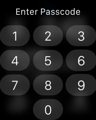

To try and figure out the answer to that question, there are really a few elements to the payment experience that have to be figured out. The first is authentication, which can easily be the biggest downfall in the experience. To this end, Apple has figured out a pretty smart system of wrist detection combined with a PIN code which ends up making for a pretty seamless experience. At the start of the day, you input your passcode when you put on the watch, and any time the watch is removed you have to input the passcode again or else pretty much everything (including Apple Pay) is locked out. If you lose your watch, no one can access the payment component without your PIN.
This effectively means that when you’re paying for something with the watch, all you have to do is double-tap the side button to activate Apple Pay. I’m not sure why it’s strictly necessary for NFC to be off unless the user activates it, but it’s likely that even the standby power of NFC would be significant with the battery of the Apple Watch.

This payment terminal was at head-level in the back of a taxi
The second potential roadblock is ease of use with payment terminals. To this end, the RF component is actually without issue. I didn’t find myself particularly constrained in terms of distance or orientation of the watch to interface with readers. However, I think the problem with payments on the Apple Watch is that in some cases readers are just placed in positions that require some really odd contortions to get the watch to the reader, regardless of whether the NFC RF subsystem is well-designed. Anything at chest or waist level was usually without problems, but I noticed that readers mounted at head-level were remarkably difficult to use with Apple Watch. Other issues like setup for card payments were really without issue, and I suspect most people won’t have any problems setting up their watch for Apple Pay.
Ultimately, while Apple Watch will work just as well as an iPhone 6 for payments, the real downfall here is mostly a problem of physiology. While in some cases using the watch for payments is a natural gesture, there are a number of edge cases that require a lot of contortion to get the watch to the payment terminal. If you don’t have an iPhone 6/6 Plus and you want to use Apple Pay, Apple Watch is probably the best way of getting Apple Pay. However, I still think the smartphone is a better platform for payments for ergonomic reasons.
WatchOS Final Words
The Apple Watch has a completely new OS, which warrants some especially close scrutiny of the OS as any early design decisions made have a tendency to snowball in terms of momentum, so it’s almost impossible to make some changes once applications are widely using shared libraries and APIs that are expected to work in a temporally consistent manner. To recap for those that don’t want to read everything previously discussed, there are a few areas that are worth examining in WatchOS, namely the watch functionality itself, notification handling, glances, apps, communication, fitness, and Apple Pay.

The watch functionality is solid, and Apple has created a number of compelling, useful, and deeply customizable watchfaces. The use of Force Touch and digital crown here makes a lot of sense when it comes to training the user for the rest of the UI, and the ease of use in customizing the watchface is truly great. There is the issue of no public API for watchfaces, but I suspect that this will come with time as it’s important to ensure that such an API is properly designed for long term support. Glances are well-executed and a useful feature, but I don’t really get the point of integrating heart rate monitoring into a glance or similar cases of app information as anything important to me ends up as a complication on the watchface. In practice, I think glances are best thought of as quick settings toggles rather than sources of glanceable information. To this end, the ability to turn on power reserve mode, toggle airplane mode, silent mode, do not disturb mode, and ringing the paired iPhone, and other controls like music playback control are definitely welcome and make a lot of sense.

When it comes to notification handling, once again I think Apple has done an effective job from a UI perspective as the notification shade uses familiar constructs from iOS/Android and the use of Force Touch to dismiss all notifications is a nice touch. However, I do have issues with how multiple simultaneous notifications are handled, which should be converted into a list view of all notifications rather than a single notification that indicates there are multiple notifications from the same application. Other than this, I think Apple has done a solid job with all the necessary features (do not disturb, actionable notifications, dismiss all, smooth UI). From a broader UX perspective the Taptic Engine is good enough to be worthy of a separate discussion, but within the context of notifications it works well.

Apps are ultimately what make a platform, because at the end of the day the reason why people use any general purpose computer is because of the apps that it can run. To this end, there’s currently a huge division in quality and functionality between first-party and third-party apps. Apple’s applications are executed well, with pretty much all the functionality that makes sense and great design. I never really had any frustrating moments with Apple’s apps on the watch. For any kind of input, there was always the ability to use Apple keyboard predictions or Siri voice input, which covered just about every case in which I wanted to input some kind of text in reply.


However, the same can’t be said of third-party apps. Probably the best example of this is Uber, which is literally just a button to request a pick-up with no other options when I can easily imagine a UI leveraging the digital crown to precisely indicate pickup, and swipes or Force Touch to select the type of Uber I want to use. This kind of UI is simple, but arguably too simple for a watch with as many UI tools as Apple Watch. I’m not sure that “native apps” will necessarily fix everything here, but native apps combined with developer experience and more powerful hardware will probably deal with most of the complaints I have about third party apps for WatchOS 2.
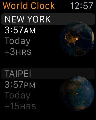

Communication is really a part of apps, but deserves specific mention because it’s such a critical task of the Apple Watch. To that end, there are really three key native apps that fall under this category. These are the phone, messages, and email application. All of these are well-executed, and in practice the user experience around all of these is pretty much painless. One could argue that email is missing some functionality, but for at a glance email viewing it works pretty much as it should. Fitness falls under a similar category in the sense that it’s a subset of the apps category, but if nothing else, Apple has made a great fitness tracking application when it comes to information presented, design, and ease of use. Apple Pay is also well-implemented in terms of ease of use, but there’s a fundamental issue with ergonomics that prevents Apple Pay on the watch from being as great as it is on the iPhone.
Overall, I think Apple has created an OS that is forward-looking and fully capable of supporting future iterations of Apple Watch without too much trouble, although many details will change as time goes on. However, for early adopters I suspect there will be some objection to performance. As one might be able to guess from our S1 CPU analysis, the S1 SiP is not going to be able to come close to a modern smartphone for performance, which means that even basic UI tasks can be a bit of a struggle with visibly-dropped frames when scrolling and swiping through some parts of the UI like the fitness app. There’s also the issue of app load times, but I suspect this will disappear with the inevitable advance of Moore’s law and native apps can load almost instantly in some cases.
Currently, third-party apps are lacking either from the lack of native app support or from general unfamiliarity of design principles for the watch. Probably the only real criticism I have for the OS overall is that there’s currently a distinct lack of watch independence, as if I set the iPhone to airplane mode but keep the watch able to connect to the internet applications like weather are unable to download anything even though it should be able to connect to my home router and download this kind of information anyways. Given the number of constraints that come with the wearable form factor, WatchOS is probably one of the best OSes out there for wearables.


270 Comments
View All Comments
everythingis1 - Tuesday, July 21, 2015 - link
Is anyone going to talk about that fact that these devices need 2 hands to operate. Doesn't that make the entire platform functionally irrelevant as anything other than a simple sensor? Am I completely crazy or is any smartphone, that can be operated with one hand for basic functionality, superior in every single way?deasys - Tuesday, July 21, 2015 - link
Actually, the Apple Watch can be operated 'no hands.' That's what Siri is all about.everythingis1 - Friday, July 24, 2015 - link
How do you activate Siri?Barilla - Tuesday, July 21, 2015 - link
Too bad one of the biggest features separating it from other smartwatches - the digital crown - becomes literally unusable if you decide to wear it on right hand. Yeah, some people do that...name99 - Tuesday, July 21, 2015 - link
LITERALLY unusable?http://www.imore.com/how-set-apple-watch-left-hand...
You mean the scheme Apple devised for this purpose doesn't work? Forgive me if I trust the opinions of various reviewers who have actually tried it over the opinion of someone who's never even touched an Apple watch...
nja4 - Tuesday, July 21, 2015 - link
I'm sort of on the anti-Apple hype train too, where reviewers are seem really expected to give Apple products overly positive reviews. However, I don't expect most people to share my opinions. The polish and appeal is so intense that I would bet most people would prefer their products over others. This review, as Ryan said, is going to be read by more than the core community, and I'm SO happy that Ryan responded in such a positive and discussion-oriented way. You're a great part of this community even when people are jerks about this sort of "obvious Apple bias."uhuznaa - Tuesday, July 21, 2015 - link
Nothing that draws 200 comments on Anandtech can be really pointless... As soon as reviews of Apple products will fizzle out here with five comments or so Apple will have lost it. But not sooner.Really, all you guys seem to be really obsessed with Apple. Even if you hate it, but you do care very much. Most reviews of smart watches draw much fewer comments...
Junereth - Tuesday, July 21, 2015 - link
this site really needs to make comments collapsible. it's incredible hard to navigate in here.SBD.3 - Tuesday, July 21, 2015 - link
I'd love to see the iWatch interface optimized on an iPhone. But as far as wearing a watch again, that ship has sailed.Tams80 - Tuesday, July 21, 2015 - link
A day for a smartwatch is just about bearable, just as it is a smartphone. More battery runtime is always better, but two to three days at moderate usage is the point at which I would be happy (basically, the ability to last a weekend away, where power is not easy to come by). One thing to take into account though, is that the smartphone takes priority. If there is only one charging point, the smartwatch gets left out, and therefore becomes useless.As for the review, I have some issues:
You haven't tried many watches, and by the sounds of it, none to the same extent as the Apple Watch. If that is the case, then I don't think you are qualified to make a comparison to them, as a professional reviewer. Further, you didn't even mention the Alcatel OneTouch Watch; the most apt comparison, as it also works with iPhones. As you clearly spent so much time of this review, you could have at least picked one up. They are cheap, but you also work for the well respected technology site; they might have even sent you one for free!
"The Apple Watch on the other hand doesn’t suffer from discomfort issues at all, and in this regard, Apple has arguably pushed the industry forward."
You do know that there are smartwatches out there that take standard watch straps? You do know that there are countless different designs of standard watch straps?
Finally, two specific points that really grated my gears (especially coming from someone who I expect to technologically knowledgeable):
"The ergonomic annoyances involved with wearing a wristwatch strongly outweighed whatever functionality it provided."
What ergonomic annoyances? The watch goes on your wrist, and in many cases never needs to come off. In return watches tell the time, often the date and day, and sometimes more. How is glancing at a watch less ergonomic than getting your phone out of wherever it is and checking it?
"wireless charging behaves differently from wired charging" - Total fluff, and no shit Sherlock.
So, to summarise. I think that while this was a good technical review of the Apple Watch, as a product review in general, it was very poor. The author let their personal view cloud his judgement too much, and comparisons were, well basically non-existent. If you didn't intend it to be a product review, then remove the product review sections. I expect much better from AnandTech.