The Android 5.0 Lollipop Review
by Brandon Chester on December 1, 2014 10:00 AM EST- Posted in
- Smartphones
- Android
- Tablets
- Android 5.0
Material Design
A good place to begin before discussing the operating system itself is to explain what exactly "Material Design" is. The term comes up a lot throughout the course of the review, which makes sense given how the biggest changes that users will see when moving from KitKat to Lollipop will be because of Material Design. Material Design is a set of design principles, and contained within them is something of a mission statement about Google's approach to services across multiple platforms. Material Design is definitely not Google's first big change to the Android interface, but this time I'm actually very confident that it will be the last we see for a very long time. I'm very impressed by the work Google has done to create an interface that looks and feels modern, simple, and beautiful. Before getting into what Material Design looks and acts like, I'd like to address and give my thoughts about Google's previous style of interface design which was called Holo.
To me, Holo always seemed like a transitional type of interface. Google had just brought on Matías Duarte, but as someone whose first smartphone was a Palm Pre, I didn't feel his influence anywhere at all. I think that Holo was a definite improvement over the previous Android interface, but that isn't really saying much. In my opinion, it still didn't feel coherent or look visually appealing. For example, if you showed me the two screens above without the status bar and navigation buttons, I would be hard pressed to tell you that they're from the same operating system. They don't share a single common interface element. The lack of color and use of grey was also questionable. While some users protest the heavy use of white in many modern interfaces, to me the grey that was commonly used in Holo Light applications was analogous to a dirty white cloth. The lacking color also made applications feel rather dull and lifeless, and I almost wondered if it was an effort to try and mask the fact that phones were shipping with either under-saturated or over-saturated displays by just having almost no color at all.
With my disappointment in Google's new interface, I was worried that it would just be something I would have to deal with for many years. Fortunately, less than one year after Android Ice Cream Sandwich was released, we were given a glimpse of the beginnings of a new type of design that was distinctly not Holo. It was in a feature called Google Now which launched with Android 4.1, and that many people now use everyday. This application used bright white cards to display relevant information, and had a much heavier use of color than any other applications that shipped along with Android. While at the time this could have been dismissed as the most obvious way to make an application that is constantly displaying and updating information for the user, in hindsight it was clearly the beginning of a new type of design being practiced at Google. It was still immature, lacking the animations, drop shadows, and dynamic nature of Material Design, but it began the dissolution of the Holo interface that had just been introduced.

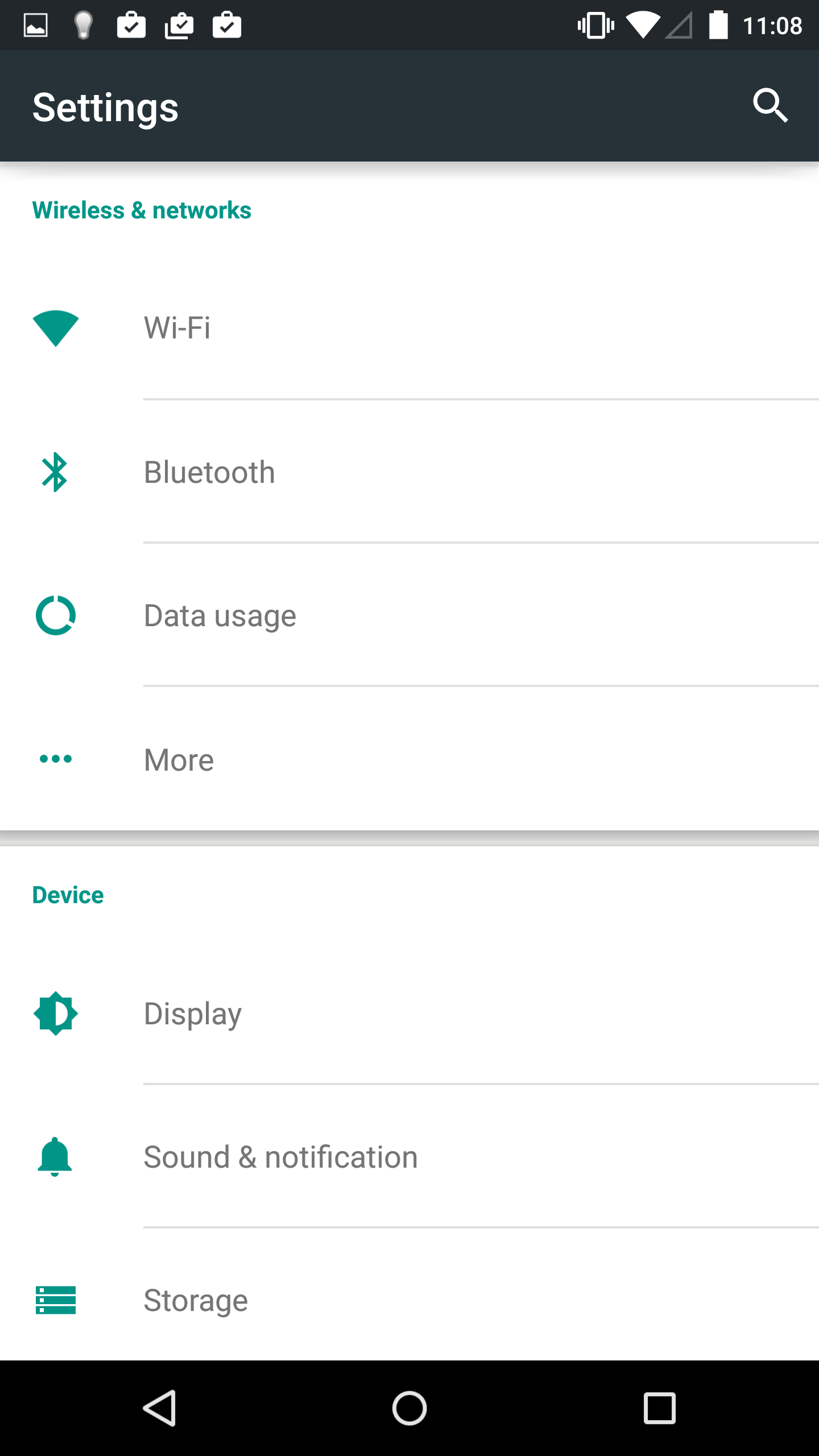
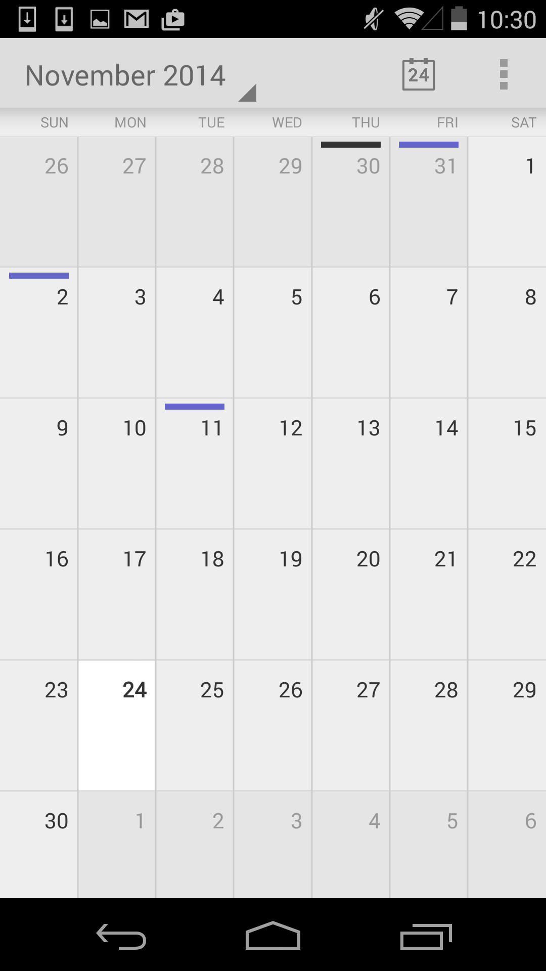
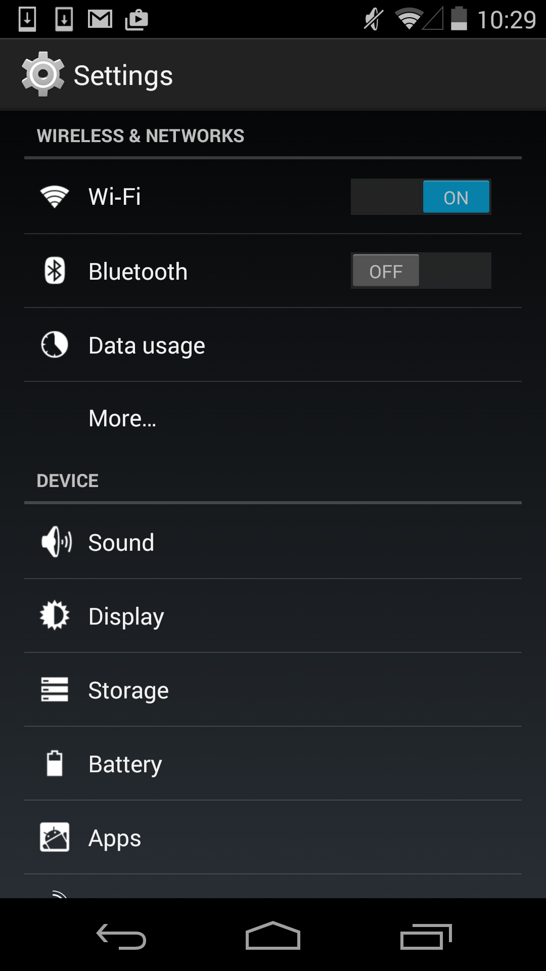
Finally with the end of Holo, comes the beginning of Material. When Google gave a sneak peek of the new interface for Lollipop at Google IO I was very excited by what I saw seeing. The basic idea of the cards in Google Now had been applied to the entire operating system, and expanded upon in ways that I hadn't expected but have been pleasantly surprised by. As you can see above, both applications display the sections of the interface on white cards that float above the background and cast slight shadows. There's also a much greater use of color, and a better use of screen real estate by dividing the application into multiple sections which can be seen in the new Calendar application. The Settings application is actually a bad example in this regard, as the increased spacing means the main page fits less on screen than before, but this is an exception and I included it primarily to show the contrast between new and old.
Material Design is based upon the ideas of paper, lighting, shadows, depth, and color. While this sounds a lot like the skeuomorphic interface of previous versions of iOS, Material Design doesn't limit itself based on the actual limits of physical items like paper, and it doesn't go to the point where applications are merely digital recreations of real world objects. There's also a heavy use of animations. Everything you touch seems to respond with an elegant animation, and the different cards in the interface can expand, contract, and stack atop one another to create an extremely dynamic feel. It is truly hard to explain, and it's really something that needs to be used to be fully understood.
The last thing to say about Material Design is how it represents more than just a way to design applications. Like I said earlier, within Material Design is a mission statement about Google's approach to services across multiple platforms. Although I've discussed it within the context of the Android platform, Material Design is going to be what you see in Google's applications across every platform. From web apps, to Android, to Chrome, to iOS applications, you will see a consistent style of design that adapts to different display sizes, use models, and methods of input. Overall this is a great step forward in making Google's services consistent across all devices, but I think in the context of iOS applications Google may be going a bit too far by ignoring the design guidelines of that platform in favor of their own.


126 Comments
View All Comments
Brandon Chester - Monday, December 1, 2014 - link
Just an additional note, I just talked to Josh and he already tested it, there's no improvement in our web battery bench. I would be suspicious of anyone reporting otherwise because like I described above, it doesn't make sense to have significant battery improvements in a browser test because of Volta.bensulli - Monday, December 1, 2014 - link
Thanks for the response, that's fair enough. Hopefully we see some real-world improvements even if they're hard to quantify.Maxpower2727 - Monday, December 1, 2014 - link
I'm not understanding your confusion with the performance issues on the Nexus 6, which are well known to be caused by the mandatory device encryption. You pointed this out yourself in another article very recently:http://www.anandtech.com/show/8725/encryption-and-...
Brandon Chester - Monday, December 1, 2014 - link
No, they aren't. Re-read the second last paragraph of that article.Maxpower2727 - Monday, December 1, 2014 - link
Ah, reading comprehension fail on my part. I would blame the issues on the ridiculous 1440p display, but the Adreno 420 should be more than up to the task of driving that resolution without issues. Strange.tuxRoller - Tuesday, December 2, 2014 - link
Yeah, I think his conclusion is wrong, iirc. Pretty much all gaming benchmarks, onscreen, deliver almost exactly the same performance @1440 as adreno 330 @1080.I know some folks don't see the point in increasing DPI but in this case I don't see the evidence for it being the culprit (especially when the note 4 doesn't appear to have the same issues).
HardwareDufus - Monday, December 1, 2014 - link
The big 3... Windows, Apple and Android are all very good now. It's senseless to constanstly bicker back and forth who's better. With 7 1/4 billion people on earth, a good number of them who will have cell phones, there is definitely space for 3 major players and the smaller guys. They all connect, share documents, utilize the same file formats.... in short.. who cares?I do prefer my windows phone... but it's not because as I perceive it is any better than apple or android... In fact Windows Phone is kind of Windows 8ish.. which I don't like... and Android/Apple feels like Windows 3.1 with it's folders of chicklet sized icons.... again which I don't like. so nothing's truly perfect... regarding my Lumia with Windows, it's just what I have and what I like,.. and is intuitive for me (yes, of course I'd like to see some level of customization available, like app ordering and so forth.... but nothing that leaves me unsatisified and I'm quite delighted I'll get Win20 too. I think my complacency shows my age.
Reading this review... from a UI perspective... there is some give and take between 4.4 and 5.0 ... some things better.. some things less helpful... But, I bet under the covers it's performing very well.
Where the big 3 have taken smart phones to is amazing... from highly proprietary embedded feature phones to full operating systems running on an architecture without allot of legacy bloat. Good stuff all around. Kudos to google for 5.0.
tralalalalalala40 - Monday, December 1, 2014 - link
It's a duopoly. If you just use your smartphone to make calls and browse the web, then yes, microsoft and BB still matter. But MS devices are missing out on billions of hours of developer time making wonderful tools/games/etc.Gadgety - Monday, December 1, 2014 - link
" They all connect, share documents, utilize the same file formats.... in short.. who cares?"Great for consumers.... However, from Google's, Apple's and Microsoft's perspective, and in particular their share holders' perspective, they care, because to them, this is war.
blzd - Monday, December 1, 2014 - link
That's fine, let them declare war on each other. As humble users, we should keep an open mind.