The Android 5.0 Lollipop Review
by Brandon Chester on December 1, 2014 10:00 AM EST- Posted in
- Smartphones
- Android
- Tablets
- Android 5.0
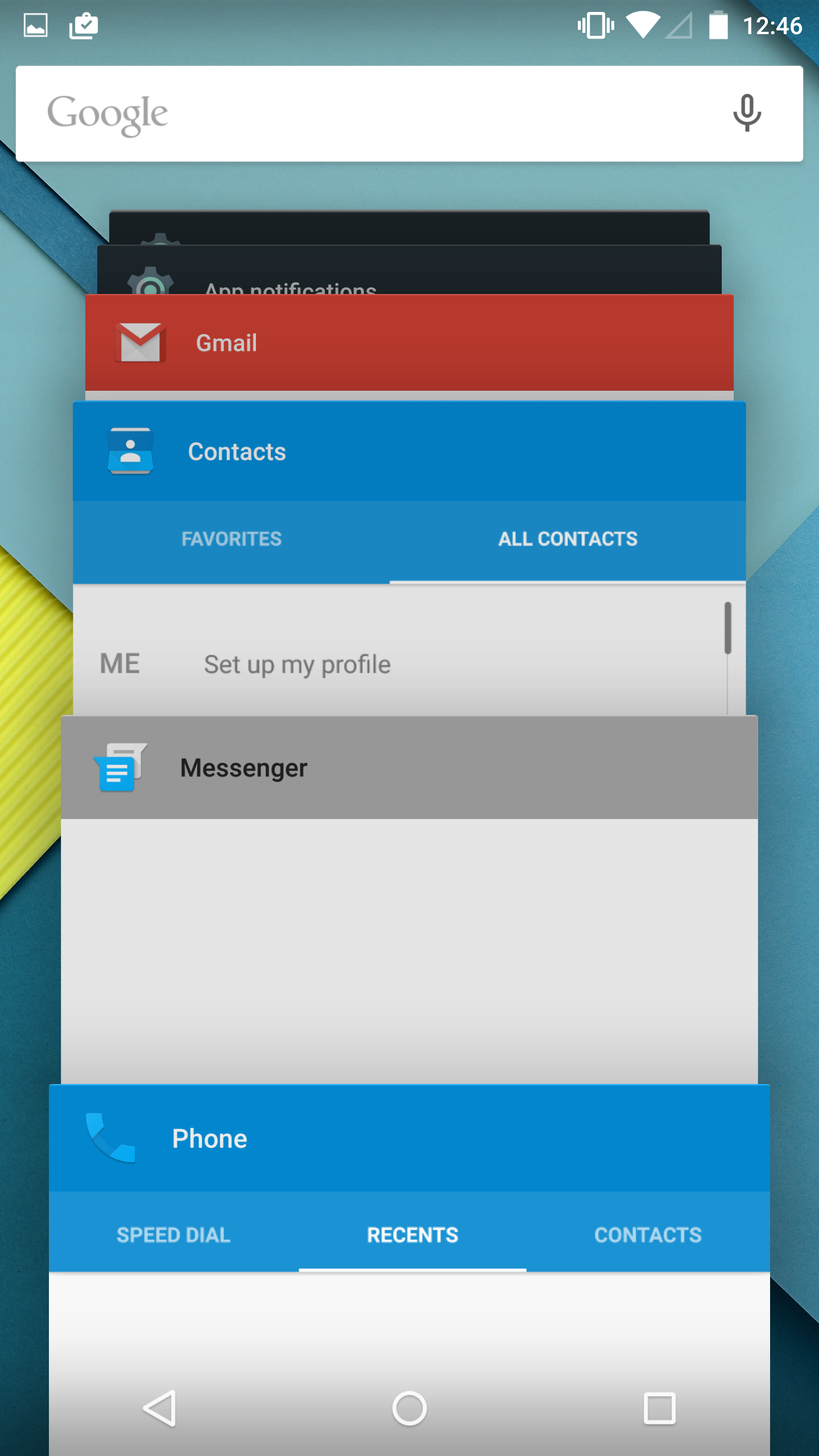
Notification Drawer
Android was the first of the major smartphone operating systems that we have today to implement the idea of a Notification Drawer. The idea of a screen to store all notifications that can be accessed from anywhere is something that both iOS and Windows Phone 8 have borrowed from Android. Although today it seems like the utility of such a design should be self-evident, it clearly was not, as iOS had previously resorted to intrusive alerts that displayed in the middle of the screen and interrupted the user. The designers behind Android's Notification Drawer certainly deserve a lot of credit for improving the state of notifications on mobile devices. In Android Lollipop the Notification Drawer has been redesigned to display like a list of cards, and has been simplified to include the quick settings page alongside the notifications themselves.
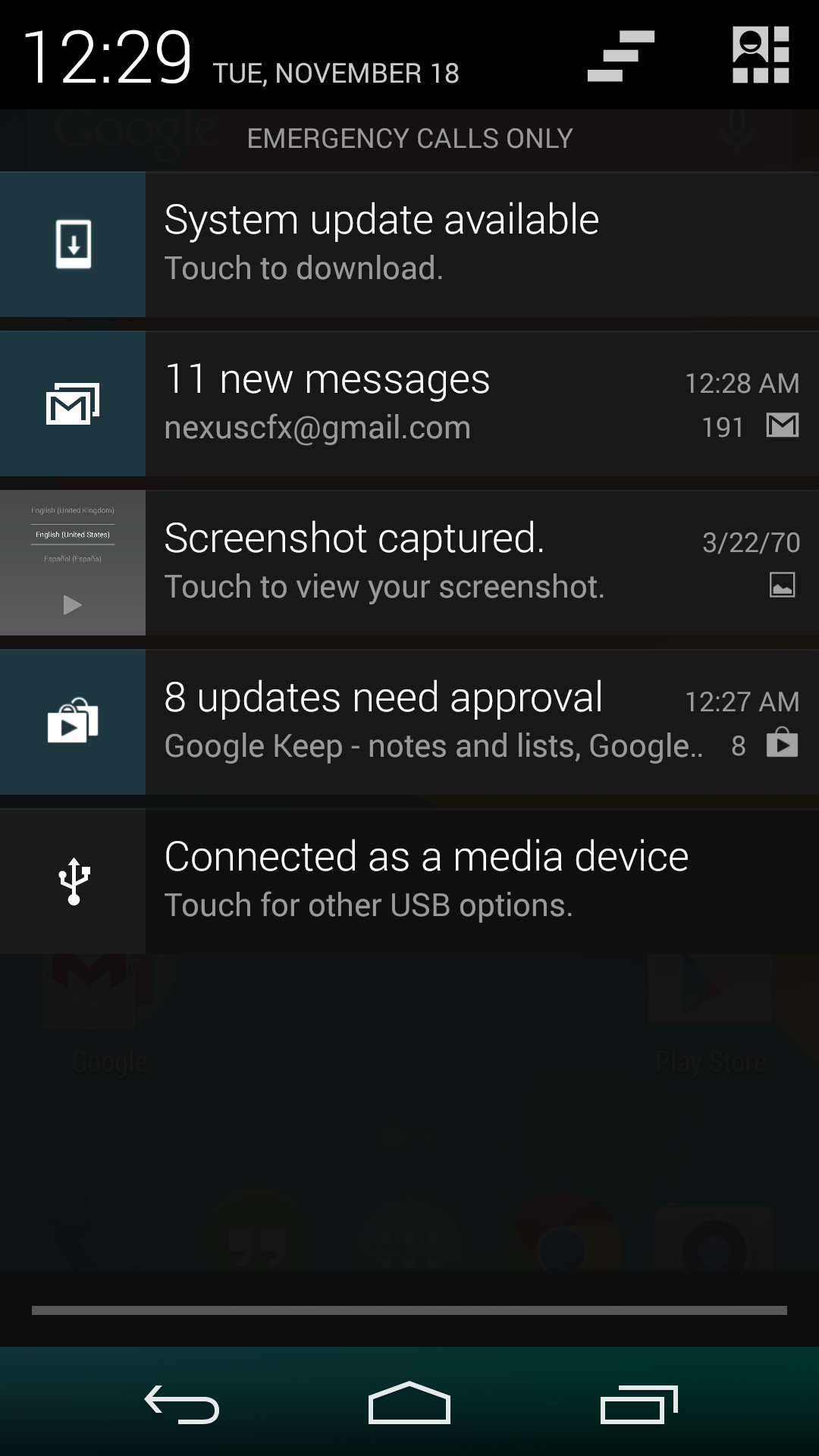
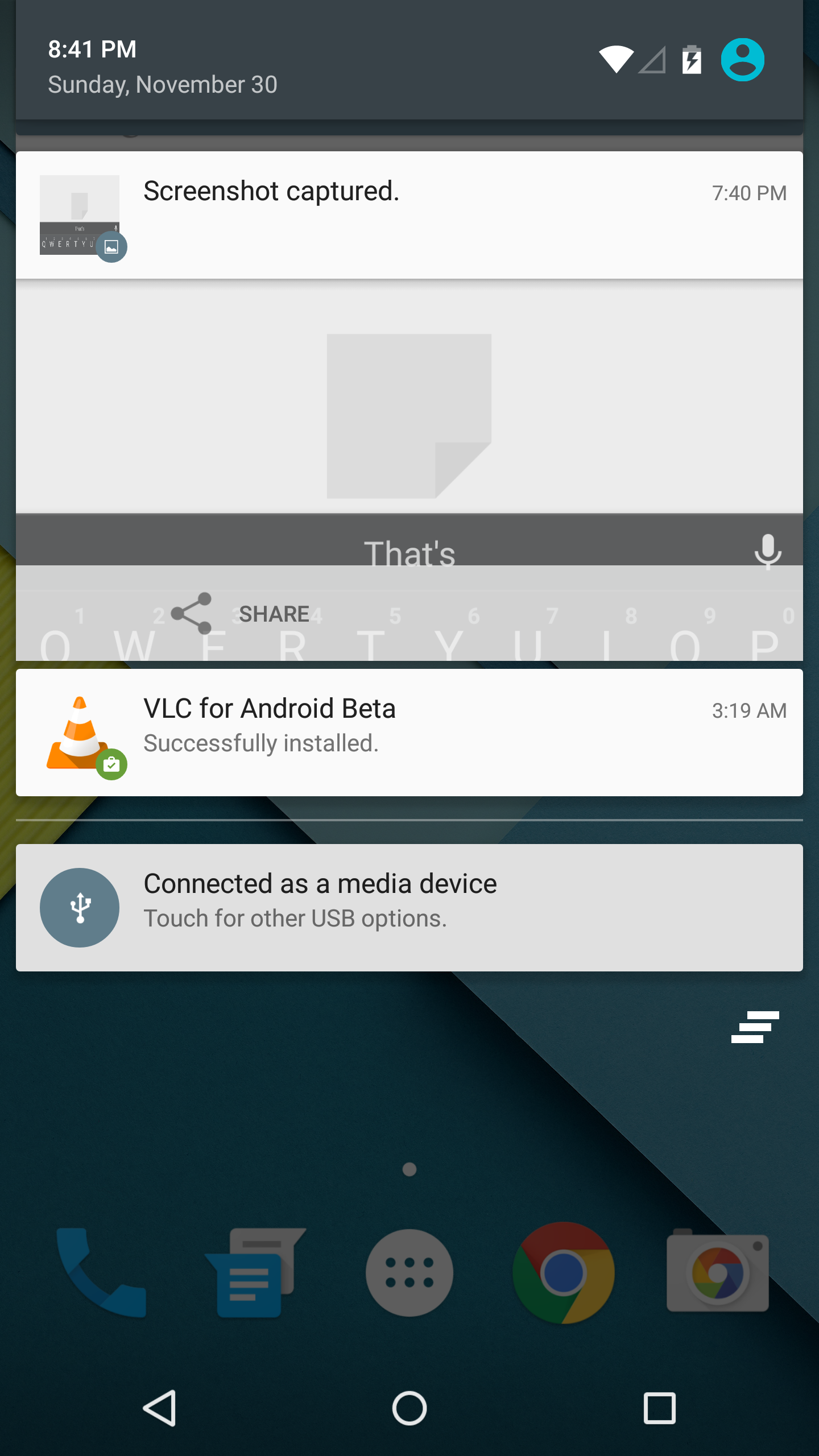
I never quite understood the animation for Notification Drawer in previous versions of Android. If you pull out the drawer in a desk, the first objects you see will be the ones that are closest to the side of the drawer with the handle. This is how the animation for pulling down Notification Centre on iOS functions. But on Android, pulling down Notification Drawer was like pulling down a magic bar that revealed notifications from top to bottom, as though they were already there and the bar somehow revealed them as it went over them. It just didn't really make any sense. In Android Lollipop, Google is clearly displaying each notification as its own separate card, and pulling down the drawer causes them to all expand and slide out from one another. Now it's not much of a drawer, but it's an extremely intricate animation that looks amazing and fits in perfectly with the Material Design aesthetic.
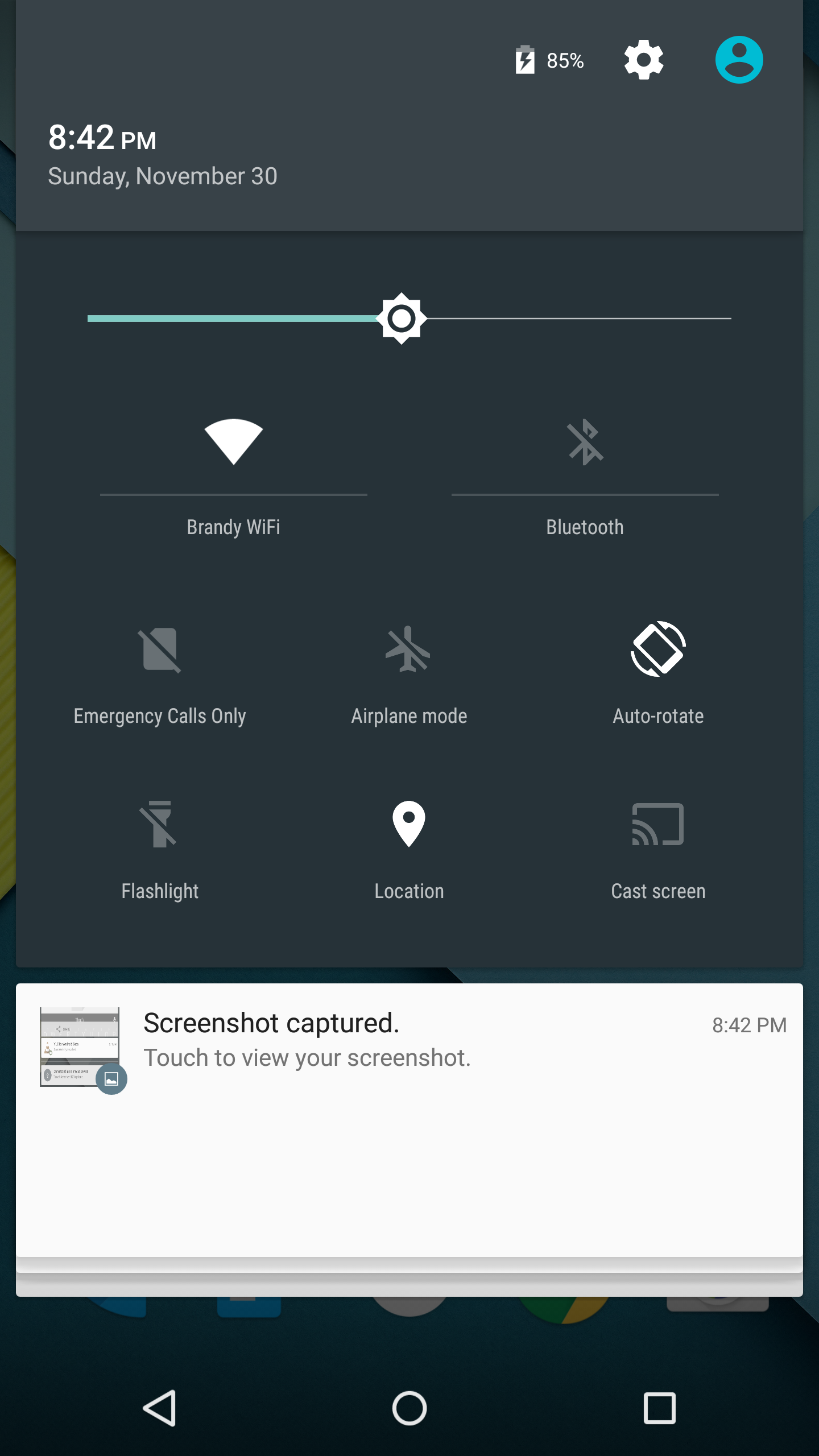
As you'll see above, the quick settings have been integrated into the same section as the notifications themselves. It's now accessed by simply swiping downward a second time after bring down the drawer. I think this works much better than the separate pages that Google was doing previously, which felt more like a way to just throw in quick settings without having to change the design of the drawer beyond the addition of a button. For the most part the settings are the same, but the brightness control is now a slider that can be accessed without having to press anything, and there are a few additions like the Cast screen and Auto-rotate toggles. Google has also finally included a built-in flashlight feature, which may not be welcomed by the developers of ad-ridden flashlight applications, but will certainly be welcomed by users.
The last thing to take note of is the icon in the top right corner. This would normally have your Google avatar, but in my case it's just one of the generic contact icons. Tapping this brings you to the menu where you can add, manage, and switch between multiple user accounts, which is a new feature for phones running Lollipop.
Overall I'm very happy with the new Notification Drawer. It looks better and does more than its previous iteration. My only issue is that it seems that the button to clear all notifications that appears beneath the last notification will not show up if there are too many cards. Swiping upward collapses the list of cards, allowing it to be displayed, but I think Google would be better off just putting it back up top where it was previously so it can always be shown.
Recent Apps
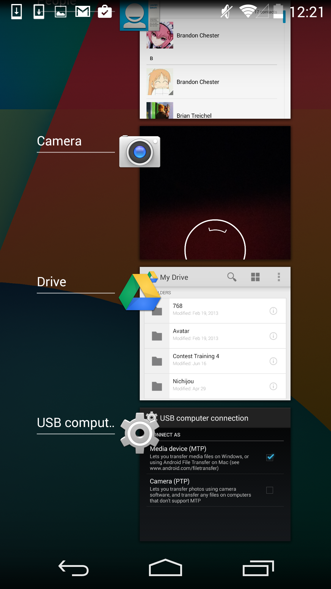
Like the Notification Drawer, Recent Apps also receives a design overhaul in Android Lollipop. What was once a list of square application previews is now something like a stack of cards which displays the full view of every application, although the perspective limits your view to the upper half. The new design also works well with the new animation when accessing it from within an app, which shows the application falling down beneath the navigation buttons and becoming the first card in the stack.
Functionally, it works the same as previous versions of Android for the most part. There is one significant change, and it's specific to Google Chrome users which I would expect is a sizable portion of the Android user base. In Lollipop, tabs in Google Chrome now appear as separate cards in the Recent Apps switcher. This is an interesting move on Google's part because in a way it knocks down a lot of the segregation between native apps and web apps, as web apps will be displayed in the list along with everything else. The only downside to this feature is that it can make it hard to keep track of tabs, and I've actually disabled it in the settings section of Chrome in favor of having the tabs within Chrome itself because I simply have too many tabs open at a single time to have to search for them among every recently opened application.


126 Comments
View All Comments
lpyihui - Tuesday, December 2, 2014 - link
How about Project Volta and the battery life on Nexus 5?Brandon Chester - Tuesday, December 2, 2014 - link
I responded earlier in the comments about this. There's really no way to benchmark Volta, it has no impact on anything like web browsing or video playback tests.genghisquan - Tuesday, December 2, 2014 - link
My experience with Lollipop went from positive to negative after the first week. I absolutely loved the concept & execution of Material Design. The other things that I was excited for with 5.0 was how smooth everything would feel and better battery performance. I'm so disappointed with those two things because things feel even more sluggish than it did on KitKat, and battery life isn't noticeably better at all! I seriously have sent more complaints/feedback while using Lollipop than I ever did on KitKat.Impulses - Tuesday, December 2, 2014 - link
Thank the Google Gods there's a setting in Chrome to disable it's tabs from invading the multi tasker, or I probably would've had to switch browsers.jabber - Tuesday, December 2, 2014 - link
I was really looking forward to just ONE thing from Lollipop for my Nexus 4 and that was the potential to use RAW capability for the camera.Unfortunately, Google decided not to update the Nexus 4 camera API. Thanks Google.
zodiacfml - Tuesday, December 2, 2014 - link
1. I don't feel the new Android much since I'm using a different launcher just to remove Google's search bar on the main screen.2. I like the flashlight capability, goodbye flashlight app. It still has a bug though. When it sleeps, it just stops working and the camera app will crash.
3. I appreciate the Auto rotate shortcut missing from the the previous.
4. Battery life seems the same. I have been using the excellent Greenify App. Yet, there should be a way to control power draining issue when the phone has little or no cellular signal.
5. ART has probably remove very small stutters in some apps. Overall, my N5 is very smooth and quick and nothing left to ask for.
6. Google camera HDR has become slower and faster depending on the scene. It's still the best way to get good photos from a smartphone. I hope for manual controls, RAW mode, and other powerful features such as 60 fps video capture on 720p.
7. Now the UI and most messaging/social apps use white background, there should definitely a content aware Auto Brightness control so that it lowers the backlight for such content and then boosts again for full screen photos or videos.
8. A very small and niche annoyance for is the missing IP Address from the WiFi information page. In 5.0, I can only find it in About Phone - Status. I currently use my phone to troubleshoot WiFi connectivity at work and implementation of 5GHz AP setup.
9. I don't like the Photo app. It still feels the Backup Photo App. I have to download a 3rd party app for viewing pictures since they have removed the Gallery app.
10. There should be an option to bring out the keyboard immediately when unlocking the phone. In 5.0, it will require to swipe the lock icon first which is probably useful if you to want to read your notifications first before deciding to unlock the phone.
darkich - Tuesday, December 2, 2014 - link
What a disappointing review.Pointless talk about frame rates and not a word about aspects that actually have practical merit and value - comparative battery endurance and application loading times.
Sigh
Alexey291 - Thursday, December 4, 2014 - link
I know its like I'm on engadget or something...IKeelU - Tuesday, December 2, 2014 - link
As an N4 user who's been using the Google Now launcher since it was available as a standalone APK last year (for those who haven't tried it, you can get it from the google play store now and it's terrific), I didn't feel as "shocked" by lollipop as I did by kitkat. Like with all android updates, it feels like the google apps were gradually updated prior to the OS update so I was already sort of used to the design changes.If your apps were fully updated, and you've been using Google Now Launcher, in day-to-day use there's really just 3 main changes: notification bar, homescreen, general smoothness. All good changes IMO.
oturn - Tuesday, December 2, 2014 - link
"I think what can be said is that overall, Android is pretty much at the same level as Windows Phone and iOS for animation smoothness and general performance."Crazy talk! I have a 2nd gen Moto X with Lollipop, and an iPhone 6. I switch between them weekly. The smoothness and general performance of the iPhone 6 / iOS is ALWAYS a breath of fresh air compared to Android, Lollipop included. I hate it, because I prefer Android, but there it is. It slaps me in the face every time. There's nothing subjective it. It's obvious.