The New Motorola Moto X (2nd Gen) Review
by Joshua Ho on September 17, 2014 9:00 AM EST- Posted in
- Smartphones
- Motorola
- Android
- Mobile
Moto Voice
One of the highlight features of the previous Moto X was Touchless Control, and Motorola spent a great deal of time trying to empahsize improvements in this feature with at the launch event. For those unfamiliar with Touchless Control in the previous Moto X, I would reference Brian's Moto X review. For those that don't want to read another review, the quick explanation is that Moto Voice acts as a voice command system, similar to Siri but with integration into Google Now and it works purely based on voice instead of long pressing a home button or a swipe gesture on the navigation keys. With the new Moto X, not too much changes, but there are some key features added. First, we see the ability to assign new keywords other than “Ok Google Now”, which is nice. I’m not really sure how this is enabled, as based upon some digging Motorola is still using a TI C55x DSP to enable low power hotword detection.
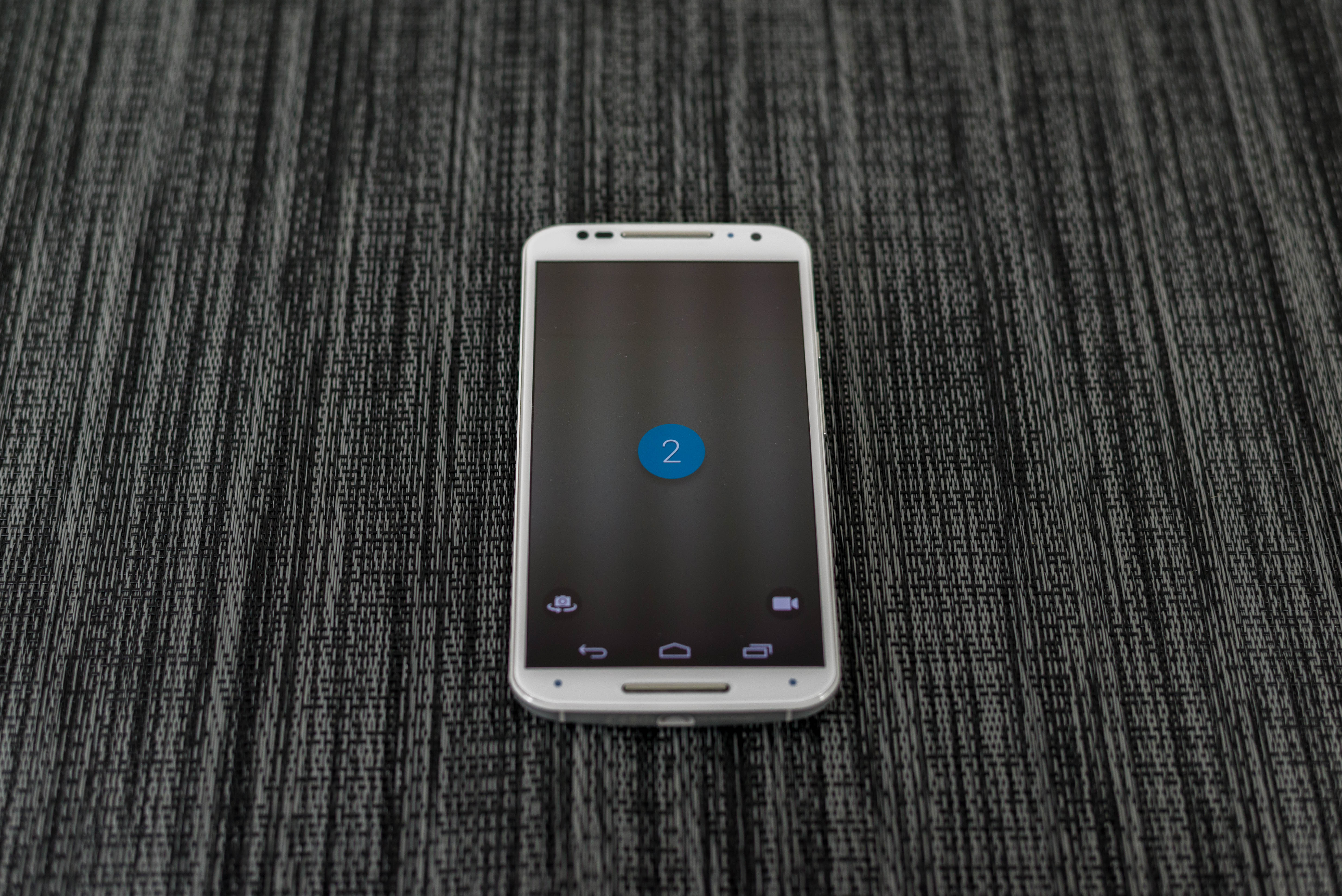
For the most part, other than this change I don’t really see a major step forward in functionality, although I’m sure that some will see a great deal of benefit from the voice-enabled selfie feature, which automatically opens the camera app with the countdown as seen above. Voice control continues to be an area where I’m unsure that there’s functionality to be had all the time. For the most part, I only seem to use voice control in situations where my hands are unable to manipulate the phone, which basically means when I’m driving or walking. For better or worse though, this is an area where wearables are much more effective. For example, it’s quick and easy to raise my wrist and ask for navigation to an event while driving compared to trying to reach into my pocket and carefully pull out my phone without dropping it under the seat. While explaining how this happens is a long story, the critical point here is that Moto Voice doesn’t really have a killer use case that isn’t done better by something else.

At any rate, the user interface also changes with the new Moto X. We see a great deal more color and a generally friendlier UI compared to the rather dark theme we saw before. Motorola seems to be following Android UI trends in general with this move, although it will affect battery life on AMOLED panels. The setup process is relatively simple, although there’s definitely a need for a quiet room. Even mild amounts of background noise will complicate setup. I also noticed that differing aural environments could alter the responsiveness of Moto Voice, although this could be due to the function turning itself on and off due to a bug in the ROM.
Moto Display
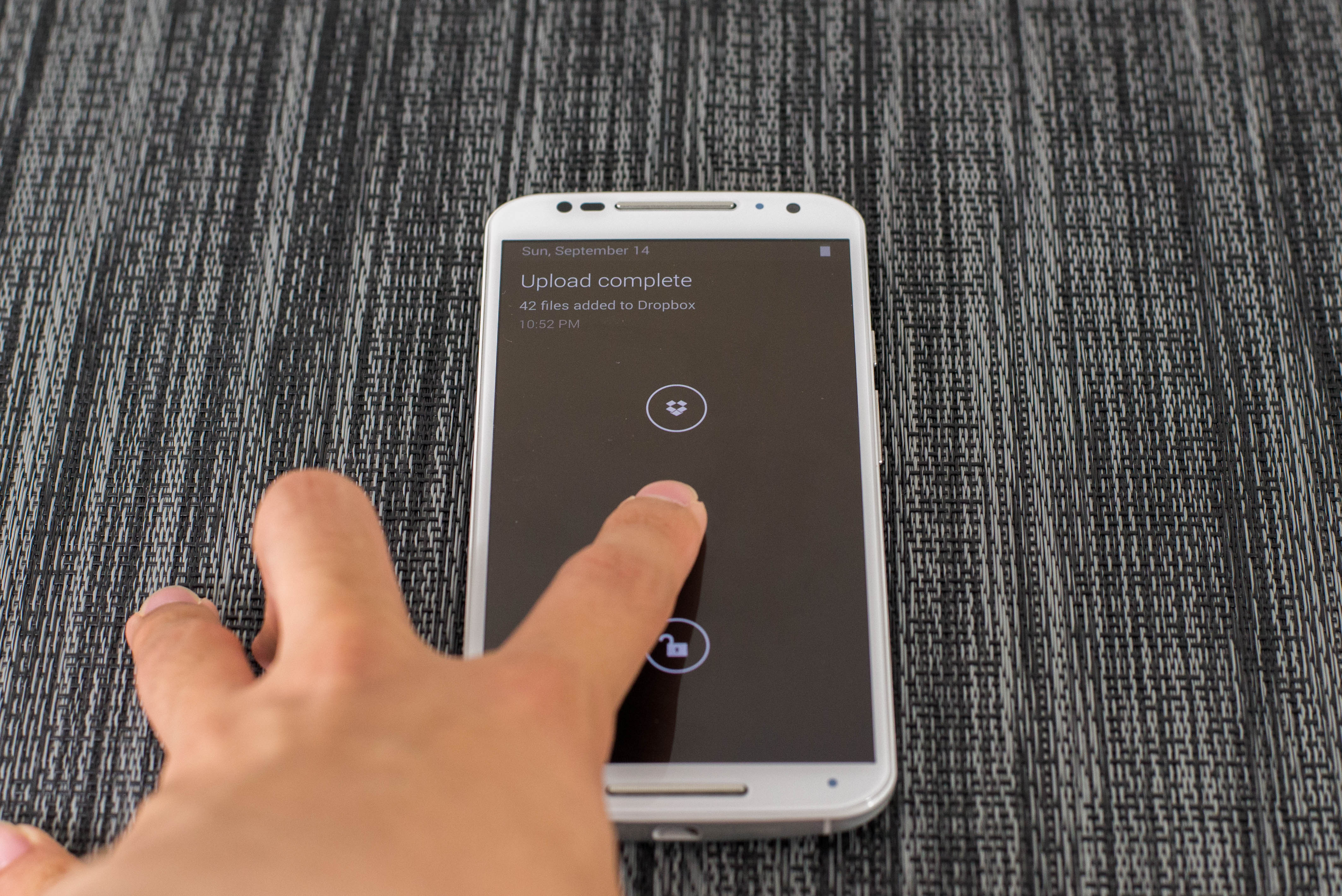
While Moto Voice is a bit limited in usability, Moto Display continues to be a great feature. For those that are unfamiliar with how Active Display worked in the previous Moto X, I would reference Brian's Moto X review again. For those that aren't familiar with Moto Display, this is effectively a low power mode in the Moto X that will display notifications and the time that also acts as a lockscreen. In order to support this low power mode, it isn't actually a part of Android OS and is programmed by a microcontroller so it isn't possible to take a screenshot of Moto Display.
While what we saw in the original Moto X was fantastic, the new Moto X takes things further by adding Moto Actions. While one part of Moto Actions is waving to silence alarms and phone calls, the other aspect allows for proximity to turn on Moto Display. This means that there’s no longer a need to shake the table or wiggle the phone in order to glance at notifications. While the original Moto X had a similar feature, it relied on the proximity sensor and required precise hand placement in order to turn on the display. Instead, with the new Moto X all that is needed is a hand wave or just getting close to the phone. It doesn’t really need to be accurate either, as pretty much any hand wave over the display will cause Moto Display to activate. In practice, handling of the notifications is still mostly similar, although now there’s the ability to display up to three notifications instead of just one.
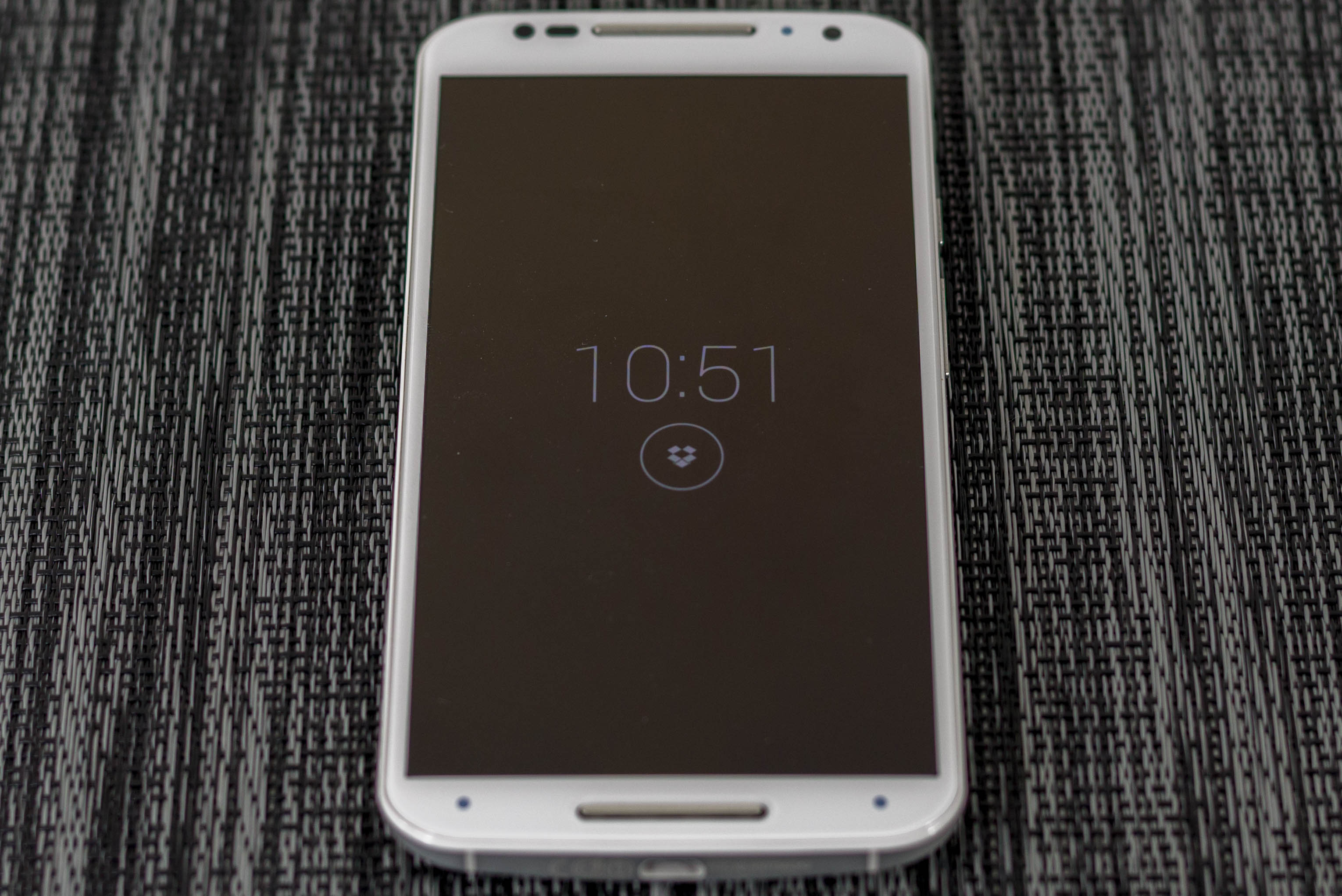
While Active Display in the original Moto X was good, the new Moto X really turns it into a fantastic feature. It's hard to really explain because on the surface it seems rather mundane but after using Moto Display it's clear just how much time it saves. The glance time is just right to view notifications and the hand wave/approach action is effortless compared to pressing a home button or tapping the display. There's also no doubt that this helps to improve real world battery life as the seconds used to glance at notifications adds up quickly over time, especially because initial unlock will drive the CPUs to max power to ensure responsiveness.
If I’m honest, I’m not really completely sure how this new feature is implemented either. TI’s MSP430 is gone, and the part that seems to take its place is an STM401 sensor processor, which could be the solution used to enable Moto Display and also acts as a sensor hub. I'm not really sure what drove a change, but it's possible that the MSP430 limited feature expansion.


179 Comments
View All Comments
Alexvrb - Thursday, September 18, 2014 - link
Yeah the RAM and the CPU aren't that big of a deal to me, but if you're going to delete the mSD slot then your base model should be 32GB with a 64GB version as the upgrade.gg555 - Wednesday, September 24, 2014 - link
I agree. These days 16 Gb is a joke (which works out to more like 10 or 11 GB, once you account for the space the system takes up). These are multimedia devices. Once you start taking photos and video, downloading music and podcasts, doing some backups with Titanium or whatever, 16 GB really doesn't cut it. I struggle with this all the time on my Nexus 4.gg555 - Wednesday, September 24, 2014 - link
And they always want you to use the cloud as the solution to this problem. Seriously? Obviously they cannot possibly be ignorant about people having data caps on their plans. Not everyone can afford an unlimited plan. Or maybe this is just their way of colluding with the carriers to push people into more expensive plans. Anyway, the could is not a serious solution for a technology that has inherent network bandwidth issues.xaml - Saturday, September 27, 2014 - link
And security issues, which then reveal underlying issues with privacy, exhibitionism and respect. Not to mention the question of reliable access. And could it even be that data over radio is consuming more power than data over few or costly internal memory, respectively neglected external memory?erikiksaz - Tuesday, September 23, 2014 - link
Unlike Amazon, they're actually trying to make money off the hardware, hah. And I'm sure the cooling solutions for something of a tablet-sized form factor is much easier to tackle than on a smartphone.1080p on a 5.2 inch screen still results in a visible difference over 720p. 1440p, not so much.
bigstrudel - Thursday, September 18, 2014 - link
It's clearly the stock kernel which reduces battery runtimes on ALL nexus devices.julianocas - Thursday, September 18, 2014 - link
peGGi - Friday, September 19, 2014 - link
Kudos to Motorola for the impressive engineering that went into the metal-band-as-antenna. I like that about Motorola, that they put time and effort into things that users may not immediately notice, but should definitely improve the everyday quality of the experience of using a phone for its primary use - to make calls. But........ the metal band ruins the design, compared to X Gen 1, sadly. Screen-plate aside, the casing now seems to consist of 3 parts rather than 2. I loved the slopey, curviness of the first gen, and the way that the backplate curved round the sides, and met the front plate in the middle. That unity of design is gone now, and this second gen looks a bit awkward imo. The front and back of the phones don't match that well anymore. There was a lovely overall unity in aesthetic to the first Gen, which has been broken on the 2nd.
I also agree with the commenters that it is too big. Just like the S5, G3, and One M8 are all too big. For my very average sized male hands, the Gen One's ergonomics were perfect.
Sensors at the top on the front, especially on white model, look messy. Could they not all have been put behind one, long translucent black strip, along with the speaker grille, or something like that? Or tidied up a bit better?
I think Motorola would've been better sticking to the compact, ergonomically wonderful design of Gen 1, but with improvements to the internals (camera, SoC, colour accuracy, battery life). They'd have a great performing phone that fits better in the hand than all their rivals, for a lower cost than their rivals.
And then it would make sense to have a 5.5inch-ish size 'phablet' too, big screen, big tricks, etc. They'd be competing just above and just below the S5 and I'd say they'd rip chunks out of the market that way.
It looks like the Gen 1 is gonna go down as a classic, flawed and all as it was.
Harry_Wild - Friday, September 19, 2014 - link
I agree with your remark on the Moto X 2014! It much bigger then the Moto X which is great feeling and the right size for me small hands. But I am surprise Motorola went to a much larger size too! Motorola should of made the Moto X 2014 the same size; and they have the Moto G - 5" for anyone wanting a larger model. That would have been perfect decision. I going to the Apple store and looking at the 4.7" iPhone 6!dsouza - Friday, September 19, 2014 - link
@Harry_Wild, the new iPhone 6 (5.44 x 2.64in) is just marginally smaller than the Moto X 2014 (5.54 x 2.85)! So, if you believe that the new Moto X is too big for you, probably the new iPhone 6 will be so!