The iOS 7 Review
by Brian Klug & Saumitra Bhagwat on September 19, 2013 1:25 AM ESTLike any major design change, iOS 7 definitely takes getting used to. My initial reaction to a lot of iOS 7 was honestly more surprise and aversion than I thought it would be, but over time the changes have grown on me. I like to think that we're pretty open to change, especially as enthusiasts, but it's a natural human response to want things to be familiar and closer to what came before. Considerable time spent running the beta and watching parts of the platform change over time in response to feedback from developers and other third parties makes me optimistic that the new iOS 7 UI will continue to change and evolve the same way previous versions did.
The flip side is that I can't shake the feeling that some of the iOS 7 design is reactionary. Pundits lambasted Apple with iOS 6 and the iPhone 5 release for being pretty much the same OS with minor tweaks and very few stylistic changes. Those vocal members wanted dramatic change in visual appearance just for the sake of having it, and like the idiom goes, be careful what you wish for because sometimes it actually does come true. No matter how you sugar coat it, iOS 7 is a dramatic departure from the visual style that came before.
I like the use of translucency and transparency, and the new eye candy and visual effects in iOS 7 did initially solicit a bit of the same "wow" reaction that I had the first time looking at iOS on the original iPhone. The use of parallax and the translucency really does convey a sense of depth and order without being as garish as drop shadows or the shiny faux-3d buttons of yesterday's iOS.
The downside is that after a few weeks of it, some animations are really just a lot more gratuitous than they need to be – after the thousandth time watching the tiles fly in or application zoom out into the multitasking interface you want it to just happen instantly. I have no doubt that iOS will go the route of OS X and Windows Phone and gradually increase the speed of these animations to make the platform feel faster. They're also bound to have a power penalty at some point.
I guess that's the ironic part – the flagship devices don't drop frames during the transitions, they just feel long. I can speak to iOS 7 performance which is good on the iPhone 4S and above and newest generation of iPads, performance however on the iPhone 4 and iPad 3 leaves a lot to be desired. The iPhone 4 stutters through all of its animations, has sparse use of transparency, and generally feels like it's on its last legs. The iPad 3 unfortunately is much of the same – sparse transparency, occasional stuttery parts throughout, although a lot more usable than the iPhone 4. I guess I'm just surprised to see the iPad 3 get to that point of feeling slow so fast.
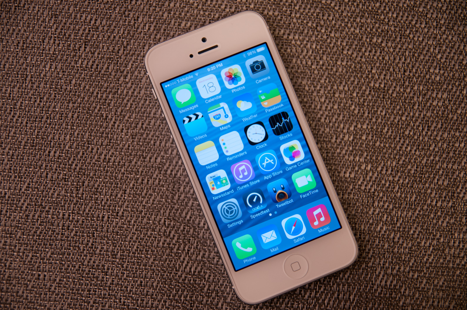
Although a lot of iOS 7 is visual, the functional changes and new features that are standouts really do make a difference. Control center is a long overdue functional improvement that makes controlling a subset of commonly used settings very fast. There's still more Apple could do here to smooth over a few more friction points, but it's a welcome addition. Notification center also feels a lot more well thought out, with logical separation of information that's useful and notifications themselves, even if there's still no "clear all" button.


144 Comments
View All Comments
uhuznaa - Thursday, September 19, 2013 - link
One point Steve Jobs argued about with the old Apple and that lead to him being fired was that he didn't want the Mac to have more RAM. His way of thinking was that programmers should look for ways to make their apps solve problems by thinking through the problem deep enough to come up with simple solutions that didn't need lots of code or memory. All this "we have actually no idea what the people want to do, so just let's throw raw hardware power at it and give them everything" never was his vision.And everybody who ever designed an app or any software solution to something knows that really diving to the bottom what you want to solve is the crucial part. If you do this right you may end up with incredibly simple solutions that go a very long way. The Wiki idea is a good example here.
Jumangi - Thursday, September 19, 2013 - link
2013 and its still just screens of static icons...boring Apple.kyuu - Thursday, September 19, 2013 - link
Personally, I think the iOS 7 aesthetic is pretty ugly. I like Metro, but you can't simply Metro-ize the old grid-of-chiclets and expect it to look good. The propensity for bright, pastel colors doesn't help either.And then that translucency effect is downright bad, especially if you have a dark background. The simple transparency you get with the iPhone 4 is much, much better and should be the default. There is a (rather obfuscated) setting to turn the translucency off labeled "Increase Contrast".
Also, the contrived text in the notifications pane (it says "It is now X degress. The high today was Y degrees" or some such instead of just showing the current temperature and today's high/low) is a huge space waster and offers nothing over simply showing the numbers.
While the move away from skeumorphism to more modern design was necessary, Apple did it in a pretty poor way, IMO. If I had any inkling to move back to iOS before, Apple pretty much killed it with iOS 7.
mfenn - Thursday, September 19, 2013 - link
Capital letters. Use them please.HardwareDufus - Thursday, September 19, 2013 - link
I'm surprised by the use of bright pastel like colors. I don't like it. I can't stand Kelly Green, Magenta, Cyan and Baby Blue used so extensively. It's like the pulled a 'ME TOO' and adopted Windows8 Crayola color palette.That said, I use Phone8 and I can only stand 2 of the color scheme's available. So perhaps I am well in the minority.
The Von Matrices - Thursday, September 19, 2013 - link
After reading through the article, I'm surprised that the new operating system brings no new software features that make me think "wow, I wish my Android phone did that." From an overall view it seems that more than ever that the only real difference between IOS 7 and Android is their colors, font, and icon graphics. It seems that smartphone operating systems are converging on one UI design, just like desktop operating systems have done in the past few years.Sandiamom1 - Thursday, September 19, 2013 - link
I have always considered myself part of that Loyal Apple fan base. I have owned Apple computers, iPods, iPads, iPhones...I have given them as gifts, etc. I have raved about my phone so much, many of my friends have gotten the iPhone. Yes, I am that middle aged woman, not terribly tech savvy & enjoyed the immediate tech support of Apple & ease of use. Since upgrading to the iPhone 5 in June 2013, I have experienced nothing but frustration! This iPhone 5 is basically a very UNSMART, expensive piece of junk! I tried going to the Apple store for tech support, but they won't talk to me for 4 days! Guess that fast tech support service is a relic of the past. Went to AT&T, but they say it's a hardware problem so I'm at the mercy of a slow to respond Apple service system. Since upgrading to the 5 (had the 4s), some contacts get no texts from me, others it may be delayed by hours or days & vice versa; it frequently won't pick up the wi-fi & won't switch to my data plan so I just can't access the internet at all; it drops calls; Find My iPhone app will not work on this; touch screen & scrolling are frequently unresponsive; other things I can't remember now. A couple family members just got the android Galaxy 4S. I am seriously thinking of dropping all Apple products. Told my friends. They're interested in hearing my thoughts on the 4s if I switch. Apple store didn't seem concerned about losing a longtime, dedicated customer, which makes me think it's time to go.kwrzesien - Friday, September 20, 2013 - link
You got a lemon, get Apple to swap it out. Don't restore your 4S profile to it, start from scratch, re-download the apps you still need/want from the App Store, let the contacts sync with iCloud and/or Gmail and/or Facebook, etc. Every few weeks kill all the running apps from the task manager (double-click the home button, hold an app until the "x's" appear) and then reboot. The friends that aren't getting your texts probably have iPhones on Verizon, switch to sending to them as SMS - there is much more delay between AT&T and Verizon then there is internally, I think Apple has different server clusters for each and the interconnect can either get bogged down or jammed. I think the iMessage servers for Verizon in general seem to be slow.The iPhone 5 hardware is very good, but the key is that you did an UPGRADE. I think the software just gets screwy with this and I recommend doing a fresh install. If that doesn't fix your issues then get it replaced.
dcost11 - Friday, September 20, 2013 - link
The apps move when you tilt your device on the ipad, has anyone else noticed this? its like they are on a layer above the wallpaper and as you move the device you see more or less of the wall paper. It doesn't seem to work on my iphone 4Gorgenapper - Friday, September 20, 2013 - link
Updated my iPad 3 to iOS 7 last night.1) Apple fans complain so much about the occasional lag on Android devices, well now they can have some of it too. But of course, Apple lag is in fact a built-in value-added feature. I'm just using the iPad wrong.
2) I think I can hire a chimpanzee to design and draw better icons than most of the ones that have been updated. I mean, sure, the iOS 6 sunflower icon for photos has been around for roughly a million years or more and was due for replacement, but they couldn't draw up one or two abstract representations of photos and instead gave us this Wheel-O-Colors that makes no sense whatsoever? Some of the other icons are so hilariously minimalistic and juvenile in execution that it cheapens the entire experience of using the iPad.
3) No calculator for the iPad? Really? Seriously? Most of the free ones out there are full of ads.
4) Movies on my iPad no longer have titles, I'm supposed to know which movie it is by looking at the thumbnail. Let's see... I have... "A Movie shot in Black", "The Terrifying Darkness", "Noire", "Black Screen of Death II", "Random Face Caught in Motion" and "Unidentified Body Part". Another value added feature from Apple, thanks!