The iOS 7 Review
by Brian Klug & Saumitra Bhagwat on September 19, 2013 1:25 AM ESTLike any major design change, iOS 7 definitely takes getting used to. My initial reaction to a lot of iOS 7 was honestly more surprise and aversion than I thought it would be, but over time the changes have grown on me. I like to think that we're pretty open to change, especially as enthusiasts, but it's a natural human response to want things to be familiar and closer to what came before. Considerable time spent running the beta and watching parts of the platform change over time in response to feedback from developers and other third parties makes me optimistic that the new iOS 7 UI will continue to change and evolve the same way previous versions did.
The flip side is that I can't shake the feeling that some of the iOS 7 design is reactionary. Pundits lambasted Apple with iOS 6 and the iPhone 5 release for being pretty much the same OS with minor tweaks and very few stylistic changes. Those vocal members wanted dramatic change in visual appearance just for the sake of having it, and like the idiom goes, be careful what you wish for because sometimes it actually does come true. No matter how you sugar coat it, iOS 7 is a dramatic departure from the visual style that came before.
I like the use of translucency and transparency, and the new eye candy and visual effects in iOS 7 did initially solicit a bit of the same "wow" reaction that I had the first time looking at iOS on the original iPhone. The use of parallax and the translucency really does convey a sense of depth and order without being as garish as drop shadows or the shiny faux-3d buttons of yesterday's iOS.
The downside is that after a few weeks of it, some animations are really just a lot more gratuitous than they need to be – after the thousandth time watching the tiles fly in or application zoom out into the multitasking interface you want it to just happen instantly. I have no doubt that iOS will go the route of OS X and Windows Phone and gradually increase the speed of these animations to make the platform feel faster. They're also bound to have a power penalty at some point.
I guess that's the ironic part – the flagship devices don't drop frames during the transitions, they just feel long. I can speak to iOS 7 performance which is good on the iPhone 4S and above and newest generation of iPads, performance however on the iPhone 4 and iPad 3 leaves a lot to be desired. The iPhone 4 stutters through all of its animations, has sparse use of transparency, and generally feels like it's on its last legs. The iPad 3 unfortunately is much of the same – sparse transparency, occasional stuttery parts throughout, although a lot more usable than the iPhone 4. I guess I'm just surprised to see the iPad 3 get to that point of feeling slow so fast.
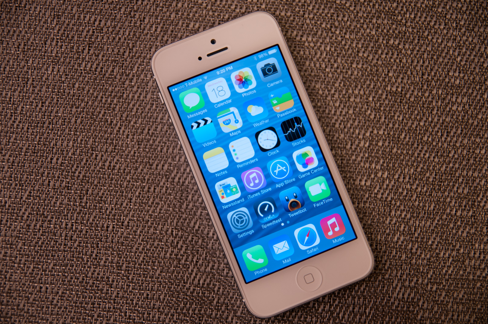
Although a lot of iOS 7 is visual, the functional changes and new features that are standouts really do make a difference. Control center is a long overdue functional improvement that makes controlling a subset of commonly used settings very fast. There's still more Apple could do here to smooth over a few more friction points, but it's a welcome addition. Notification center also feels a lot more well thought out, with logical separation of information that's useful and notifications themselves, even if there's still no "clear all" button.


144 Comments
View All Comments
KPOM - Thursday, September 19, 2013 - link
Regarding battery life, I'd say I've noticed a slight drop, but it's hard to tell from one day. I recall that happened last year, too, but was fixed in one of the first bug fixes. I expect it will be the same this year.ltcommanderdata - Thursday, September 19, 2013 - link
What about graphics benchmarks? Are the newer GPU drivers faster?blacks329 - Thursday, September 19, 2013 - link
"Swipe to delete has also been reversed in iOS 7. Rather than a left to right swipe to bring up a delete button, it’s now a right to left swipe."Actually swiping both ways worked pre-iOS 7, swipe left to right or right to left, would present you with the delete button. The delete button would animate in from right to left anyways, so I don't know why they even let you swipe left to right to delete.
Surrept - Thursday, September 19, 2013 - link
Good review Brian. Been beta testing for awhile now and I really do like the changes.Icehawk - Thursday, September 19, 2013 - link
Did I miss it - where was AirDrop discussed?apertotes - Thursday, September 19, 2013 - link
"The other reality is that smartphone users no longer need a UI that emulates real-world analogues to real objects for them to be able to discover and learn the interface. Things like controls (switches, sliders, and buttons) that emulated actual buttons no longer have to appear that way to be immediately obvious. Textures and other surfaces no longer need to mimic the real world either. Instead these can now give way to something that’s minimalist and new."Welcome to 2005. But as always, nothing is cool until Apple does it.
solipsism - Thursday, September 19, 2013 - link
What changed in 2005? Where did these sweeping changes take place that somehow left Apple out in the cold despite being 2 years before the original iPhone launched?Impulses - Thursday, September 19, 2013 - link
Revisionism 101uhuznaa - Thursday, September 19, 2013 - link
I think this is totally wrong. Emulating real-world analogues (including things like inertia and friction) leverages things you not only have learned by dealing with the world but even things that are hard-wired in every animal. Even cats have an easier time to tap on things that appear like things and not an abstract symbol.Doing away with that is just another fad, that's all. Things like clear borders, shadows and raised buttons are not only a fad, they carry a meaning that goes much deeper than things you learn by using an interface.
Skeuomorphism got a bad reputation for all the wrong reasons. UNNECESSARY decoration is bad (maybe, it may still look nice) but not everything from the real world is skeuomorphism. You just need to look at the physics model of inertia and friction when scrolling that is still pretty much nailed down in iOS and a bad emulation in Android (and this is not meant as a jab, you'll find no combination of mass and friction that will work like the model in Android tries to do, it's just wrong from a physics POV). These are things that are rooted in physics. It's not only a good idea, it's the law...
Because of that I still like things I can press to look as if they're standing out. There's something in my animal layers that understands these hints even before I do. Apple throwing this away for no good reason is a sign of them being helpless and without a real clue. They're just fumbling around.
By the way, using large areas in clear colors for that may be fine too, and this is what MS is doing. Apple just using strings of colored text is by far a third-rate choice, but it was the only choice left for them. This is important to understand: iOS 7 is all about what was left and nobody did before for very good reasons. Apple was complacent for far too long, they did nothing for 6 years and thus they gave up the freedom of leading.
One day all of this will be written down in IT history books and it will be clear as day.
LordConrad - Thursday, September 19, 2013 - link
I don't like the new look, seems like it was designed for teenage girls. I will not be upgrading my iPad 4.