Dell U3014 LCD Review
by Chris Heinonen on April 15, 2013 2:00 PM ESTAnother reason that we changed calibration packages is that we can now target AdobeRGB correctly, as CalMAN supports it and almost any other color space out there. Here we used the U3014 AdobeRGB preset and measured with the same targets as before. We didn’t do the 80 cd/m2 pass as AdobeRGB doesn’t use an sRGB gamma curve in the specification, and we saw how the Dell U3014 handles the change in luminance levels already. We are mostly looking to see how the monitor handles the larger gamut of AdobeRGB and if it gets the color points correct.
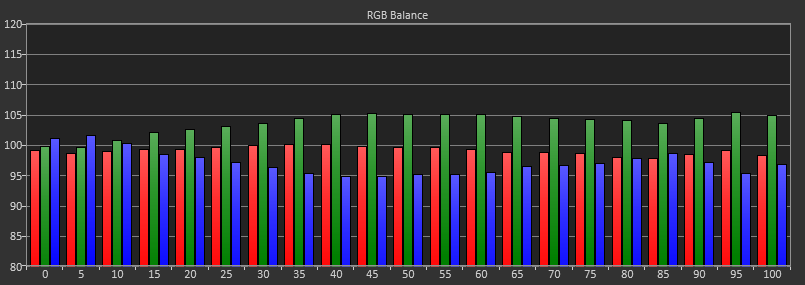
Once again, the Grayscale has a green bias to it by default. The overall average CCT looks good at 6568K, but that’s why you have to look at the individual RGB components as you can easily have an accurate CCT but have a color shift that is clearly visible.
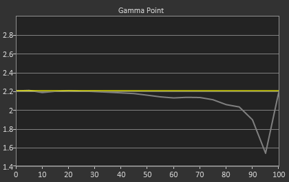
The gamma is once again very good up until 85-90% where we see a steep drop-off that seems to be crushing highlights a bit. This issue pushes the average gamma down to 2.1 from our 2.2 target. I checked the contrast with a pattern before setting it and taking the measurements so all white samples are visible, but it seems to push them too close together at the top. I’d recommend taking the contrast down 3-4 levels from the maximum available to help with this highlight clipping, but that also will reduce the contrast ratio a bit as we saw with the sRGB calibration.
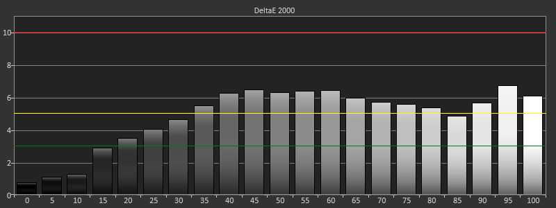
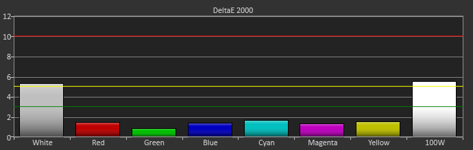
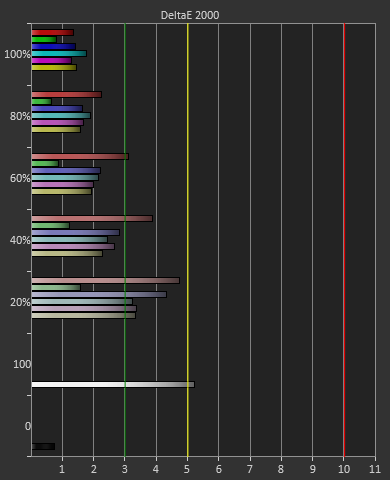
The grayscale starts out good, but you get errors above a dE2000 of 5 from 35% on, except for at 85%. Given the green tint that we saw in the RGB balance this isn’t surprising at all, since dE2000 is really a combination of gamma and RGB balance, and if both of those are perfect your dE2000 should be perfect as well. Conversely, when there are errors (as seen above), they'll show up here as well.
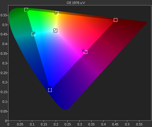
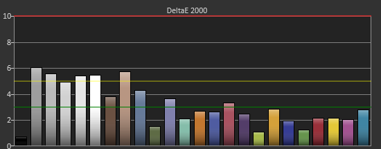
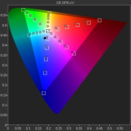
Colors again are very good by default, with errors being made much worse by the presence of white in the average. You can see the much larger gamut of AdobeRGB here, as those color points are in different locations than they are with sRGB. The color dE2000 errors are on top, and on bottom is the AdobeRGB CIE chart with the sRGB CIE chart overlaid on it to show the difference in gamut size.
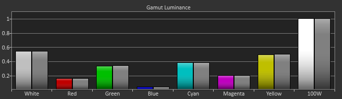
The Gretag chart fares worst in the default AdobeRGB mode, with the grayscale being a very high error and skin tones being bad as well. Most other colors manage to get to a dE2000 of 3.0 or below, but the average for the whole chart is 3.22, which is still good for no calibration but not excellent. Luminance levels for the colors are all still fantastic, which is the most important thing to get right, but other aspects of the colors don’t fare as well.

Finally our saturations show that we have errors that get larger the closer we get to being unsaturated. Despite the higher errors there, our eyes are really more sensitive to errors with 100% saturation, so it’s better that the errors happen this way than the opposite way. Of course, this should improve after calibration, and then we hopefully won’t have to make any sacrifices at all.


84 Comments
View All Comments
chazh - Friday, April 26, 2013 - link
i am a new about this.actually, what is the parameter for being a good monitor especially for gaming ?
to be honest, this monitor prices looks expensive. Now, i am using the Asus MX279H with a triple setup. So far, i really satisfied with the result.
yslee - Saturday, April 27, 2013 - link
Hmm, no word on how the anti-glare coat is like on this version? I have the 3008 WFP and the coat interferes a little on white backgrounds. It's not extremely annoying, but I'd like to see an improvement here regardless.secretmanofagent - Sunday, April 28, 2013 - link
How is the antiglare coating? The U2412M's coating drives me nuts.masotime - Friday, May 17, 2013 - link
Did anyone actually bother to test this against a MacBook / OSX? There's this bizzare oversharpening effect that is produced by this monitor - turning the "Sharpness" down to 0 still leaves some weird distortion. In addition, the colours look all wrong when the output is displayed from OSX - regardless of how much tweaking of the colour profiles I attempt.