Samsung Galaxy S 2 (International) Review - The Best, Redefined
by Brian Klug & Anand Lal Shimpi on September 11, 2011 11:06 AM EST- Posted in
- Smartphones
- Samsung
- Galaxy S II
- Exynos
- Mobile
Software
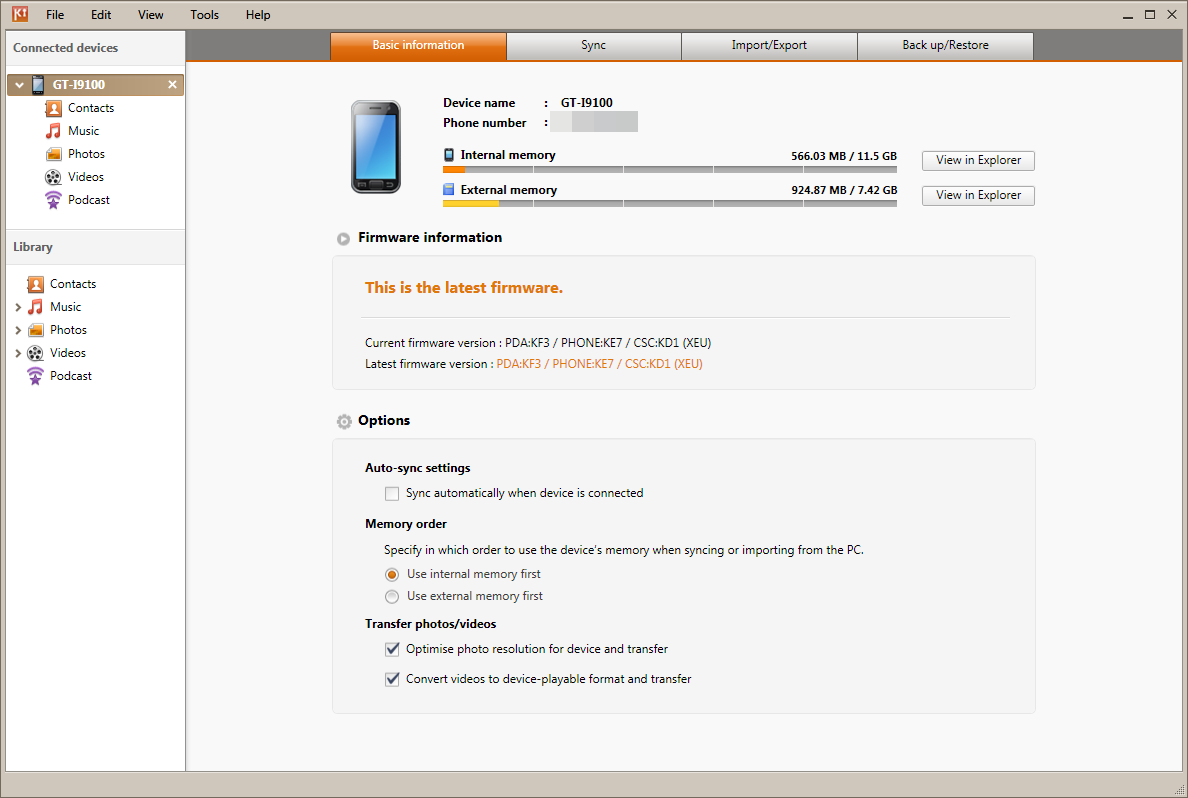
Before we go much further, I think it’s important to go over all of the software running on the international version of the SGS2 we’ve been loaned. I’ve made explicit mention of the fact that we were loaned this device because as a result it makes testing things with custom and leaked ROMs somewhat interesting. For the most part, carriers and OEMs don’t care as long as everything makes it back to them in exactly the same state they were shipped out, but it’s always a grey area. For that reason, I’ve been testing and using the device exclusively with the latest ROM for the phone as shown in Samsung Kies. As of this writing, that’s still Android 2.3.3 and firmware XWKF3. I realize there’s a leaked ROM which is 2.3.4, however we’ve opted to just go with official at this point.
The original SGS1 started Samsung’s trend of adding UI skins to high-end devices, and drew a firestorm of criticism from critics all over. Thankfully it seems as though Samsung has heard those complaints and has lightened things up considerably this go-around with TouchWiz 4.0 which runs on the SGS2. Where TouchWiz 3.0 (from SGS1) looked like a strange attempt at making Android 2.1 and 2.2 look like iOS, TouchWiz 4.0 is a much cleaner, less claustrophobic, and considerably less garish experience.
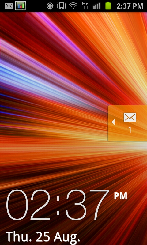
Starting with the lock screen, TouchWiz 4.0 continues the tradition of changing things here. Unlocking is achieved by moving the large graphic and clock off the screen, unless of course you’ve defined a custom lock pattern or PIN. Alerts such as new SMSes can be handled by sliding the notification ribbon across the screen. Of course this background is customizable and discrete from the main background as well. There’s really not much to say about this beyond that I’m still surprised TouchWiz didn’t take a nod from HTC’s Sense 3.0 and add shortcut functionality into this menu.
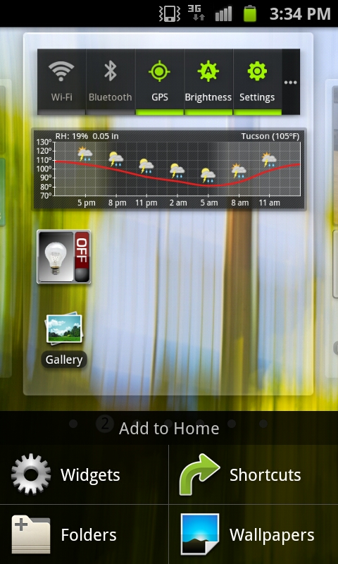
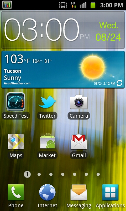
The main application launcher and home screens are what make or break a skin, and here I think there’s more positive than negative with TouchWiz 4.0. To start, home screen one is the far left, not the center. Switching between these is accomplished either by swiping back and forth or dragging on the dots at the bottom. This animation is extremely fluid - I get the impression that the entire TouchWiz 4.0 experience does leverage the GPU for composition and as a result feels very speedy.
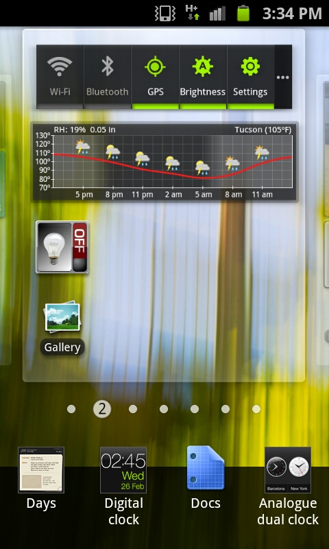
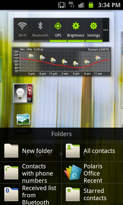
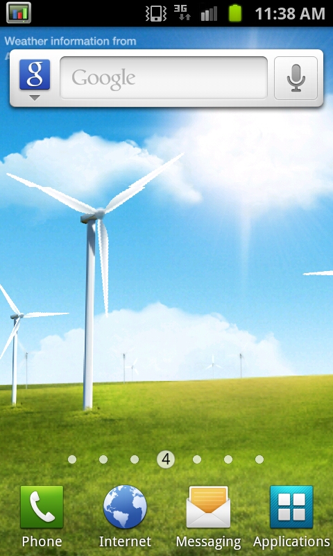
There’s a contextual menu as well where new widgets, shortcuts, and folders can be added. In fact, most of the home screen customization takes a similar - screen on top, menu on bottom - approach, which makes a lot more sense than stock Android’s popup bubble schema. Tapping widgets gives you a long list of available widgets which tilt as you scroll through them. Just like other UI skins, there’s an assortment of skin-specific widgets that support resizing.
For the most part, I find that TouchWiz 4.0 moves away from the social-hub augmented with weird widgets motif set by the last generation of UI skins. That’s definitely a good thing, because most of the time that last generation failed to really deliver social experiences that came close to true first-party experiences.
TouchWiz 4.0 does still keep the bottom row of applications which is another throwback to iOS, and like other skins puts the application launcher shortcut in the far right.
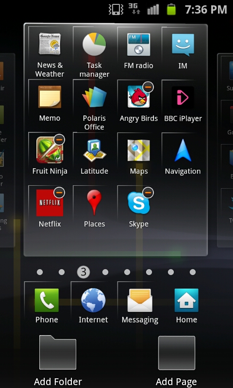
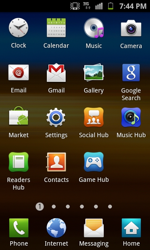
By default the applications launcher presents icons in a 4x4 paginated layout, though you can toggle a list view as well and just scroll up and down. Menu edit brings you to a view just like the home screen customization page, where you can move icons around and also change the bottom row of shortcuts. There’s also folder support for organization. One major plus is that icons no longer have the chicklet-like background colors that made everything square and applications difficult to identify quickly. Thankfully, that’s gone, and the result feels far less tacky than the previous iteration.
Just like the home screen, you can change between pages of applications by tapping on the page number dot, or scroll back and forth quickly by sliding along the bar. This results in the same animated sliding view that the homescreen shows. I guess that’s one positive thing this go-around with TouchWiz, if anything you can’t criticize it for being inconsistent. For the most part honestly the launcher and homescreen TouchWiz components are pretty tolerable.
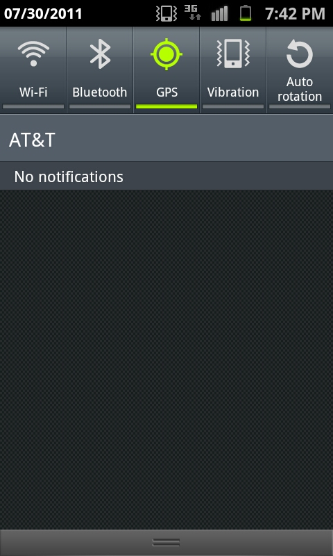
Just like in the past, the notifications shade drop down includes toggles for WiFi, Bluetooth, GPS, Sound, and Auto Rotate. It all works just like you’d expect it to. One small thing here is that if you’re in manual brightness mode, press and holding on the notifications bar and dragging left or right will change brightness along the scale. It’s a quick way to get analog control over brightness if you’re in manual setting mode.


132 Comments
View All Comments
numberoneoppa - Wednesday, September 14, 2011 - link
Guys, that mysterious notch you write about is not for straps, it's for phone charms, and it's arguably my favourite feature of samsung phones. (In korea, phone charms can be used for more than just cute things, one can get a T-money card that will hang here, or an apartment key).Tishyn - Wednesday, September 14, 2011 - link
I spend hours every week just browsing through reviews and tests comparing devices and vendors. This is one if the most interesting and most comprehensive review I've read for a veery long time.I especially enjoyed the rendering part and how it relates to the ultra mobile device market. Thumbs up!
milli - Wednesday, September 14, 2011 - link
Brian / Anand, why are you so reluctant to test chips from this company? ZiiO tablets, sporting the ZMS-08, are available for a while now and i'm sure Creative would send you the new Jaguar3 tablet (ZMS-20) if you guys would ask for it.The ZMS-20 has 26 GFlops ... faster than anything you've tested till now. The ZMS-40 coming in Q4 doubles that number!
I'm an old school IT technician and I for one don't understand your lack of interest. The GPU's in these chips are based on technology that Creative acquired with the 3DLabs purchase.
rigel84 - Thursday, September 15, 2011 - link
Just a quick tip: You can take a screenshot by pressing the power and home button at the same time.If you double tap your home button it will bring the voice talk feature.
While watching video clips just press the power button to disable the touch sensitive buttons.
Swipe your finger to the left on contact name to send him a message
Swipe you finger to the right on the contact name to dial the contact.
To see all the tabs in the browser just pinch inside twice :)
If you experience random reboots when you drop it on the table, or if you are leaning towards things or running, then try to cut a piece of paper and put it under the battery. It happens because the battery shortly looses connection to the pins. If you check XDA you can see that many people has this problem, and I had it too. I was experiencing many random reboots whenever I had it in my pocket, but after I pit a piece of paper below the battery they all disappeared.
A few things...
- GPS is horrible if you ask me. Unless I download the data before with gps-status then it takes ages. Mostly 15-30 seconds with 2.3.3 (no idea if the radio got updated in the release)
- Kies AIR is HORRIBLE! It's on pair with realmedia's real player from 10 years ago. Crash on crash on crash and sluggish behavior.
- I don't know whether it's the phone or not, but I've been missing a lot of text messages after I got my Galaxy S2. I'm on the same net, but along with the poor GPS reception I'm suspectiong the phone :(
- There is a stupid 458 character limit on textmessages, and then they are auto-converted to an MMS message. There is a fixed mms.apk on XDA (requires root) or you can download something like Go SMS Pro (still free) on the market, which removes this stupid limit.
ph00ny - Thursday, September 15, 2011 - link
OddI haven't seen any posts about the battery disconnect issues and if you've been browsing the xda forum, probably saw my thread about dropping my phone on concrete twice...
As for Kies AIR, i've used it twice and my expectation was low to begin and it wasn't that bad. Some things were definitely slow but it's a good start
-GPS for me has always been solid. I even used it on multiple trips in less than ideal location, not a single glitch even with shoddy cell reception.
ciparis - Tuesday, September 27, 2011 - link
I've been using Sprint's SGS2 (Epic 4G) for less than a day, but already there are some annoying points which I'm surprised aren't mentioned in this review:1) The digitizer lags behind finger movement.
In the web browser, when your finger moves, there is a disconnected rubber-band effect before the screen catches up with your finger. This is visible in the browsing smoothness video as well, and it's very noticeable in actual use. Coming from an iPhone 4, it feels cheap and broken.
2) Back/Forward navigation often ignores the previous scroll point.
If you spend some amount of time reading a page you arrived at from a link (it seems to be about 10 seconds or so), hitting back doesn't take you back where you were previously reading from -- instead of returning you to the page position where the link was, it drops you at the top of the page. This makes real web usage tedious. On the Sprint, the timing seems to be related to when the 4G icon indicates sleep mode: hit back before the radio sleeps and you are returned to the right spot. In actual use, this rarely happens.
3) The browser resets the view to the top, even after you've started scrolling.
When loading a page, there's a point in which the page is visible and usable, but it's technically still loading (which can go on for quite a awhile, depending on the page). It's natural to start reading the page and scrolling down, but typically the phone will randomly jerk the scroll back up to the top of the page, sometimes several times before the page is done. This is unbelievably annoying.
I suppose expecting an Apple level of polish prior to release is unrealistic, but Samsung seems hell-bent on positioning themselves as an Apple-level alternative; even the power brick looks like they took the square Apple USB charger, colored it black, and slapped their logo on it. The point being, they're inviting direct comparison, and it's a comparison their software team isn't ready to deliver on -- certainly not out of the box.
ciparis - Tuesday, September 27, 2011 - link
How are you supposed to use this phone if the keyboard is covering up the text fields, there's no "next" button to get to the next field, you can't see what you're typing, and there's no button to make the keyboard go away?Case in point: go to Google News and click on Feedback at the bottom of the page. There's no scrolling room at the bottom, so the keyboard obscures the fields; I was unable to send feedback to Google that their news site was opening every link in a new bowser window on a mobile phone (...) despite my account having the preference for that set to "off", because I couldn't navigate the form fields.
mythun.chandra - Wednesday, September 28, 2011 - link
Just realized there are no numbers for the Adreno 220 in the GLBench 2.1 offscreen tests...?sam46 - Saturday, October 1, 2011 - link
brian,please tell me which one of these smartphones is the best.i wanna purchase one of them so,pls help me in deciding.b1cb01 - Wednesday, October 5, 2011 - link
I love the green wallpaper on the first page of the review, but I can't find it anywhere. Could someone point me to where I could find it?