The Windows Phone 7 Review
by Anand Lal Shimpi & Brian Klug on October 20, 2010 7:00 PM EST- Posted in
- Smartphones
- Windows Phone 7
- Microsoft
- Mobile
While Anand played with AT&T’s other launch device - the Samsung Focus - and later on the LG Optimus 7, I got to play with the HTC Surround. HTC's entry into the fray stands out on AT&T. Ok, that was a terrible pun.
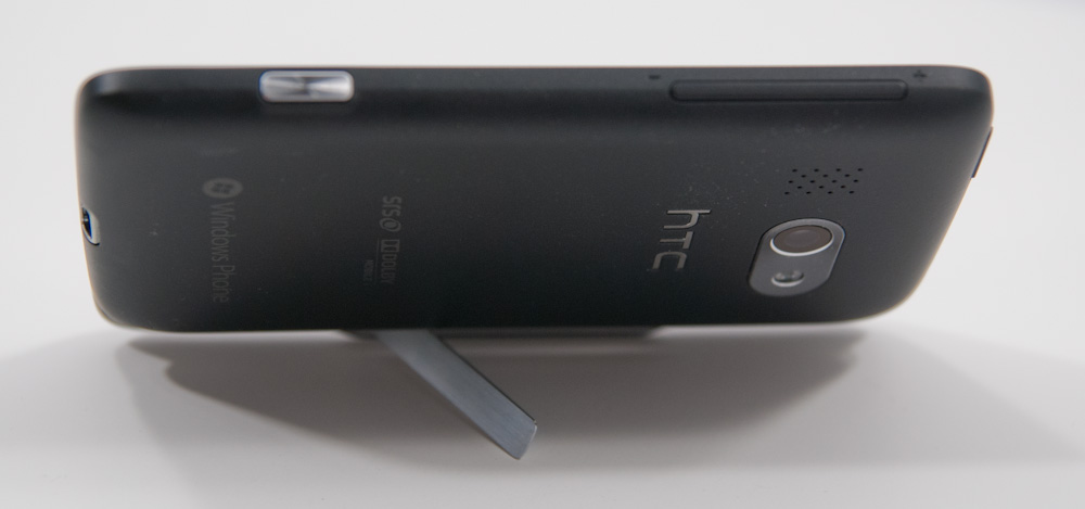
It's an interesting form factor, let's just say that. The Surround is put together like a landscape slider, except instead of a keyboard, you get a speaker that runs the entire length of the device. The speaker only slides out a mere 1.25 cm. As a result, the slider mechanism itself feels very sturdy, and there's very little space between the display and main base, not enough to slide a fingernail into. There's no spring mechanism on this slider, it’s just friction and two clicks that hold it in place.

In case it isn't readily apparent yet, the HTC Surround's primary differentiator is audio playback. There's a small button at the top of the device which cycles through SRS surround emulation and some Dolby audio enhancements. The speaker is actually impressively loud when you’re playing back music, as long as you remember to slide the thing open.
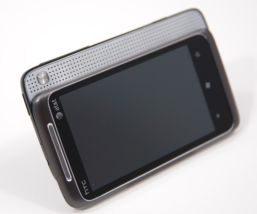
The speaker grille feels like brushed aluminum, and looks reasonably classy. On the back, when the speaker is slid out, you get a pop up kickstand. It's different from the EVO's kickstand - this one is narrower and rests differently. Where the EVO's is like a leg, the Surround's is like a small base that slides out. It’s just as sturdy honestly and does a great job propping the device up.
The Surround makes a tradeoff - on one hand, you get the increased thickness of a slider, but none of the keyboard goodness. Honestly, I haven’t found myself want for a keyboard on WP7 yet, especially considering lack of landscape homepage support. There’s definitely a market out there for devices that have good audio and emphasis on music playback. If that describes you, the Surround is perfect. It’s loud, pumps out undeniably the best sound quality from that big speaker of any smartphone I’ve ever used, and even has a kickstand so you can prop it up anywhere. Of course, the Surround also doubles as a loud alarm clock too.
Battery life is middle of the road for the WP7 devices we’ve tested thus far, but much better than the other AT&T launch device. Oh, and the HTC Surround charges very quickly as well. As we noted before, we’re going to have longer more comprehensive reviews of these devices up when they’re ready.


125 Comments
View All Comments
bplewis24 - Thursday, October 21, 2010 - link
You call it smooth running and functional, which is fine. That doesn't dissuade me and the OP from feeling it is ugly and off-putting. You even say it doesn't have to be cluttered eye candy, but the review claims it is the most beautiful UI he has ever seen. The thing is big blue blocks. It is exactly what he explained on the first page that Windows typically does with any refresh of their OS: "make it bigger and bluer."It is definitely ugly, but if you only care about how functional and fast it is, then you will love it. I admit that I can't stand iOS cluttered eye-candy style either, so I'm with you on that. Give me functional, customizable and sleek and I'm in heaven. Glad somebody already figured out how to do that.
Brandon
geniekid - Thursday, October 21, 2010 - link
In my opinion, it's quite good looking and better than the default home screen on my HTC Incredible.Like you said, it's all a matter of taste. I will put myself out there and say the guy who thinks the "6 year old crackberry looked better" probably has poor taste.
Smilin - Monday, October 25, 2010 - link
It is the most beautiful UI I've seen. Mind you I've SEEN it. Have you? Screenshots don't do it justice. You have to see it moving and the text shifting in parallax. It's eerily 3D.iPhone and Android are beautiful too....if you're a Windows 3.1 progman.exe fan.
gstrickler - Friday, October 22, 2010 - link
It may be simple and functional, but that doesn't mean it has to be boring and ugly. I'm a huge proponent of simple and functional, but that screen looks like something out of the late 80's or early 90's. The tiles have too little to differentiate them from each other. A little use of color and better contrast would make it a lot clearer and faster to identify the icons, and it would look better.Note to MS, hire a usability consultant and put some of your graphic designers to work (I know you have graphic designers). It shouldn't look like just like Windows 7, but it definitely shouldn't look like it comes from Windows 2.0
inighthawki - Thursday, October 21, 2010 - link
That "ugly" home/start screen interface is one of the main reasons I'm interested in WP7. The other smartphone interfaces I've seen from others like iOS and Android are nothing more than glorified and eye-candy enhanced versions of every other phone out there IMO. And as someone who owns a Zune HD which has a very similar interface, I can tell you that it works really well, and is very nice.bplewis24 - Thursday, October 21, 2010 - link
There is no eye candy in Android. It's basically a blank slate desktop background. And obviously it's no surprise that a Zune HD user would prefer the Windows Phone 7 UI. It's also not a surprise you use subjective and vague justifications for your preference :)inighthawki - Friday, October 22, 2010 - link
I don't see why I have to justify a subjective decision. The bottom line is "I like it" and my entire point was that just because the OP thinks it's the ugliest home screen they've ever seen, there are people like myself that not only like it, but actually dislike the style they do. I am not trying to force my opinion on anyone.Smilin - Monday, October 25, 2010 - link
I agree with you FWIW.cknobman - Thursday, October 21, 2010 - link
I agree 100%Gigantic big colored tiles? Seriously?
What a waste of space and an overly boring-bland appearance!!!
Guspaz - Thursday, October 21, 2010 - link
I agree, the WP7 UI looks horrendous to me. Giant space-wasting bland UI components.My biggest concern is how HUGE the tiles are. Anand complained about iOS/Android cluttering screens with app icons, but it seems to me like WP7 will be incredibly worse.
Reducing the number of tiles on the screen so that you can only view 6 full tiles at a time, as WP7 has done (the bottom two tiles appear cut off in pictures) is a huge limitation. The iPhone displays 20 icons.
If I've got 50 apps, and I'm not using folders, an iPhone will give you three screens to scroll through. Android, I assume is similar. Windows phone 7 seems to require something like 8... And the lack of some sort of folder or grouping support is only going to make this worse.
My prediction is that, if WP7 takes off and starts getting a decent number of apps, they're going to have to rethink the home UI or it'll be unusable.