The Windows Phone 7 Review
by Anand Lal Shimpi & Brian Klug on October 20, 2010 7:00 PM EST- Posted in
- Smartphones
- Windows Phone 7
- Microsoft
- Mobile
Apps
WP7 includes some preloaded productivity applications whose inclusion are just expected on any given modern platform. Things like a basic alarm, calendar, and calculator. It’s easy (and dangerous) to overlook just how critical things like these are. Alarm requires some background infrastructure to work that other applications don’t have yet, and calendar honestly makes or breaks a platform if you’re constantly running around trying to catch meetings or events. Thankfully the options on WP7 are pretty decent.
Alarm is basic and draws obvious inspiration from Apple. There’s a switch at the far right, and the time/date of the alarm at left. It even changes to things like ‘weekdays’ or ‘weekends’ like iOS did way back when everyone was easily amused. The alarm notification is basic as well, you get snooze or dismiss buttons that are surprisingly hard to hit early in the morning, but it works.
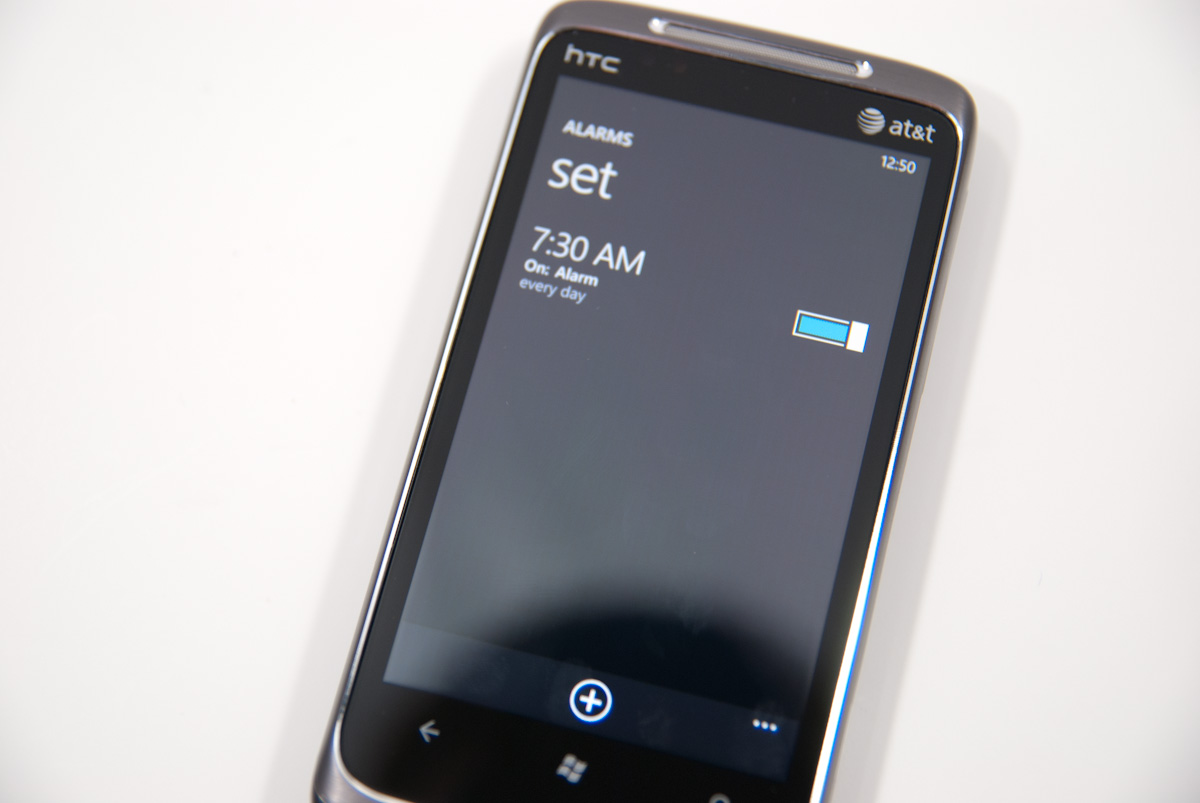
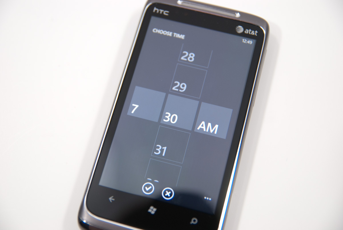
The time switcher is actually pretty novel. Tap on one of the fields, and you scroll up and down through all the possible entries. It clearly derives inspiration from iOS’s ring switcher for most things, but instead 2D and given the Metro style.
There’s a calculator too, as expected.
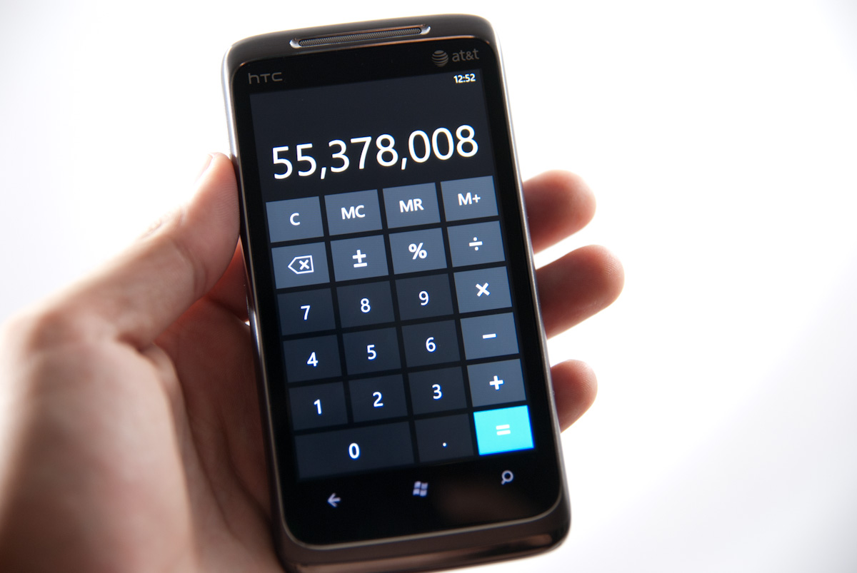
It’s simple in portrait mode, but becomes a basic scientific calculator in landscape:
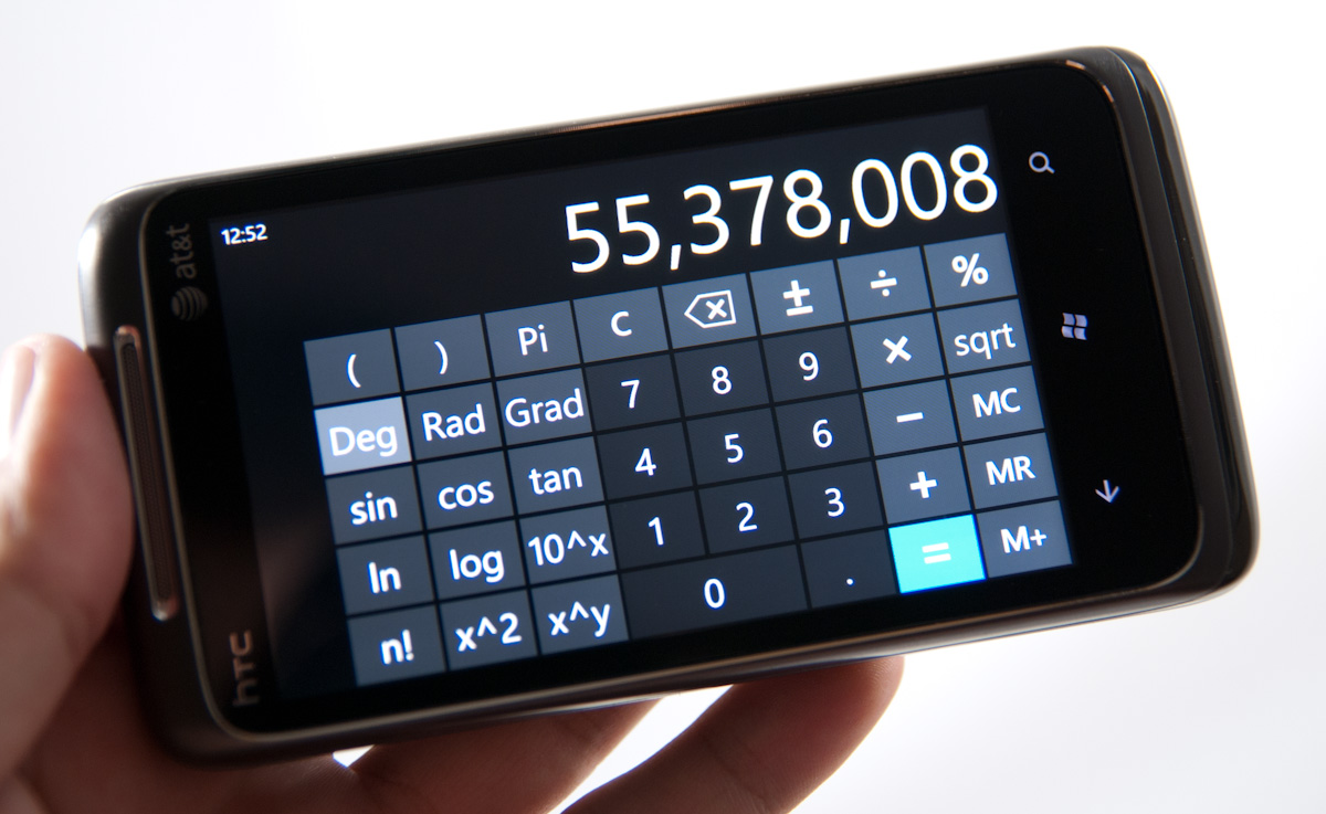
WP7 (nor any smartphone) is close to replacing my Ti-89, but it’s there if you need it. There’s a second row with input history above the large results text, and it supports slightly more complicated syntax (with parenthesis) than other first party calculator apps I’ve seen. It would’ve been nice to see WP7 build a unit converter or some unit conversion into the calculator since Bing lacks it, but that’s for the future.
Finally we’ve got calendar, which has very obvious unique Metro styling. First up, the tile always shows your next upcoming calendar event, same as the lock screen. You get the name, location, and time all in the tile. There’s also the current date in the bottom right.
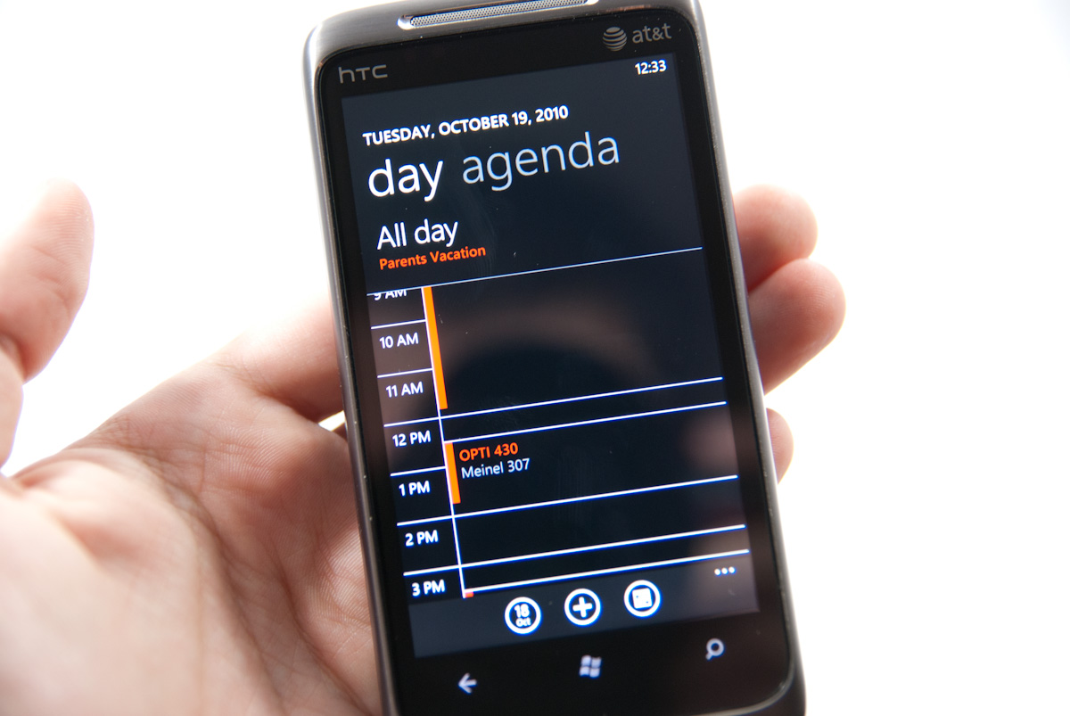
Portrait and landscape view initially give you a timeline view of the day with some color coding. Swiping left and right changes the view to an agenda with a simple list of what’s going on. Getting to the next day is a vertical swype away.
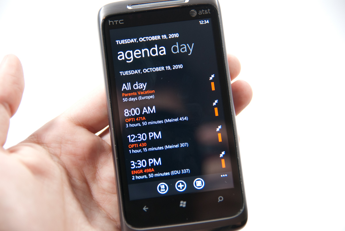
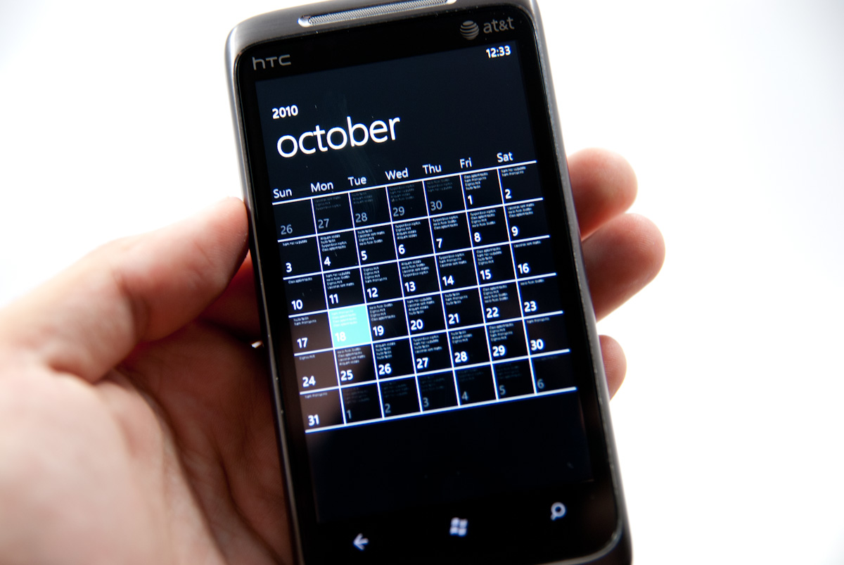
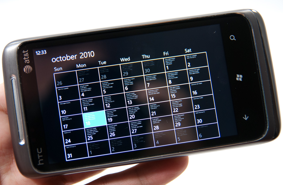
The three buttons at the bottom bring you to the today view, add an event, or month view. There’s no option to see a weekly timeline, which is a bit frustrating but not killer. The landscape view of the month makes it readily apparent that rendered inside each day in minuscule but still slightly readable text are that respective day’s events. Though it isn’t readable, you can still tell that something is going on based on how much text there is inside.
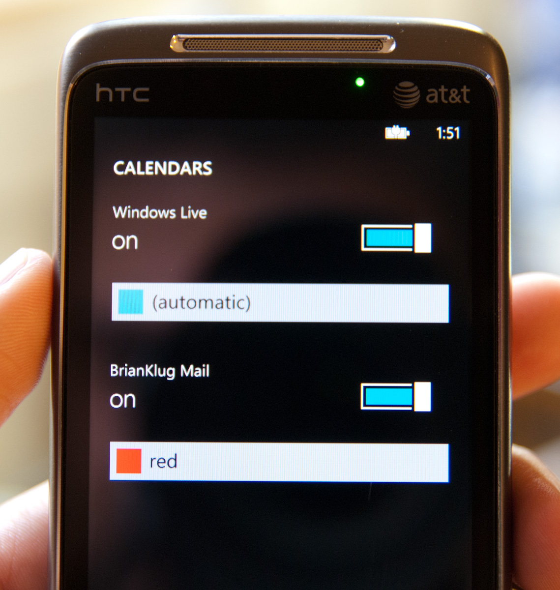
The current issue with WP7’s calendar is that there’s no obvious way right now to get google calendars working inside the calendar app. Anand had problems with ordinary google calendars, I had no luck with a Google Apps Premiere account using Exchange. To be clear, the main exchange calendar on my account appears just fine (that’s what you see in screenshots), but I can’t see other calendars I’ve been granted access to outside my domain. On other devices, you can view other calendars in a selection list somewhere or get to them through m.google.com/sync. This must be coming soon.
You can tap the options panel and calendars, but the only options are Windows Live and my exchange calendar:
Overall, WP7 delivers the right amount of out of box functionality that we’ve grown accustomed to from smartphones of every sort. No doubt they’ll flesh out with time, but they’re ample for right now and get the job done.


125 Comments
View All Comments
bplewis24 - Thursday, October 21, 2010 - link
Check out page 26. It's dedicated completely to how the "update" process works. In short, it's more like iOS than Android....which is sounds like you'd prefer.ishbuggy - Thursday, October 21, 2010 - link
Yeah I accidentally skipped that page :PI really hope it works out as well as Microsoft hopes it will
Voldenuit - Wednesday, October 20, 2010 - link
Will AT be reviewing the Nokia N8 and E8 Symbian phones? Nokia is pretty obscure in the States (since they mainly sell direct from their website, with no carrier subsidy), but are pretty big in Europe and Asia.epyon96 - Wednesday, October 20, 2010 - link
Anand,With such a glowing review from you, it's almost enough to bump Windows 7 above my initial choice of getting a blackberry. I need a physical keyboard. I'm very picky about it. You are simply a very engaging writer.
I really hope Windows 7 mobile comes up with a superior keyboard version
VashHT - Thursday, October 21, 2010 - link
The Dell phone coming out looks like it will have a really nice keyboard, I think it is called the venue pro. Also ATT is supposed to have a keyboard phone by LG I think.heelo - Thursday, October 21, 2010 - link
The Venue Pro *looks* great, but it's somewhat of a monster in size and weight.If I weren't stuck on a T-Mobile family plan, I'd probably opt for that LG Quantum. Like Anand said, WP7's interface is extremely usable on smaller screens, and the reasonable form factor and physical keyboard likely make for a very convenient real-world user experience. The drawback is that the looks and (supposedly) build quality are sub-par.
EarthwormJim - Wednesday, October 20, 2010 - link
OMG a screenshot of me in action is on the Xbox Live page!! Woo-hoogstrickler - Thursday, October 21, 2010 - link
That's the ugliest and least interesting home/start screen I've ever seen on a smartphone. It may be functional, but even a 6 year old crackberry looked better (and I don't like the BB). The rest of the UI doesn't look too bad, but the start screen needs some work.bplewis24 - Thursday, October 21, 2010 - link
I couldn't agree more. I find it funny that people are claiming this UI is "100% right" as if everybody is going to like it. Obviously it's a matter of preference, but I just cannot see the overwhelming majority of people getting into this UI. I find it appalling to look at and couldn't imagine using it every day.Brandon
B3an - Thursday, October 21, 2010 - link
Dont know what you're smoking but most people prefer an easy to use simple looking UI thats functional rather than cluttered eye candy.From the vids i've seen it seems to be the smoothest running, most functional, fastest, and natural UI on any phone to date.