The Windows Phone 7 Review
by Anand Lal Shimpi & Brian Klug on October 20, 2010 7:00 PM EST- Posted in
- Smartphones
- Windows Phone 7
- Microsoft
- Mobile
Final Words
There's a lot of good to say about Windows Phone 7. Far more than I expected going into this review, to be honest.
The Facebook integration is the best I’ve seen on a smartphone. The Zune integration is similarly perfect. If you’re used to spending a good amount of money on iTunes every month you’ll have a better overall experience with Zune Pass on a Windows Phone. Exchange support, Office and the Email app are great too, it all just works. And unlike previous Microsoft OS launches, there’s no caveat necessary. Windows Phone 7 is both functional and attractive.

The UI is a thing of beauty. Microsoft got the style, customization and performance one hundred percent right on this thing. It makes iOS feel old and utilitarian. It’s funny to think that Microsoft was the one to out-simplify Apple in the UI department.
Microsoft made great use of GPU acceleration throughout the OS. Scrolling, panning, zooming, everything is ridiculously smooth. The OS is so polished in this regard that almost none of the third party apps I tried seemed to clear the bar Microsoft has set. It’s going to take a while for developers to do the right thing on this platform.
It’s not only third party developers at fault. Microsoft itself clearly has a lot to work on. The Xbox Live Extras app is inexcusably slow. And then there’s IE mobile.
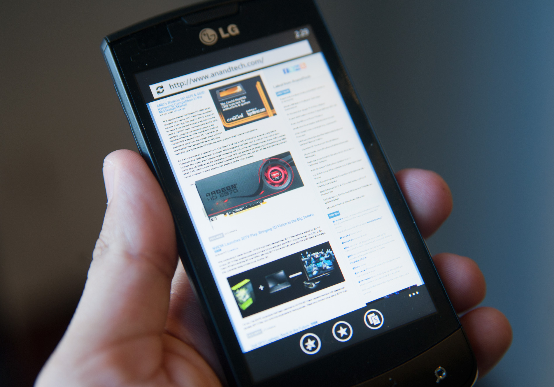
With JavaScript performance much lower than iOS and Android, IE mobile is measurable slower at loading web pages. The browser doesn’t actually feel much slower because of how smooth actually navigating around web pages is, but the web page loading performance must be improved. On top of that, web page legibility when zoomed out suffers due to a lack of font smoothing on very small fonts.
The application history and associated back button work well enough to make getting around WP7 pretty easy. Proper linking of addresses, phone numbers and web pages is nice and plays well with the back button. Ultimately adding copy & paste (coming in early 2011) will help but I’m not sure Microsoft can get around not having an actual way to switch between apps rather than just going back all the time.
From a hardware standpoint I have to say that I believe Microsoft got the formula right. Windows Phone 7 is launching a lot like a gaming console that Microsoft allows other companies to manufacture. Microsoft dictates the hardware, and it’s up to the handset manufacturers to implement it as stylishly as possible. If the manufacturers want to provide additional features, they can do so through their own apps that can come preloaded on the device.
Some handset makers are undoubtedly upset that they won’t be able to use UI as a differentiation vector, but I believe this is a better option for general consumers. You get a consistent experience across all Windows Phones and you force the handset guys to deliver better hardware, rather than attempt to compete out of their realm of expertise with software.
Buying a Windows Phone is going to be a lot like buying a PC. Except this time around the pre-installed software will be a lot easier to get rid of and hopefully a lot less intrusive.
Of course, this approach only works if the OS is good enough from the get go, and in this case, it is.
I’ve always liked Microsoft as an underdog. It isn’t afraid to spend money to deliver a good user experience and the company has the talent to do some amazing things. It’s only when Microsoft becomes a monopoly that things go wrong. But in the fight to reach that point, we get great products and healthy competition.
With Windows Phone Microsoft is in underdog mode. The OS isn’t perfect but aside from the lack of apps, it’s competitive today. While I’m traveling I need the apps you can only get with a mature platform like Android or iOS (e.g. Yelp, BART app, etc...), but while home I don’t use those apps as much. Instead my smartphone behaves more like an SMS, phone, email, camera and web browsing device, and it’s in those areas that Windows Phone is easily just as good as the competition.
The app story and lack of conventional task switching are the two biggest issues facing Windows Phone 7 today. Both of which look to be very fixable problems. If you don’t own a modern smartphone, you probably won’t view either as an issue today and you can bide your time until Microsoft introduces them. If you’re migrating from an Android device or iPhone, depending on your app usage, Windows Phone may be too young for you.
If you’re looking for a feature replacement to an Android phone or Windows Mobile device, WP7 will disappoint. Windows Phone is more like the iPhone than it is anything else. If you don’t like the iPhone (for reasons other than an inherent dislike for Apple), you probably won’t like Windows Phone. If your sole reason is disdain for Apple, then pick up a Windows Phone.
What I’m most excited about isn’t the fact that we’ll have another good competitor in the smartphone space, but rather the hope this gives me for Microsoft’s future products. Windows 7 was a nice OS, but it was nothing earth shattering and clearly did nothing to fend off Apple’s erosion of PC market share. Windows Phone 7 is a beacon of hope for Microsoft. If Windows Phone 8 and Windows 8 are designed with similar focus and clarity of thought as WP7 was, we may be looking at the beginning of Microsoft’s return.


125 Comments
View All Comments
Kentcomp - Friday, October 22, 2010 - link
I really appreciate you guys so thoroughly reviewing WP7. Your review was like reading a really well illustrated, yet candid owner's manual. Thank you!PS I find the home screen to be kind of boring too but I'll choose functionality over style 99% of the time. After all, the homescreen is just there to get you to where you really want to be.
Riccardo - Friday, October 22, 2010 - link
That's a remarkably in-depth review. Thanks guys!rye222 - Friday, October 22, 2010 - link
amazingly thorough article. i've been eagerly awaiting these phones ever since i bought the Zune HD and thought, "if MS made this into a phone, they would own". thanks Anand, great job as usual on your articles!lewchenko74 - Friday, October 22, 2010 - link
The interface is too minimalistic. Hate the massive two color icons. Just looks ugly.. and really not that functional if you have a lot of these 'icons' to wade through.Then there are the limitations that mean it isnt quite as feature rich as an iphone or Android in certain areas.
There is absolutely nothing compelling to sway me to this phone (at all).
Anyone with an app library (android or iOS) is hardly gonna part with their spent money on a new device and lose that investment... plus it barely has an app library yet.
I wish MS well as competition is important... but it really doesnt give an iOS / Android owner anything new, plus if I was buying fresh... I think that the iOS / Android phones and app-sphere etc are just more compelling.
Nice thorough review though.... just read a little too enthusiastically MS focussed at times, but a good read.
hakime - Friday, October 22, 2010 - link
"The UI is a thing of beauty. Microsoft got the style, customization and performance one hundred percent right on this thing. It makes iOS feel old and utilitarian. It’s funny to think that Microsoft was the one to out-simplify Apple in the UI department."This sentence summarize by itself how not objective and professional this review is. I mean no one on Earth being a little bit rational can think that this Metro interface is beautiful let alone functional or easy to use. I mean how a hell can a text based interface with half displayed text all around and ugly flat colors on top of black background can be called beautiful? This interface just lacks taste, it is different yes, but it is bad, it lacks interaction. You are so Microsft driven that you come to think that a different interface is necessarily easy to use and functional. Nothing is right here, the theme, the colors are ugly with little sense for giving some wish for the user to use the phone, there are too many steps needed to go to what the user wants to do, the tiles are a mess as they can be anything and hubs are an obscure UI concept that serve little interest. You want to browse through your apps, you are presented with only a list view and good luck with that. The calendar and SMS apps are a horrible vision for the users, they are just ugly. The email app looks like it was design by a bunch of students in GUI design with no clue on how to present the information to users. And everything else is just a mess in itself hidden behind a ton of useless animations.
In contrary, iOS just looks easy to use, clean, beautiful. You have your phone and that's it, not extra useless UI concepts and distractions. They are nice for a demo, but for daily usage, they rapidly get useless.
Then you continue with the Zune pass, noting that it is better than iTunes, but in what regard? You are strange enough to like the Zune pass, that does not make it better than the iTunes model. Again non objective argument.
Best integration of Facebook in WP7? Is it a big deal or even a nice feature? The question is if it is really a good thing. Why should I have all my contact and photos all mixed up in an almost uncontrollable mess? Someone objective would surely recognize that such exaggerated integration of Facebook just makes little sense. A well designed app is more than enough to access the Facebook content without having to have all the time friends and non-friends popping up with messages and photos. Distractive and useless like the UI of WP7.
And what about not being more reserved with the major shortcomings of WP7. How many times we have been told about the lack of multitasking in iOS? And now an os comes to a market where all the other mobiles os have multitasking and this is not called a deal breaker! It is a deal breaker, not having multitasking on WP7 is just inexcusable from Microsoft.
Same thing with copy and paste, in 2010 an smart phone should have an efficient copy and past implemented, and WP7 not having it is a total shame. Sure, most implementation out there sucks, and only the iOS has a real efficient and easy to use implementation, but that does not forgive Microsoft for that.
What about also the significant lack of unified mail box in the email app, the lack of robust security features, the lack of tethering, the clumsy Exchange support, the pour performing third party apps, the lack of universal search, the excessive $14.99 for zune pass, the inexcusable lack for support of HTML5 which is even more unacceptable as the os does not support flash either, no YouTube app, weird interface concept when you need to long press to reach some options and in-app menus, etc...
The list is long, WP7 is surely full of animations but it is little functional. And the authors fail to give an objective review of this system which is new but far behind the competition. Having a different UI style does not make this os more functional or even attractive. It just sacrifices too much on real usability for bringing useless UI concepts. The authors wishing so much that their lovely Microsoft brings something to save itself from the mobile market that they have forgotten what objectivity means.
dustcrusher - Friday, October 22, 2010 - link
It's a review. Reviews are inherently subjective. The only parts that aren't are the benchmarks, and even those are arguably not 100% objective. I think at points they were gushing over what worked well but there were other points where they did bring up some valid objections, even if they tinted them a little with rose-colored glasses.Thanks to this review, I learned enough to realize I'm probably better off going to an Android phone when I am able (disclosure: I'm on WinMo 6 right now). Android simply fits my wants and needs better. I don't see WP7 taking giant chunks of market share from Apple or Android, but I think it will do better than WinMo did.
Microsoft is trying to do something different; seems like they are trying to make a smartphone that is as easy to use as a featurephone. It's risky but it could pay off big time. If their sole intention was to cram all of Android and iOS's features into their new OS, it'd be closer to WinMo 6.6 w/HTC's UI shell on top.
A couple of reviewers decided they like the way WP7 does some things. You are clearly happy with your iPhone, so why are you letting it bother you so much? Do you really want to come off as a trollish fanboy?
cjl - Friday, October 22, 2010 - link
Have you read any of Anand's Iphone reviews? If anything, Anand is biased towards the iphone at the expense of pretty much anything else, so the fact that this review is so positive speaks volumes about the phone.Also, to everyone complaining about the interface, you should really try using a Zune HD sometime. It's amazing how natural the interface is.
headrush69 - Sunday, October 24, 2010 - link
There is a big difference between saying an interface is natural to use over saying it is a thing of beauty.Frankly many of the screen shots make elements of the interface look very basic, dated and rushed.
Example: plain square flat buttons on call screen, on/off toggles in setting screen.
Of course these things are pretty trivial to improve and I'm sure they will, but statements like this in the article
"The UI is a thing of beauty. Microsoft got the style, customization and performance one hundred percent right on this thing. It makes iOS feel old and utilitarian."
I just can't agree with and believe exactly the opposite.
Smilin - Monday, October 25, 2010 - link
Have YOU seen the UI? Not screenshot of it. Have you seen it? Used it?Your opinion is worthless.
Smilin - Monday, October 25, 2010 - link
smells like hater in here.Sorry man but this is the most comprehensive and *objective* review I've seen yet. Most of the things you're griping about are IN the article. Did you read it?