BlackBerry Torch 9800 Review: Keeping RIM's Flame Alive
by Brian Klug on September 1, 2010 7:00 AM EST- Posted in
- Smartphones
- Torch
- BlackBerry
- Mobile
Browsin' on the Torch
The most notable change with BlackBerry 6 is the web browser, which we’ll start out with. Previously, the BlackBerry web browser was clearly the platform’s weakest link, as it refused to properly render content on anything but the most basic mobile pages. Even then, the most frequent solution to mitigating the BlackBerry’s previous browser was to use Opera Mini and forego the default browser entirely. Luckily, RIM saw the writing on the wall that and acquired Torch Mobile in 2009, who had been developing a WebKit based browser named Iris for Windows Mobile. Almost a year later, and we’ve got the BlackBerry Torch, bearing that acquisition’s namesake, and sporting a modern browser with WebKit at the core.
RIM has changed the interface, yet kept a surprising amount of the UI consistent. The result is that even though BlackBerry 6 is different, it’ll be familiar territory for the majority of BlackBerry veterans.
|
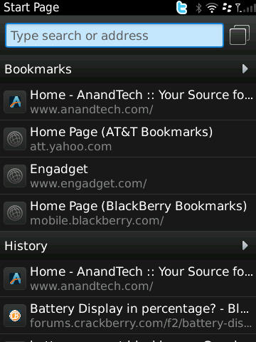
Left: Default Start Page, Right: Entering a URL/Search
|
||||
 |
 |
|||
The browser start page is familiar territory. You’ve got bookmarks and history pages down below that populate during use with pages most frequently visited. Tapping on the arrow to the right does what you’d expect and brings up a more traditional bookmarks interface where you can add folders and other things.
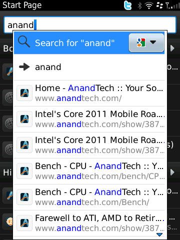
Tap on the URL bar, start typing, and BlackBerry users should be in familiar territory. The interface has been subtly tweaked - input is considered to be a search unless you explicitly use the spacebar shortcut and type a generic top level domain like .com, .org, or the like, after which your selection bar immediately treats entry like a URL. Search comes with google preselected, though Yahoo, Live Search, Wikipedia, and Dictionary.com search APIs are also present. If you don’t have the keyboard out, again, you’re presented with the virtual keyboard until out of the text entry field.
|
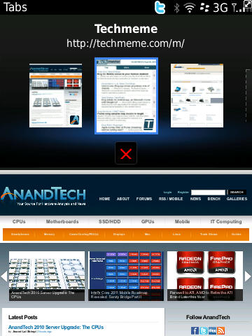
Left: Tab Switcher, Right: Drop Down Options
|
||||
 |
 |
|||
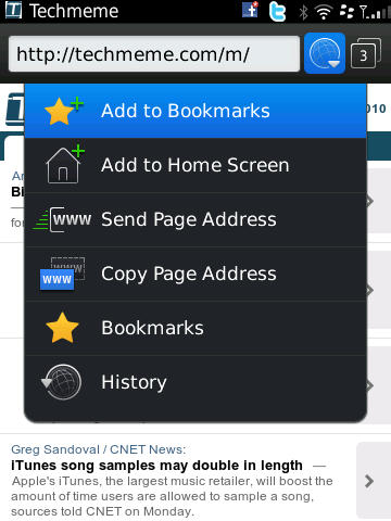
To the right of the address bar is a button with drop downs for adding the current page to bookmarks, home screen, and the like. Next to it is the tab switching button which launches the tab switcher. RIM calls this a “tab” system, but in practice it works more like iOS’ windows metaphor with multiple full windows that can be switched between and closed.
The transitions when switching between windows in the switcher feel smooth as silk, though the window thumbnails themselves aren’t live. That means if you open a new tab, set it to load some website, and switch to another, you’ll still see a white square or whatever was visible when you switched. The thumbnail doesn’t update until you leave it - it’s almost like RIM is storing a screenshot and using it as the thumbnail. Not a huge concern, but often you can get the perception that pages haven’t loaded when they actually have. You can also close all tabs or “other” tabs (all but current), which is a nice addition.
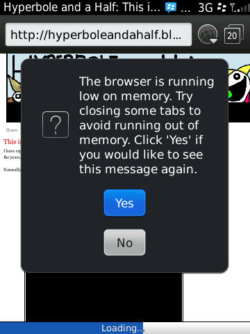
I spent a lot of time seeing how many pages I could get open in the Torch before the OS yelled at me. I loaded up the AnandTech home page and others in new tabs endlessly, and got to 20 pages before getting a message about the browser being out of memory and that I needed to close tabs. By this time, the phone’s backside had gotten a bit warm, but what was surprising was how I was able to keep a BBM conversation going, fluidly switching back and forth between BBM and the browser while loading those 20 tabs.
|
Left: Running out of memory, Right: Switching to Application Management
|
||||
 |
 |
|||
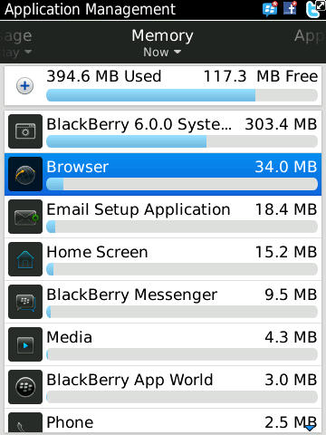
On BlackBerry 6, you can see CPU load, memory use, and active time for each application on the platform in another program called Applications Manager. I checked here when the Torch hit that 20 page ceiling, and found the browser surprisingly not using very much memory at all. It’s unclear whether RIM is being conservative with memory use (even though 20 pages is a lot).
I kept trying to load a 21st page, and eventually crashed the browser to the default homepage, closing all 20 tabs with no warning.
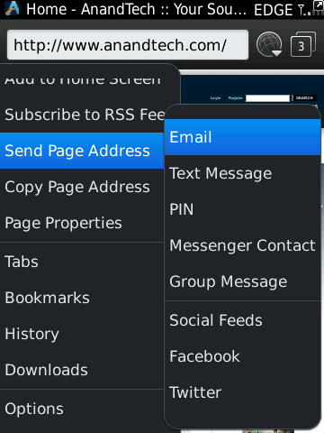
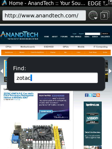
From the menu button, you can do a bevy of things, including find on page, find net, select, zoom, and the other usual controls. Admittedly some of this is redundant and can be done with touch gestures, but remember that RIM is building BlackBerry 6 to also be functional on phones without touchscreens. There’s also a suite of ways to send the current page address - email, text message, BBM, basically every possible means of messaging from the device regardless.
|
Left: Browser Options, Right: Finding Text
|
||||
 |
 |
|||
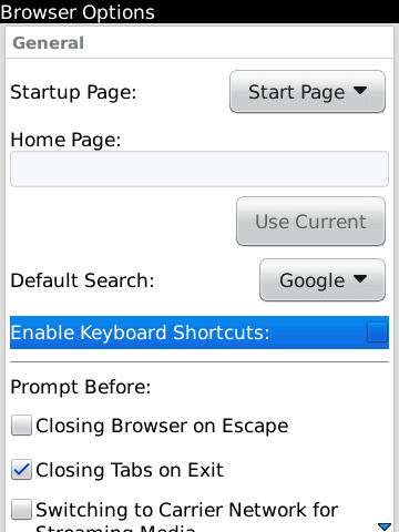
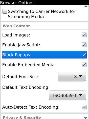
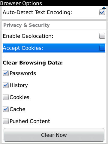
Inside options, there are the usual suspects. Settings are there for setting a custom homepage, rather than the history/bookmarks divide that’s default, settings for cookie storage, a nice clear private data menu, and everything we’ve grown accustomed to from real browsers.
|
BlackBerry 6 Browser Options Explored
|
|||||
 |
 |
 |
|||
So before I go any further, I need to mention how stymied I was with BlackBerry 6 and keyboard shortcuts in the browser. If you’re not a BlackBerry user, allow me to explain. They’re simple shortcuts - press t to go to the top of any page, b for the bottom, f for find, and you can type things like “mypin” and “mynumber” which - you guessed it - instantly insert your pin or number into the given text field. They’re super helpful tricks for sorting through discussions when you want to go to the top or bottom, similar to tapping on the top bar on iOS to go to the top. They work in nearly every BB application, including the browser. In fact, for the browser, there are even more - w for switching between tabs, i and o for zooming in and out, g to immediately enter a URL in the address field, e.t.c. So imagine how confused I was when I couldn’t get any of them to work in the browser.
I consulted in-browser help, which basically just told me they exist - there’s no helpful line in there which mentions that the browser ships with them disabled by default. After a week or so, I gave up. Finally, while pouring over every single of the browser options, I discovered the checkbox. My only question is why the heck this isn’t checked by default.
Navigating around on webpages is basically how it always was for BlackBerry users. Use the trackpad to scroll the cursor around, click once to zoom in or reflow text. What’s new is that if you long press on a link you’ll get a pop up like this:
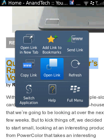
The same thing happens if you long press from the touchscreen directly.


41 Comments
View All Comments
Kamen75 - Wednesday, September 1, 2010 - link
Rim needs two different BB lines to meet the needs of the two different types of customers they are selling to. They should have a BlackBerry Professional version of there os for corporate clients and then a "fun" version to sell to the average consumer. These two os's only need differ on a few security points and each gets a different ui, one to look business like and one to look flashy and bright. Underneath they would be the same os and run the same apps. Their current middle of the road, one size fits all approach is turning all customers away.Add in some decent hardware and you would have a competitive BB again. Two year old hardware specs impress nobody.
Zensen - Thursday, September 2, 2010 - link
that's what themes are for...RIM just needs to work on better tools for developers since what they've managed to do on the business level is second to none and I feel the overall improvement of OS 6 has done just enough to grab enough of the spotlight to be fresh yet familiar without being burdened by the lower specs that have dogged it since the its release.
There are still quirks in the OS 6 model that needs addressing such as in the social feeds but nothing that can't be solved via updates and UI changes. OS 6 has thrown away utilitarian menus and brought it up to speed with the other Operating systems. It hasn't leaped over like a triple axel but it's more like a combination of moves that will culminate in a much more successful Blackberry phone in the eyes of the average consumer, hopefully dispelling some of the noise that RIM can't do a touchscreen phone to save themselves.
I'm glad anandtech have finally covered this phone. Good or bad you can rely on these guys for great technical review without putting in ridiculous remarks or bias towards a product that reviews like engadget have seemingly perfected.
zorxd - Wednesday, September 1, 2010 - link
I am disapointed that Acanac fell into the Apple marketing trap which is PPI. Who cares about PPI? Do you really think that it's better to have a 1" 320x480 display than a 4" 480x800? The first one have higher PPI.Apple started to talk about PPI (even before pixel count) when they realized that the competition was going with larger displays. Larger display, with the same resolution, means lower PPI, even if it's better.
What looks sharp is not PPI. It's pixel count. Just hold your 4" 480x800 farther away if you think that pixels are too big. A 1x1 pixel 1000000000000 PPI display is useless.
So please, stop making graphs about the useless metric which is PPI and start comparing what we actually care about: brightness, size, resolution, etc.
raulr - Wednesday, September 1, 2010 - link
Have you actually looked at the iPhone 4 display. It really is quite fantastic. And especially since this review is about the Torch, your display size argument is pointless since the torch is both physically smaller and lower resolution. The point they were making is that the Torch display, while not bad, really doesn't stack up with the current generation of devices.zorxd - Wednesday, September 1, 2010 - link
The iPhone 4 display is one of the best, I agree. Why? Because it has the highest resolution. The PPI have nothing to do with that. The iPhone display would be even better if it was larger, even if that would mean lower PPI.Of course, the phone would probably get larger too, which is a downside.
What I mean is that the highest PPI is never, or at least should never be an priority for any consumer.
The iPhone display would suck if it was 2" instead of 3.5".
MacTheSpoon - Wednesday, September 1, 2010 - link
He is right, though -- nobody cared about PPI before Apple started their marketing. Now suddenly it's the standard by which screens are judged. Weird.I have looked at the iPhone4 screen and while it's nice, it's nowhere near as nice as all the marketing and buzz make it out to be. I cannot read all that sharp yet incredibly tiny web page text without a magnifying glass. I'd say it's about 20% as nice as all the hype. A large screen that lets you see more of your web pages in an actually readable way is certainly nice, too, probably a little bit nicer -- and yet for some reason the iPhone4 gets a pass on this readability issue from all the reviewers, just as Apple hoped. Honestly, having seen the iPhone4 screen, its main benefit is in browsing photos, which look really smooth, but who uses their phone mainly for browsing photos? Not that many people, I'm sure.
I believe that the whole PPI thing came about because Steve Jobs realized his 320x480 screen was getting long in the tooth compared to other phones but a) didn't want to change the dimensions of the current iPhone and b) wanted to make the existing iPhone layout and apps easy to port by simply doubling the screen resolution. So he pushed the PPI angle hard and zombie reviewers got in line.
bplewis24 - Wednesday, September 1, 2010 - link
Great post.Brandon
synaesthetic - Friday, September 3, 2010 - link
Lots of people care about PPI, just not so much on smartphones.I hope Apple's obsession with PPI and the Retina Display pushes the trend into *laptops,* so I can finally stop seeing 15.6" laptops with 1366x768 horrible LCDs.
Jabroni444 - Wednesday, September 1, 2010 - link
I'm confused by conflicting statements in this review. Half way through the conclusion he says, "I’ve described the Torch as anywhere from a quarter to a half generation behind - I think that’s the best way to describe performance." But, the last sentence is, "The Torch is what RIM should have launched years ago in their stead."Combined with the fact that the Torch both statistically and measured performance wise is no better than the iPhone 3GS or other last-gen phones I don't get the quarter to half generation behind comment.
I'm not sure whether even hardcore RIM users are going to be able to accept weak attempt at getting up-to-date.
tech6 - Wednesday, September 1, 2010 - link
A very balanced review. This device isn't for techno snobs or people who like to show off apps - it's still a business communication device. While anecdotal, I know a number of BB users which looked at Apple and Android but decided to go with the Torch instead. Without exception they are happy as it gives them the new functionality they wanted but without leaving the BB strengths and advantages behind.