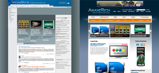
Welcome to the 2010 AnandTech Beta
by Anand Lal Shimpi on March 29, 2010 11:52 PM EST- Posted in
- Guides
That old design lasted us a long time, didn't it? :) Welcome to the 2010 AnandTech Beta. We've done a lot of updating behind the scenes as well as (obviously) on the front end.
Most obvious is the brand new look and feel. For a site that reviews the latest and greatest tech, we can't get by looking like we're still living in 2004. Now when the 80s make a comeback we'll be on top of that, you've got my word.

We've ditched the left hand column, streamlined some of the ads and widened the content column. While each article will still give you a preview of 10 comments, we finally have an option to view all comments on each review page. Right now we've got this set to 50 comments per page but we'll be tweaking as need be. We're also cutting down on the number of page loads you'll encounter. In view all comments mode there's no page refreshing between comment pages. We'll be bringing this feature to more parts of the site in the future. User friendliness is our drug :)
The front page allows for both linking to our superlong articles as well as shorter stories that can just appear on the front page for quick scanning. By default the latest 5 articles will appear in the rotating carousel up top, but if something super interesting comes up we'll promote it up there (similar to what did on the old site). The expanded summaries on the front page will give you more insight into what it is we're talking about in the article before you ever click anything.
Tags are enabled but not in full effect just yet. We'll be beefing up search, comments (the return of ratings!), galleries, Bench, user profiles and site layout/color customization over the coming weeks. We're planning on this being a regularly updated thing so if you see anything that warrants our attention let us know.
It's not all about a pretty face though, we're still going to be publishing the content that you demand from us. If you haven't seen it, be sure to read Ryan's GeForce GTX 480 & GTX 470 Review. And I'm commemorating today with a new SSD article addressing one of the longest running questions you've been asking: how do SSDs perform in RAID?
As always, thank you for your support over the years and for reading the site. It's been a pleasure to be able to write for you all over the past 13 years. Thank you guys for giving me and all of us the opportunity to do just that. If you haven't been able to tell by now, I love writing this stuff - and you all make it possible.


277 Comments
View All Comments
punjabiplaya - Tuesday, March 30, 2010 - link
Looks great. And Virus free!tdawg - Tuesday, March 30, 2010 - link
So far, I like the new design. Reminds me a little bit of the Engadget site design, except that it's coded much better! :) Very clean and modern-looking design.Thanks for keeping the site fresh!
toms98pc - Tuesday, March 30, 2010 - link
Wheres the print view option for articles?Kibbles - Tuesday, March 30, 2010 - link
Love the new layout.Nice new logo. The A needs more AA j/k =D
Hardin - Tuesday, March 30, 2010 - link
Wow this new interface is very different. I'm scared!Chad Boga - Tuesday, March 30, 2010 - link
How do we print out the reviews to read on the couch?I couldn't find a print whole article button like there used to be.
morsel - Tuesday, March 30, 2010 - link
The previous AnandTech web design was sensible, practical, and usable. The new design emphasizes form over function, and we the users will suffer for it.The scrolling headlines are obnoxious. They force users to pause, fast forward, or wait tediously to see them all, instead of being able to merely read the headlines as we used to do.
Article links are no longer a different color if visited. It may look more uniform to the web designer, but for users it means we can no longer tell at a glance which articles we have already read.
In article view, there used to be a print option which let users print or read the article as one long document, instead of having to tediously click through page after page.
Your content and site usability have made you the best for years, please don't ruin your site usability. At least let users access the lost functionality mentioned above with a classic view option, even if you don't bring back the lost functionality by default.
noxipoo - Tuesday, March 30, 2010 - link
can you make the banner scroll faster on the main page? when i click the arrows, it scrolls really slow to the next one, no point being that slow? make it fast like google flip.Adul - Tuesday, March 30, 2010 - link
doesn't work at all.I like the new layout so far. Through me totally off this morning.
fernando.gomes@ydreams.com - Tuesday, March 30, 2010 - link
Congrats on the new look. It is a welcome ovehaul! Here's what I miss:- how do I remember my login and/or password? I just had to create a new account because I could not find a way to retrieve my previous login information .
- where is the 'Print this article' feature? That was very handy; not that I ever printed any article, but it was very handy to be able to have an entire article at the touch of a scroll button. Please bring that back!
Cheers,
Fernando