Dell UltraSharp U2711: Quality has a Price
by Jarred Walton on January 22, 2010 2:00 AM EST- Posted in
- Displays
Dell U2711 Lag and Response Time
Some users are very concerned with display lag and pixel response time. For others, they really don't notice anything unless a particular display is very sluggish. I fall into the latter camp, though I do notice the processing lag when it's above ~40ms (e.g. on the Dell 2408WFP and LaCie 324, my mouse input just felt off.) To test for display lag, we run the Wings of Fury benchmark in 3DMark03, with the output set to the native LCD resolution - in this case 2560x1440. We clone the output to our reference LCD, an HP LP3065, snap a bunch of pictures, toss out any where the time readout isn't clear, and then average the remaining results (at least 10, and usually 20 or more).
As a reminder, the reference HP LP3065 is one of the best LCDs we currently possess in terms of not having display lag. (The lack of a built-in scaler probably has something to do with this.) While we know some of you would like us to compare performance to a CRT, few users have CRTs these days and all we're really interested in measuring is the relative lag. It's possible we will find an LCD that ends up with a negative result, meaning it's faster than the LP3065, but the best we have managed so far is a tie.
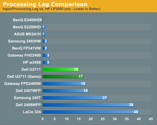
So far, all of the S-PVA panels we have tested show a significant amount of input lag, ranging from 18ms up to 40ms. In contrast, the TN and S-IPS panels show little to no processing lag (relative to the HP LP3065). The BenQ FP241VW with an S-MVA panel performs similarly to the TN and IPS panels, with an average display lag of 2ms - not something you would actually notice compared to other LCDs. What about the new U2711?
We tested with the "Graphics" setting and Adobe RGB as well as "Video" and "Game" - we figured the latter might disable some post-processing and result in less lag. That turned out to be incorrect, as our measured lag actually went up 2ms. However, in practice the settings are pretty much tied. That means the U2711 has around one frame of lag relative to our best LCDs, but it still has a lot less lag than our worst offenders. As stated already, I didn't notice lag in using the U2711 - just like I didn't notice lag on the 2407WFP or the FPD2485W. I did notice slight lag on the Samsung 245T and some clear lag on the 2408WFP and LaCie 324, but the threshold for lag varies and you'll need to determine if 15-17ms is too much or not for you. If you've tried any TN panels and still noticed lag, we would expect every current LCD to be above your "lag threshold".
 |
Despite what the manufacturers might advertise as their average pixel response time, we have found most of the LCDs are basically equal in this area - they all show roughly a one frame "lag", which equates to a response time of around 16ms. Some transitions are faster than others, but the above is representative of what we found in a study of numerous photos. If you look at the tail of the center plane, you can see a slight ghost image before and after the dominant frame. Some of that will come from the camera (we use a 1/120s shutter speed), but most of it comes from the LCD panel. In this case, the U2711 panel does outperform most LCDs that we've tested, where it was often possible to see at least three frames more clearly than the two slight ghosts in the above image.


153 Comments
View All Comments
jmurbank - Saturday, January 23, 2010 - link
You explain DPI completely wrong. DPI is dots per inch or pixels per inch. It is the space between pixels on the screen that basically has no relationship how graphics is realistically being shown on the display. Lower then 0.28 mm DPI for the monitor is better for computers while higher is OK for TV.The DPI for your desire OS is different than the DPI for your monitor. Each DPI relates to something else, but the DPI you have to look out for is the value in the OS and not the display since you are dealing with formatting issues. The calculation of how fonts are sized includes operating system DPI, so you should not change the DPI at all if you are sharing your work to others. It is best to set to the standard what everybody is using which is 96 dpi for Windows. Then change the operating system font size.
If your eyes are not what they used to be, it is best to use lower resolutions instead changing the operating system DPI or referring to a monitor that has high DPI which can look like you are viewing through a sunscreen screen for your window. Of course lower resolution screens will lose your workspace, but you will not have to rely on high DPI. To gain the workspace back, use multiple displays. Of course lower the resolution and viewing it on a LCD monitor will look blocky, but you will have to live with a poor mans technology until there is something better.
CSMR - Saturday, January 23, 2010 - link
This is nonsense. Comparing non-native low resolutions to a change in dpi at the OS level, sizes of objects are the same, but with the OS change most things are sharp while with the non-native change everything is unsharp. Using non-native resolutions is just incorrect use of the monitor.jmurbank - Saturday, January 23, 2010 - link
It is not about what is sharp and what is not sharp. LCD are basically a poor mans technology and you have to give up quality if you can not see what is on the screen. LCD are designed for notebooks for their portability and not for their quality. If we go back to a better technology such as CRT, everything just works the way it is. Using a non-native resolution is not an incorrect use or a waste of the monitor's capabilities if you can not see anything what you are doing. Sure you can setup a panning which will make a virtual resolution be viewed at a native resolution, but with a sacrifice of panning.I do not recommend changing the operating system DPI just to make sure you can read at ultra high resolutions because it will create problems in the future.
strikeback03 - Monday, January 25, 2010 - link
The only CRTs worth using were the extremely high-end models. The vast majority of CRTs are absolute crap and just about any LCD is better.CSMR - Friday, January 22, 2010 - link
Text isn't smaller when the dpi setting is correct. Unless you want it to be smaller (you might now find smaller text more readable).Some apps do override the dpi setting, in my experience only browsers (and image software - fair enough). There you have to set a zoom level. That will zoom images and text (default on IE, firefox). Well I'm on Anandtech on FF now and it zooms correctly, as do all sites I have ever visited.
Now yes, images that were mapped pixel-to-pixel before are now not as sharp at a higher setting. That's mitigated by most popular software now storing icons at various dpi settings, but is a problem for web images and I usually return to 100% zoom for photographic images. However you get the same problem if you use a non-native resolution, except instead of just a few things being unsharp, everything is including text. So that is the worst possible option you can take.
If you like a 96dpi icon on a 96dpi screen (say), then you should like a 120dpi icon on a 120dpi screen even better. (Assuming the icon has been rendered at 120dpi, which most have.) So the icons comment doesn't make any sense.
You seem to be thinking about display of computer content at a very low level, each element separately. But everything has to have the right proportions and the key measurement is physical distance. Dpi settings allow you to have the right scale while preserving the right proportions.
JarredWalton - Friday, January 22, 2010 - link
When I changed the DPI on my system, all the icons look fine, but the spacing is all messed up. They look the same size as before, but there's now a bunch of empty space surrounding each icon. (This is looking at my desktop.) They look like they use 100x100 pixels instead of 75x75 (give or take).Really, my experience is that just about everything tends to be designed assuming users are running 96DPI... it's getting a bit better, but that's the short summary. There are a lot of screen elements that just run 1:1 mapping and ignore your DPI setting. Windows Vista seems to have done more than Windows XP at addressing this area, and Win7 may be even better than Vista, but no one has really nailed this IMO.
kmmatney - Saturday, January 23, 2010 - link
I don't have great eyes, so I was a fan of larger pixel sized monitors. That is until I upgraded to windows 7. One of the big problems with Windows 7 is that you can't turn off cleartype, or at least its extremely difficult to get rid of it. So, large pixel monitors look like crap. As an example, I was using a HannsG 28" LCD @ 1920 x 1200. This was fine with Windows XP, but absolutely horrible with Windows 7. I had to get rid of this LCD, and get one with smaller pitch, just to comfortably use Windows 7. My eyes are bad enough, I don't need cleartype making things even fuzzier...erple2 - Monday, January 25, 2010 - link
I'm assuming that:CPL\System\Performance Information and Tools\Adjust Visual Effects [sidebar], uncheck "Smooth edges of screen fonts".
Doesn't work? (This was from one of the first results of:
http://www.google.com/search?q=remove+cleartpye+fr...">http://www.google.com/search?q=remove+cleartpye+fr...
)
erple2 - Monday, January 25, 2010 - link
Awesome - Google figured out what I meant. The real URL ishttp://www.google.com/search?q=remove+cleartype+fr...">http://www.google.com/search?q=remove+cleartype+fr...
CSMR - Friday, January 22, 2010 - link
Not sure what's up with your system. XP was pretty awful at this, but on Vista/Win 7 it's a very strange problem to have.