The Microsoft Surface Studio Review
by Brett Howse on January 20, 2017 8:00 AM EST- Posted in
- Desktop
- Microsoft
- Surface
- Surface Studio
Color Modes: sRGB, DCI-P3, and Vivid
Next up, let’s take a look at the color gamut accuracy on the three different display modes. sRGB is the one that most people are going to want to use most of the time, because most applications do not have any color management, but in the images below you can see just how much larger the P3 gamut is. It appears P3 is making its way to being the next gamut for computers, but without color management, it is going to be a messy transition.
sRGB
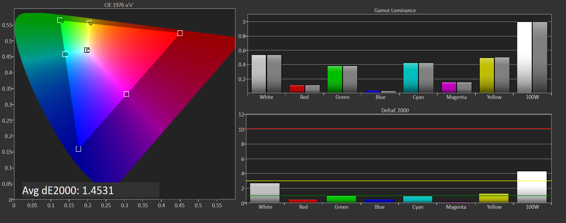
sRGB is still the default target for almost everything, so it is important to get this one right, even more than the others. You can see that the Surface Studio easily covers the sRGB gamut, and it is almost perfect at doing it. Really only the white levels bring the error levels up, with the colors almost perfect for this gamut.
DCI-P3

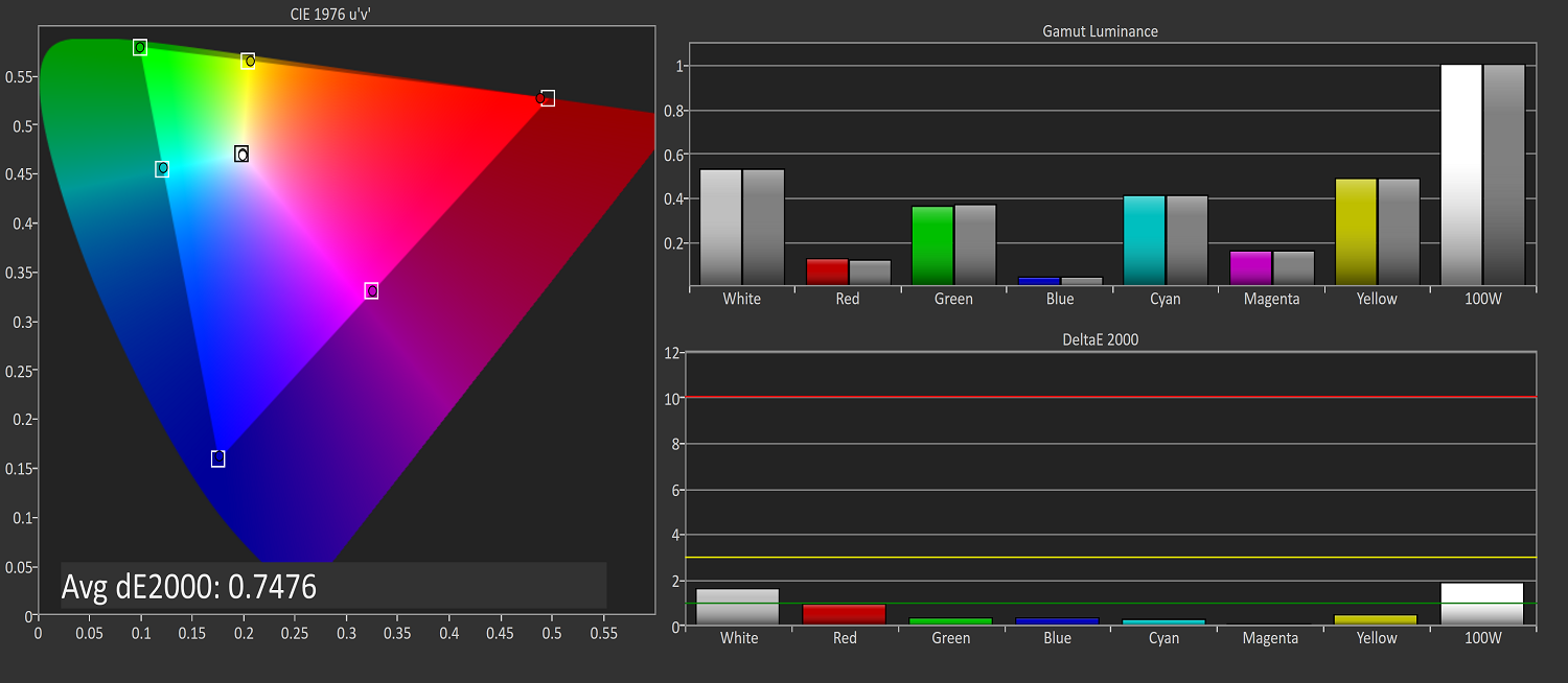
The sRGB gamut coverage was good, but the DCI-P3 is even better, with a much more accurate white point for this color space really helping the average error level here. But take a good look at the actual white point in the image, which is the square inside the triangle. On this color space, the white point shifts much higher into green, and away from the pure white you would expect of sunlight, which we call D65. The DCI-P3 gamut does not use D65, and is therefore not really going to be used much on the Surface Studio.
Vivid
Although called Vivid, this color mode is the correct P3 color space for computers, which is P3 D65. The gamut coverage is the same as DCI-P3, but the white point moves to the D65 point which is sunlight at noon. The Surface Studio is somehow even more accurate hitting this gamut than the two that are correctly named. Using the name Vivid is a poor choice in naming this when the other two color spaces are named correctly, so if you do own or buy a Studio, and you do want to look at P3 gamut content, Vivid is the correct color space to choose for this.
Color Accuracy
Now that we’ve looked at the various color spaces, it’s time to examine each one individually to see how the Surface Studio performs when set to each color space.
sRGB
On the sRGB tests, the grayscale and saturation tests were done to the new 2017 standard of 4-bit steps rather than 5% and 20% steps respectively. This gives a better picture of what the display is doing, and a much more accurate gamma result.
Grayscale
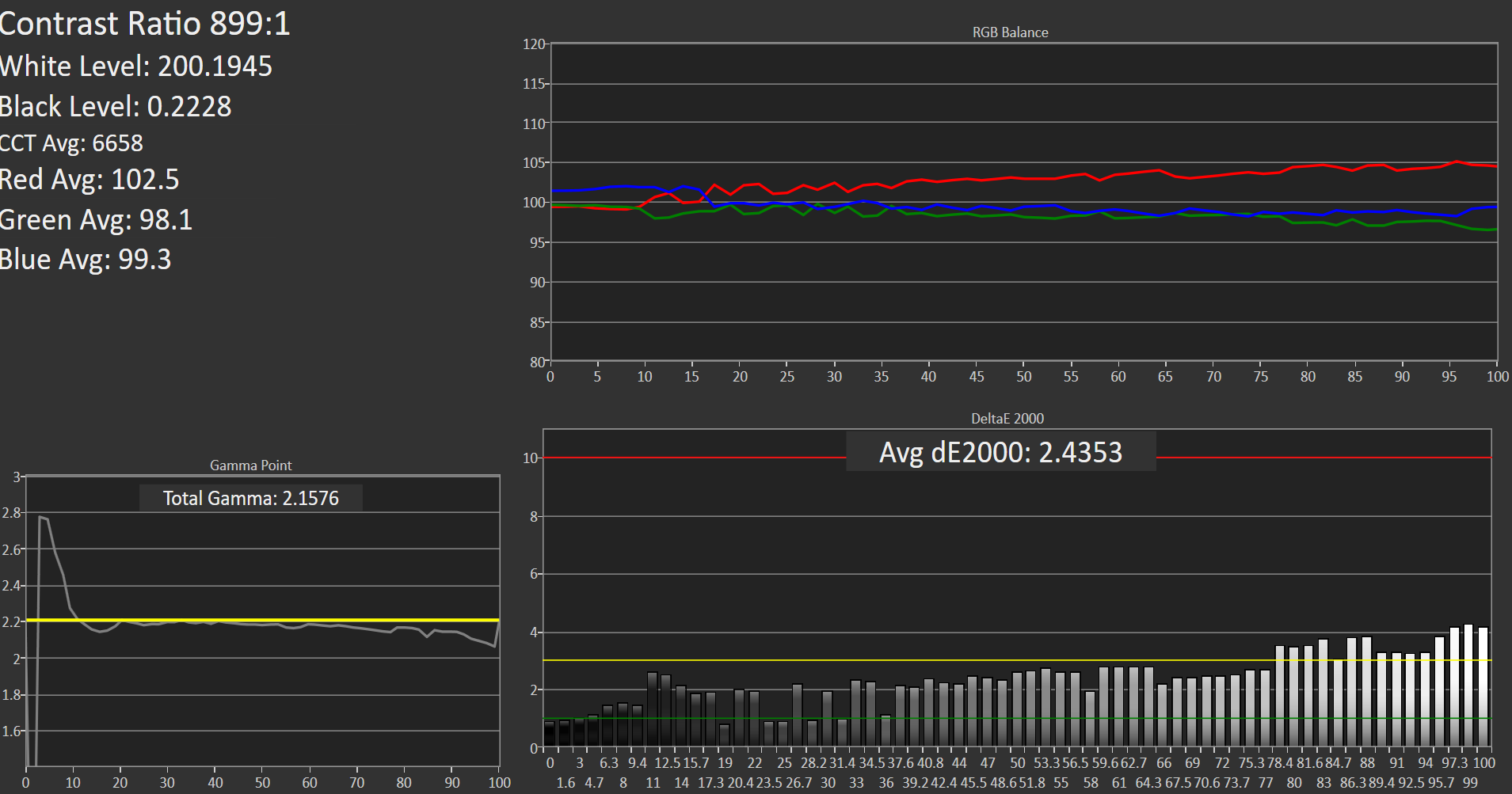
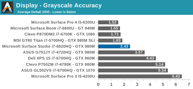
Microsoft nailed the gamma, which should be 2.2, and it very nearly is. However some errors creep up in the grayscale as the image gets closer to 100% white, with the red levels too high, and green a bit low. Overall, it’s still a very good average result, but not perfect. Notice how far they have come since the Surface Pro 3.
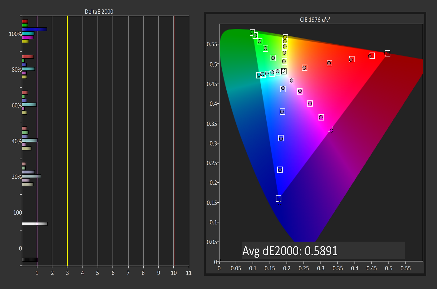
Saturation
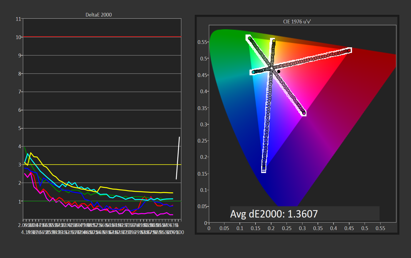
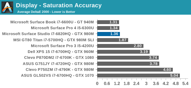
Once again, other than the white level errors at 100% white, the saturation result is fantastic. An overall error level of just 1.36 is very strong, and the individual color traces show that there are no real issues with any of the primary or secondary colors when set to sRGB.
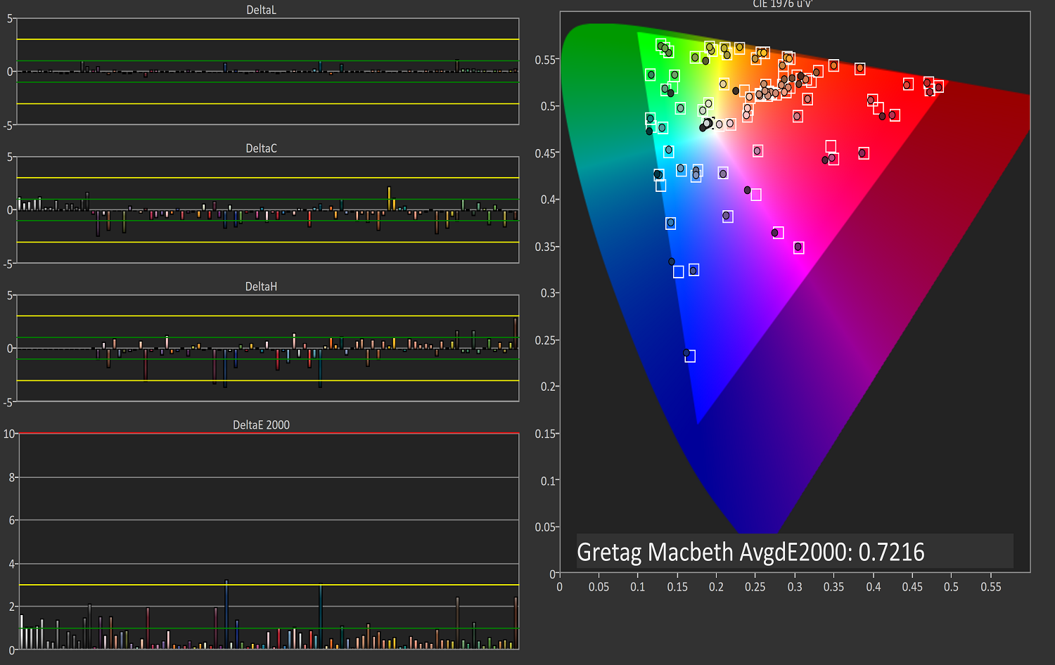
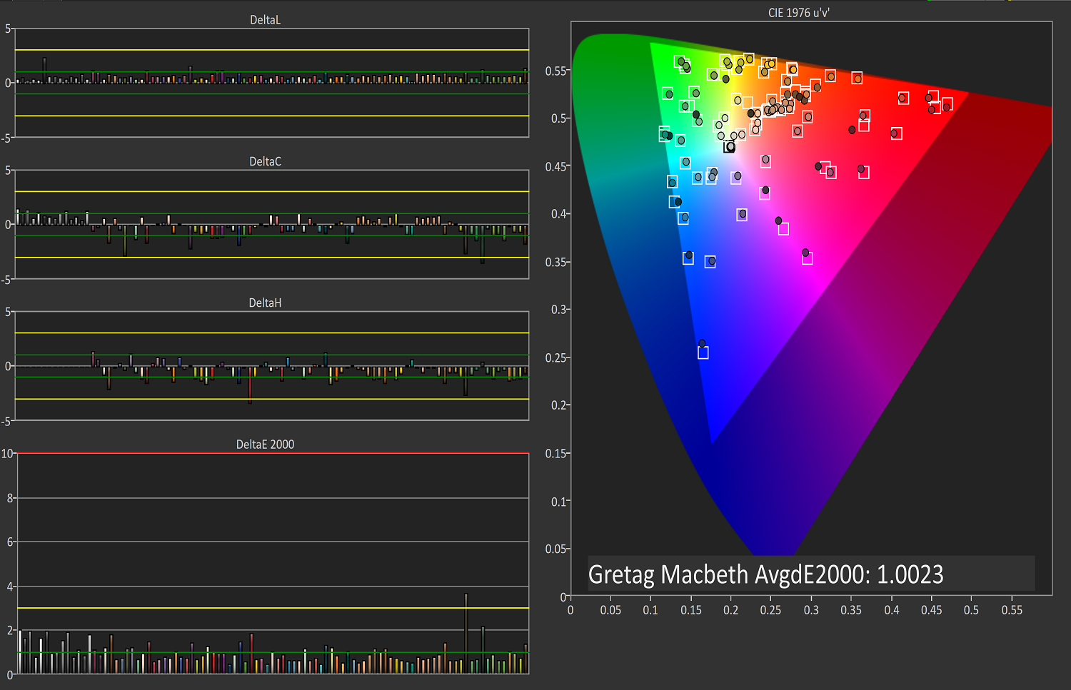
Gretag Macbeth

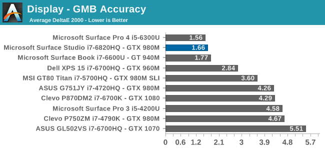
This test is the most comprehensive test, covering a large number of color points, including the important flesh tones. Here, again, the Surface Studio ends up with a fantastic result, and other than a single color, most of the errors are less than two, with many much closer to one. The sRGB results have started off very strong.
DCI-P3
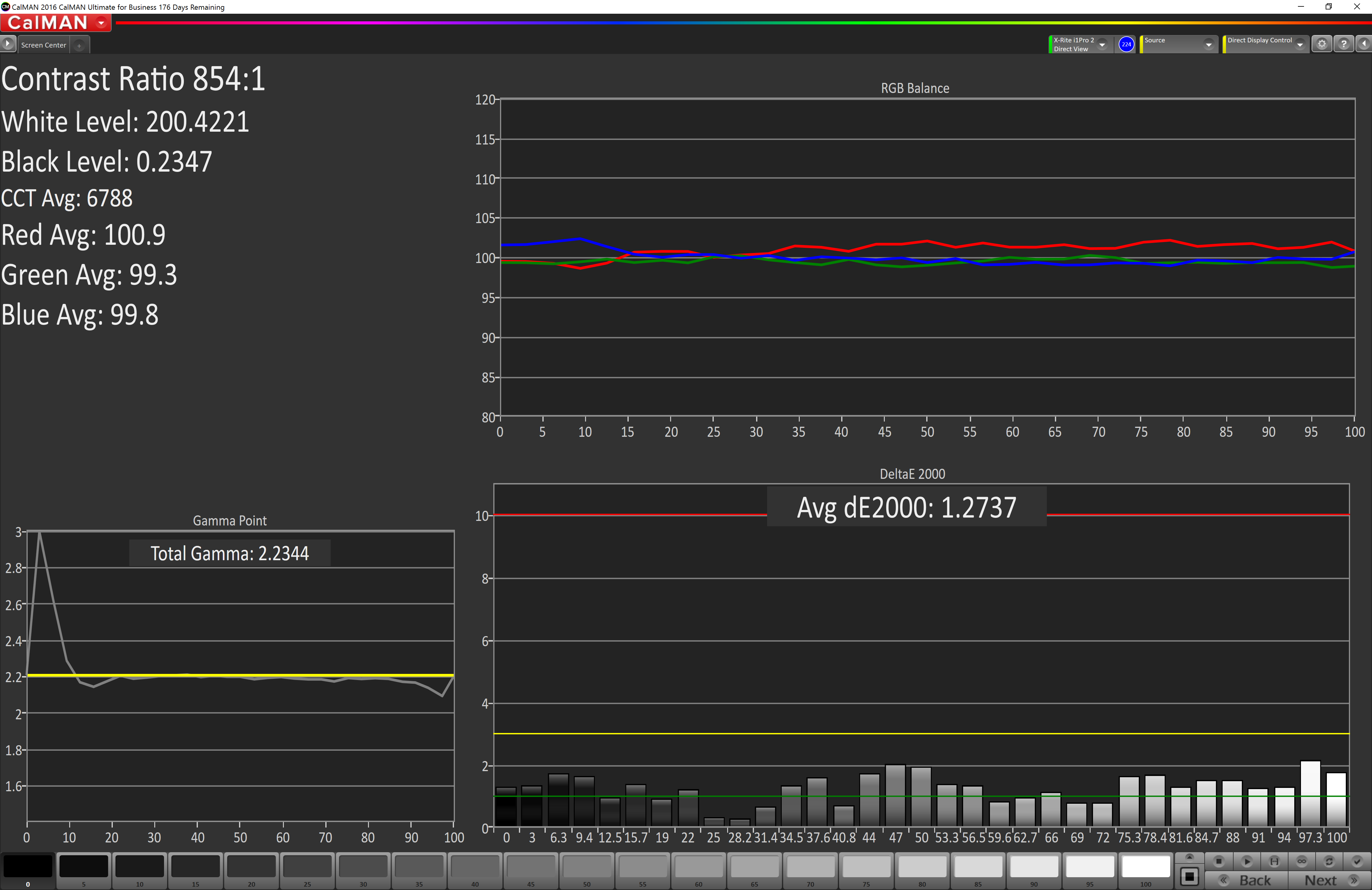
Grayscale
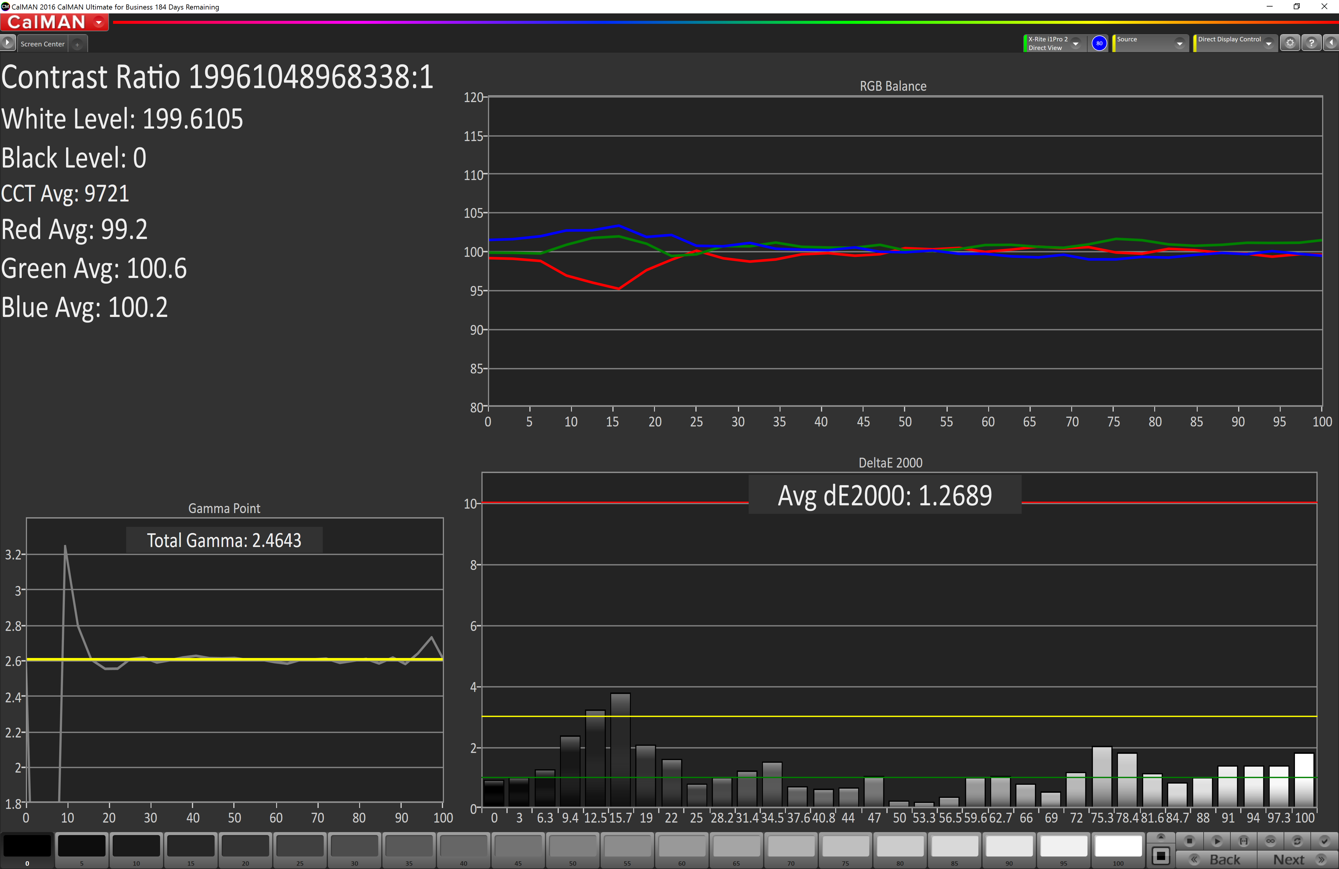
When testing for the DCI-P3 color space, the gamma changes to 2.4, and the Surface Studio correctly hits this gamma as well. Across the entire grayscale sweep, the red, blue, and green levels are very consistent, and the average error level is just 1.27, which is outstanding. The display hits this new gamma and white point almost perfectly.
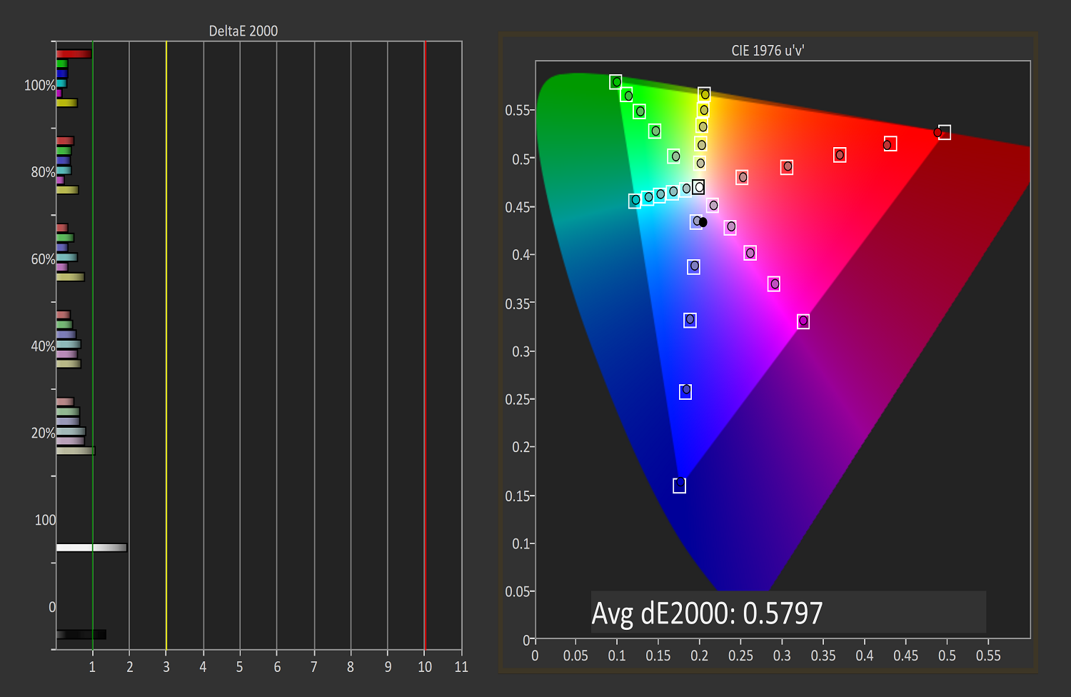
Saturation
Continuing its impressive results, the Surface Studio is practically perfect on the DCI-P3 saturation sweeps. The blue results and 100% white are the only real issues, but neither of them are really much of an issue at all.
Gretag Macbeth
An average error level under one is a great result again, and although there are a few individual colors that jump up to dE 2000 of three or so, almost every color tested is well under one.
Vivid (P3 D65)
Grayscale
The P3 D65 gamut moves back to a gamma of 2.2, and the Surface Studio nicely hits that. The error levels on the grays are all very low, with only 97.3% white jumping over the two line. The D65 white point is also almost perfect, with the red just a bit higher than it should be, but not to a level that would be very noticeable.
Saturation
The saturation graph is amazingly accurate. Only 20% yellow even crosses the one mark, outside of white and black.
Gretag Macbeth
Finally, the Gretag Macbeth test continues the trend of fantastic display calibration on the Surface Studio. Just a single color tested has an error level over three, with pretty much the rest of the tested colors showing an error level of under one. It is a pretty fantastic result.
Display Conclusions
It’s difficult to not be impressed by the work put into the Surface Studio’s display. Here we have a display with an ICC profile for sRGB, DCI-P3, and P3 D65, and in every gamut, the accuracy levels are near, if not the best, that have ever been tested on this site. It is a fantastic achievement, and a testament to what can happen if a company decides to focus on quality. There is no doubt that the Surface Studio’s display is the stand-out feature on this PC, and Microsoft has taken the time to individually calibrate each display to one of the highest levels of accuracy possible.
The fact that this display also features ten-point multitouch, and pen support, as well as having accuracy that is top-notch, makes the Surface Studio arguably the best computer display targeted towards consumers and prosumers. Combine that with the excellent 3:2 aspect ratio, the high pixel density, and practically perfect display scaling, and it would be hard to find any faults with this display. It truly is a masterpiece.


197 Comments
View All Comments
warrenk81 - Friday, January 20, 2017 - link
what does this sentence mean? "It would be great to see backlighting as well, but that is also not missing."Does it have lights or not?
Ryan Smith - Friday, January 20, 2017 - link
One too many negations, it seems. Let's try this: "It would be great to see backlighting on this keyboard as well, but that is also absent"melgross - Friday, January 20, 2017 - link
About the review. There are a number of errors in areas in which the reviewer doesn't seem to understand,D65 is NOT daylight, the concept of what daylight is is very complex. For many decades, daylight has been standardized as 5.6K, not 6.5K. The reason why D65 was invented wasn't to simulate daylight, but because of practical graphics standards reasoning.
D5 has been the graphics standard going back a very long time. Every light box used for color was D5. So were print view boxes and such. The problem was that in the beginning days of computers entering the graphics space, a problem came up.
While my Barco monitors, in my place, that cost $16,000, could reach D5 calibration, no other could. The problem was that the monitors couldn't be made to display enough brightness. As a result, calibrating to D5 left us with a fairly dim, and very yellow screen. Since the red and green couldn't be brought up enough, the blue needed to be turned down, leaving that horrible screen. The barco was the only monitor that had enough brightness.
So there was much discussion, and as a result, D65 was decided upon as a compromise. It could easily be calibrated to using most high quality graphics monitors, and so that became the standard.
Now, we thing of D65 as daylight, but it isn't. Daylight varies from about D22 to about D20.0 in other words, about 2.2K to about 20K. Where you are in the world, at any given time of the day, or year, will determine what that point is, and it doesn't average D65.
It's why when a photo is taken with sunlight and open shade, the sun portion is very yellow, and the shade is mostly cyan.
This may seem to be a little point to make, but I see people misunderstanding this so often, it's frustrating. I ran a large commercial photo lab in NYC for many years, and we were one of the first to begin to go digital in 1988.
By the way, Windows has never had effective color management. Individual developers such as Adobe have had to write their own management software, which isn't usable systemwide. That means that if you have anything other than an image that is using the sRGB gamut, it won't be correct except when running in a color managed app.
Windows 10 is the first Windows OS to have a working color management system built-in, but it comes turned off, because turning it on at this late stage screws up everything else in Windows, and it's very buggy. Maybe someday, that will change. But for now, you can't view two images with differing gamuts side by side in Windows. Only one will ever show correctly.
This is one reason doing commercial color work on this will be a major headache.
Brandon Chester - Friday, January 20, 2017 - link
All CIE standard illuminants from series D are designed to simulate daylight. I believe by D5 you mean D50, which has a lower CCT than D65. The review is not incorrect in describing D65 as representing daylight. In fact, the actual spec states that D65 should be used for all colorimetric calculations requiring a value to represent daylight. I encourage you to read ISO 11664-2.You are correct on companies having to roll their own color management. However, Windows 10 still uses WCS, it is just as unusable as before, and neither Win32 nor UWP integrate it at all, so there is not some working CMM that is just turned off. This is why brand new UWP apps like Photos and Microsoft Edge still aren't color managed, which would be implicit in a system where the underlying graphics framework is color managed and thus any component that uses it for drawing is color managed.
melgross - Friday, January 20, 2017 - link
Yes, D50, but, hese color spaces do not actually represent daylight. They represent a convenient compromise that allows equipment to be made and maintained, while giving some "sort" of recognizable color while point.This is why the concept of daylight has varied so much over time. I know ISO 11664-2, because I was one of those who was consulted on this standard way back then. As I say, all of these various standards are mechanical approximations of something natural.
So, for example, what is a proper white point? Well, we really don't know. Should it be represented by something that supposedly looks something like "natural" light, whatever that is? Should it be represented by our own eye/brain combination which is most sensitive to yellow/green?
So when you look at the sky, it's about 20K. But that's not what's always reflected off an object, which could be closer to 3K, which is what we're looking at, and what our brain recognizes as "correct", with its ability to adjust its perception to various light sources.
I've undergone many permutations of these questions over the decades. And it will change again.
I did say that WCS is so buggy that it's still turned off. But that's not the only reason. Microsoft's customers don't care about color management in a large enough percentage for Microsoft to really care. They only added this, years ago, to satisfy those screaming for it, but without bothering to really work on it. Enough said, they think, that it's there.
You basically said what I did, it with more explanation. Yeah, it's always been a mess, and it's not likely to be fixed anytime soon. Android, by the way, has no color management whatsoever, and isn't likely to get any, which is why wide band screens on Android products are almost useless.
id4andrei - Friday, January 20, 2017 - link
I'm curious, in the case of something like a Samsung Galaxy phone, when you select the supposedly exceptionally accurate "basic" profile is that not akin to switching colorspaces on the Studio? I mean Samsung does not use pure Android which as you said is completely inept at color management, but a modified and skinned Android that might have some rudimentary color management. Is it not?Brett Howse - Friday, January 20, 2017 - link
How do I put this. If there was color management, it wouldn't matter what gamut the display was able to use, since the colors would be transformed to fit that color space, assuming the display color space covers both. So, as an example, if you were viewing a sRGB photo on a P3 D65 display, the colors would be correct because there is color management, and it knows the photo is sRGB, and it knows the display is P3 D65, so it can use some math to put the sRGB photo into the correct P3 D65 space.If you don't have color management, and something is 85% red in sRGB, but your display is P3 D65, it will appear as 85% of the larger space, and would be oversaturated.
We should really have Brandon write up a piece on this outside of the few times he's addressed it.
Some Windows apps do have color management, and some respect the color management in Windows, but most do not. For instance the old Photo Viewer does work, but the new UWP Photos app has no color management. Apps like Adobe Photoshop have written their own color management, so they generally work well.
id4andrei - Saturday, January 21, 2017 - link
Aha so viewing a random sRGB picture on your presumably AdobeRGB Android smartphone would look waaaay off. While an AdobeRGB picture would look right.Brett Howse - Saturday, January 21, 2017 - link
Exactly, and that's the case on Android. iOS has color management, so the P3 D65 displays they've started using don't suffer from this issue.Icehawk - Sunday, January 22, 2017 - link
I bet this is why colors were off viewing a file in the new Photo app (like way off) but using the old Photo Viewer it looked right.