The Microsoft Surface Studio Review
by Brett Howse on January 20, 2017 8:00 AM EST- Posted in
- Desktop
- Microsoft
- Surface
- Surface Studio
The PixelSense Display
Microsoft has been pushing display technology since the original Surface RT launched, but it is only recently that they have gotten really serious about quality displays. The Surface Pro 4 and Surface Book both feature the best displays in their class, with very accurate color reproduction and high pixel densities. The move to the 3:2 aspect ratio with the Surface Pro 3 was a game changer for that tablet, and it is great to see they have stuck with this even with the much larger Surface Studio.
There is a lot to talk about in regards to the display of the Surface Studio. First of all, it is truly a “wow” moment for practically anyone who sees it. We can get a bit carried away with talk of pixels, color gamuts, and contrast, but pretty much anyone who has seen this Surface Studio has said “wow” whether they are technical or not. The combination of a huge number of pixels, a very large display, good brightness, and the not so average aspect ratio really make the Studio stand out. The fact that it’s all in a 12.5 mm thick design is the icing on the cake.
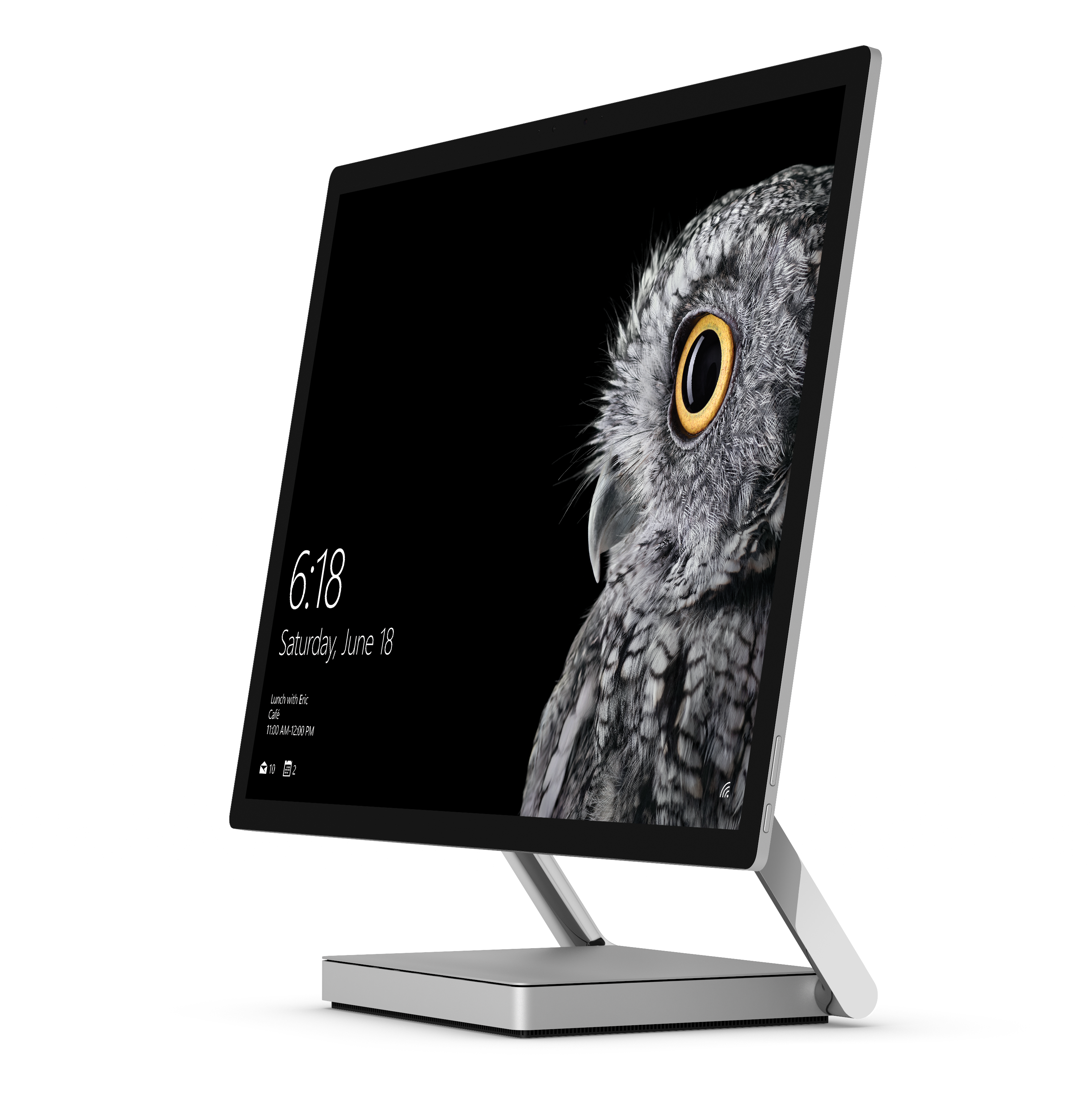
A few pages ago, I spoke of attention to detail. There is nowhere this is more apparent than the Surface Studio’s 28.125-inch PixelSense display. It’s not a 28-inch display. It’s not a 28.5-inch display. It is a 28.125-inch display, and this size was decided upon to make sure this display can be scaled almost perfectly within Windows. It was something that would have been chosen way back at the very beginnings of the project.
Combined with the 4500x3000 resolution, the 28.125-inch display works out to almost exactly 192 pixels per inch. That may not seem like a very large number, or a very significant number, when you have smartphones with almost 600 pixels per inch, but 192 is exactly double 96. Why does 96 matter? 96 DPI is what Windows was originally built around, so if you had a display with 96 DPI, one inch on the display would be exactly one inch on a printed paper. With the Surface Studio, they have doubled the DPI so that Windows can be run at exactly 200% scaling, but keep the correct dimensions for everything on the display. When the Surface Studio was announced, the head of Surface, Panos Panay, held up a 8.5x11-inch piece of paper to the Surface Studio and showed that it was exactly the same size as the original word document on the display. None of this was an accident. Attention to detail, again.
Let’s not just glance over the resolution either. 4500x3000 is a huge number of pixels; 13.5 million to be precise. This is almost 63% more pixels than a 4K display, and just 8% under a 5K display. It’s one of the reasons you won’t see me use the term "4K" or "5K" or "8K" for displays, since it really does the display an injustice. Some people have called the Surface Studio a 4.5K display, hinting that it’s between a 4K and a 5K, but it is way closer to 5120x2880 than it is to 3840x2160, with the former having about 14.75 million pixels, and the latter only 8.3 million (and a Full HD 1920x1080 is just a hair over 2 million pixels). The Surface Studio’s display is very sharp for a desktop, and the perfect 200% scaling makes it a treat to work with. Add in the aspect ratio giving you over 50 square inches more display than a 27-inch 16:9 display, and it can start to become apparent why this display is such a stunner.
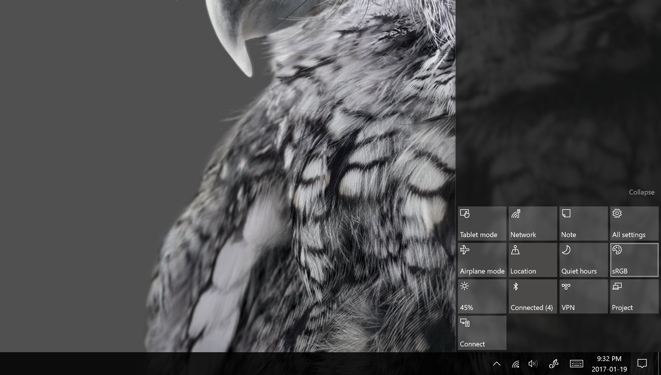
Another feature of the display that Microsoft touted at the launch event is that the Surface Studio is a wide-gamut display, with the Studio featuring DCI-P3 color space support. There is a toggle in the Action Center that lets you choose among sRGB, DCI-P3, and Vivid color modes. Each of these color targets are actually an ICC profile, and each display is individually calibrated to ensure that they correctly display each color gamut.
sRGB should be well known to our readers, but this is the most common color gamut in computing, with almost all images and web content targeting sRGB. Meanwhile DCI-P3 is a bit more complex. DCI-P3 started life as the color gamut used in cinema, with a wider color spectrum and much more green white point. In fact, cinema DCI-P3 is so green that it is almost impossible to use on the Studio. DCI-P3 was designed for low light in a movie theatre, and in addition to having a different white point, it also has a gamma of 2.4, making it not all that useful when using the Studio as a typical desktop.
But there is also this third color profile, which Microsoft called “Vivid” and you’re likely thinking, what the heck is that? Vivid is in fact the correct P3 color gamut for use on a desktop, and it’s called P3 D65, where D65 is the white point, and it has a 2.2 gamma (both of which are carried over from sRGB). P3 D65 is the same P3 color space you would find on an iPhone, iMac, or iPad Pro, and it offers the same wider color gamut, but with a white point that is white, and not green.
Microsoft did a fantastic job of adding three color gamuts to the Surface Studio, and they even made it simple to choose which one you need, but by naming two of them by their proper name, and the third by an adjective, makes it very confusing. DCI-P3 and P3 D65 are not great names, nor is sRGB, but at least a quick search on the internet would let even an inexperienced person know what they have. They really need to fix the name on Vivid, because if you had content in the P3 color space, more than likely it would target P3 D65. But unless you were aware that Vivid was correct, you may choose the DCI-P3 space which would make it look awful. Offering the cinema DCI-P3 standard is not a bad thing, mind you, but Microsoft should be directing users to P3 D65 instead, as that's the de facto standard for computers.
The added gamuts are welcome though, as is the Action Center toggle to choose the one you need, but because Windows doesn’t have proper color management, the end user needs to make the decision on which gamut to target. Microsoft needs to fix this, and fix it soon, since it is a problem that is only going to get larger as time goes on. You can run the display in Vivid all the time, but program designed for the sRGB color space will end up having the colors oversaturated. So although there are three color spaces, most people should use sRGB almost exclusively, which is a bit of a shame.
But enough preamble. How good is the Surface Studio’s display? Let’s find out.
Brightness, Contrast, Uniformity, and the Color Modes
As with any display, we test using SpectraCal’s CalMAN suite, and leverage the X-Rite i1Display Pro colorimeter for brightness and contrast readings, and the X-Rite i1Pro2 Spectrophotometer for color accuracy. For 2017, laptop displays, as well as the Surface Studio, will be subjected to a more thorough display test than in the past, with more points tested in both grayscale and saturation.
Using the colorimeter to test the display brightness and contrast gives a more accurate reading than using a spectrophotometer for this, because a spectrophotometer does not read black levels as well due to extra noise on the sensor. We test contrast at maximum brightness, and then set the display to 200 nits for the remainder of the tests.
Brightness and Contrast
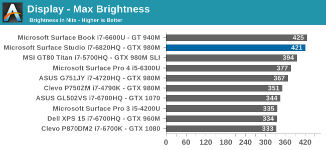
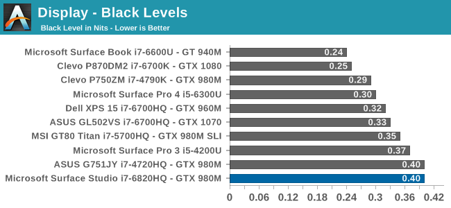
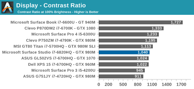
The Surface Studio can get very bright, especially for a desktop. 421 nits is one of the highest brightness levels we’ve seen in a desktop monitor. Even in the most well-lit office setting, this level of brightness should be plenty for almost anyone. The contrast ratio being just over 1000:1 is also a decent result, although nowhere near the over 1700:1 of the Surface Book. The excellent contrast ratio is one of the best features of the Book, so only getting 1000:1 on the Studio was a bit disappointing, but nonetheless it is one of the higher contrast ratios of any desktop display we have tested.
For those that like to work in a dark office, the Surface Studio’s display will go all the way down to just 3 nits, which is also an excellent result. There is plenty of brightness range for anyone to find a comfortable level.
Uniformity
On smaller displays, such as tablets and notebooks, we don’t generally test uniformity, but it is a good thing to test on a desktop display, where the sheer size of the display can cause some real issues for a poorly designed backlight. Since the Surface Studio is edge lit, there is always going to be some issues with uniformity due to the nature of that type of backlight, as compared to a full-array backlight on a monitor.
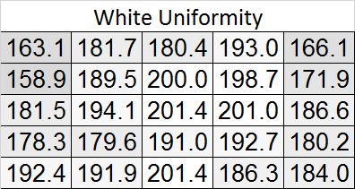

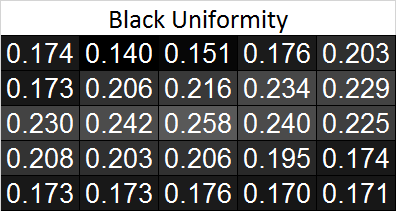
There is definitely some drop in the white output in the upper corners of the display, as well as along the top edge. The black levels also drop here, although since it was tested with a spectrophotometer the black levels won’t be absolutely accurate. On a percentage basis, there is about 20% less light in the top right corner, and just a bit under that on the top right corner. However the rest of the display is quite a bit more uniform.
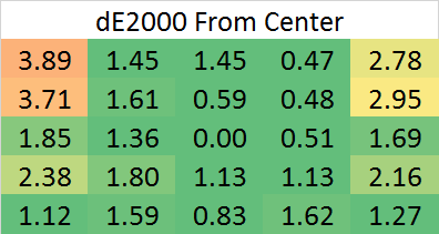
Next, the color levels were tested across the display, and here the result is quite a bit better than the brightness levels. The backlight issues in the top corners still causes some shift in color right at the edges, but overall the dE2000 across the rest of the display is fantastic for an edge-lit display.


197 Comments
View All Comments
warrenk81 - Friday, January 20, 2017 - link
what does this sentence mean? "It would be great to see backlighting as well, but that is also not missing."Does it have lights or not?
Ryan Smith - Friday, January 20, 2017 - link
One too many negations, it seems. Let's try this: "It would be great to see backlighting on this keyboard as well, but that is also absent"melgross - Friday, January 20, 2017 - link
About the review. There are a number of errors in areas in which the reviewer doesn't seem to understand,D65 is NOT daylight, the concept of what daylight is is very complex. For many decades, daylight has been standardized as 5.6K, not 6.5K. The reason why D65 was invented wasn't to simulate daylight, but because of practical graphics standards reasoning.
D5 has been the graphics standard going back a very long time. Every light box used for color was D5. So were print view boxes and such. The problem was that in the beginning days of computers entering the graphics space, a problem came up.
While my Barco monitors, in my place, that cost $16,000, could reach D5 calibration, no other could. The problem was that the monitors couldn't be made to display enough brightness. As a result, calibrating to D5 left us with a fairly dim, and very yellow screen. Since the red and green couldn't be brought up enough, the blue needed to be turned down, leaving that horrible screen. The barco was the only monitor that had enough brightness.
So there was much discussion, and as a result, D65 was decided upon as a compromise. It could easily be calibrated to using most high quality graphics monitors, and so that became the standard.
Now, we thing of D65 as daylight, but it isn't. Daylight varies from about D22 to about D20.0 in other words, about 2.2K to about 20K. Where you are in the world, at any given time of the day, or year, will determine what that point is, and it doesn't average D65.
It's why when a photo is taken with sunlight and open shade, the sun portion is very yellow, and the shade is mostly cyan.
This may seem to be a little point to make, but I see people misunderstanding this so often, it's frustrating. I ran a large commercial photo lab in NYC for many years, and we were one of the first to begin to go digital in 1988.
By the way, Windows has never had effective color management. Individual developers such as Adobe have had to write their own management software, which isn't usable systemwide. That means that if you have anything other than an image that is using the sRGB gamut, it won't be correct except when running in a color managed app.
Windows 10 is the first Windows OS to have a working color management system built-in, but it comes turned off, because turning it on at this late stage screws up everything else in Windows, and it's very buggy. Maybe someday, that will change. But for now, you can't view two images with differing gamuts side by side in Windows. Only one will ever show correctly.
This is one reason doing commercial color work on this will be a major headache.
Brandon Chester - Friday, January 20, 2017 - link
All CIE standard illuminants from series D are designed to simulate daylight. I believe by D5 you mean D50, which has a lower CCT than D65. The review is not incorrect in describing D65 as representing daylight. In fact, the actual spec states that D65 should be used for all colorimetric calculations requiring a value to represent daylight. I encourage you to read ISO 11664-2.You are correct on companies having to roll their own color management. However, Windows 10 still uses WCS, it is just as unusable as before, and neither Win32 nor UWP integrate it at all, so there is not some working CMM that is just turned off. This is why brand new UWP apps like Photos and Microsoft Edge still aren't color managed, which would be implicit in a system where the underlying graphics framework is color managed and thus any component that uses it for drawing is color managed.
melgross - Friday, January 20, 2017 - link
Yes, D50, but, hese color spaces do not actually represent daylight. They represent a convenient compromise that allows equipment to be made and maintained, while giving some "sort" of recognizable color while point.This is why the concept of daylight has varied so much over time. I know ISO 11664-2, because I was one of those who was consulted on this standard way back then. As I say, all of these various standards are mechanical approximations of something natural.
So, for example, what is a proper white point? Well, we really don't know. Should it be represented by something that supposedly looks something like "natural" light, whatever that is? Should it be represented by our own eye/brain combination which is most sensitive to yellow/green?
So when you look at the sky, it's about 20K. But that's not what's always reflected off an object, which could be closer to 3K, which is what we're looking at, and what our brain recognizes as "correct", with its ability to adjust its perception to various light sources.
I've undergone many permutations of these questions over the decades. And it will change again.
I did say that WCS is so buggy that it's still turned off. But that's not the only reason. Microsoft's customers don't care about color management in a large enough percentage for Microsoft to really care. They only added this, years ago, to satisfy those screaming for it, but without bothering to really work on it. Enough said, they think, that it's there.
You basically said what I did, it with more explanation. Yeah, it's always been a mess, and it's not likely to be fixed anytime soon. Android, by the way, has no color management whatsoever, and isn't likely to get any, which is why wide band screens on Android products are almost useless.
id4andrei - Friday, January 20, 2017 - link
I'm curious, in the case of something like a Samsung Galaxy phone, when you select the supposedly exceptionally accurate "basic" profile is that not akin to switching colorspaces on the Studio? I mean Samsung does not use pure Android which as you said is completely inept at color management, but a modified and skinned Android that might have some rudimentary color management. Is it not?Brett Howse - Friday, January 20, 2017 - link
How do I put this. If there was color management, it wouldn't matter what gamut the display was able to use, since the colors would be transformed to fit that color space, assuming the display color space covers both. So, as an example, if you were viewing a sRGB photo on a P3 D65 display, the colors would be correct because there is color management, and it knows the photo is sRGB, and it knows the display is P3 D65, so it can use some math to put the sRGB photo into the correct P3 D65 space.If you don't have color management, and something is 85% red in sRGB, but your display is P3 D65, it will appear as 85% of the larger space, and would be oversaturated.
We should really have Brandon write up a piece on this outside of the few times he's addressed it.
Some Windows apps do have color management, and some respect the color management in Windows, but most do not. For instance the old Photo Viewer does work, but the new UWP Photos app has no color management. Apps like Adobe Photoshop have written their own color management, so they generally work well.
id4andrei - Saturday, January 21, 2017 - link
Aha so viewing a random sRGB picture on your presumably AdobeRGB Android smartphone would look waaaay off. While an AdobeRGB picture would look right.Brett Howse - Saturday, January 21, 2017 - link
Exactly, and that's the case on Android. iOS has color management, so the P3 D65 displays they've started using don't suffer from this issue.Icehawk - Sunday, January 22, 2017 - link
I bet this is why colors were off viewing a file in the new Photo app (like way off) but using the old Photo Viewer it looked right.