The iOS 10 Review: Refining the iOS Experience Both Over & Under the Hood
by Brandon Chester on September 13, 2016 12:00 PM ESTExtending iMessage
The Message app is the most used application on iOS. This isn't really a surprise when one thinks about how people use their phones, but it does identify an area that the developer community hasn't been able to tap into despite users spending a great deal of their time there. For someone like me, it was difficult to imagine that there really was anything that developers could do with iMessage, as my use case is just sending images, videos, and text in the same way that you could with SMS and MMS. Of course, I make use of some other convenient features like group chats, read receipts, etc, but none of these areas seemed to present a way for third party developers to add value. Of course, that's when I think about how I use messaging, but there's a whole world of messaging beyond the most basic functionality that SMS and iMessage provide. Apple is tapping into those ideas for iMessage in iOS 10, and they're bringing developers along for the ride.
Apple has taken a two pronged approach to upgrading iMessage in iOS 10. The first are the features that come by default, the features that are part of iMessage itself. I actually covered some of these in my macOS Sierra preview, although in a limited manner as macOS Sierra is not capable of using most of the new features itself and is just able to receive messages that use them. The two main features added to iMessage by default in iOS 10 are message effects and Digital Touch messages.

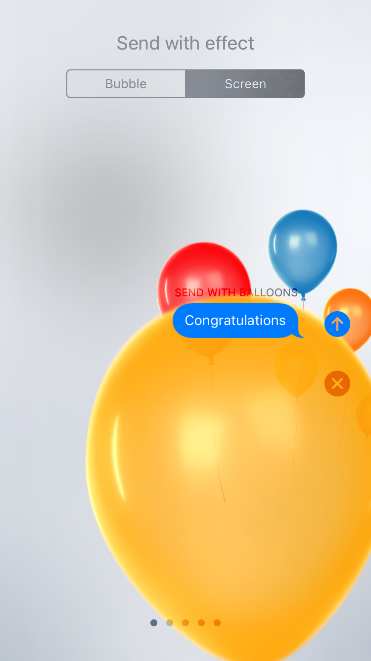
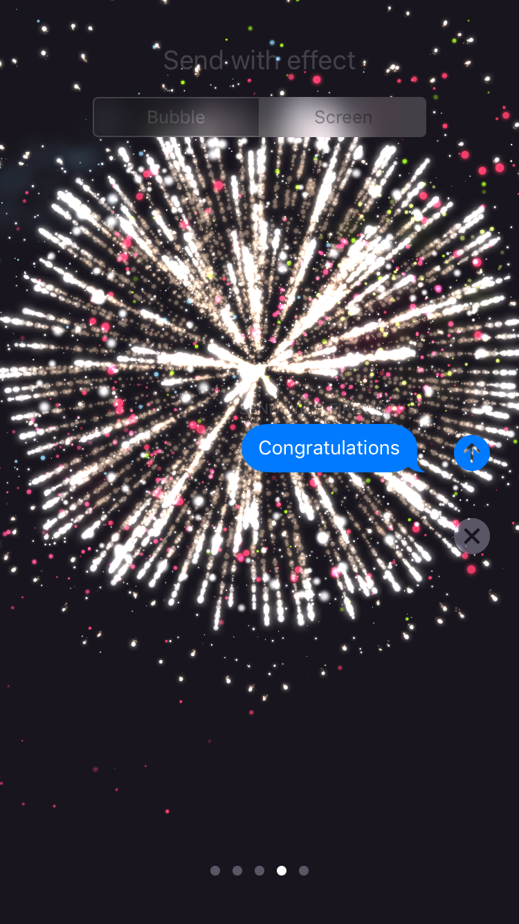
Message effects work as you'd expect, with animations that can be applied to the actual message bubble itself or as an effect that plays in the background behind the scrolling list of messages. For bubble effects Apple provides an invisible ink effect that requires you to swipe across the message to reveal it, a gentle effect with tiny text, a loud effect which enlarges the bubble for a moment when it's viewed, and a slam effect which crashes the message into the screen, complete with dust effects as it touches down. As for screen effects, you have balloons, confetti, lasers, fireworks, and a shooting star. There's not a whole lot else to say about message effects, as other messaging apps have implemented these features before. If you're a fan of them then you'll be happy to see them brought to iMessage, and if you're not you'll just have to hope all your contacts feel the same way.
Anyone who has used an Apple Watch will be familiar with Digital Touch. In this case it has been modified since you're using it from an iPhone instead of a watch, and the list of things you can send have been expanded as well. To bring up Digital Touch you simply tap the icon with two fingers on a heart which sits next to the text entry field. Once you do so you'll be presented with a condensed version of the Digital Touch UI in the space where the keyboard would normally be. This UI works in a similar manner for iMessage apps, although I'll touch on that more in a bit.
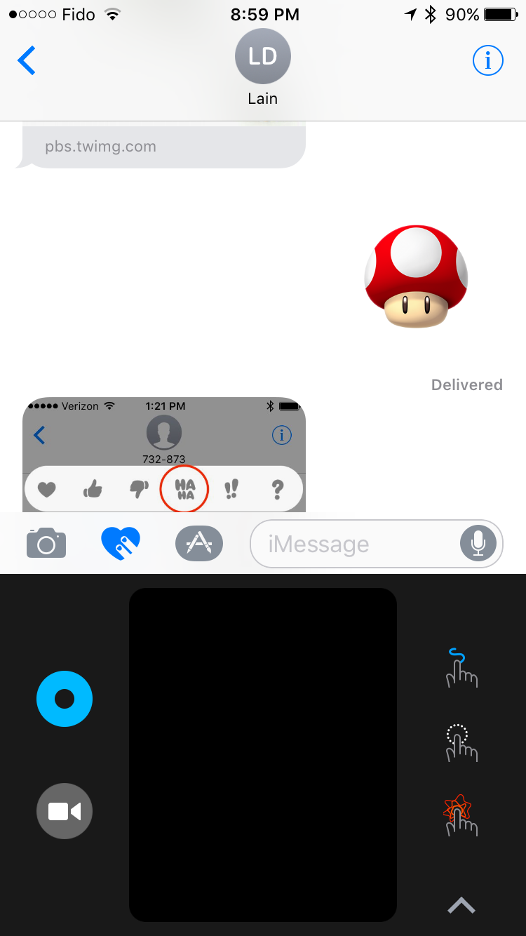
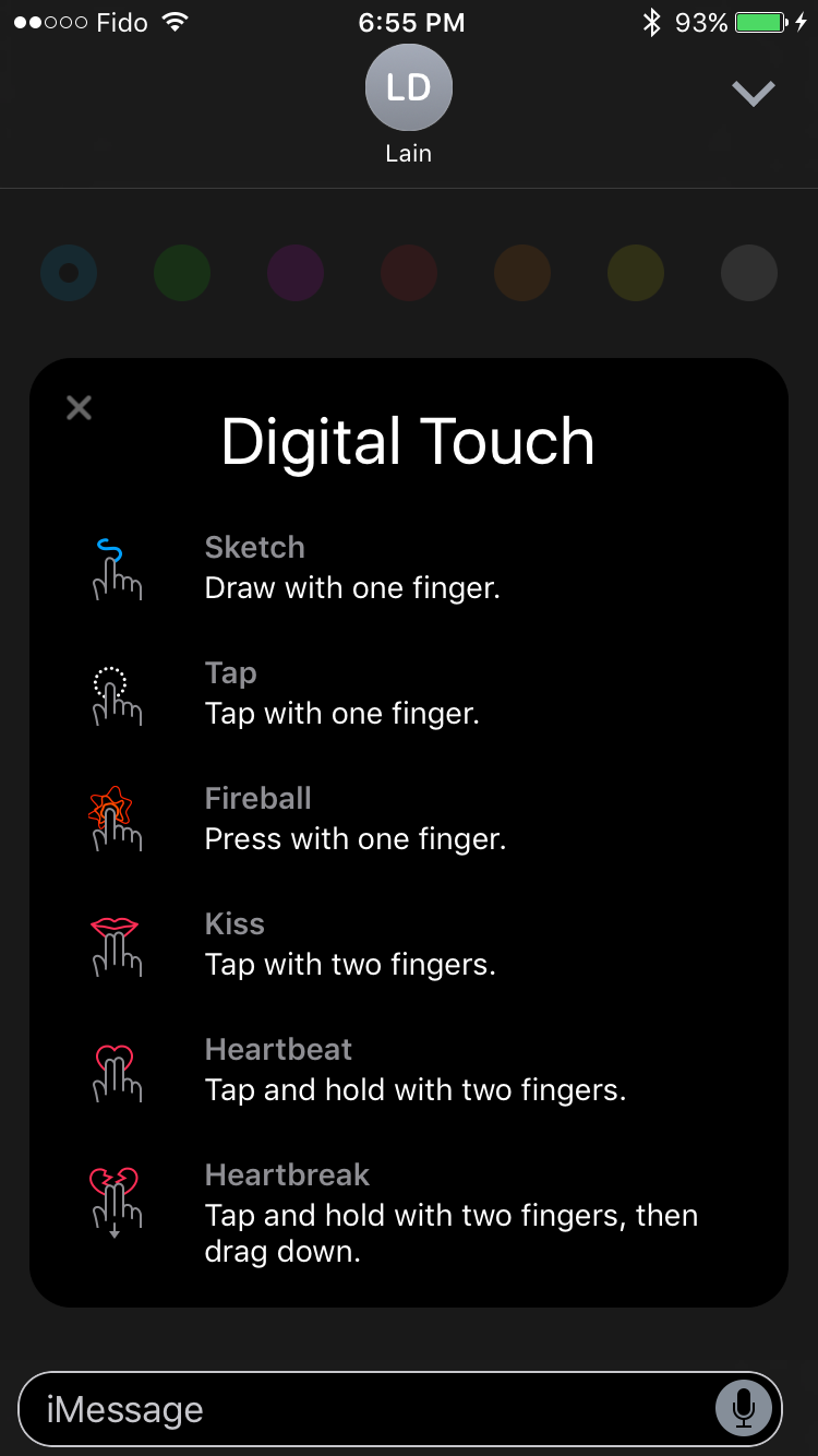
In the condensed UI there's a small drawing canvas where you can perform Digital Touch actions. On the left side you have a button that allows you to change the color of the pen used when drawing, and below that is a camera button which expands the UI and allows you to draw on top of a photo taken with the camera.
The expanded UI will first show a preview of all the actions you can perform. These all work in the condensed UI as well, but you may not know about all of them until you bring up the expanded version as the condensed view only shows three actions on the right side and switches between two sets every few sections to show all six. To be honest, the Digital Touch interface is kind of confusing, and I wouldn't be surprised if it receives some tweaks in future minor updates to iOS 10. I'm don't really much value in Digital Touch on the iPhone either, especially since actions like tapping don't translate well from the Apple Watch where it would actually trigger the Taptic Engine to simulate your wrist being tapped.
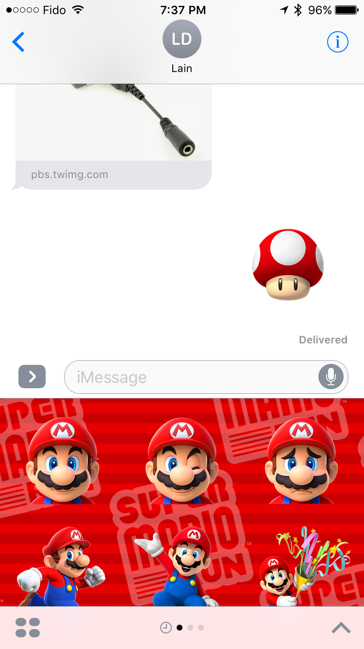
The second side of the iMessage improvements is the creation of a developer ecosystem centered around iMessage. This API will allow developers to create their own mini-applications that run inside of iMessage. This really covers three types of applications, the first of which being sticker packs, the second being interactive messages, and the third being other types of apps that work with media. You can see an example above of the new Super Mario Run sticker pack which is available in the iMessage app store. Interactive messages cover applications that send messages with content which can then be opened by the receiving user in the corresponding application. Apple's example was sending a message with the menu for a party being planned, which can then be modified and commented on by the receivers. Finally, the other category of app is for working with media, and an obvious example is implementing a GIF application for sourcing reaction images in the iMessage app itself.
I'm not really someone who makes heavy use of emoji or effects in message apps, and so I don't have a whole lot else to say about the changes Apple has made to iMessage in iOS 10. However, the popularity of these features in other messaging apps makes it clear that many users value these capabilities, and so it makes perfect sense for Apple to bring them to iMessage. Most interesting for me is the idea of the iMessage App Store, and whether or not it's going to be possible to monetize applications like sticker packs. Line has already shown that people will pay money for such things, but that relies on developers not rapidly creating a race to the bottom for prices, which is what has happened in the iOS App Store to an extent. Like many of the new technologies that Apple introduces in new versions of iOS, only time will tell how things play out.


113 Comments
View All Comments
damianrobertjones - Wednesday, September 14, 2016 - link
Cash. Money. The usual. Bills have to be paid. The days of complete, free, impartial journalism died years back. The Verge and Engadget being the worst of the many. I see a web page design in the future for Anandtech.robinthakur - Friday, September 23, 2016 - link
Because people click on the articles more, would be my guess? I scanned the whole site for the iPhone 7 review and clicked on another apple article on iOS10 when I couldn't find it. This is actually a good technical review by somebody who clearly knows the OS inside out, so I've got no problem with it.ABR - Wednesday, September 14, 2016 - link
The overall UI smoothness improvement is really noticeable on an iPad Air 2. It's a really shame this is the release they decided to cut support for iPad 2 and that era devices, because those are just the ones that became truly unusable starting with iOS 8. Thinking charitably, it could be that dropping the support is one of the things that helped improve the performance, or, more cynically, maybe it's just part of their plan to continue encouraging purchase of new devices.tipoo - Wednesday, September 14, 2016 - link
Yeah, even if they dropped all the new features, the performance improvements would have been huge for A5 devices. In fact I wouldn't mind if they stripped the OS as much as they could to get A5 smooth again, but of course they're not going to do such an undertaking for the old chip.tipoo - Wednesday, September 14, 2016 - link
The worst thing about it is no OS security updates for older OSs, so you're forced to either go insecure, or get a dog slow OS on your formerly decent hardware. There's also no easy downgrade mechanism.m16 - Wednesday, September 14, 2016 - link
I'm very impressed with the update, really snappy. I'm even more impressed that all my apps work, but I don't have any fancy apps outside of some photography apps that control the aperture.I wish they'd brought back notification center social media posting. I mean, OS X Capitan has it!!! It had it back on the iOS 7 days.
Anyone else thinking this should be back should go to apple's feedback page on either iOS or the iPhone/iPad and request the feature back.
yhselp - Wednesday, September 14, 2016 - link
I'm very glad Apple have seemingly fixed performance and UI issues for the 5s compared to iOS 9.After upgrading yesterday I was pleasantly surprised. At least for now. I hope I don't jinx it. The 5s is now noticeably smoother; navigating menus, multitasking, and general use overall is now more in line with how fast it used to be on iOS 8. In-app performance seems to have improved as well; I specifically tested an app that used to work great on iOS 8, then ran poorly on iOS 9, and now seems to work great again on iOS 10. Furthermore, the UI itself is now better optimized for a 4-inch display - not only is it better than iOS 9, but there are also improvement over how it used to be on iOS 8.
So far so good then. Haven't encountered any major hitches, and battery life seems to be holding up. Still, some things are sometimes actually slower than how I remember them from iOS 8, but the opposite is true as well - sometimes the 5s feels faster than ever. Overall, so far, I'd say the smoothness is on par with iOS 8.
One thing that still baffles me is the Music app. I still pretty much hate it, although it's an improvement over iOS 9 both in terms of usability and 4-inch friendliness. Maybe it's better suited to how most people seem to consume music nowadays - internet music, music services, etc. I can't believe that so few people listen to music in a more traditional way that it's worth ignoring them. Why is it so hard for Apple to at least offer more control over how the music library is sorted? I want to be able to browse by artist, tap on a band, and see all their songs I have on my device in one place with little bars above every group indicating which albums they're from; just as it used to be, and not how it is now. On top of that, the Music app is now less sexy than ever, there's no cover flow at all (at least, I can't seem to find it), and the UI can still get unnecessarily cluttered on a 4-inch display. For me, the best Music app would be a hybrid of how it used to look on iPhone 5 running iOS 6 with some of the improvements from iOS 7 and 8.
yhselp - Wednesday, September 14, 2016 - link
I can't help but think - thank God they made the SE, because without it iOS 10 might not have been as 4-inch friendly as it is.I'd be very much interested to hear any impressions on how iOS 10 works on iPhone 5/5c.
yhselp - Wednesday, September 14, 2016 - link
Update: One important thing that has seen a downgrade, in my opinion, is notification banners. When you're doing something, and someone sends you a message the banner that appears on the top of the screen is bigger, gets in the way, and it's harder to reply quickly without opening the Messages app - pulling down the banner is harder, and once done it takes up to whole screen.For me, that is a major downgrade as it makes banner more obtrusive on a 4" device, and make it hard to reply to messages quickly. I understand it might have been made in a bid to improve visibility on 4" devices, but I don't think it was the right call.
This might prove to be iOS 10's Achilles' heel on 4" devices. I would very much like to see it fixed.
mdriftmeyer - Wednesday, September 14, 2016 - link
You'd be wrong. Works great on my iPhone 5s. Notifications now are more easily flipped through and understood at quick glances.