The Samsung Galaxy Note7 (S820) Review
by Joshua Ho on August 16, 2016 9:00 AM ESTDisplay
Moving past the design the next point of interest is going to be the display which is one of the major elements of any smartphone, and pretty much the first thing you’re going to notice when you power on the phone. It’s easy to look at a display and provide some fluff about how the colors pop and how the high contrast leads to dark, inky blacks, but to rely solely on subjective observation really fails to capture the full extent of what a display is really like. If you put two displays side by side, you can tell that one is more visible outdoors, but there’s no way of distinguishing whether this is the case because of differences in display reflectance or display luminance. Other factors like gamut and gamma can also affect perceived visibility which is the basis for technologies like Apical’s Assertive Display system.
In order to try and separate out these various effects and reduce the need for relative testing we can use testing equipment that allows for absolute values which allow us to draw various conclusions about the ability of a display to perform to a certain specification. While in some cases more is generally speaking better, there are some cases where this isn’t necessarily true. An example of this is gamut and gamma. Although from an engineering perspective the ability to display extremely wide color gamuts is a good thing, we’re faced with the issue of standards compliance. For the most part we aren’t creating content that is solely for our own consumption, so a display needs to accurately reproduce content as the content creator intended. On the content creation side, it’s hard to know how to edit a photo to be shared if you don’t know how it will actually look on other people’s hardware. This can lead to monetary costs as well if you print photos from your phone that look nothing like the on-device preview.
To test all relevant aspects of a mobile display, our current workflow uses X-Rite’s i1Display Pro for cases where contrast and luminance accuracy is important, and the i1Pro2 spectrophotometer for cases where color accuracy is the main metric of interest. In order to put this hardware to use we use SpectraCal/Portrait Display’s CalMAN 5 Ultimate for its highly customizable UI and powerful workflow.

Before we get into the results though I want to discuss a few choice aspects of the Galaxy Note7’s display. At a high level this is a 5.7 inch 1440p Super AMOLED display that is made by Samsung with a PenTile subpixel matrix that uses two subpixels per logical pixel in a diamond arrangement. The display driver supports panel self-refresh as a MIPI DSI command panel rather than a video panel. In the Snapdragon 820 variant of this device it looks like there isn’t a dynamic FPS system and a two lane system is used so the display is rendered in halves. The panel identifies itself as S6E3HA5_AMB567MK01 which I’ve never actually seen anywhere else, but if we take the leap of guessing that the first half is the DDIC this uses a slightly newer revision of DDIC than the S6E3HA3 used in the Galaxy S7. I’m guessing this allows for the HDR mode that Samsung is advertising, but the panel is likely to be fairly comparable to the Galaxy Note5 given that the Galaxy S7 panel is fairly comparable to what we saw in the Galaxy S6.
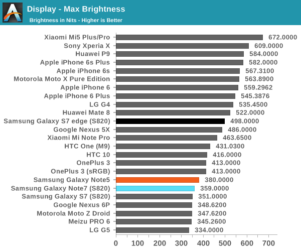
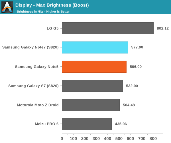
Looking at the brightness of the display, it’s pretty evident that the Galaxy Note7 is a bright panel, especially when compared to things like the HTC 10 and LG G5. The G5 does reach “800 nits” with its auto brightness boost, but the true steady state is nowhere near that point while the Galaxy Note7’s display can actually stay at its boost brightness for a reasonable amount of time and I’ve never really noticed a case where the boost brightness couldn’t be sustained if the environment dictated it.
Before we get into the calibration of the display it’s probably also worth discussing the viewing angles. As you might have guessed, the nature of PenTile and AMOLED have noticeable effects on viewing angles, but in different ways. As AMOLED places light emitters closer to the surface of the glass and doesn’t have a liquid crystal array to affect light emission, contrast and luminance are maintained significantly better than a traditional LCD. However, due to the use of PenTile it is still very obvious that there is a lot of color shifting as viewing angles vary. There are still some interference effects when you vary viewing angles as well. In this regard, LCDs seen in phones like the iPhone 6s are still better here. You could argue that one is more important than the other so I’d call this a wash, but AMOLED could stand to improve here.

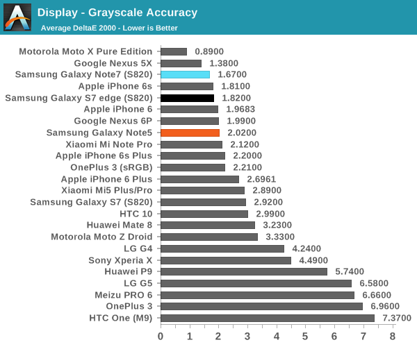
Moving on to grayscale and other parts of the display calibration testing it’s worth mentioning that all of these tests are done in Basic mode which is something I would suggest using in these AMOLED devices in order to improve both calibration accuracy and battery life as brightness is generally controlled by PWM while hue is controlled by voltage, so constraining the gamut actually reduces power draw of the display. Putting this comment aside, the grayscale calibration is really absurdly good here. Samsung could afford to slightly increase the target gamma from 2.1 to 2.2 but the difference is basically indistinguishable even if you had a perfectly calibrated monitor to compare to the Note7 we were sampled. Color temperature here is also neutral with none of the green push that often plagues Samsung AMOLEDs. There’s basically no room to discuss for improvement here because the calibration is going to be almost impossible to distinguish from perfect.
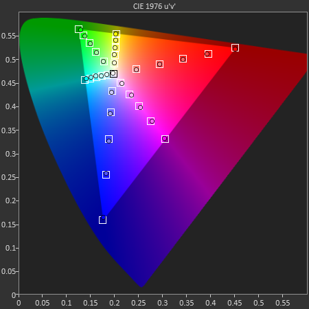
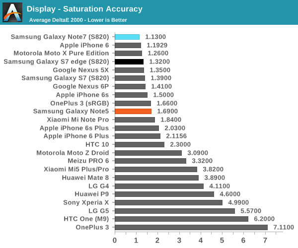
In the saturations test again Samsung has basically nailed the sRGB gamut here to the extent that it’s going to be basically impossible to distinguish it from a reference monitor. I really have nothing else to say here because Samsung has no room to improve here. Of course, saturation sweeps are just one part of the whole story, so we can look at the GMB ColorChecker to see how well the Note7’s display can reproduce common hues.
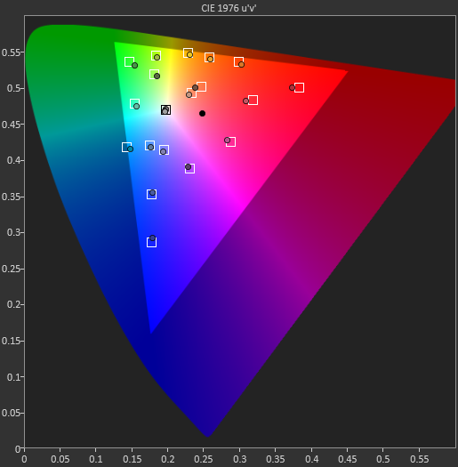
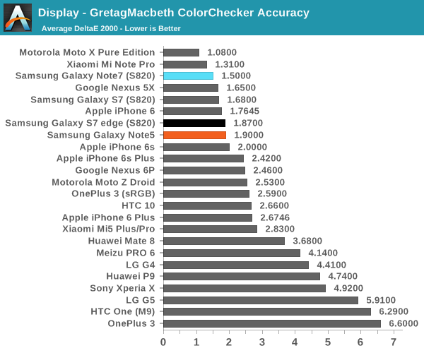
In the Gretag MacBeth ColorChecker test a number of common tones including skin, sky, and foliage are represented as well as other common colors. Again, Samsung is basically perfect here. They might need to push up the saturation of reds slightly higher but it’s basically impossible to tell this apart from a reference monitor. If you want to use your phone for photo editing, online shopping, watching videos, sharing photos, or pretty much anything where images are reproduced on more than one device, the Galaxy Note7 is going to be a great display. It may not be much of a step up from the Galaxy Note5, but at this point the only avenues that Samsung really needs to improve on is the maximum brightness at realistic APLs above 50% and power efficiency. It would also be good to see wider color gamuts in general, but I suspect the value of such things is going to continue to be limited until Google and Microsoft actually make a serious effort at building color management into the OS. It might also make sense to try and improve color stability with changes in viewing angle, but I suspect that AMOLED faces greater constraints here relative to LCD due to the need to improve the aging characteristics of the display. Regardless, it’s truly amazing just how well Samsung can execute when they make something a priority.


202 Comments
View All Comments
erikiksaz - Friday, August 19, 2016 - link
How did you guys manage to monitor for frame drops? Is it a separate app?Belard - Sunday, August 21, 2016 - link
Still rather blah- design. I'm surprised they continue the glass backing from the S6, like as if they have not learned anything from Apple? A family member has the S6 and yes, her back has a spider crack on it with a long one from top to bottom.amdwilliam1985 - Tuesday, August 23, 2016 - link
they need the glass back for the wireless charging.Glass and plastic works with Qi-charging, metal does not(at least for now).
thek - Sunday, August 21, 2016 - link
so no one is going to bring up the facts that this 850$ phone has a smaller battery then the Xiaomi redmi note 3 (a 150$ phone) and it's bootloader is locked in the US which literally makes it just the same as an Iphone. (All of us here came to Android because it was an open garden). Closing android is making Samsung not a legit Apple vendor IMO, and should too for the rest of you.Don't be kids and be fooled by gimmicks and high specs. You can't even get CM13 on this phone.
And a really bad job by the reviewer for not bringing this up. As usual in Anandtech they only cares about numbers and not whats behind them.
thek - Sunday, August 21, 2016 - link
not a legit Android* vendorCSMR - Sunday, August 21, 2016 - link
Great review and phone.I wonder if it would be possible to check the compass in future?
All the phones I have owned have had terrible magnetometers which stop working, require shaking the phone, or are off by a large angle.
Having compass inaccuracies pointed out in reviews would really shake things up.
Pipperox - Sunday, August 21, 2016 - link
So you're slamming an excellent phone (like the S7 as well) because of your non-sensical review of its camera?The most reputable camera review website - Dxomark - puts the S7 at the top for still image quality, on par with the HTC10, and the Samsung is even better in the video score.
What problems do you see with video stabilization?
Dxo Labs talks about "excellent video stabilization", i have an S7 edge and can only confirm what they say.
Diet - Monday, August 22, 2016 - link
This the only review on the internet that addreses the weak points of this overpriced phone.Kudos To Anandtech!
KoolAidMan1 - Monday, August 22, 2016 - link
More performance tests: https://youtu.be/3-61FFoJFy0tldw - The flagship GN7 is slower than a year-old iPhone 6S.
jlabelle2 - Tuesday, August 23, 2016 - link
- The flagship GN7 is slower than a year-old iPhone 6Syes and a Porsche 911 from last year is faster than an Audi RS6. The question is what do you need in your day to day life. Is the speed of the RS6 enough? Do you need space? 5 seats? Comfort? Good equipments?
People have short memory. The iPhone was a success because it was the 1st phone with a big touchscreen, easy to use, with a great experience. Now, people consider that a phone should be choosen only based on the speed difference of launching 30 different applications within 2mn. Even if new phone are twice as quick as the previous one that was twice as quick as the previous previous one that was twice... Well, you see the point. Phones are fast enough.
I do not know anybody that is using an iPhone 6 or Samsung S6 and that is saying: "my phone is too slow and the only thing I would wish is to that a phone twice as quick".
I am certain that if Apple would sell at the same price:
1/ iPhone 7 = CPU of the 6S, AMOLED screen, quick and wireless charging, waterproof, 5,7" screen but 5mm narrower than current 6S+, camera hardware button, pen support.
2/ iPhone 6SS = iPhone 6S with a CPU 50% quicker
you can be absolutely assure that NOBODY would choose an iPhone 6SS versus this hypothetical iPhone 7.
We can be all fair of what Apple is achieving with its iPhone, which is great. But some minimal common sense would be good in this forum.