The 9.7" iPad Pro Review
by Brandon Chester on June 1, 2016 9:00 AM ESTA Few Thoughts On True Tone
Back when I received the 9.7" iPad Pro I published some of my thoughts regarding the True Tone display technology. And while I won't really be going over the topic in great detail again, I do have some additional thoughts on the technology after having using the new iPad Pro for quite some time.
Something I wanted to clarify from my original article is the purpose of my greyscale measurements. Some readers interpreted it as evidence that True Tone didn't work as intended. In actuality True Tone works exactly as intended by providing good relative accuracy. As you move to different environments the color temperature of the display shifts to match how your eye adjusts its perception of white depending on the temperature and brightness of the light around you. This obviously leads to inaccuracy relative to the sRGB standard, but that's missing the point of True Tone entirely. My tests were simply meant to demonstrate how much shifting occurs in different environments, along with a clarification on some misunderstandings I had heard regarding the relationship between True Tone and the DCI-P3 gamut, which are really unrelated technologies.
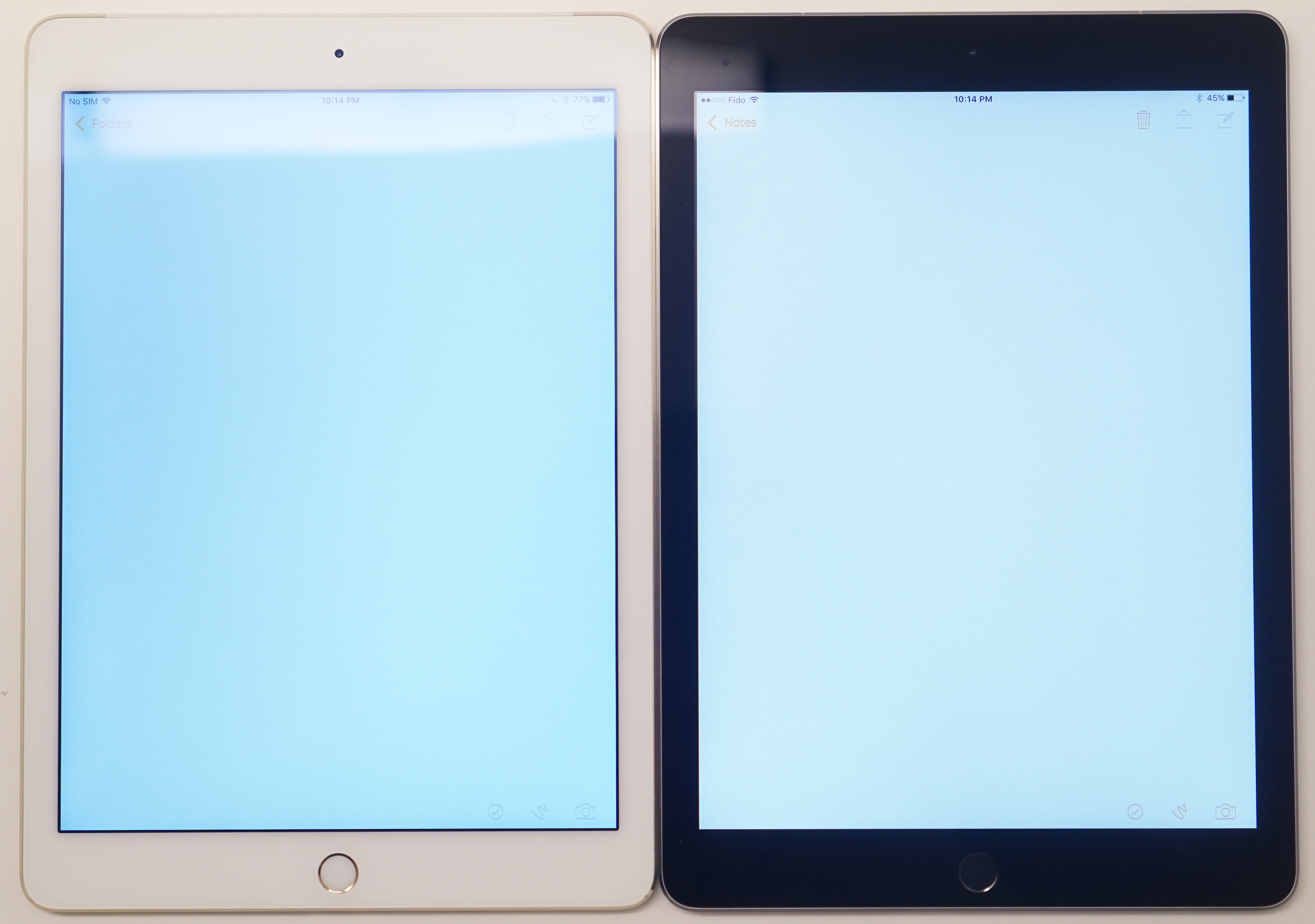
True Tone works very well, and in a way Apple has proven me wrong here because I was initially skeptical. I've seen this attempted before, particularly by Samsung, and the implementations have not been good at all. When I first got the 9.7" Pro I felt like the True Tone mode shifted too far toward the red. However, after using it for some time I began to realize that this was the product of me using other devices that all shift toward blue, which ruined my perception of the display. When using the iPad Pro on its own for reading or doing work, pulling out another device with a blue shifted display is absolutely jarring, as the iPad has adjusted to match how my eyes perceive things in different lighting, while all my other displays are forever blue. In a way, the biggest problem with True Tone is that it's not in everything, and I think this is something Apple should be bringing to all of their portable devices.
Apple's Simulated True Tone Image
It's difficult to photograph True Tone, as depending on where your camera's white balance lands the iPad Pro will look too red, or the other display will look too blue. I really recommend checking out True Tone for yourself, although if you decide to do it in an Apple Store you probably won't see the benefits because Apple's other products are designed to look neutral under the same sort of fluorescent lighting as those stores. If you have a chance to try the 9.7" iPad Pro outdoors or somewhere with warmer lighting I think you'll see why this tech is one of the small things that nobody really asks for, but everyone appreciates once they have it.


144 Comments
View All Comments
tipoo - Wednesday, June 1, 2016 - link
The memory scores from Ars's review seemed to more than split the difference from halfhttp://cdn.arstechnica.net/wp-content/uploads/2016...
tipoo - Wednesday, June 1, 2016 - link
Or this review itself, definitely not halfhttp://www.anandtech.com/show/10286/the-97-ipad-pr...
Gich - Wednesday, June 1, 2016 - link
Where is the Surface?Gich - Wednesday, June 1, 2016 - link
*ProUtilityMax - Friday, June 3, 2016 - link
Because Surface is hardly a tablet. It's a laptop or a netbook, with a removable keyboard.CoreyWat - Wednesday, June 1, 2016 - link
Man if I didn't need that Apple Pencil support...I would have totally gone for the Pixel C, very very close race.KPOM - Wednesday, June 1, 2016 - link
Unless you care about display quality. The iPad Pro blows the Pixel C out of the water.grayson_carr - Thursday, June 2, 2016 - link
Except in contrast and black level. Pixel C obliterates the iPad Pro there. And the max brightness is near equal. The iPad Pro has better sRGB calibration, but it's not like the Pixel C is poorly calibrated. It's still good.Vigilant007 - Sunday, August 7, 2016 - link
The Pixel C just looks fantastic. I LOVE their method for attaching the keyboard. That thing looks like Google at it's bestarsjum - Thursday, June 2, 2016 - link
I highly doubt you have actually seen the screen of Pixel C. iPad Pro has advantages for professional photography, but for everything else the Pixel C either matches or beats it in quality. It has an excellent screen.