A Look At QD Vision's Color IQ And The Philips 276E6 Monitor: Quantum Dots for Wider Color Gamuts
by Brandon Chester on April 28, 2016 8:00 AM EST- Posted in
- Monitors
- Philips
- Quantum Dot
- QD Vision
Contrast, Brightness, and Gamut
Of course, while QD Vision's Color IQ technology looks good on paper, what's equally important is how well the technology translates to the real world. QD Vision's goal to bring down the cost of backlighting suitable for wide gamut displays is unabashedly aggressive, and like other efforts to reduce manufacturing costs, cost reductions need to be carefully balanced to exploit the advantages of new technology without unnecessarily sacrificing quality. To that end QD Vision's first outing in the PC display market is an especially interesting one, as we can see and evaluate first-hand the true gamut capabilities of Color IQ as implemented in Phillips' 276E6 monitor.
Starting things off with a look at some more basic monitor metrics, Philips rates the 276E6 as having a peak brightness of 300 nits and a contrast ratio of 1000:1. This is in line with what you'll typically find on displays of this price, and in general you probably won't be using a monitor at anything close to 300 nits in a typical workspace. As always, measurements for white and black level are done with an i1DisplayPro due to its greater accuracy with levels below 0.2 nits than the i1Pro 2.
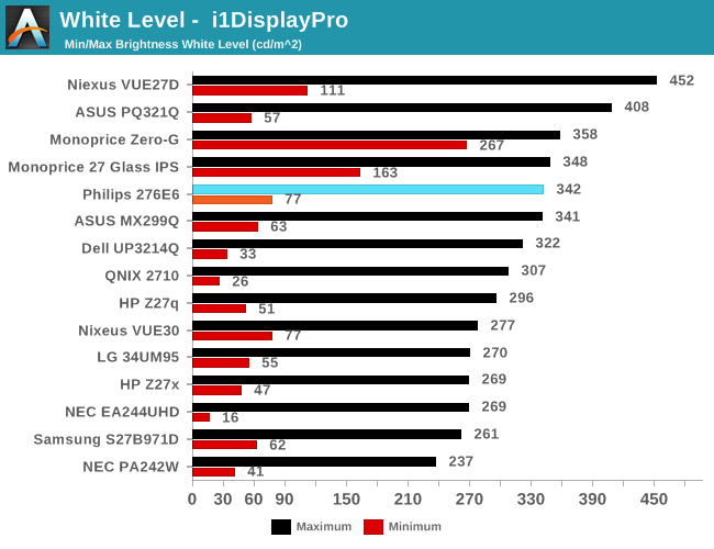
Peak luminance on the Philips 276E6 is relatively high. While we have seen some monitors reach beyond 400 nits, in practice this isn't really important because the ambient environment lighting for a monitor is usually constant, and rarely requires a brightness above 100-200 nits to overcome reflections. As for the minimum brightness, in its standard Adobe RGB mode the display dropped to 77 nits. This is actually fairly bright, and if were any brighter it would be difficult to perform our 80 nit calibration later in the review.
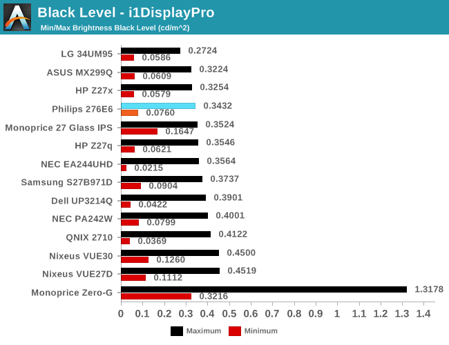
Black levels on the Philips 276E6 are quite good as well. At maximum brightness it's one of the better panels on record, which will pair well with its high brightness. At minimum brightness the gap between it and the next best display is quite a bit larger, but it's important to remember that the Philips 276E6 has a minimum brightness that is also higher than most displays, and so the contrast ratio should end up being quite good in both cases.
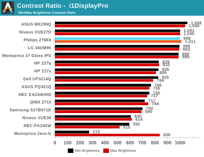
As far as contrast ratio goes, the Philips 276E6 does as well as you'd expect based on its white and black levels. Obviously there are now displays on the market that utilize photoalignment technology to achieve contrast ratios around 1800:1, but 1000:1 is quite a good result for a $300 display, and it's right in line with what Philips advertises so you're definitely getting what you paid for.
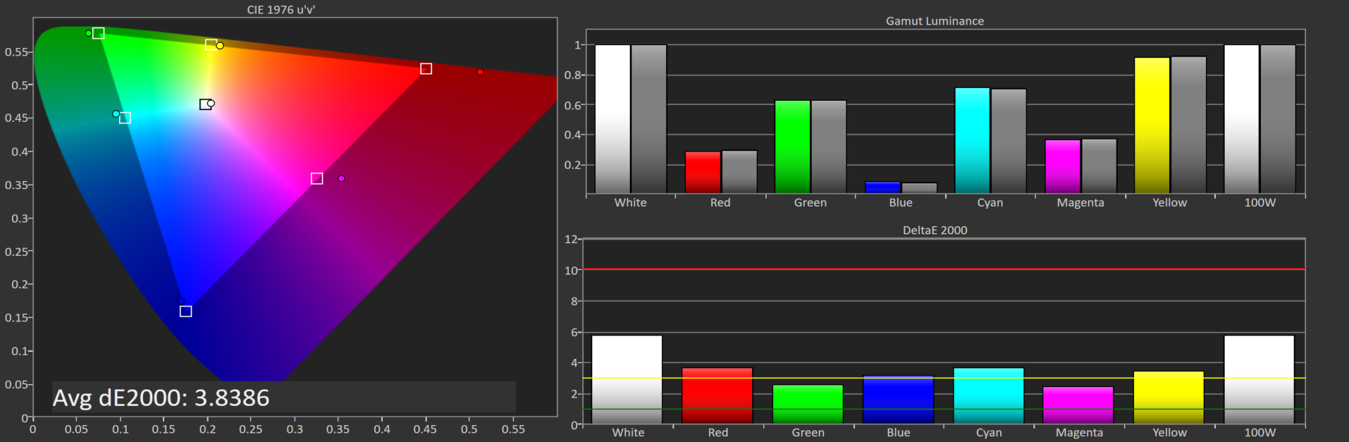
Philips 276E6 gamut DeltaE with default settings
Philips 276E6 gamut DeltaE with OSD tweaks
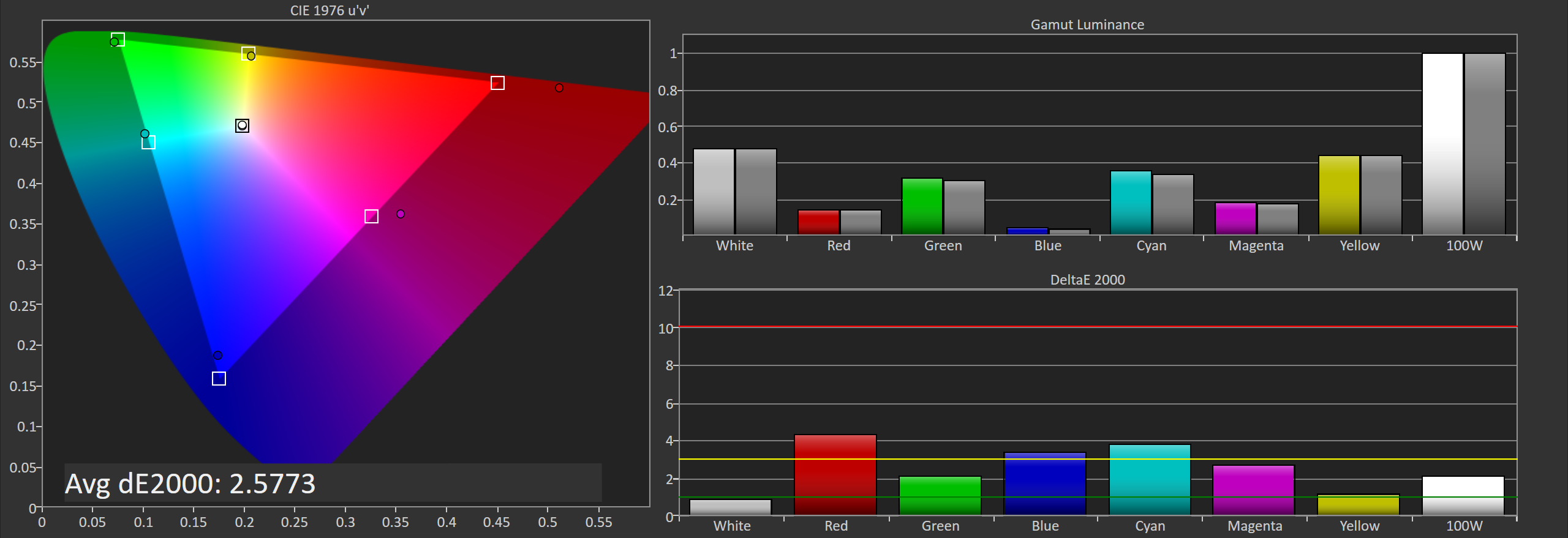
Gamut accuracy on the Philips 276E6 can vary pretty wildly. On both of the units I tested there were two common errors. The first is color, with the blue primary being undersaturated while the red primary is significantly oversaturated. The second problem is the white point. If your luminance is wrong your colors will also be wrong, and on both monitors it took a lot of fiddling with the OSD to get an accurate white point, and you can see the result of that in the photos above. Out of the box the white error on our second unit causes the DeltaE to approach four.
Generally, you'll be able to eyeball it and figure out which of the white presets is the most neutral, but even if you do you're also dealing with significant errors in blue, red, and the secondary colors that rely on them. Considering that the Color IQ tech is supposed to be highly tunable I really don't know how such large errors could exist in the shipping product, and it's not clear whether this is a technology limitation or a decision on Philips' part. In any case it doesn't look good to have large errors on the most basic of our tests.


51 Comments
View All Comments
willis936 - Friday, April 29, 2016 - link
I'm skeptical of your first claim without seeing data.As for the second that's why packages lime dispcalgui exist.
Brandon Chester - Friday, April 29, 2016 - link
Again, that doesn't help the fact that software needs to support it. I think you're confusing greyscale calibration and color management here. If there was some easy way to fix color management across all Windows programs this would not be such a long standing issue.UrQuan3 - Thursday, May 12, 2016 - link
"Cheap colorimeters are so inaccurate that they're basically useless."I'm going to have to go with willis936 on your first comment. It sounds rather like someone driving a Ferrari saying that a Mustang has so little horsepower it is useless. To the average car owner, they're both godlike. In practice, a little $100-200 colorimeter makes a large improvement on almost any monitor. Expensive calibration for expensive monitors. Of course, use the best gear when doing a review.
I wonder how you would review calibration tools? That does not sound easy.
Pork@III - Thursday, April 28, 2016 - link
Too bad against full cover CCFLAzurael - Friday, April 29, 2016 - link
It's possible to get a 27" 2K display for $300 equivalent in Europe... I've got a Hannspree HQ271HPG which even with VAT is £200. I wouldn't say it's the best thing in the world (stuck with HDMI 1.4 & DL-DVI and hiding >1cm behind a piece of glass) but it is IPS, it calibrated up nicely (to sRGB) and the backlight consistency is much better than most cheap monitors on my sample (although it does have a bit of bleed visible at the very edges on a totally black screen.)Gunbuster - Friday, April 29, 2016 - link
I know it's a cheap monitor but dear lord, did they have to make the bezel so chunky that it looks like a 22" in photos?Haravikk - Friday, April 29, 2016 - link
Why does this include a VGA port?I'd also much prefer down-facing ports, and some kind of cable management, monitors that don't include these always confuse me.
zodiacfml - Saturday, April 30, 2016 - link
Thanks for always including a tutorial and in-depth look of color management. I quite understand the challenges of the industry.You are correct that Philips should be applauded for taking the first step as this will take time to improve as OLED/AMOLED of Samsung has improved throughout the years. For now, the Philips seems useful for increasing saturation/vividness of content for entertainment.
Questions:
1) Isn't better for Philips to target a higher color space despite coming short for now (as conversion from a bigger space to smaller seems straightforward)? The Adobe RGB doesn't improve from the sRGB space in the "reds" where the most benefit from quantum dots can be had. I believe this primary color should be given attention as content to show this is widely available in photos such as flowers, sunsets, and red sports cars. I have seen too many red subjects looking flat like plastic.
2) How does color spaces Rec. 2020 and Pro Photo RGB relate to each other? They seem to have the same coverage but obviously for different applications.
zodiacfml - Saturday, April 30, 2016 - link
I did some reading and found the problem already which is color bit depth. What are the currently supported bit depths supported by video cards and monitors?Oxford Guy - Monday, May 2, 2016 - link
AdobeRGB is obsolete.