A Look At QD Vision's Color IQ And The Philips 276E6 Monitor: Quantum Dots for Wider Color Gamuts
by Brandon Chester on April 28, 2016 8:00 AM EST- Posted in
- Monitors
- Philips
- Quantum Dot
- QD Vision
Contrast, Brightness, and Gamut
Of course, while QD Vision's Color IQ technology looks good on paper, what's equally important is how well the technology translates to the real world. QD Vision's goal to bring down the cost of backlighting suitable for wide gamut displays is unabashedly aggressive, and like other efforts to reduce manufacturing costs, cost reductions need to be carefully balanced to exploit the advantages of new technology without unnecessarily sacrificing quality. To that end QD Vision's first outing in the PC display market is an especially interesting one, as we can see and evaluate first-hand the true gamut capabilities of Color IQ as implemented in Phillips' 276E6 monitor.
Starting things off with a look at some more basic monitor metrics, Philips rates the 276E6 as having a peak brightness of 300 nits and a contrast ratio of 1000:1. This is in line with what you'll typically find on displays of this price, and in general you probably won't be using a monitor at anything close to 300 nits in a typical workspace. As always, measurements for white and black level are done with an i1DisplayPro due to its greater accuracy with levels below 0.2 nits than the i1Pro 2.
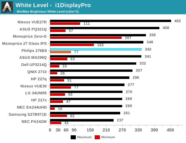
Peak luminance on the Philips 276E6 is relatively high. While we have seen some monitors reach beyond 400 nits, in practice this isn't really important because the ambient environment lighting for a monitor is usually constant, and rarely requires a brightness above 100-200 nits to overcome reflections. As for the minimum brightness, in its standard Adobe RGB mode the display dropped to 77 nits. This is actually fairly bright, and if were any brighter it would be difficult to perform our 80 nit calibration later in the review.
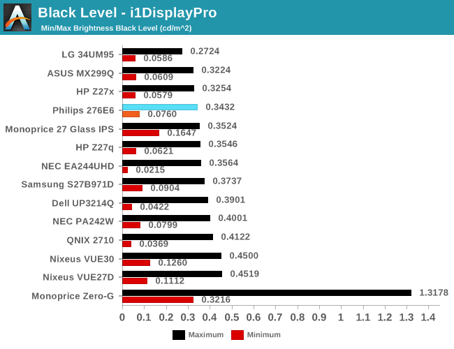
Black levels on the Philips 276E6 are quite good as well. At maximum brightness it's one of the better panels on record, which will pair well with its high brightness. At minimum brightness the gap between it and the next best display is quite a bit larger, but it's important to remember that the Philips 276E6 has a minimum brightness that is also higher than most displays, and so the contrast ratio should end up being quite good in both cases.
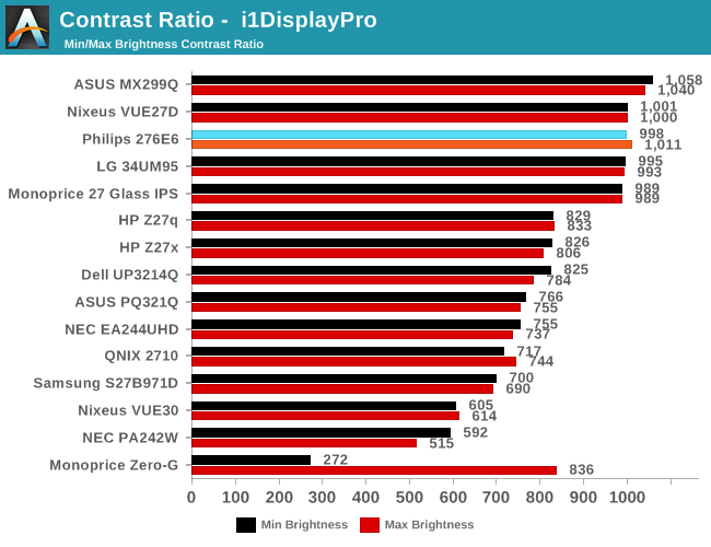
As far as contrast ratio goes, the Philips 276E6 does as well as you'd expect based on its white and black levels. Obviously there are now displays on the market that utilize photoalignment technology to achieve contrast ratios around 1800:1, but 1000:1 is quite a good result for a $300 display, and it's right in line with what Philips advertises so you're definitely getting what you paid for.
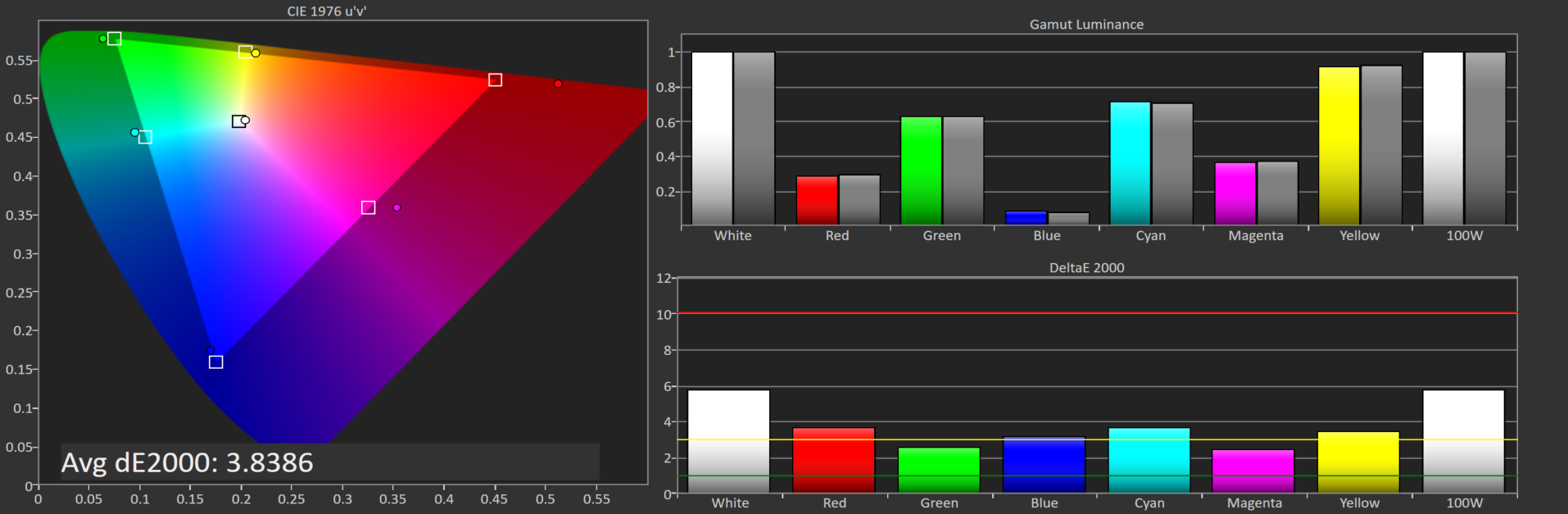
Philips 276E6 gamut DeltaE with default settings
Philips 276E6 gamut DeltaE with OSD tweaks
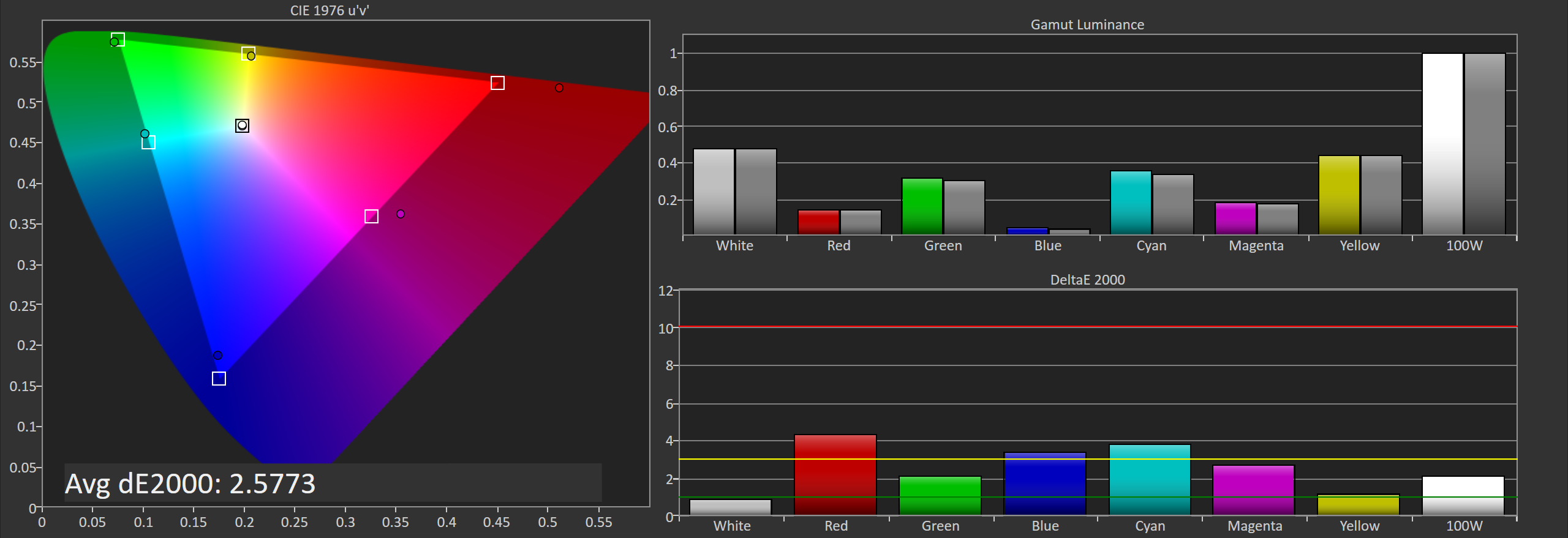
Gamut accuracy on the Philips 276E6 can vary pretty wildly. On both of the units I tested there were two common errors. The first is color, with the blue primary being undersaturated while the red primary is significantly oversaturated. The second problem is the white point. If your luminance is wrong your colors will also be wrong, and on both monitors it took a lot of fiddling with the OSD to get an accurate white point, and you can see the result of that in the photos above. Out of the box the white error on our second unit causes the DeltaE to approach four.
Generally, you'll be able to eyeball it and figure out which of the white presets is the most neutral, but even if you do you're also dealing with significant errors in blue, red, and the secondary colors that rely on them. Considering that the Color IQ tech is supposed to be highly tunable I really don't know how such large errors could exist in the shipping product, and it's not clear whether this is a technology limitation or a decision on Philips' part. In any case it doesn't look good to have large errors on the most basic of our tests.


51 Comments
View All Comments
Guspaz - Friday, April 29, 2016 - link
The U2711 was a high-end monitor, and so one of the advertised features was that Dell individually calibrated every monitor at the factory. They included with each monitor a custom calibration report that had the deltaE and such things, with graphs and whatnot. Dell provided a generic ICC profile file for the monitor, so I would imagine that the monitor itself was calibrated so that the ICC profile would match the physical monitor.If I pick option 2 (monitor set to sRGB, Windows set to ICC profile), then how does Windows know that the monitor is expecting the input to be in the sRGB colour space?
Brandon Chester - Friday, April 29, 2016 - link
To the best of my knowledge Dell's factory calibration is at the internal LUT level so you can plug it into any device and have it be accurate (the best type of calibration). The ICC is probably just something generic and I doubt it contains a VCGT for the GPU.I would choose "option 4", which is to say, just leave the OS color management alone because Dell has been playing this game long enough to know that the Windows CMM doesn't work, has made your monitor usable in sRGB without having to mess with it, and given you the option to turn on Adobe RGB when you open Lightroom or some other program.
jlabelle2 - Wednesday, May 4, 2016 - link
- If I pick option 2 (monitor set to sRGB, Windows set to ICC profile), then how does Windows know that the monitor is expecting the input to be in the sRGB colour space? -Option 2 is Option 4 with a display ICC calibration. If you are using a color managed application, it reads embedded profile and therefore will display correctly. On most of the case where it is not color managed (wall paper, Edge, modern Windows app...), the assumption is that you would use sRGB content anyway (web, pictures you received..).
The ICC display profile ensure that you are correcting the latest inaccuracy from the Dell screen compared to sRGB color space (as, even out of the box, calibrated by Dell, it is not perfect).
If you have no calibration probe, your best bet is option 4.
jlabelle - Friday, April 29, 2016 - link
- On my Mac I just set the ICC profile and everything works immediately and perfectly. -For record, it does because ...it does not really take advantage of the wide gamut in your case !
Spunjji - Thursday, April 28, 2016 - link
"for photographers and other professionals... the relatively low resolution poses less of a problem"Higher pixel density is actually huge asset - you can get a better idea of critical image sharpness without zooming in, and getting above 1080p is a massive help for getting more working area between all the toolbars.
So really, having wide gamut /and/ high pixel density would be great. Hopefully they get on that! :)
Brandon Chester - Thursday, April 28, 2016 - link
I definitely agree. Anyone who has done photo editing on a 4K or 5K display can attest to the improvement. I just meant that relative to someone who writes word documents all day, the lower resolution is probably less of an issue.Spunjji - Thursday, April 28, 2016 - link
If I could edit, I'd add thanks for the article - it was a fascinating read and I was certainly not aware that Apple had such a commanding lead in colour calibration support. Food for thought.jlabelle - Friday, April 29, 2016 - link
- I was certainly not aware that Apple had such a commanding lead in colour calibration support. Food for thought.-Let's be honest, having a less confusing way of setting once your display ICC profile (which anyway is done automatically by the software coming with your calibration probe) is NOT having a commanding lead in color calibration support. That is a silly statement.
willis936 - Thursday, April 28, 2016 - link
I'm seeing a lot of gripes about windows color management. Doesn't argyllcms take care of that? Anyone shelling out for wide gamut should also spend the $50 for a cheap colorimeter.Brandon Chester - Thursday, April 28, 2016 - link
1. Cheap colorimeters are so inaccurate that they're basically useless.2. Argyll doesn't solve any of the problems. You need your OS, its frameworks, and its applications to all understand color management and work with the CMM. ArgyllCMS is basically a tool for profiling and creating ICC profiles, it can't make software understand and utilize them.