The Samsung Galaxy S7 & S7 Edge Review, Part 1
by Joshua Ho on March 8, 2016 9:00 AM ESTDisplay
As always, the display of any mobile device is a critical part of the overall user experience. A poor display in any way is often going to sour the entire experience.
On a personal note, there are a number of mobile devices that I’ve used over the course of the previous year that frankly just weren’t good enough for me to use as a daily driver because the display just wasn’t good enough. My laptop is quite closely calibrated to sRGB and it’s used to edit all of my device photos, so I’ve really come to appreciate a device that has sufficiently accurate color that I can actually use a phone or tablet as a reference monitor of sorts to verify that images look the way I want them to.
In order to test this critical portion of the user experience, we turn to our standard test suite which uses SpectraCal’s CalMAN 5, a custom workflow for testing basic metrics like brightness, contrast, and calibration accuracy, and X-Rite’s i1Pro2 and i1DisplayPro.
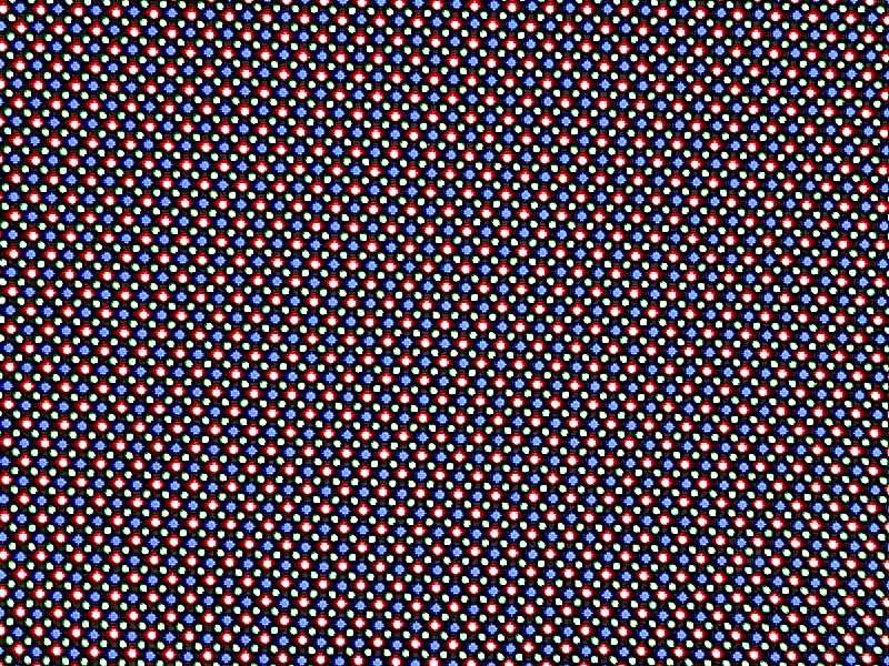
Starting off with a microscope's view of the Galaxy S7's display, it looks like Samsung has elected to keep most aspects of the display constant when comparing the Galaxy S6 and S7. At a high level, the display is the same 5.1” display size that we’ve seen for a few generations now, and the 1440p resolution is shared with previous devices. Samsung continues to use their diamond PenTile layout, but it’s hard for me to say whether there’s been an adjustment to the size of the emitters as the microscope I have on hand isn’t quite sufficient for making such measurements. It’s likely that under the hood there are changes to the display driver IC in order to enable features like Always-On Display, but as we’ll soon see it’s rather unlikely that there are any generational changes in things like the emitter material or TFT backplane.
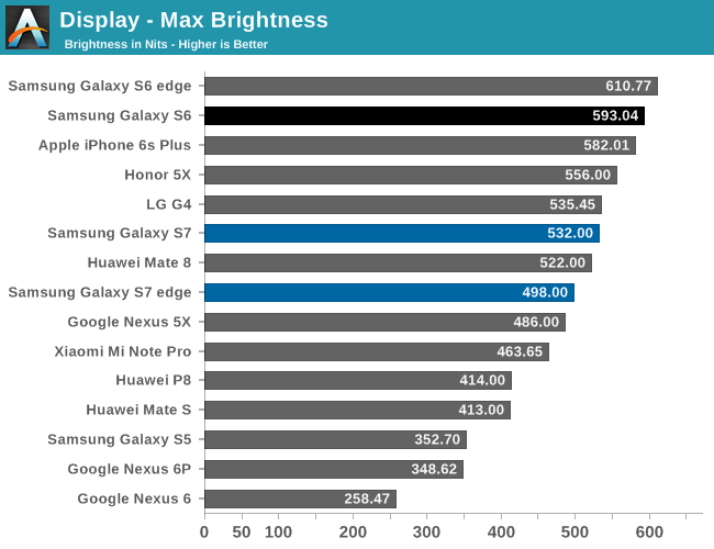
One of our first tests here is a pretty standard test of maximum luminance. Here, we see that the Galaxy S7 and S7 edge both are in the same general ballpark as the Galaxy Note5, which suggests that both devices are likely to be in the same generation of AMOLED panel. This brightness was achieved by using the auto-brightness mode, so it’s important to note that the max luminance in manual mode will be much lower. Of course, this brightness figure was determined with a full white display so reducing the APL will result in a higher maximum luminance as the power budget can we spent on fewer pixels which means that a higher duty cycle can be achieved in each pixel.
Galaxy S7
Galaxy S7 edge
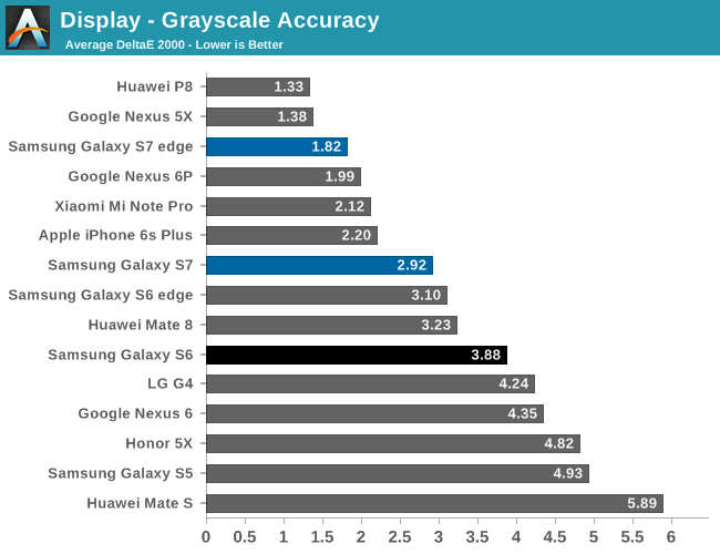
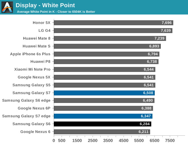
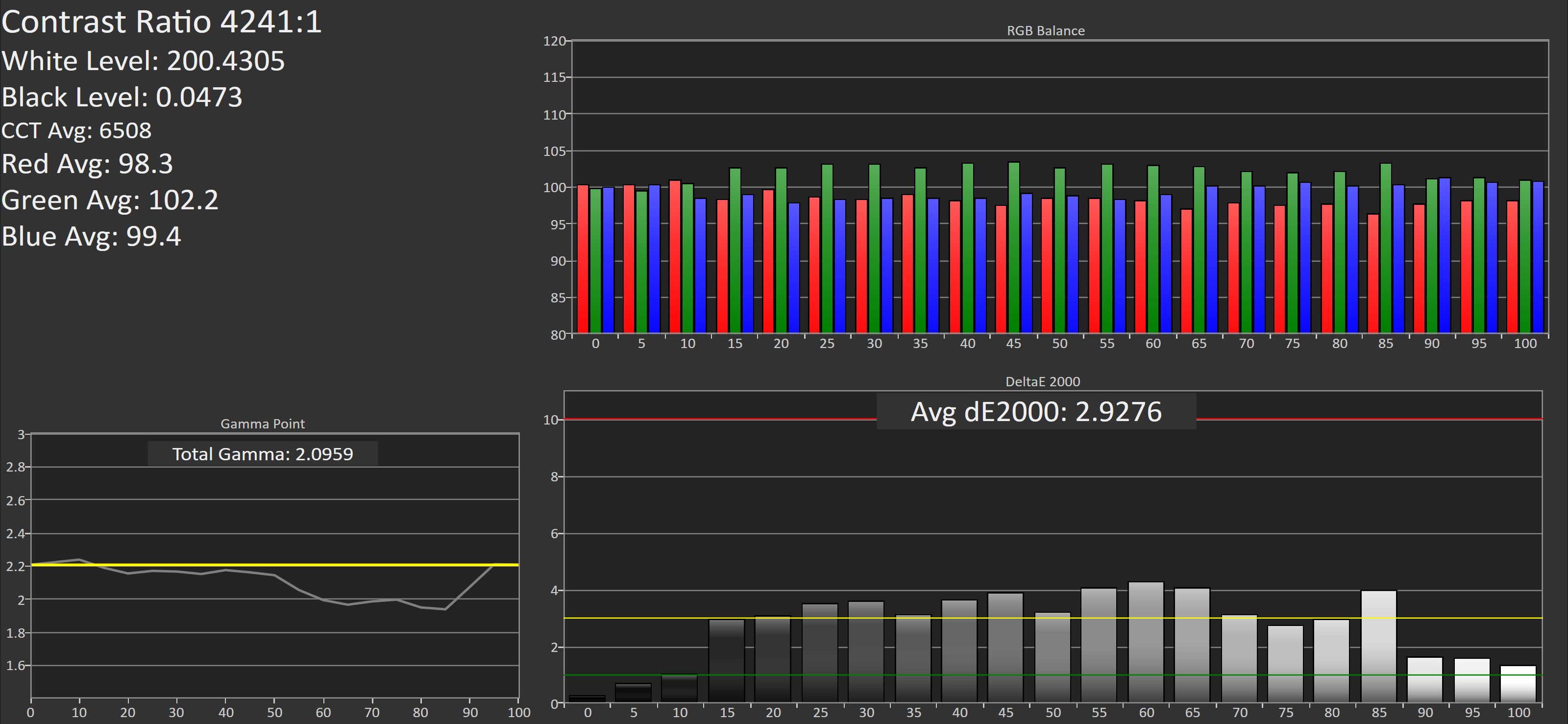
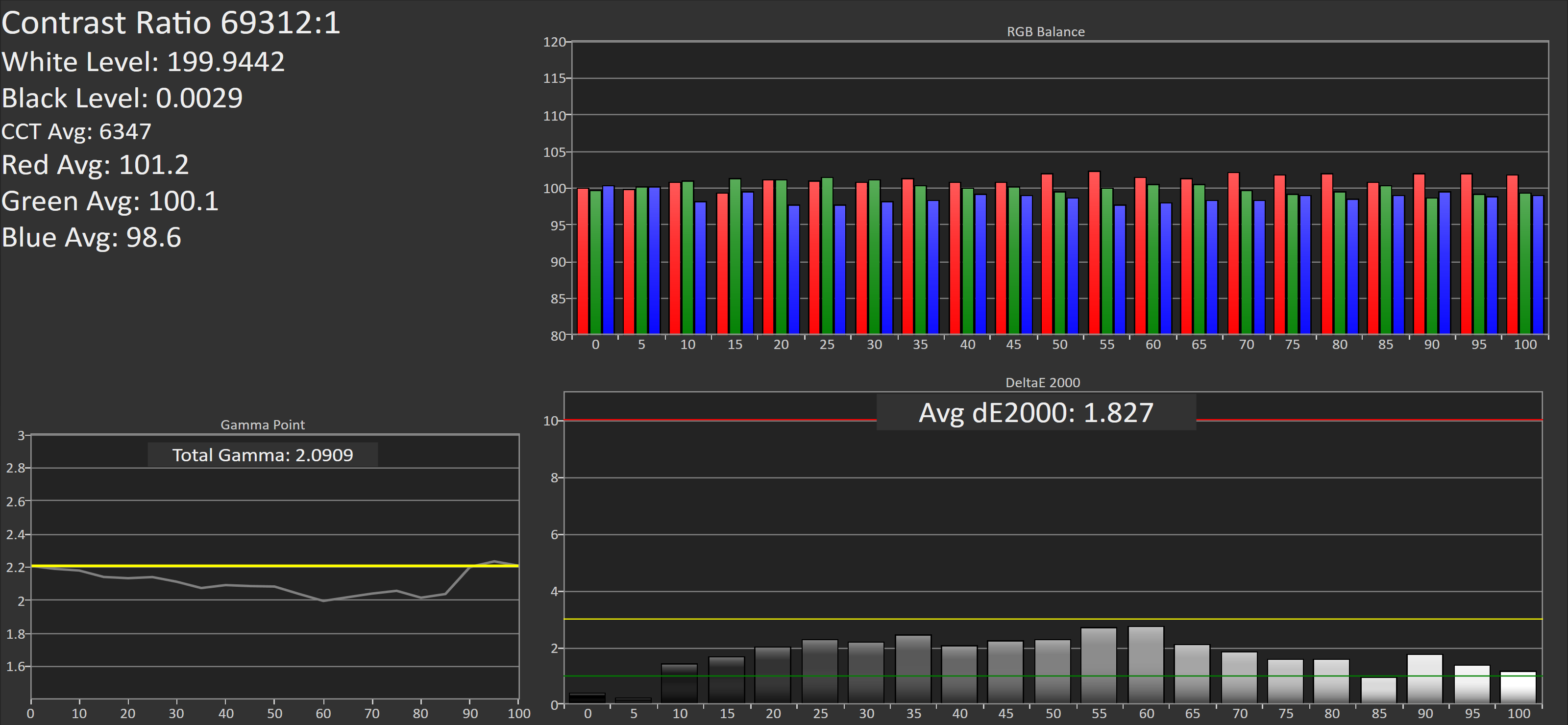
The next part of our testing is grayscale. As always, we target the industry standard of a 2.2 power gamma with 6504k white point. Relative to the Galaxy S6 and Note5, we see a pretty significant improvement in white point accuracy as it’s pretty much consistently quite close to a neutral white rather than a warmer color balance. Unfortunately though, in both review units I received the display has a noticeable green tint for many shades of grey, which seems to be somewhat of a perpetual problem with Samsung AMOLED displays. This really does affect quite a bit of the UI, as Material Design greys have this noticeable green tint to them that really makes things look off.
The same issue seems to not be present on the Galaxy S7 edge, which leads to a significant improvement overall in calibration quality for this portion of the testing, but both devices have a noticeably lower gamma than expected, which does have some effect on accuracy but for the most part can help to serve as a compensation mechanism for reflectance when dealing with ambient light. It’s likely that the green tint issue may only appear on a device to device basis, but to see that such issues haven’t been resolved for years is somewhat concerning given that phones costing hundreds of dollars less don’t seem to have the same problems.
Galaxy S7

Galaxy S7 edge
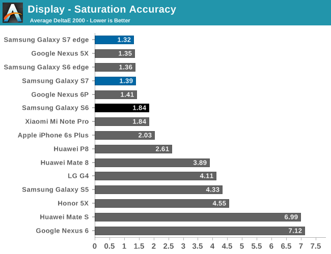
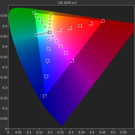
The next portion of our testing is the standard saturation sweep test. Here, the Galaxy S7 and S7 edge are basically perfect. It’s great to see that Samsung continues to provide their Basic color mode with a real focus on providing accurate color calibration for those that care about these things, and the user experience with getting to the right color calibration is pretty much as painless as it can be compared to some other devices where things like saturation curves, white balance, and other parts of a display calibration can only be adjusted using unitless sliders that basically require a spectrophotometer to actually use.

Galaxy S7
Galaxy S7 edge
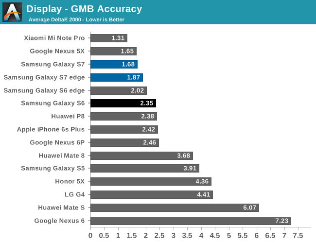
In our Gretag MacBeth ColorChecker test, we see that there are some issues with grayscale accuracy, but overall color accuracy remains quite good. In terms of overall display quality, I don’t really think there’s any meaningful improvement over the Galaxy S6, but that’s mostly because the Galaxy S6 set a ridiculously high bar for display quality.
However, I don’t believe that Samsung has run out of things to improve for future AMOLD displays. In addition to the grayscale problems mentioned earlier, Samsung clearly has not resolved issues with color shifting that occurs with viewing angle changes. LCDs definitely have more luminance degradation as you move away from the normal of the display plane, but at almost every angle change I can see whites get noticeably colder and interference patterns, in addition to a general color shift that is noticeably more than most LCDs used in high end smartphones and tablets. It’s obvious that this is a hard problem to solve due to uneven subpixel aging, but for things like tablets, laptops, and desktops color shifting is going to be a much more significant issue.


202 Comments
View All Comments
buxe2quec - Tuesday, March 8, 2016 - link
And I'm still wondering... how is it possible that years after various websited emphasized the better alignment and design of the connectors and perforations of the iPhone, Galaxies are still aligning them with no care at all? check that top side with the slots and holes thrown there randomly and that bottom side with the four holes (or groups thereof) aligned in FOUR different ways.But hey at least Apple supporters won't say they are copying everything...
Dobson123 - Tuesday, March 8, 2016 - link
I couldn't care less.name99 - Tuesday, March 8, 2016 - link
Fair enough. But don't then complain that it's "unfair" when Apple sucks up 80% of the profits in this sector. It's attention to details (ALL details) that allows a company to charge more...lilmoe - Tuesday, March 8, 2016 - link
Attention to detail hardly has anything to do with the port alignment at the bottom of the phone, and more so with the antenna bands on the back and the cheap choice of aluminum alloys in previous models (changed only after "bending" to public pressure, pun intended).A nice finish =/= quality. A polished piece of cheap glass looks better than a rough diamond.
Most of Apple's attention to detail goes to media, perception, image, supply chain, and money making business models. Well, at least more so than their attention to hardware.
You have good points here and there, but your fanboyish attitude ruins the good parts...
theduckofdeath - Tuesday, March 8, 2016 - link
Exactly. And there is a pretty good reason why the SD/SIM slot is on the side on the top. It can't be in the same location as the camera's. Apple have displaced the camera to a corner, that's not very symmetric in my eyes. And like you, I've never been a fan of those plastic separators on the back on all-metal phones.End of the day, manufactures are always doing deliberate design differentiations to make sure their hardware is distinguishable from a distance. Most people can easily identify a Samsung phone when someone's using it, simply because they've stuck to the same camera design/location since the Galaxy S2.
tipoo - Tuesday, March 8, 2016 - link
I think you mean this?http://www.imore.com/difference-apple-samsung-indu...
That was about the GS6 and only just started making its rounds, after Samsung finally tried to make nicer designs. I mean, I agree with you, it's such a bizarre miss, but when you say "years and years", it's really, "year", or less.
grayson_carr - Wednesday, March 9, 2016 - link
Well if the Galaxy phones had bezels the size of Texas like the iPhones, I'm sure they could align the ports better because they'd have more room to work with.syxbit - Tuesday, March 8, 2016 - link
"While not quite going from zero to hero, Qualcomm has come close, and that definitely deserves some credit."I disagree. Giving them credit because of the large improvement over the awful SD810 doesn't make sense.
Instead of a comparison to last years garbage, give them credit for how SD820 performs compared to todays best SoCs. It turns out SD820 isn't really leading that much. It's mostly still behind a year old Apple chip.
whiteiphoneproblems - Tuesday, March 8, 2016 - link
"Always-On Display is nice to have, but for some reason it only polls the ambient light sensor, so the display won’t actually turn off in your pocket."This is strange and disappointing. I wonder why it does not use the proximity sensor.
whiteiphoneproblems - Tuesday, March 8, 2016 - link
...and as a stab at answering my own question: I assume constantly polling the prox sensor would cause a greater battery hit than simply leaving the display on all the time (including in pocket)?Would be interesting to chart battery life with AOD on vs. off (in some kind of controlled way, of course).