Motorola Droid X: Thoroughly Reviewed
by Brian Klug on July 20, 2010 4:27 PM EST- Posted in
- Smartphones
- Motorola Droid X
- OMAP
- Mobile
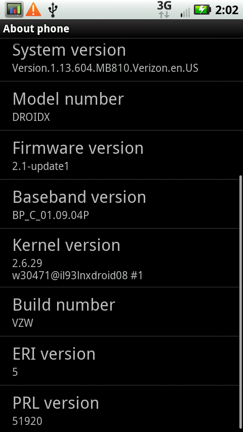
Software - Android 2.1
I want some froyo already.
The X launched with Android 2.1, although Motorola emphatically promises that they will update the X to 2.2 “late summer.” That update will bring all the Froyo goodness I’ve been enjoying on my Nexus One since the update, including flash, tweaks to the UI, much improved responsiveness, and “update all” in the market among a host of others.
Droid X Software - after OTA Update
To be honest, using 2.1 on the X makes it just feel old after using my Nexus One with 2.2 solidly for a few weeks. I can understand Motorola wanting to launch the X as soon as possible, but launching mid summer and promising a platform-changing and relatively major update by late summer is a bit puzzling.
Motorola Droid reviews written running 2.0 at launch read totally different than reviews from the device running 2.1. So too will the X will be changed from 2.1 to 2.2. Hopefully we’ll still have our X when the update hits, because 2.2 honestly makes 2.1 feel old in so many ways. I’ve been spoiled running my Nexus One with froyo more than I thought possible. That’s not to say that 2.1 isn’t totally manageable and workable, it’s just that for a phone launching right now, the update can’t come soon enough.
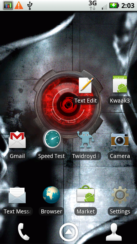
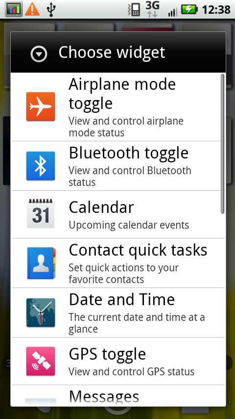
MOTOBLUR lite edition
Motorola has rolled a lite version of their BLUR interface and skin into the X. It isn’t the full on intrusive BLUR that the CLIQ or Devour featured. It’s not as much of a reskinning as HTC’s sense, but still does change the UI.
|
MOTOBLUR lite - it's honestly minimalist
|
|
 |
 |
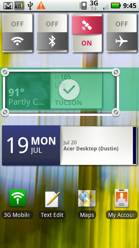
The phone comes out of box with Blur widgets all over the home screens. Literally every single one has Motorola widgets and shortcuts, a number of which I immediately dragged to the trash.
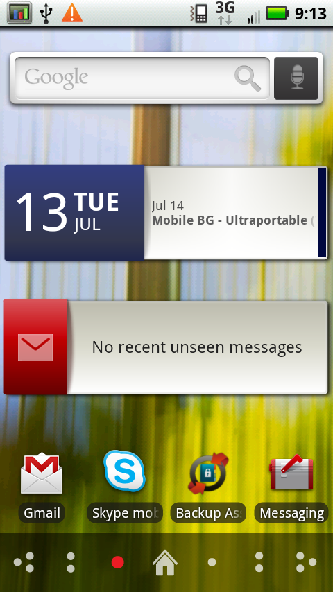
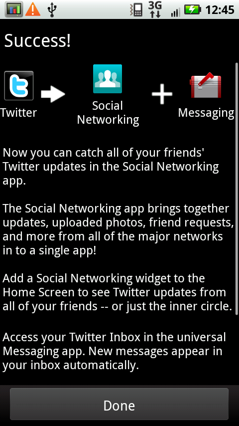
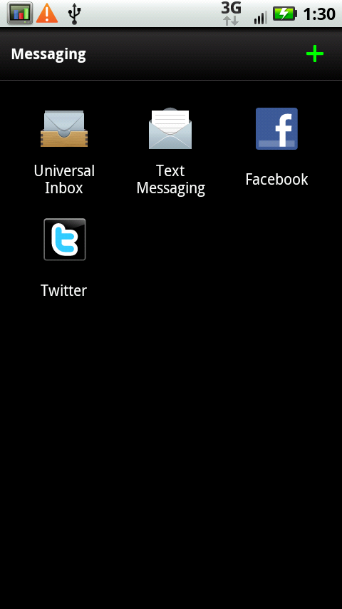
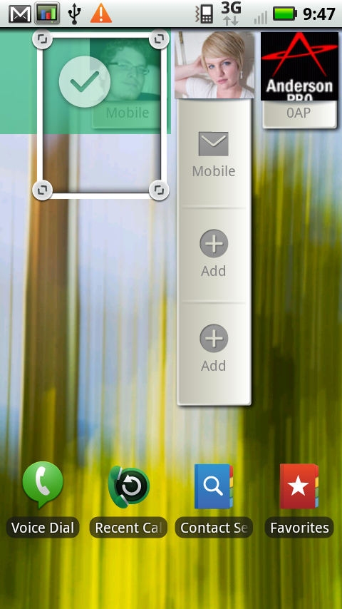
Motorola tries to roll all of your social network messaging into a unified messaging application (whose icon consistently confuses me with Gmail’s shorcut icon). It’s a good idea that ended up pushing me over the Twitter API call limit a bunch of times on other devices, but does pull down Facebook messages and others effectively.
|
Social Networking Unified Inbox - Great in theory, not perfect in practice
|
||
 |
 |
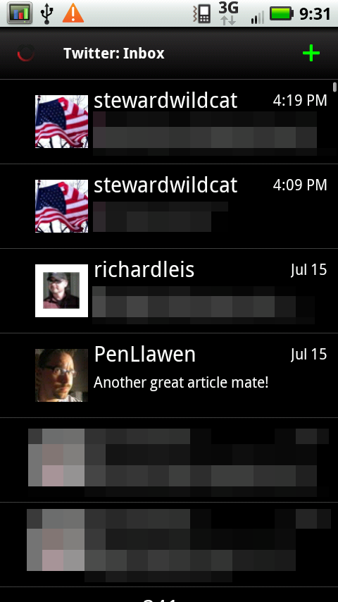 |
I’m just left wondering what use having this done is when Facebook and Twitter offer their own applications and integration - you can inadvertently wind up with two duplicate Facebook icons and inboxes in the messaging app.
But a lot of it I think is quite tasteful. The clock, calendar, and weather widgets are well done, arguably a bit better than Android’s default. The contacts shortcuts are also not bad. They still aren’t as nice as some of HTC Sense’s, but not nearly as bad as I expected them to be. Motorola keeps its widgets in a different tab when you long press on the home screen, so they’re not mixed into your main widgets library. If you don’t like ‘em, they’re segmented away in a separate menu entirely.
|
Blur Widgets - Not bad
|
||
 |
 |
 |
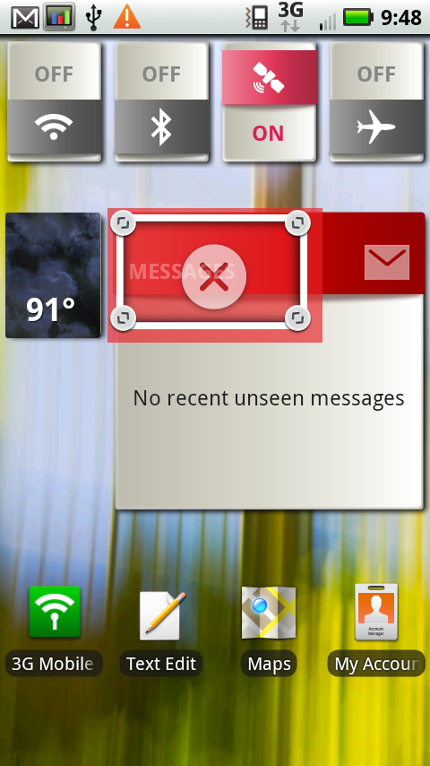
The other interesting thing is the way most of the BLUR widgets are resizable. Long press on the widget, and up pop some resize handles at the corners. They’re a tiny hard to get the hang of at first, but you can then drag and resize the widget entirely. I think that’s kind of cool - for example, you can resize the date/calendar widget and see a ton of events instead of just one. Pull down the contacts widget, and you get more shortcuts. Make the weather widget longer, and you get more detail.
|
Blur widgets can be resized dynamically
|
||
 |
 |
 |
The rest of the sense tweaks seem to make the interface actually less busy than stock Android. The signal icons are simple, the shade has no texture when you pull it out, and the applications launcher is just a bunch of application tiles. There’s no 3D cube effect like the Nexus One (which still feels laggy to me), nor a pop up shade like the old Droid, or a button and tray like Sense.
I feel like most of the Blur additions are pretty minimalist, thankfully.
The only major annoyance is what happens to the three icons at the bottom when you change screens left or right. Normally, you see three icons - phone, the applications launcher, and contacts. If you drag back and forth to change which home screen you’re on, however, this changes to a home logo and dots corresponding to the 7 home screens.
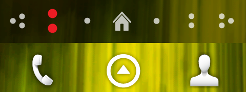
It changes from the bottom to the top when you're touching the screen.
The problem is that this visualization to let you know what screen you’re on (which itself seems a bit extraneous unless you’re spatially challenged) gets in the way of tapping on the applications launcher - it will replace the 3 icons for a full 3 seconds. I inevitably end up sliding to a different home screen, wanting to launch the app launcher, and tapping on home. It’s frustrating. I guess the icons are useful if you want to tap on a specific page, but seriously, it gets in the way.


89 Comments
View All Comments
czesiu - Tuesday, July 20, 2010 - link
great review!higher res version for this please:)
http://images.anandtech.com/doci/3826/DROIDX-Anand...
Brian Klug - Tuesday, July 20, 2010 - link
I'm actually going to dump all the screen comparison photos I've got (there are quite a few) into a gallery, then you can peruse at native resolution. Should be up in a little bit ;)-Brian
hatter_india - Tuesday, July 20, 2010 - link
Fantastic review but I expect no less from AnandTech. But there are a couple of bloopers:1- OMAP 3630 is third mobile chip to use 45nm process. First is of course A4. But second is Samsung's Hummingbird, a chip that the korean company designed with help of Intrinsity. This chip is found in Galaxy S or its variants. Samsung is the same company that also tweaked A4, which incidentally is fabbed by Samsung. Too many coincidences ;-)
2- A comparison to PowerVR SGX 540 found on Galaxy S would have been interesting as according to Samsung SGX 540 is almost three times more powerful than SGX535.
3- Droid X should have also been compared with Galaxy S or any of its variants like Captivate, Vibrant etc
hatter_india - Tuesday, July 20, 2010 - link
This line: Samsung is the same company that also tweaked A4, which incidentally is fabbed by SamsungShould read: Intrinsity is the same company that also tweaked A4, which incidentally is fabbed by Samsung
Goty - Tuesday, July 20, 2010 - link
Does AT have any plans to review any of the Galaxy S phones? I just picked up a Captivate on Sunday and I'd love to see how it stacks up. I just ran the Neocore benchmark and got around 55 FPS, which speaks well of the GPU, but I'd like to see results from the other tests you guys do.Brian Klug - Tuesday, July 20, 2010 - link
Hey Goty,We definitely have plans to do reviews of all of the Galaxy S phones we can get our hands on. I'm working on getting them as soon as possible ;)
I'm also pretty excited to explore that SoC and compare.
-Brian
Ram21 - Tuesday, July 20, 2010 - link
Really enjoyed this review. Keep up the great work! Being as thorough as you guys are really helps to make good decisions on purchases.SonicIce - Tuesday, July 20, 2010 - link
lol how long before we can attach an external mouse and keyboard to a phone to use it as a pc and play 3d games online with itstrikeback03 - Tuesday, July 27, 2010 - link
How about this?http://www.androidcentral.com/dell-streak-logitech...
ltfields - Tuesday, July 20, 2010 - link
Guys, another gold standard review. I may not be able to pick up an X because I'm still under contract with another carrier, but the reviews are riveting. Keep up the excellent work!