The Apple iOS 9 Review
by Brandon Chester on September 16, 2015 8:00 AM EST- Posted in
- Smartphones
- Apple
- Mobile
- Tablets
- iOS 9
UI And System Changes
With every major release of iOS Apple makes various changes to the interface. This has been especially true with both major and minor updates that have come after the launch of iOS 7. With Apple redesigning iOS in what is rumored to have been less than a year, there were naturally areas that weren’t polished or didn’t fit in. This section just covers some of the more major visual and functional changes to the various aspects of iOS.
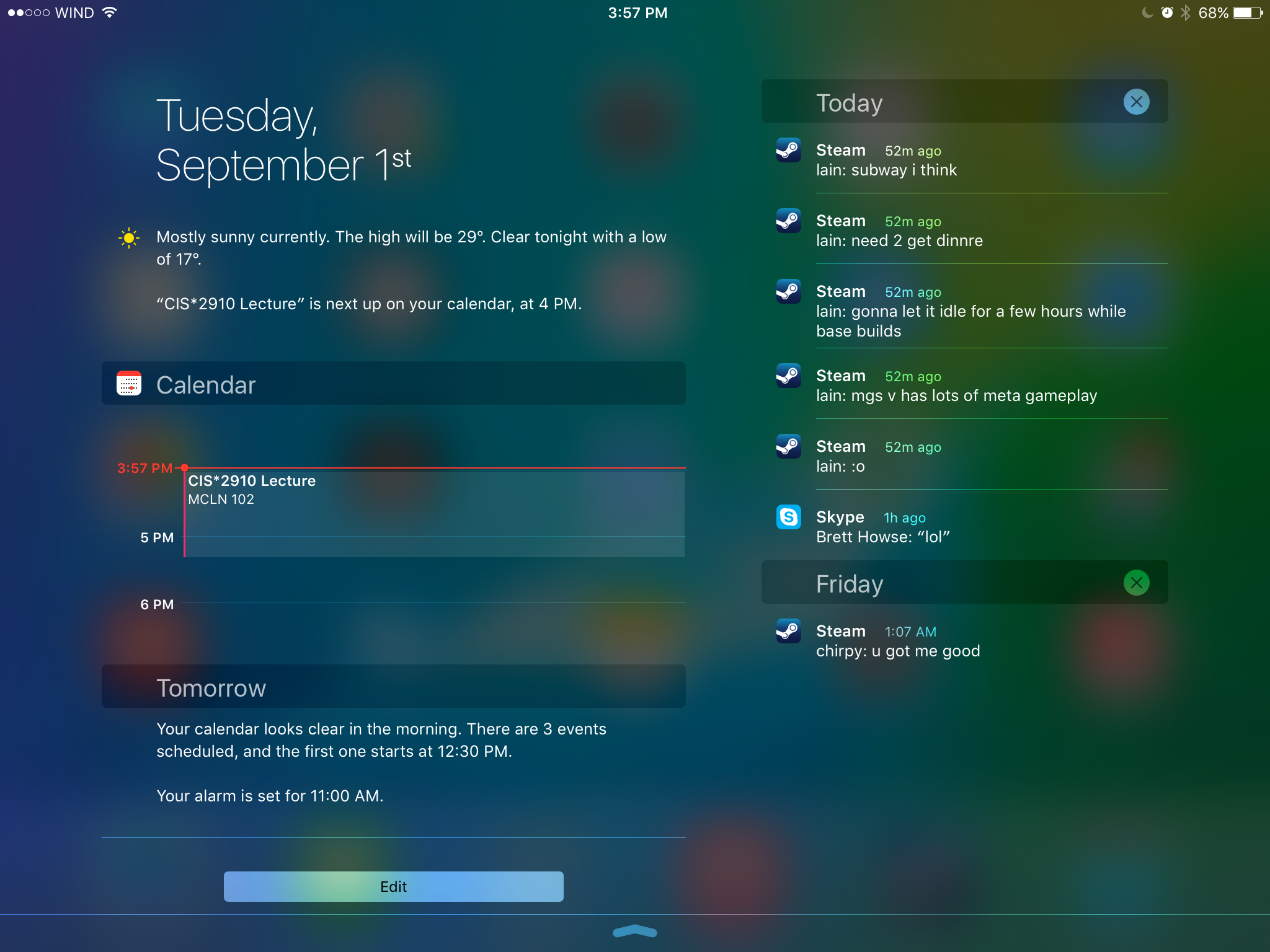
One of the first major changes I noticed in iOS 9 was the new Notification Center layout when in landscape orientation on the iPad. Since there’s enough horizontal space to do so, Apple has segmented the drawer into two sections, with the today view and widgets on the left, and notifications on the right. I’m surprised it took this long for someone to do this, as it has always seemed like an obvious way to use the space in landscape, rather than simply having a bunch of empty space on the sides or stretching the interface to fill the width of the display.
One other thing to note is that notifications now sort by time, and also by date. Previously the notifications still sorted “by time”, but they were also grouped by app. This meant that they didn’t really sort by time in the way you would expect. The group by app feature is now optional, and disabled by default. Notifications are now sorted by when they arrive, and while you still can’t close them all at once, you can delete them by day which ends up being pretty quick. I know the sorting of notifications has been a long source of pain on iOS, particularly among Android users moving to iOS who were used to the sensible time based manner than Android has always used to sort notifications, and it’s good to finally see it changed.

As for the today view, there aren’t many big changes. The one addition that I did notice is a new battery widget, which shows the battery life of devices connected via Bluetooth. This was obviously added with the Apple Watch in mind, but it also applies to other devices like Bluetooth keyboards, speakers, and headsets. It’s important to keep in mind that your Bluetooth device has to report its battery life to the host device in order for this to work. You’ll know if it does if you’ve ever seen a small battery symbol next to the Bluetooth logo in the status bar when your device was connected. For example, I have a Plantronics and a Creative headset here that do show up in the battery widget, but a pair of Sony headphones and an older Creative set that do not.
The recent apps switcher receives a big visual overhaul in iOS 9. Long ago it was a bar at the bottom with app icons, and with iOS 7 it was changed to a list of icons with cards to preview the application. It reminded me a lot of the Windows Phone recent apps list, but it was a much better implementation. This time around it seems that Apple has taken a bit of inspiration from the recent apps tray introduced in Android Lollipop which has a scrolling stack of app preview cards that are overlaid. The iOS recent apps tray is basically the exact same thing, but scrolling sideways instead of forward and back. It works fine, although I don’t know what necessitated the change apart from the old style being really difficult to run smoothly on a device like the iPad due to the requirement of high resolution app previews being entirely loaded into memory.
One consequence of the fact that the recent apps tray now scrolls left initially rather than right is that the direction of the four finger app switching gesture on the iPad is now reversed. I still find myself swiping to the left with four fingers to get my last used app on screen, but this just results in a bouncing overscroll effect as you now need to swipe right with four fingers. I understand Apple’s reasoning, as moving your thumb to the right when holding a phone in your right hand is more ergonomic than moving it left, and this works with the new app switching gesture enabled by 3D Touch on the iPhone 6s, but it does cause a bit of confusion at times if you're used to using that gesture on an iPad.
Something that has been greatly improved about the recent apps list is how you access applications that are being handed off from another device. With the old tray, you accessed it by swiping to the left of the card that had the home screen on it. This meant that if you weren’t at the very beginning of the list you had to scroll all the way back. In iOS 9 you complete the handoff of an application simply by pulling up on a card shown at the bottom of the display. Apple has also used this same interface to show the music app when you have a pair of headphones or a speaker connected via Bluetooth or the 3.5mm jack. I’ve found this very useful when switching from an application to the music app, as it removes the need to go to the home screen to find and select it there.
The last thing I wanted to mention about the new recent apps tray is that the recent contacts list at the top has been removed. I mentioned in my iOS 8 review that it wasn't very useful and that I had never used it, and it looks like I wasn’t the only one who felt that way.
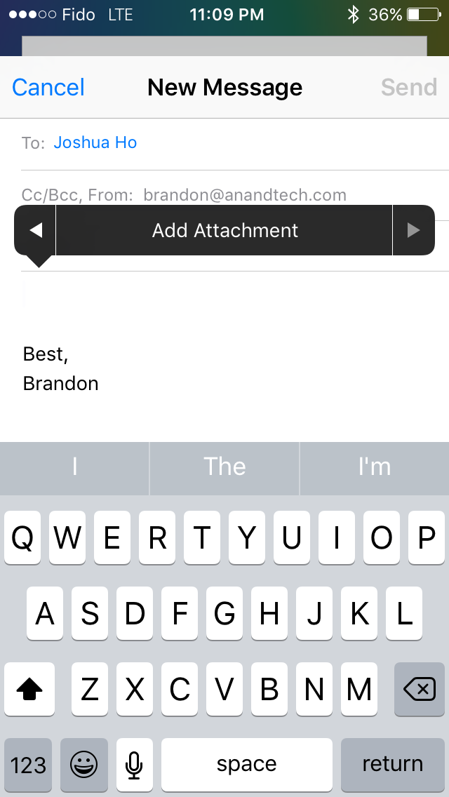
Some of the included iOS apps receive some notable improvements as well. Mail now allows you to include more than five photos in a message which is a long overdue removal of an antiquated constraint. You can also add attachments now, which you select from iCloud Drive. Searching through mail is also much better as well. Previously it would just show you every message that corresponded to the keywords you entered. The search now gives you a list of thread topics that match, and if those aren't sufficient you then have the option to use the older individual message view.

Apple's Photos app gets a couple of upgrades too. There's now a scrubber at the bottom of the iPhone version of the app which allows you to quickly go through photos. The functionality of the scrubber is slightly different from the older version on the iPad, as it accelerates the movement through photos much more quickly. You can also select multiple photos in an easier manner by pressing on one and dragging left or right to select images in a row, and up or down to select an entire row.
There are other visual and functional changes all over the place, and it’s impossible to document them all. A few others that I felt are worth mentioning include a significantly more rounded share and overflow menu with a separated cancel button, 4x4 folders on the iPad, the ability to set your recording resolution to 720p in the settings app in order to reduce the space taken by videos, and the ability to have caller ID guesses made based on emails you’ve received.
Ultimately, there are no revolutionary improvements to the interface among the changes that I’ve highlighted here. The new visual appearance that came with iOS 7 appears to have matured by this point, and now Apple is making refinements to how things look, and improving how things work. I think most of the changes I’ve found and discussed here are for the better, even when they’re removing something like the recent contacts in the multitasking tray. If you’re not a fan of the design of iOS your opinion isn’t likely to change with iOS 9, but if you do enjoy it then you’ll be getting some nice visual and functional improvements throughout the system.
A New System Font
Both OS X and iOS have made some major changes to the system font in recent years. iOS moved from Helvetica to Helvetica Neue on Retina devices in iOS 4, with non-Retina devices moving to the thinner weighted Helvetica Neue alongside the Retina devices in iOS 7. OS X changed from Lucida Grande to Helvetica Neue with OS X Yosemite. This year both operating systems are adopting Apple's San Francisco font. Technically this is different than the San Francisco font used on the Apple Watch, which is a result of the different circumstances and sizes that will be used on an iPhone, iPad, and Mac compared to a smartwatch. Specifically, the San Francisco Compact font used on the Apple Watch has flat edges to letters like e, a, and o have flat edges that put more space between them and other characters to improve legibility.
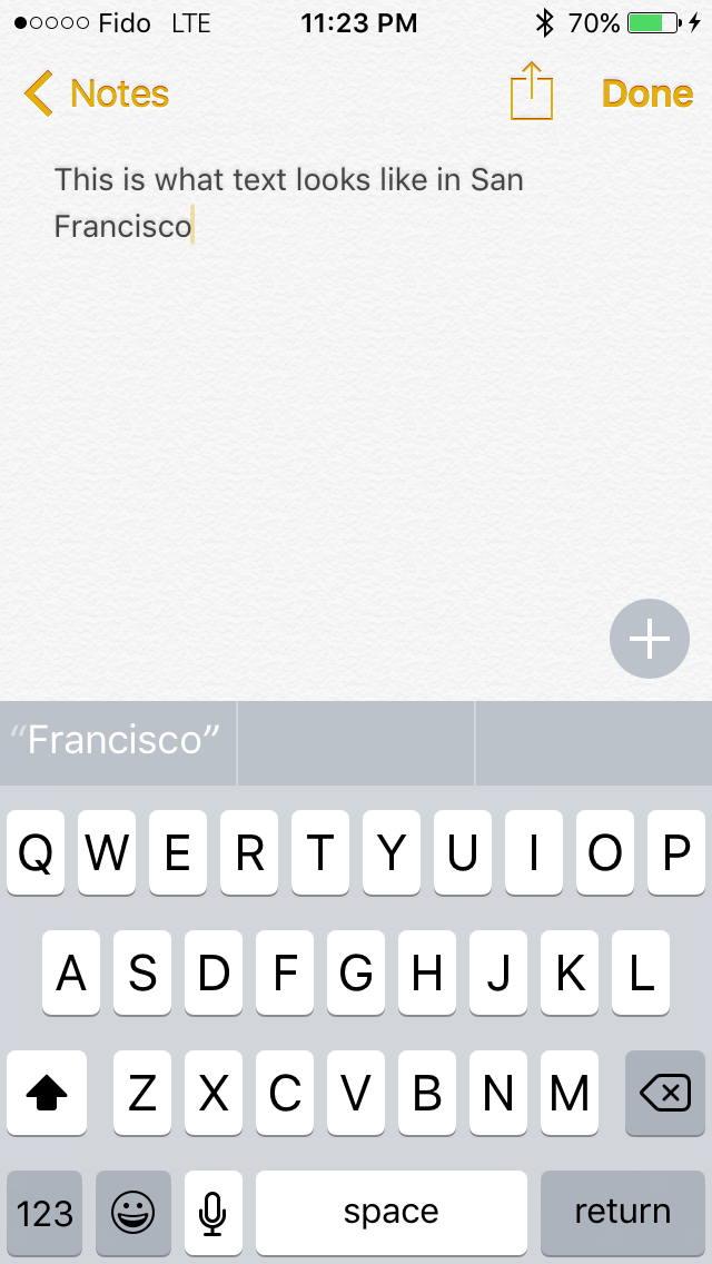

To be honest, I'm not the best person to give commentary on what's good and bad about Apple's new typeface. While I can see and understand the differences between fonts, I find it difficult to articulate exactly what makes a font look and feel different from another similar font. My first impression when using San Francisco was that characters seem more rounded than those in Helvetica Neue, and the spacing between them is greater. After using iOS 9 for quite some time I've grown completely used to them, and the initial surprise of having a different looking font everywhere actually wore off after a couple days. To learn a whole lot more about San Francisco and the process of designing it I would check out Apple's WWDC session that was dedicated to discussing it.


227 Comments
View All Comments
nafhan - Wednesday, September 16, 2015 - link
Wrong. iPads get used by professionals (in addition to "prosumers") all the time for content creation tasks while on the go like music recording, viewing tablature, reviewing photos with clients, etc. Just because the content creation isn't happening on the tablet doesn't mean it's not getting used as part of a content creation workflow.That said: they are not a professionals primary content creation device. They're a secondary device that gets used when it's not reasonable to use the primary device for some reason.
The Surface is going to fall into the same boat. Someone who does these types of content creation tasks is probably going to want something more powerful than Surface for their regular work. The iPad Pro and the Surface will both be used when the primary device is not available.
Also, you are absolutely correct in that the vast majority of iPads (and computers) sold are as consumption devices. That's why the iPad mini exists!
superflex - Wednesday, September 16, 2015 - link
Yikes.A koolaid fight has broken out and everyone is drunk on their brand of OS punch.
You clowns are worse the the GPU fanbois.
Makes reading the comments at AT a waste of time.
Now get back to your respective OS shrines.
lilmoe - Wednesday, September 16, 2015 - link
You're contradicting yourself;"Just because the content creation isn't happening on the tablet doesn't mean it's not getting used as part of a content creation workflow".
That was exactly my point, and the point you emphasized in your last paragraph. iPads (even the lateset "Pro") can never be used for standalone, real professional work. The iPad "Pro" might be good for simple sketching at best... I mean, the new "pencil" doesn't even support hover or palm rejection, nor does the "Pro" run any full blown professional programs.
There's nothing an iPad can do that a Surface can't (provided the mobile app is there). But the Surface can also replace laptops for many consumers, they can be the sole PCs of many prosumers, and they can be the mobile workstations of professionals because they can run the full blown programs their used to. Something iPads can never do.
Android was never a real threat to iPads. However, while Apple isn't worried about the Surface series in particular, the real threat to iPads lies in Windows 10 and Universal Windows Platform.
I can't wait for a Samsung made Wacom Windows 10 tablet with a Core M7.
nafhan - Wednesday, September 16, 2015 - link
I'm not contradicting myself.Your argument seems to be that since it could be used as an all around replacement for every computer, professionals are using the Surface that way. My observation is that you are wrong. People who make money doing creative work generally don't have an MS based workflow, at all, and that even if they did, they'd probably still only use the Surface as a primary computer when absolutely necessary. If you're making money at your job and doing creative work, you're going to want a more powerful computer with more storage than the Surface as your main computer.
I have a feeling that you have never worked with any professionals. They don't want Swiss Army knives. They want dedicated tools to get their work done easily and quickly. I'll sort of take that back: they do want the Swiss Army knife device, just as a secondary or tertiary device, not as a primary.
The-J-Man - Friday, September 18, 2015 - link
This is changing. Some creatives are moving to Windows-based workflows as there are shifts in the industry, and Surface Pro is significant part of that. Ever since the first Surface Pro came out, the question among creatives is "Can it run Photoshop?" (Yes, it can.) Since that day, I think most creatives realize that iPads are consumption only. If you can have a tablet that is a presentation device that also lets you do actual work on a train or at a coffee shop between meetings, then isn't that better, even if it doesn't have iMessage?Apple has had some missteps lately in the creative world. The garbage can look-alike Mac Pro is selling so poorly that I don't know anyone who owns one. Adobe's Premiere Pro takeover of Final Cut market share is significant and seems to be accelerating. It is getting harder and harder to justify the IT costs of supporting a department of Macs in an otherwise Windows environment, just to get the graphics work done. (Yes, Macs need support. They are not magic.) Most artists are getting used to using Windows through Boot Camp, and Windows 10 is actually a really nice experience.
You are right that it is fairly safe to assume a creative is working on a Mac these days, but devices like Surface Pro are very impressive, even to us creatives. iPad Pro, to me, looks like a Surface Pro without the ability to run any of the apps that I really want to run. Let's face it, Creative Cloud programs like Photoshop and After Effects are where the money is, not those silly ideation apps Adobe keeps trying to push.
Most creatives work on a workstation with a Wacom tablet and multiple monitors for maximum productivity. Given the creative's standard equipment of a primary workstation, a secondary tablet/laptop, and a smartphone, I am guessing a lot of creatives would choose Surface Pro over iPad (Pro or otherwise) as their secondary device.
robinthakur - Thursday, October 1, 2015 - link
Most proper creatives doing it as a job that I know still use Apple, mainly for historic reasons it has to be said (try getting creatives to change tooling!) and the fact that the Surface Pro 3 runs Photoshop avoids the question of how well it runs it. The pen accuracy and pressure sensitivity as well as the display scaling are significant issues which hobble the SP3 to some extent and mean that it can't be used as a dedicated tool. The pen is designed primarily for OneNote, after all.The great unknown is the software for the iPad Pro. If Appl ecan persuade Adobe to release versions of CC and Micrososft to release versions of Office which are compiled for it with pen compatibility, then I can see it doing very well as all the User interface problems of not having a precision input device or keyboard will be solved.
KoolAidMan1 - Wednesday, September 16, 2015 - link
A Macbook Pro is a much better laptop than the Surface and an iPad is a much better tablet. The value of the Surface is that it combines both. If you want to combine both devices while introducing compromises then its a good option. There's certainly something to be said for having fewer things.Sc0rp - Wednesday, September 30, 2015 - link
The pencil supports palm protection dude.Morawka - Wednesday, September 16, 2015 - link
they'll lose imessage and facetime.. they dont care about safari, and everyone can agree that itunes is garbage. you seriously cited itunes as a reason to stay apple? Simplistic device are great and all, but it severely limits how you can improve them 5-10 years down the road without inherently making them more complex (therefore losing the simplicity)they are made of metal and are nice looking. the ui looks like a candy shop. they are successful because the iphone is successful. you think it will stay this way for much longer tho? It remains to be seen, but odds are not in their favor.
apple is pushing everyone to apps, even website developers (by ad blocking). apple is a compartmentalized experience on each device. They created lots of devices that only do a few things (but do them well) and then hope you buy all of them so they make lots of money.
meanwhile competitors with complex systems which allow you to do much more with fewer devices, but has steeper learning curve. do you want to pack 3-4 devices that each do a couple of things good, or 1-2 devices that can do everything.
let the market decide over the next 10 years, but eventually people will wise up and spend less money and pack less gadgets
centhar - Thursday, September 17, 2015 - link
Apple users are the Pakleds of the computer world. "We can make it go, no intelligence is required"