The ASUS ZenPad S (Z580CA) Review
by Brandon Chester on August 31, 2015 8:00 AM ESTDisplay: Altered White Point
ASUS’s ZenUI devices include an application called Splendid, which allows the user to select from a few different display settings or create their own. The controls are limited to a color temperature slider, a hue slider and a saturation slider. Because there’s absolutely no way for a normal user to check if the adjustments they are making are improving or reducing the display’s accuracy, I’ve refrained from adjusting the hue or saturation sliders. However, users can judge when adjustments to color temperature have made the rendition of grey shades less cold than the stock settings, and so I have adjusted the color temperature slider to be 3 positions from the right for the following tests.

As you can see above, adjusting the white balance allows the ZenPad’s greyscale accuracy to increase dramatically, and the display’s blue shift is essentially eliminated. The accuracy is now competitive with the iPad Mini 2, which is where it really should have been in the first place. Adjusting the color temperature to this setting does drop peak brightness by 8 nits or so, but it’s well worth it to improve the appearance of the display to this extent.
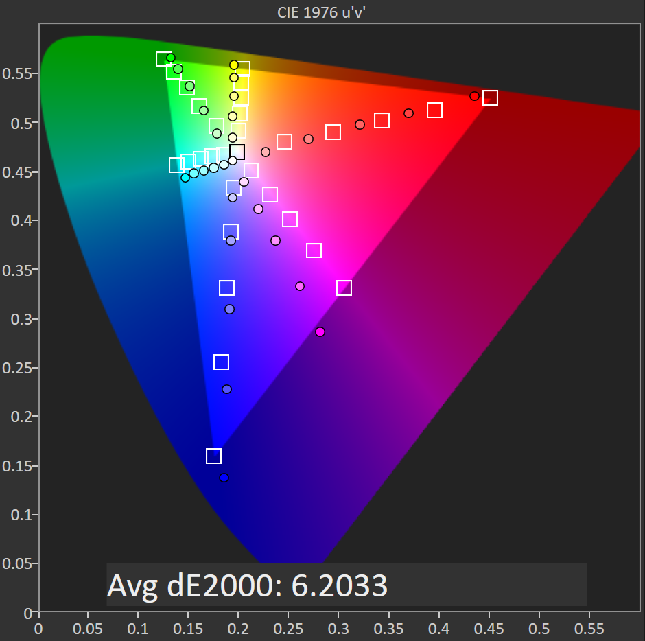

Before adjustment on the left, after on the right
Saturation accuracy improves from being less accurate than the iPad Mini 2 to being noticeably more accurate. There’s only so much that can be done by adjusting the display’s overall RGB balance, and I really wish the ZenPad S had better accuracy than this right out of the box, but it’s still a good improvement from the stock settings.
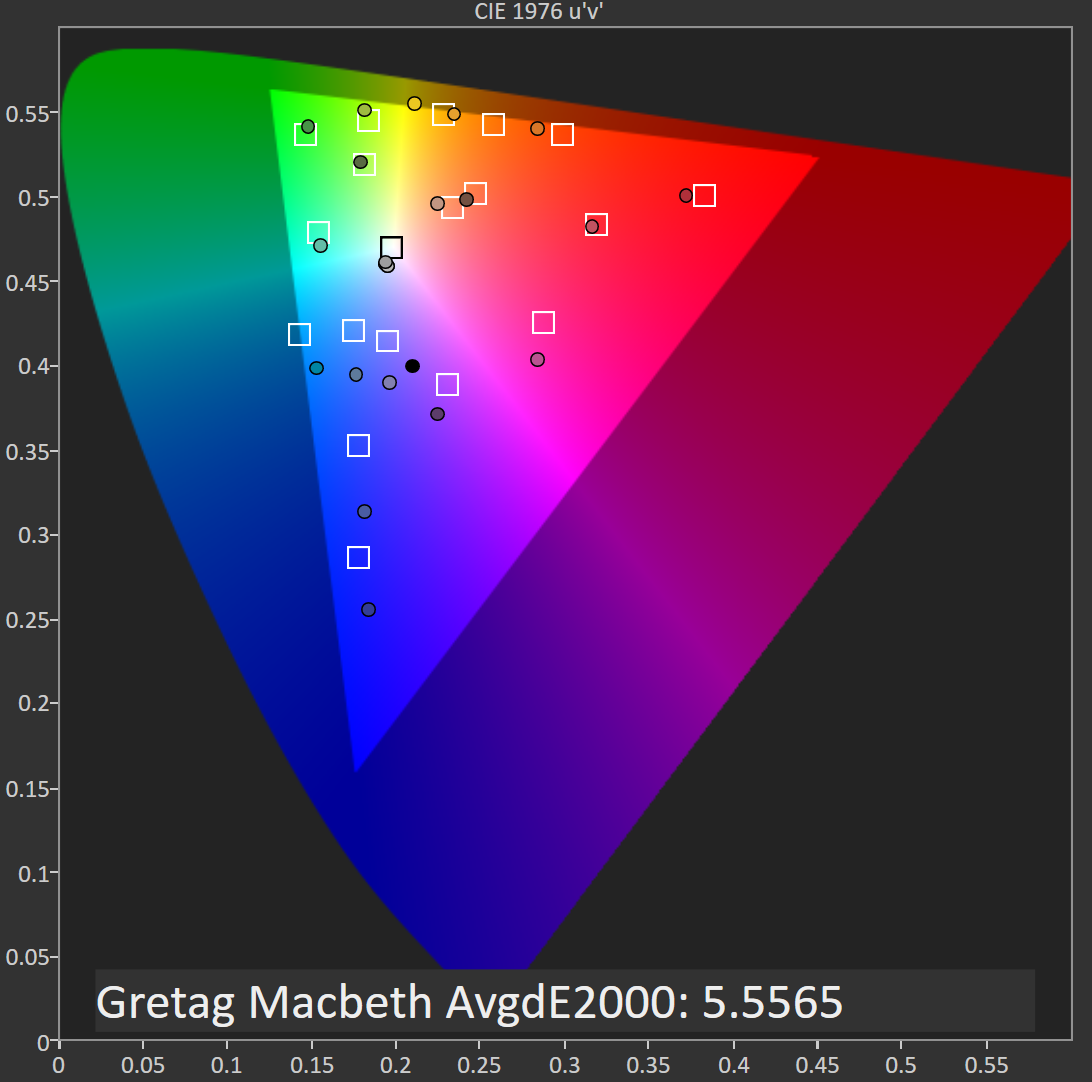

Before adjustment on the left, after on the right
In the GretagMacbeth ColorChecker test there’s a good improvement in the accuracy of color mixtures with the adjusted color temperature. Since the saturation accuracy is still imperfect, there’s inherent error to many of the color mixtures, but the error is to a much lesser degree than how the display looks without any adjustments.
In the end the ZenPad S has a better display than ASUS’s default settings would have you believe. Although the ZenPad S has a laminated display and a wider color gamut than the iPad Mini 2, based on the results of the ColorChecker test I would have to conclude that the iPad Mini 2’s display is superior overall. If you can adjust your ZenPad’s display you will still have a very sharp panel, and in the $199 model it’s definitely best in class. That being said, I think the $299 ZenPad S Z580CA should have aimed higher when it comes to color accuracy, as the two year old iPad Mini 2 still offers better reproduction of grey shades, colors, and offers roughly equivalent brightness and contrast.
A Word On ASUS VisualMaster/True2Life+
The ZenPad S Z580CA comes with a number of display "optimizations" which are similar to those you would find on televisions. I put optimization in quotes because while it is true that slight adjustments to brightness and gamma can help to maintain image quality in different ambient conditions, I have never in my entire life seen a single device where those optimizations are applied in a reasonable manner. The display oriented processing that ASUS performs is marketed as ASUS True2Life+ technology, and I wanted to go over a few aspects of it while also discussing the positive or negative impacts they had on my experience when using the ZenPad S.
Dynamic Brightness and Contrast
These features are often referred to as CABC, or Content Adaptive Backlight Control. ASUS advertises them as a measure to improve image quality, but in practice it's more useful as a tool to save power when applied in the right situations. Unfortunately, the ZenPad S goes overboard with its adaptive brightness, which was also an issue with the ZenFone 2. Because the ZenPad S has a much larger display, the shifting of brightness is far more obvious than on a phone. For example, when scrolling through the recent apps tray you will notice the brightness of the entire display going up and down depending on how light or dark the interface of the application currently in view is. Swiping open the quick toggles in the notification shade also changes the brightness of the display, as do many of the switches to and from applications. A tablet like the iPad Air 2 employs the use of CABC when watching videos, and even in that case I am still not a fan but I understand the purpose. Having significant brightness changes constantly occurring throughout every app and every part of the UI is not something I understand, and it's not something that I feel devices should use outside of something like a power saver mode or when the display APL is incredibly low.
Sharpening
This part of VisualMaster is fairly self explanatory. ASUS performs sharpening as a post-processing effect, and it applies to pretty much all content on the display to varying degrees. I have never seen this feature implemented in a way that is completely useful, and the ZenPad S is no exception. Like other devices that perform sharpening, like the LG G3, the only thing I notice is that text and any objects made of reasonably thin lines has a distracting halo effect. It seems contradictory to the idea of sharpening, but the effect actually reduces the sharpness of what you see on screen, and at times it can actually cause small text to be straining on the eyes. Considering the ZenPad S has a 326ppi display, I don't understand why there's any need for artificial sharpening. To my knowledge, there's no way to disable this feature, so it's something users will have to deal with unless ASUS issues an update with an option to disable it.
Blur-free Motion
The last significant aspect of VisualMaster/True2Life+ is ASUS's Blur-free motion tech. This is essentially the same as the frame interpolation that you see on televisions, which analyzes two frames and attempts to construct an intermediate frame that would go between the two. This feature is actually very successful in making videos appear to be a higher frame rate than they actually are, and it does help to eliminate blurring. I'm actually quite impressed that this can be done as a real-time processing effect on a performance-limited device like a tablet without significant artifacting or other issues. That being said, I fundamentally disagree with the entire concept. To be clear, I am not at all against filming or animating video content at a frame rate higher than 24fps. What I am against is the idea of trying to make content that was not produced at a high frame rate look as though it was. I've loaded as many different videos as possible onto the ZenPad S, and because I'm used to seeing all of them run at 24 or 30 frames per second they just look strange with ASUS's anti-blur processing and frame interpolation.
Unlike the display's heavy CABC, ASUS offers a setting to disable the anti-blur processing in the display section of the settings application. When I first received my review unit, this setting was actually broken which was a huge issue. A recently released firmware update which brings the tablet to V4.1.0 fixed this issue, which is a huge relief. I personally would recommend turning this feature off, but it's great that users are given the option of having it if they want it.
Final Words
Ultimately, I've never seen much appeal in the heavy post-processing that televisions can apply to content, and that hasn't changed with it being brought over to mobile. Most of my feelings toward VisualMaster and True2Life+ are negative, and I really wish there was an option to just turn all the processing off entirely.


114 Comments
View All Comments
kmmatney - Monday, August 31, 2015 - link
Having both a 16:9 windows tablet and an iPad, IMO 4:3 is better. Who plays "immersive" games on there tablet? - that's what a computer or laptop is for. For typical things you use a tablet for - web browsing, reading emails, reading books, you tube, various other consumption, the 4:3 aspect ratio is perfect. I don't pretend to do any serious work on my tablets, but I wish my windows tablet was 4:3. There is a reason why the MS Surface tablets no longer use a 16:9 aspect ratio.boeush - Monday, August 31, 2015 - link
This is getting pretty stupid... Let's say your tablet is x inches long. Does it really make that much difference whether it's height gives 19:10 ot 4:3 AR? Unlike a phone, you aren't about to shove that tablet into a pocket. So is it REALLY so TERRIBLE that you have extra vertical screen space when watching a movie in landscape? Yeah, instead of that extra screen you could just have empty space I guess - but that still won't make your tablet all that more compact anyway (with the horizontal dimension being dominant.) So boo-hoo, you get top and bottom sidebars on your video. Contrast that with the use cases where you need/want that extra height in your landscape mode, or the extra width in portrait - and DON'T HAVE IT because your tablet is built oblong and that's that. Seriously, I for one would rather have extra screen space I don't need under certain circumstances, rather than at other times needing the extra space and not having it!keltypack - Monday, August 31, 2015 - link
I totally agree with the 4:3 aspect ratio. I don't know what people are thinking, but a tablet is a GREAT way to watch a movie on an airplane. The 16:9 ratio is much better for reading books. I don't understand the Apple fascination with 4:3. To be fair, I think 3:2 is a better aspect ratio than 16:9, but maybe that is the old-school photographer in me.uhuznaa - Monday, August 31, 2015 - link
16:9 sucks for websites and more compley apps though, both in portrait (too narrow) and in landscape (with some toolbars around you see only a small sliver and when typing into a form there's hardly any content left).But yes, if you're mainly watching movies with your tablet, 16:9 is better.
sonny73n - Tuesday, September 1, 2015 - link
The only reason 16:9 is better for movies because all HD contents are in 16:9. But to me, 16:9 is just odd and stupid. I remember when the first wave of HDTV hit the market, there was a widescreen trend. So bad they even started making movies wider than 16:9 - something really odd like 1920x818 instead of the 1920x1080.16:9 is horrible even on phones. Keyboard in landscape mode blocks more than 50% of the screen. You can have a 4.7in 1280x768 screen looks as big as a 5in 1280x720. 16:9 sucks, movies too. I'd rather see movies in 2:3 format.
BurntMyBacon - Wednesday, September 2, 2015 - link
@sonny73n: 16:10 more accurately maps to the active area of the human visual system and thus gives a more immersive experience at the appropriate screen size / viewing distance. 16:9 was just cost cutting measure by reducing the probability of defects in a screen given the statistical probability of localization. Problem is, you can't interact with your tablet when it's in your face. Most people don't sit that close to a TV either. Usability on 16:9 isn't very good. It is better at 16:10, but 4:3 or 3:2 can make more sense in a lot of cases. I personally prefer 16:10 (1280x800 in your example above), but a lot of that depends on how the tools you use are laid out.R. Hunt - Tuesday, September 1, 2015 - link
Apps look so much more natural in 4:3 IMO. Web browsing, and PDF reading are also better. I think, specially for large tablets, a squarer aspect ratio is overall the better choice. My Tab Pro 10.1 looks and feels really awkward in portrait (and unnecessarily long). I'll be getting the Tab S2 soon, no doubt.BurntMyBacon - Wednesday, September 2, 2015 - link
@keltypack: Yes. Your 3:2 preference is the old school photographer in you. Nothin wrong with that.retrospooty - Monday, August 31, 2015 - link
jjj, I think you need to put the pipe down.Puck85 - Thursday, September 10, 2015 - link
serious question: what should I buy instead of this around this price range?