The Mobile CPU Core-Count Debate: Analyzing The Real World
by Andrei Frumusanu on September 1, 2015 8:00 AM EST- Posted in
- Smartphones
- CPUs
- Mobile
- SoCs
Over the last 5 years the mobile space has seen a dramatic change in terms of performance of smartphone and tablet SoCs. The industry has seen a move from single-core to dual-core to quad-core processors to today’s heterogeneous 6-10 core designs. This was a natural evolution similar to what the PC space has seen in the last decade, but only in a much more accelerated pace. While ILP (Instruction-level parallelism) has certainly also gone up with each new processor architecture, with designs such as ARM’s Cortex A15 or Apple’s Cyclone processor cores brining significant single-threaded performance boosts, it’s the increase of CPU cores that has brought the most simple way of increasing overall computing power.
This increasing of CPU cores brought up many discussions about just how much sense such designs make in real-world usages. I can still remember when the first quad-cores were introduced that users were arguing the benefit of 4 cores in mobile workloads and that these increases were just done for the sake of marketing. I can draw parallels between those discussions from a few years ago and today’s arguments about 6 to 10-core SoCs based on big.LITTLE.
While there have been some attempts to analyse the core-count debate, I was never really satisfied with the methodology and results of these pieces. The existing tools for monitoring CPUs just don’t cut it when it comes to accurately analysing the fine-grained events that dictate the management of multi-core and heterogeneous CPUs. To try to finally have a proper analysis of the situation, for this article, I’ve tried to approach this issue from the ground up in an orderly and correct manner, and not relying on any third-party tools.
Methodology Explained
I should start with a disclaimer that because the tools required for such an analysis rely heavily on the Linux kernel, that this analysis is constrained to the behaviour of Android devices and doesn't necessarily represent the behaviour of devices on other operating systems, in particular Apple's iOS. As such, any comparisons between such SoCs should be limited to purely to theoretical scenarios where a given CPU configuration would be running Android.
The Basics: Frequency
Traditionally when wanting to log what the CPU is doing, most users would think of looking at the frequency which it is currently running at. Usually this gives a rough idea to see if there is some load on the CPU and when it kicks into high gear. The issue with this is the way one captures the frequency: the readout sample will always be a single discrete value at a given point in time. To be able to accurately get a good representation of the frequency one would need to have a sample rate of at least twice as fast as the CPU’s DVFS mechanism. Mobile SoCs now can switch frequency at intervals of down to 10-20ms, and even have unpredictable finer-grained switches which can be caused by QoS (Quality of Service) requests.
Sampling at anything under half the DVFS switching speeds can lead to inaccurate data. For example this can happen in periodic short high bursts. Take a given sample rate of 1s: Imagine that we read frequency out at 0.1s and 1.1s in time. Frequency at both these readouts would be either at a high or low frequency. What happens in-between though is not captured, and due to the switching speed being so high, we can miss out on 90%+ of the true frequency behaviour of the CPU.
Instead of going the route of logging the discrete frequency at a very high rate, we can do something far more accurate: Log the cumulative residency time for each frequency on each readout. Since Android devices run on the Linux kernel, we have easy access to this statistic provided by the CPUFreq framework. The time-in-state statistics are always accurate because they are incremented by the kernel driver asynchronously at each frequency change. So by calculating the deltas between each readout, we end up with an accurate frequency distribution within the period between our readouts.
What we end up is a stacked time distribution graph such as this:
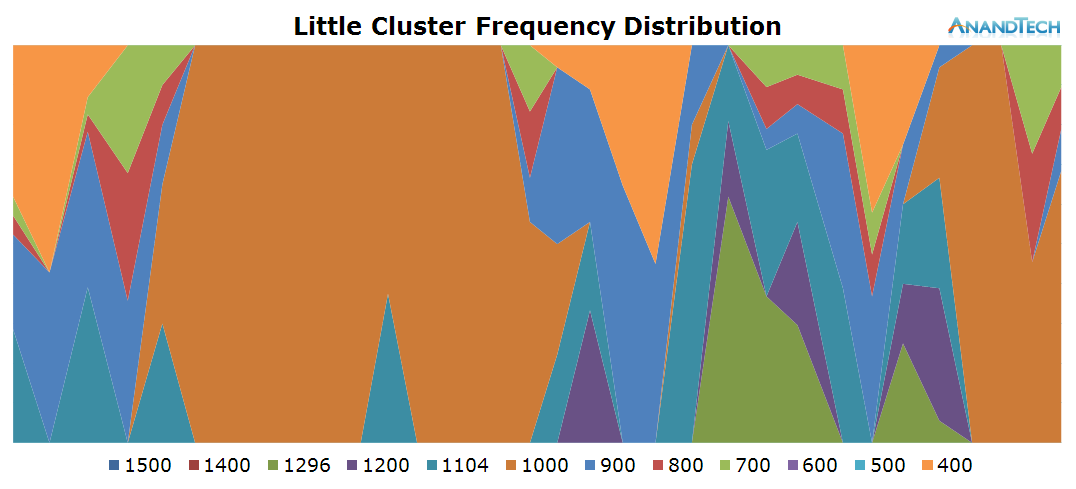
The Y-axis of the graph is a stacked percentage of each CPU’s frequency state. The X-axis represents the distribution in time, always depending on the scenario’s length. For readability’s sake in this article, I chose an effective ~200ms sample period (Due to overhead on scripting and time-keeping mechanisms, this is just a rough target) which should give enough resolution for a good graphical representation of the CPU’s frequency behaviour.
With this, we now have the first part of our tools to accurately analyse the SoC’s behaviour: frequency.
The Details: Power States
While frequency is one of the first metrics that comes to mind when trying to monitor a CPU’s behaviour, there’s a whole other hidden layer that rarely gets exposure: CPU idle states. For readers looking for a more in-depth explanation of how CPUIdle works, I’ve touched upon it and power management of modern SoCs in general work in our deep dive of the Exynos 7420. These explanations are valid for basically all of today's SoCs based on ARM CPU IP, so it applies to SoCs from MediaTek and ARM-based Qualcomm chipsets as well.
To keep things short, a simplified explanation is that beyond frequency, modern CPUs are able to save power by entering idle states that either turn off the clock or the power to the individual CPU cores. At this point we’re talking about switching times of ~500µs to +5ms. It is rare to find SoC vendors expose APIs for live readout of the power states of the CPUs, so this is a statistic one couldn’t even realistically log via discrete readouts. Luckily CPU idle states are still arbitrated by the kernel, which again, similarly to the CPUFreq framework, provides us aggregate time-in-state statistics for each power state on each CPU.
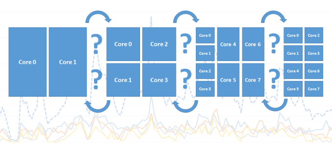
This is an important distinction to make in today’s ARM CPU cores as (except for Qualcomm’s Krait architecture) all CPUs within a cluster run on the same synchronous frequency plane. So while one CPU can be reported to be running at a high frequency, this doesn’t really tell us what it’s doing and could as well be fully power-gated while sitting idle.
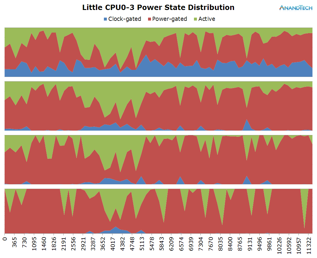
Using the same method as for frequency logging, we end up with an idle power-state stacked time-distribution graph for all cores within a cluster. I’ve labelled the states as “Clock-gated”, “Power-gated” and “Active” which in technical terms they represent the WFI (Wait-For-Interrupt) C1, power-collapse C2 idle states, as well as the difference in time to the wall-clock which represents the “active” time in which the CPU isn’t in any power-saving state.
The Intricacies: Scheduler Run-Queue Depths
One metric I don’t think that was ever discussed in the context of mobile is the depth of the CPU’s run-queue. In the Linux kernel scheduler the run-queue is a list of processes (The actual implementation involves a red-black tree) currently residing on that CPU. This is at the core of the preemptive scheduling nature of the CFS (Completely Fair Scheduler) process scheduler in the Linux kernel. When multiple processes run on the same CPU the scheduler is in charge to fairly distribute processing time between each thread based on time-slices and process priority.
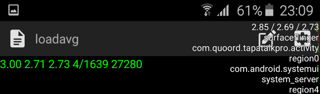
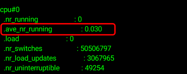
The kernel and Android are able to sort of expose information on the run-queue through one of the kernel’s sysfs nodes. On Android this can be enabled through the “Show CPU Usage” option in the developer options. This gives you three numerical parameters as well as a list of the read-out active processes. The numerical value is the so-called “load average” of the scheduler. It represents the load of the whole system – and it can be used to read how many threads in a system are used. The three values represent averages for different time-windows: 1 minute, 5 minutes and 15 minutes. The actual value is a percentage – so for example 2.85 represents 285%. How this is meant to be interpreted is that if we were to consolidate all processes in as little CPUs as possible we theoretically have two CPUs whose load is 100% (summing up to 200%) as well as a third up to 85% load.
Now this is very odd, how can the phone be fully using almost 3 cores while I was doing nothing more than idling on the screen with the CPU statistics on? Sadly the kernel scheduler suffers from the same sampling rate issue as explained in our frequency logging methodology. Truth is that the load average statistic is only a snapshot of the scheduler’s run-queues which is updated only in 5-second intervals and the represented value is a calculated load based on the time between snapshots. Unfortunately this statistic is extremely misleading and in no way represents the actual situation of the run-queues. On Qualcomm devices this statistic is even more misleading as it can show load-averages of up to 12 in idle situations. Ultimately, this means it’s basically impossible to get accurate RQ-depth statistics on stock devices.
Luckily, I stumbled upon the same issue a few years ago and was aware of a patch that I previously used in the past and which was authored by Nvidia which introduces detailed rq-depth statistics. This tracks the run-queues accurately and atomically each time a process enters or leaves a run-queue, enabling it to expose a sliding-window average of the run-queue depth of each CPU over the period of 134ms.
Now we have a live pollable average for the scheduler’s run-queues and we can fully log the exact amount of threads run on the system.
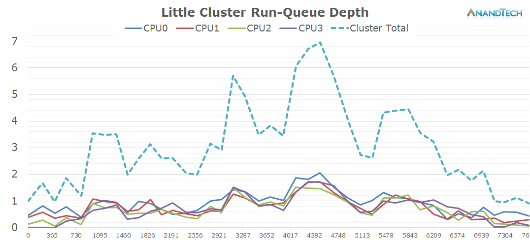
Again, the X-axis throughout the graphs represent the time in milliseconds. This time the Y-axis represents the rq-depth of each CPU. I also included the sum of the rq-depths of all CPUs in a cluster as well the sum of both clusters for the system total in a separate graph.
The values can be interpreted similarly to the load-average metrics, only this time we have a separate value for each CPU. A run-queue depth of 1 means the CPU is loaded 100% of the time, 0.2 means the CPU is loaded by only 20%. Now the interesting metric comes for values above 1: For anything above a rq-depth of 1 it means that the CPU is preempting between multiple processes which cumulatively exceed the processing power of that CPU. For example in the above graph we have some per-CPU peaks of ~2. It means the CPU has at least two threads on that CPU and they each share 50% of the compute-time of that CPU, i.e. they’re running at half speed.
The Data And The Goals
On the following pages we’ll have a look at about 20 different real-world often encountered use-cases where we monitor CPU frequency, power states and scheduler run-queues. What we are looking for specifically is the run-queue depth spikes for each scenario to see just how many threads are spawned during the various scenarios.
The tests are run on Samsung's Galaxy S6 with the Exynos 7420 (4x Cortex A57 @ 2.1GHz + 4x Cortex A53 @ 1.5GHz) which should serve well as a representation of similar flagship devices sold in 2015 and beyond.
Depending on the use-cases, we'll see just how many of the cores on today's many-core big.LITTLE systems are used. Together with having power management data on both clusters, we'll also see just how much sense heterogeneous processing makes and just how much benefit one can gain from it.


157 Comments
View All Comments
jjj - Wednesday, September 2, 2015 - link
Fortune seems way heavy for example but even Amazon's home page (desktop version) seems not too friendly.djscrew - Tuesday, September 1, 2015 - link
Love the article, but after reading it, I feel like the articles you write comparing phone CPU performance & battery life are far more applicable. You lose access to so much of the information in this article that at the end of the day testing the actual phone & OS usage of the CPU makes more sense.Daniel Egger - Tuesday, September 1, 2015 - link
What I'm sincerely missing in this article is the differentiation between multi-processing and multi-threading, with the difference being that multi-processing is partitioning the workload across multiple processes whereas multi-threading spawns threads which are then run in the OS directly or again mapped to processes in different ways -- depending on the OS, in Linux they're actually mapped onto processes.Threads do share context with their creator so shared information requires locking which wastes performance and increases waiting times, the solution to which in the threading happy world is to throw more threads at a problem in the hopes that locking contention doesn't go through the roof and there's always enough work to do to keep the cores busy.So the optimum way to utilise resources to a maximum is actually not to use MT but MP for the heavy lifting and make sure that the heavy work is split evenly across the available number of to-be-utilised cores.
For me it would actually be interesting to know whether some apps are actually clever enough to do MP for the real work or are just stupidly creating threads (and also how many).
Since someone mentioned iOS: Actually if you're using queues this is not a traditional threading model but more akin to a MP model where different queues handled by workers (IMNSHO confusingly called thread) are used to dispatch work to in a usually lock free manner. Those workers (although they can be managed manually) are managed by the system and adjust automatically to the available resources to always deliver the best possible performance.
extide - Tuesday, September 1, 2015 - link
Don't forget, most of it is in Java, so it's probably one java process with several threads, not multiple java processes. The native apps, could go either way.Daniel Egger - Tuesday, September 1, 2015 - link
One interesting question here is: What does Google do? Chrome on regular desktop OS uses one process per view to properly isolate views from one another; does anybody know whether Chrome on Android does the same? I couldn't figure it out from the available documentation...praeses - Tuesday, September 1, 2015 - link
Next time can the colour legend below the graphs have their little squares enlarged to the height of the text? For those who are colour-challenged, it would make it a lot easier to match even when the image is blown-up. There doesn't seem to be a reason to have them so small.endrebjorsvik - Thursday, September 3, 2015 - link
I would rather make the colors more intuitive. For instance by using a colormap like the jet colormap from Octave/Matlab. Low clock frequencies should be mapped to cool colors (blue to green), while high clock frequencies should be mapped to warm colors (yellow to red). By doing that you just have to look at the legend only once. After that, the colors speak for themselves.The plots are really hard to read now when you have green at both low and high frequency (700 and 1400), and four shades of blue evenly distributed over the frequency range (500, 900, 1100, 1500). When I want to read such a plot, I don't care whether the frequency is 600 or 700. So these two colors doesn't have to be very different. But 500 and 1500 should be wastly different. The plots in this article are made in the opposite way. All the small steps has big color differences in order to be able to distinguish every small step from each other. But at some point the map ran out of majors colors and started repeating the spectrum again, with only slightly different colors.
qlum - Tuesday, September 1, 2015 - link
It would be interesting how desktop systems hold up in these tests especially with amd's 2 cores per module design.name99 - Tuesday, September 1, 2015 - link
Andrei,After so much work on your part it seems uncouth to complain! But this is the internet, so here goes...
If you ever have the energy to revise this topic, allow me to suggest two changes to substantially improve the value of the results:
With respect to how results are displayed:
- Might I suggest you change the stacking order of the Power State Distribution graphs so that we see Power Gated (ie the most power saving state) at the bottom, with Clock Gated (slightly less power saving) in the middle, and Active on top.
- The frequency distribution graphs make it really difficult to distinguish certain color pairs, and to see the big picture. Might I suggest that a plot using just grey scale (eg black at lowest frequency to white at highest frequency) would actually be easier to parse and to show the general structural pattern?
As a larger point, while this data is interesting in many ways, it doesn't (IMHO) answer the real question of interest. Knowing that there are frequently four runnable threads is NOT the same thing as knowing that four cores are useful, because it is quite possible that those threads are low priority, and that sliding them so as run consecutively rather than simultaneously would have no effect on perceived user performance.
The only way, I think, that one can REALLY answer this particular question ("are four cores valuable, and if so how") is an elimination study. (Alternatives like trying to figure out the average run duration of short term threads is really tough, especially given the granularity at which data is reported).
So the question is: does Android provide facilities for knocking out certain cores so that the scheduler just ignores them? If so, I can suggest a few very interesting experiments one might run to see the effects of certain knockout patterns. In each case, ideally, one would want to learn
- "throughput" style performance (how fast the system scores on various benchmarks)
- effect on battery usage
- "snappiness" (which is difficult to measure objectively, but maybe is obvious enough for subjective results to be noticed).
So, for example, what if we knock out all the .LITTLE cores? How much faster does the system seem to run, with what effect on battery? Likewise if we knockout all the big cores? What if we have just two big cores (vaguely equivalent to an iPhone 6)? What if we have two big and two LITTLE cores?
I don't have any axe to grind here --- I've no idea what these experiments will show. But it would certainly be interesting to know, for example, if a system consisting of only 4 big cores feels noticeably snappier than a big.LITTLE system while battery life is 95% as long? That might be a tradeoff many people are willing to make. Or, maybe it goes the other way --- a system with only one big core and 2 little cores feels just as fast as an octocore system, but the battery lasts 50% longer?
justinoes - Tuesday, September 1, 2015 - link
This was a seriously fascinating read. It points to a few things...First, Android has some serious ability to take advantage of multiple cores or ILP has improved dramatically. I remember when the Moto X (1st Gen) came out with a dual core CPU engineers at Moto said that even opening many websites didn't use more than two cores on most phones. [http://www.cnet.com/news/top-motorola-engineer-def...] Does this mean that Android has stepped up its game dramatically or was that information not true to begin with?
Second, It seems like there are two related components to the question that I have about multi-core performance. First, do extra cores get used? (You show that they do. Question answered.) Secondly, do extra cores matter from a performance perspective (if clock speed is compromised or otherwise)? (This is probably harder to answer because cores and clock are confounded - better CPU -> more cores, faster clock and complicated by the heterogeneous nature of these CPUs core setups.)
I suppose the second question could be (mostly) answered by taking a homogeneous core CPU and disabling a cores sequentially and looking at the changes in user experienced performance and power consumption. I'm sure some people will buy something with the maximum number of cores, but I'm just curious about whether it'll make a difference in real-world situations.