The Apple Watch Review
by Joshua Ho & Brandon Chester on July 20, 2015 8:00 AM EST- Posted in
- Wearables
- Apple
- Mobile
- Apple Watch
WatchOS: Apps and Glances
In general, the third party app ecosystem seems to be a bit weak at this point as I suspect most developers haven’t quite figured out the model for how apps should look like and how they should work on the watch. For example, Twitter currently only shows trending tweets and a timeline. However, features like direct messages, mentions, replies, and other notifications are missing from the main application. Instead, these are solely surfaced through notifications, so if you accidentally dismiss the notification you have to use your phone to respond to such things. Even the timeline feature isn’t fleshed out properly, as scrolling through about five tweets is all it takes before you have to tap a button to load more tweets when the user shouldn’t have to worry about doing such things. It seems like a small problem, but simple things like this can have major effects on the user experience.
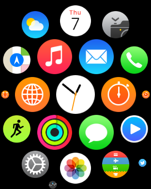
Speaking of apps, reaching the app drawer is accomplished by pressing the digital crown once, which is equivalent to the home button as pressing the digital crown twice sends you back to the previously used application and a long hold of the crown will activate Siri. The resulting app drawer will probably be a bit strange to people that are used to more conventional app drawers from operating systems like iOS and Android, but this design works well. Panning around the app drawer is simple, and it’s relatively easy to go back to the center of the app drawer if you get lost while panning around for whatever reason. It’s also helpful to be able to zoom in and out to find the right application, then zoom in so it’s possible to tap the icon on the app drawer. At first I definitely had some problems with the apparent size of the icons at maximum zoom but with time it became pretty obvious to me that the touch targets are sized well to make it basically impossible to accidentally launch the wrong application at the maximum zoom level.
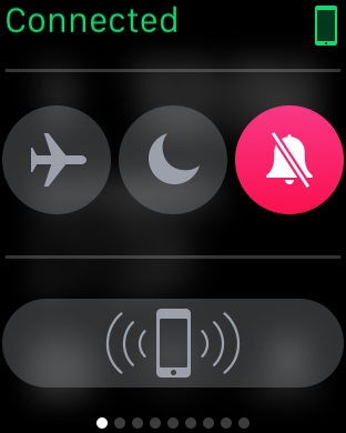
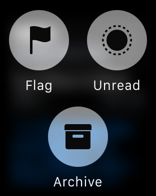
Although the app drawer is a logical place to place most applications, swiping up on the watchface reveals the glances menu, which by default will contain a quick settings menu for airplane mode, do not disturb mode, and silent mode. There’s also a button that makes the paired iPhone play the same pinging noise as Find My iPhone, which is surprisingly helpful in my experience as it’s pretty easy to just rely on the watch for notifications around the house and leave the phone in random places instead of in a pocket. Other than this panel, in practice I didn’t actually use this feature all that much as most of the information at a glance isn’t really all that necessary with the use of complications, but it’s nice to be able to use it for media controls, enable power reserve mode, and various other interactions that can be separated out from an application for quick access on the watchface.
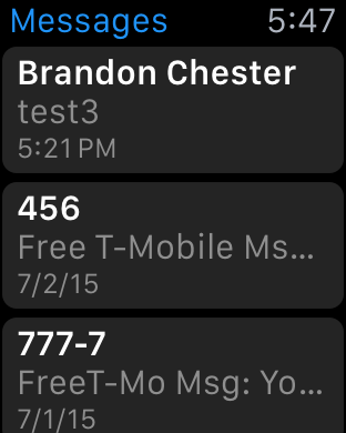
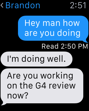
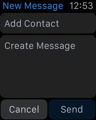
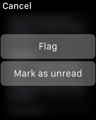
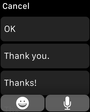
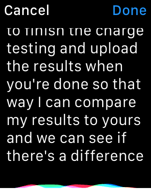
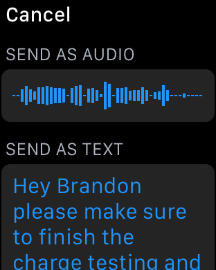
I’ve already mentioned third party applications, but first party applications are really the indicator of the potential of the watch platform at this state. The two most important applications of the watch platform are really email and messaging. When it comes to messaging, the UI is deeply familiar to anyone that has ever interacted with messaging on a smartphone, especially an iPhone. You can access each conversation with a person by tapping on their name, which gives you the conversation. Scrolling is accomplished with the digital crown, which is really far superior to touch screen scrolling because of just how valuable each pixel of display real estate is. Reaching the bottom of the list gives you an option to compose a reply, which can either be done using a list of preset messages or using Siri voice dictation. In the case of the preset messages, Apple is leveraging the same prediction engine that they have with the iOS keyboard to roughly guess what you’d want to say in reply to something.
In practice, I suspect a lot of people will be able to use this to send the reply that they were hoping to use, but I ended up using voice dictation a lot. Voice dictation for its part works well, but has its limits. If I didn’t use any obscure jargon or acronyms, Siri voice dictation is almost flawless. However, if the words I tried to use weren’t in Siri’s dictionary, it was almost guaranteed that whatever I was going to get would be wrong. So discussing dinner plans is quick and painless, but discussing anything related to AnandTech would usually require taking out the iPhone to write out the full message.


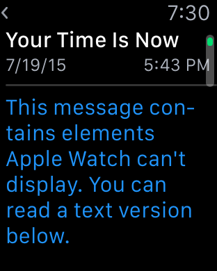
Email is similarly well-done, even if there are some limits to what Apple is able to accomplish. You’re given access to read your inbox, although it doesn’t look like there’s any ability to change the inbox that you want to read on the watch itself and there’s only folder that can be synced at any given time. Although this isn’t really a big deal as you can read all email from all inboxes as-is, it does feel like the UI would be much more full-featured if a force touching the inbox screen would allow viewing email by account and subfolders of each account like the iPhone email application.
At any rate, tapping an individual email will bring up the email or the thread of emails, and reading through the email can be done by scrolling through the email with the touchscreen or the digital crown. The same email can be opened from the lockscreen as a part of iOS' continuity feature, which is a great solution for when drafting a response to an email. WatchOS 2 should also bring the ability to dictate replies, which might be useful but will require testing to see how it works in practice.
Within the inbox, scrolling up until you hit a “detent” with the digital crown will cause the email application to check for new mail, which works as you’d expect. Going back through the application is done by swiping right on the display, which is intuitive and obvious given the similarity to the iOS UI and animations used. The one issue here is that email can only be read in plaintext, which can present a lot of formatting issues in some cases. For the most part actual emails with value are easily read with plaintext, but I suspect that it would be helpful if there were a better conversion to “reader mode” for content with images or HTML in the UI for future iterations of the OS.
These are probably the hardest cases for a watch to cover, given the utter lack of a proper keyboard and no real way of providing input outside of dictation and a selection of predicted responses. For all other first-party apps, I don’t have any particular issues and design is pretty much as good as I can reasonably expect from a wearable interface. Something like a weather application isn’t really all that difficult to execute well on a wearable given that such information can be easily conveyed in a watch form factor. However, the use of Force Touch in the weather application is done well and allows for multiple different types of information like weather conditions, temperature, and the chance of rain throughout the day in addition to a ten day forecast of conditions and temperatures. Other applications like the calendar app are similarly well-executed although the month view is restricted to only the current month and the day view to the current week presumably to avoid the case where the user ends up 20 years in the past with no one-touch method of getting back to the current day.
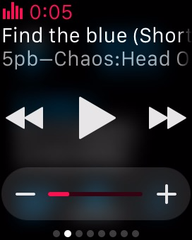
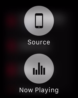
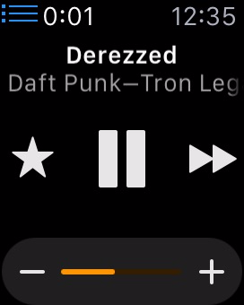
One app that translates much better to the Apple Watch's limited screen size than I expected is the music application. There are really two sides to the app. For most users it will act as a remote control of sorts for the music playing on your iPhone. Since the Apple Watch has a glance for music controls, you can easily access the now playing section of the app right from your watchface. This allows you to pause, play, and go to the previous song or the next with a swipe and a single tap. In addition, you can use the digital crown to adjust the current volume of the audio, which is a great application of the precise adjustments that the crown allows beyond just scrolling through lists.
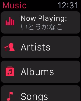
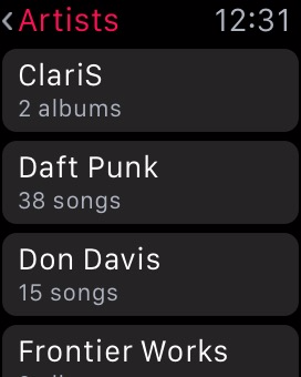
When going into the application itself, you'll notice that it's very similar to the music app on the iPhone. There's not many other ways to lay out a list of artists or albums than a scrolling list, especially on such a small screen size, but it makes the app feel instantly familiar. Swiping on the screen or using the digital crown allows you to scroll through albums or artists, and from there you can go into lists of songs and change what track is playing. I've actually found this to be one of my favorite functions of the watch, because it completely removes the need to pull out a phone, unlock it, open the music app, leave the now playing screen, and then scroll through a list of albums to find the track I want to play.
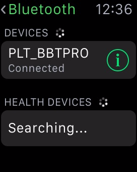
The music app is also one of the few apps that can be used while the Apple Watch is away from its companion iPhone. While it has no 3.5mm headphone jack, Bluetooth headphone users can pair their headphones with the Apple Watch, or alternatively, Apple now sells some of their own pairs as part of the Beats headphone line. In either case, when paired up with a set of Bluetooth headphones, the Apple Watch works as a stand-alone device and behaves a lot like an iPod.
When using the Watch as a stand-alone music player, there are a number of stipulations on the amount of music you can include. The first is that you can only include a single playlist. Since you can customize playlists to your liking this isn't a big deal. However, the amount of space you can use for music on the watch is limited to 2GB, the same amount as an iPod Shuffle. Alternatively, you can select a limit of 250 songs.
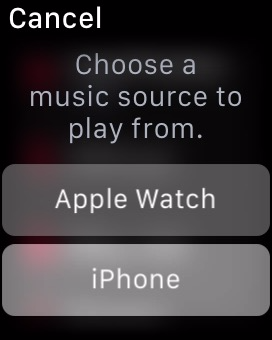
Managing which playlist syncs over and how much space you allow music to take is done using the Apple Watch app on the iPhone, which means the music and playlist you send to your Apple Watch must exist on your iPhone as well. Accessing your local Apple Watch music library simply involves force pressing anywhere in the application. Once you do, you'll be prompted to pair your Bluetooth headphones with the watch if you haven't done so by then, as there's no way to play local music via the speaker. After you've moved to your local library, you can use the app the same way you did when playing music from your iPhone, and can switch back to that mode with another force press.
I think the ability to play back local music ties in very well with the fitness aspects of the Apple Watch, as users who are out for a jog can listen to music without having to have a phone bouncing around in their pocket or strapped to their arm. For general users I don't think it will be quite as useful, as you'll typically have your iPhone with you and will have much more space to store music on that.

One Apple app that is surprisingly limited is the iTunes Remote app, which can be installed on the watch if you have the corresponding iPhone app from the App Store. While I expected it to essentially be the same as the music app but for controlling iTunes playback, it ends up being much more limited than that. You're only able to play/pause the currently playing song and go to the next track, along with being able to adjust the volume slider in iTunes. This means you can only continue to move forward through your list of songs, which doesn't give you much control over what song is playing. These limitations seem like a lack of effort on Apple's part to make the application functional, which is a shame because there's a perfectly good template for it in the music application. My guess is that engineering resources have been more focused on the continued development of watchOS and on the apps that pair with the applications built into iOS, with App Store apps being put on the backburner.
In summary, I think Apple has done a good job of integrating notifications and applications on watchOS into an interface that is sensible and intuitive. Some parts of the interface leverage existing user knowledge in order to be discovered and used, such as the notification shade that comes down from the top. Others do require a bit of discovery, but much of it is the natural exploration that any user would perform with a new device such as pressing buttons and swiping around.
The Digital Crown also has the benefit of providing a similar function to that of the home button on iOS devices, and with it having the same functions such as long pressing to access Siri it's easy for users to begin using to navigate and access parts of the operating system. Force touch provides a smart way to access different sections of an application, but in the beginning it does require some random pressing around the UI to figure out what menus it brings up in a certain app or area.
The notifications and applications themselves are also handled well, but Apple's less than optimal interface for multiple notifications for third party apps also creates certain situations where using the watch is actually slower than just taking out your iPhone. Many of the issues with the notifications and third party apps in watchOS are also a result of the current situation for third party developers. At the moment, the number of applications that support actionable notifications on the watch is very small, which means that at times the watch can serve as a communication device, but at others it just ends up being a notification device.
It's clear that at this point in time developers are experiencing a period of uncertainty as to how apps should be made for this new platform. Piled on top of that is the fact that applications have to execute all code on the iPhone itself, and are working with limited or non-existent APIs to access to hardware features like the digital crown and microphone. As developer support for watchOS increases and watchOS 2 brings developers support for native apps and greater access to the Apple Watch's hardware most of these issues should disappear, and Apple's first party applications like messages, mail, and music are great showcases for the potential of the Apple Watch and watchOS.


270 Comments
View All Comments
JoshHo - Tuesday, July 21, 2015 - link
It would be great to get specific instances of overly wordy areas, and information that you have learned elsewhere that is redundant in the review to improve our wearable reviews going forward.Blairh - Monday, July 20, 2015 - link
As an iPhone user I think the notifications aspect of the AW would be very appealing, but Apple is asking for too much money for such a luxury. And I'm talking about the Sport models. The SS models are ridiculously expensive. It's no surprise that roughly 3/4 of all AW sales have been the Sport models. Seriously you are nuts IMO to buy the SS model unless you have money to burn. Plus I think the Sport models are just nicer looking in general. And lighter to boot.Anyways, this review highlights a current glaring weakness which is the inability to respond to IM 3rd party apps directly on the AW. If you use WhatsApp or Facebook Messenger often as I do you are SOL if you want to respond with your AW right now. Perhaps this will change with the 2.0 update come fall, but still, right now this is really only ideal if you main communication is the messages app. Email is another story as there are several 3rd party email clients that offer voice dictation.
I'm waffling between an AW and the Vivosmart. The Vivosmart won't let me reply to any notifications from my wrist however it's a third of the price of the 38mm AW and feels awesome on your wrist.
I do believe in the future of the AW, but right now its got a lot of glaring holes to fill.
nrencoret - Monday, July 20, 2015 - link
The worst article I've ever read on this site by miles. Too many words for nothing insightful. What I find here is a desperate struggle to justify what cannot be justified. As a person who loves the site's content I'm stumped by the horrible mess I have just read just a few points:- Apple has "solved" how a watch has to fit like no other company, traditional (ie. Rolex) or tech focused. That is a simply mindboggling statement.
- The UI/UX is great. The Apple mouse and the iPhone have just one primary button for interacting. The crown, side button and force touch trilogy are the work of a comitee which couldn't settle for a simple means of interacting with a piece of technology. What Apple is best known for is how great they are at removing complexity -"just works" and "boom" come to mind- the reviewers were far to forgiving to all the usabily issues (ie. force touch discoverability). These would have been major issues on any other piece of technology.
- Understanding what it is you get for your money: If you own a jewel like a watch or ring its timeless and has an intangible value. The watch can cost a pretty penny for something that has no better hardware than whats out there. There is no inherent intangible value in the watch because as has been stated in the review there will be future iterations of it, killing the timeles argument. As such, this watch is a piece of technology not jewelery and thus, its way overpriced. Lets just see how many dads give their sons Apple Watches and how those sons give them to theirr own.
- Battery life of a single day for a timepiece is not even remotely acceptable. The Basis Peak, Fitbits and Pebbles may not be as smart but they nail the basic concept of a a time keeping device must do.
- Nowhere was there a real argument of how the current incarnation of the watch is mostly useless without being tethered. Basis Peak comes to mind as how useful a device can be with our without tether.
I could go on, given the amount of sheer nonsense of this review. I'm really dissapointed that this came from Anandtech.
alanpgh1 - Monday, July 20, 2015 - link
Awesome Review... and right on target.I've had an Apple Watch for 2 months, and it continues to be an important and non-intrusive assistant in my life. I seem to learn something new that is helpful all the time.
The only thing I ask the author to consider are these words from your review:
"Finally, "Hey Siri" works well in terms of activation, but it's really kind of disappointing that the hotword detection doesn't work with the display off. I suspect this is due to power requirements as I haven't seen any other wearable have screen-off hotword detection, but it would definitely be great to see such a feature in the future."
It is actually a feature to have the watch only listen for the "Hey Siri" hotword when the arm is lifted.
Otherwise, if listening all the time, the system would have false triggers. Think about it; this way of operation is by design.
Thanks for an excellent and thorough review!
TheRealArdrid - Tuesday, July 21, 2015 - link
Gotta admit: I didn't get past the second page of this review. This is dripping with the feel of an Apple shill piece. Am I really to believe that no other watch in history, including recent smartwatches, properly fit the author's wrist but the Apple Watch, with its amazing Milanese band, magically did? Statements like that completely destroy legitimacy and credibility. Come on man...zodiacfml - Tuesday, July 21, 2015 - link
Their failure is sticking to the old, physical idea of a watch.FunBunny2 - Tuesday, July 21, 2015 - link
-- Their failure is sticking to the old, physical idea of a watch.Yeah, and what would GUIs be without radio buttons, menus, and all of the other analog clones they're built on? Face it: it's just pixels made to look "physical".
Oxford Guy - Tuesday, July 21, 2015 - link
Honestly, I love that Apple is successful. The sound of PC-worshiping heads exploding all over the Internet is amusing. It lifts my spirits on a regular basis.Seriously, people... Apple didn't run over your mother, kill your dog, or beat your sister.
The level of nerd rage over Apple's success really is misplaced. There are far worse things to cry over than yet another big tech firm that dodges taxes and overprices stuff. It's not like Apple is the only one and it's not like society in general doesn't reward that behavior.
I've seen the anti-Apple zealotry for decades. It never changes. It always comes down to whinging about how much Apple charges, along with accusations that only gays, girls, and social-climbing superficial people use the products. In reality, despite their flaws, Apple products have been dependable workhorses for people for a long time, and some of them have been pretty innovative.
The Lisa was a thousand times more innovative than the IBM PC. Apple didn't execute because of some poor management and the sudden spike in DRAM cost (caused by Japanese firms pushing US firms out of the market with price dumping and then colluding to raise prices, as far as I have read). Yes, it was expensive but the platform was a very solid foundation for line of machines. Apple had an office suite, multitasking, protected memory, tool-less design, a bootloader that made it easy to boot from multiple operating systems, and a plethora of other modern features back in '83.
Unfortunately, the Mac was botched because it was turned from what was envisioned to be a $500 computer into a $1000 computer and then into a $2400 computer -- without making the underlying OS robust enough to justify that price or the hardware expandable enough. But, despite that, it had a very efficient GUI and people were willing to put up with bombs and freezes because that GUI was miles nicer to work with than Windows (up until 95 when things almost became as good on Windows, but not quite).
If you think Apple is so fraudulent then start your own company or get a job running one already out there and out-compete them. Then let us know about your success. Until then, find something more productive to do with your time than rant ineffectually on Internet forums.
Oxford Guy - Tuesday, July 21, 2015 - link
As for this product specifically, my advice is to wait for the next iteration that comes with a shrunken process. Apple's first iPad had a relatively short lifespan, rapidly orphaned. I wouldn't want to be stuck with this device if the same thing were to happen. It has generally been the same advice for quite some time: when Apple comes out with a new form factor, wait until version 2.Oxford Guy - Tuesday, July 21, 2015 - link
This even applied to the Mac, come to think of it. Jobs demoed (without telling the audience or the press, of course) a 512k prototype in order to run speech synthesis when he was unveiling the first Mac (128K, not expandable) to the press.