The Apple Watch Review
by Joshua Ho & Brandon Chester on July 20, 2015 8:00 AM EST- Posted in
- Wearables
- Apple
- Mobile
- Apple Watch
WatchOS: Apps and Glances
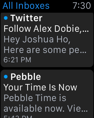
In general, the third party app ecosystem seems to be a bit weak at this point as I suspect most developers haven’t quite figured out the model for how apps should look like and how they should work on the watch. For example, Twitter currently only shows trending tweets and a timeline. However, features like direct messages, mentions, replies, and other notifications are missing from the main application. Instead, these are solely surfaced through notifications, so if you accidentally dismiss the notification you have to use your phone to respond to such things. Even the timeline feature isn’t fleshed out properly, as scrolling through about five tweets is all it takes before you have to tap a button to load more tweets when the user shouldn’t have to worry about doing such things. It seems like a small problem, but simple things like this can have major effects on the user experience.
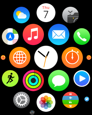
Speaking of apps, reaching the app drawer is accomplished by pressing the digital crown once, which is equivalent to the home button as pressing the digital crown twice sends you back to the previously used application and a long hold of the crown will activate Siri. The resulting app drawer will probably be a bit strange to people that are used to more conventional app drawers from operating systems like iOS and Android, but this design works well. Panning around the app drawer is simple, and it’s relatively easy to go back to the center of the app drawer if you get lost while panning around for whatever reason. It’s also helpful to be able to zoom in and out to find the right application, then zoom in so it’s possible to tap the icon on the app drawer. At first I definitely had some problems with the apparent size of the icons at maximum zoom but with time it became pretty obvious to me that the touch targets are sized well to make it basically impossible to accidentally launch the wrong application at the maximum zoom level.
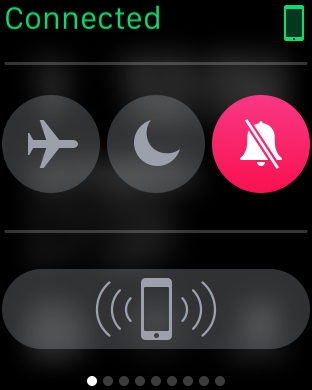
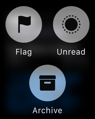
Although the app drawer is a logical place to place most applications, swiping up on the watchface reveals the glances menu, which by default will contain a quick settings menu for airplane mode, do not disturb mode, and silent mode. There’s also a button that makes the paired iPhone play the same pinging noise as Find My iPhone, which is surprisingly helpful in my experience as it’s pretty easy to just rely on the watch for notifications around the house and leave the phone in random places instead of in a pocket. Other than this panel, in practice I didn’t actually use this feature all that much as most of the information at a glance isn’t really all that necessary with the use of complications, but it’s nice to be able to use it for media controls, enable power reserve mode, and various other interactions that can be separated out from an application for quick access on the watchface.
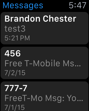
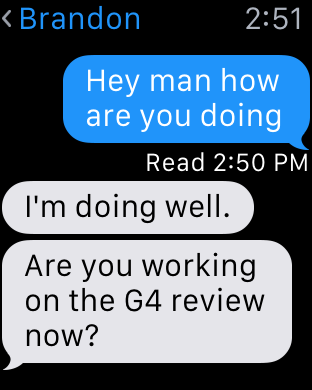
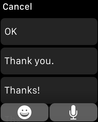
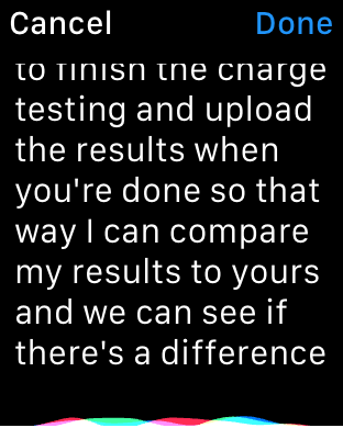
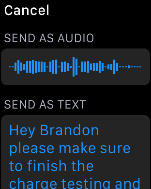
I’ve already mentioned third party applications, but first party applications are really the indicator of the potential of the watch platform at this state. The two most important applications of the watch platform are really email and messaging. When it comes to messaging, the UI is deeply familiar to anyone that has ever interacted with messaging on a smartphone, especially an iPhone. You can access each conversation with a person by tapping on their name, which gives you the conversation. Scrolling is accomplished with the digital crown, which is really far superior to touch screen scrolling because of just how valuable each pixel of display real estate is. Reaching the bottom of the list gives you an option to compose a reply, which can either be done using a list of preset messages or using Siri voice dictation. In the case of the preset messages, Apple is leveraging the same prediction engine that they have with the iOS keyboard to roughly guess what you’d want to say in reply to something.
In practice, I suspect a lot of people will be able to use this to send the reply that they were hoping to use, but I ended up using voice dictation a lot. Voice dictation for its part works well, but has its limits. If I didn’t use any obscure jargon or acronyms, Siri voice dictation is almost flawless. However, if the words I tried to use weren’t in Siri’s dictionary, it was almost guaranteed that whatever I was going to get would be wrong. So discussing dinner plans is quick and painless, but discussing anything related to AnandTech would usually require taking out the iPhone to write out the full message.

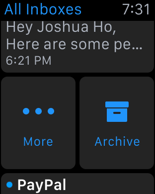
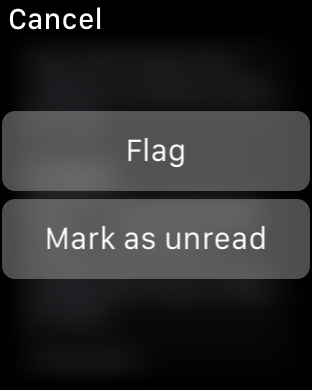
Email is similarly well-done, even if there are some limits to what Apple is able to accomplish. You’re given access to read your inbox, although it doesn’t look like there’s any ability to change the inbox that you want to read on the watch itself and there’s only folder that can be synced at any given time. Although this isn’t really a big deal as you can read all email from all inboxes as-is, it does feel like the UI would be much more full-featured if a force touching the inbox screen would allow viewing email by account and subfolders of each account like the iPhone email application.
At any rate, tapping an individual email will bring up the email or the thread of emails, and reading through the email can be done by scrolling through the email with the touchscreen or the digital crown. The same email can be opened from the lockscreen as a part of iOS' continuity feature, which is a great solution for when drafting a response to an email. WatchOS 2 should also bring the ability to dictate replies, which might be useful but will require testing to see how it works in practice.
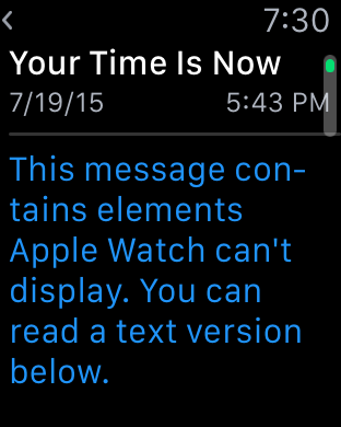
Within the inbox, scrolling up until you hit a “detent” with the digital crown will cause the email application to check for new mail, which works as you’d expect. Going back through the application is done by swiping right on the display, which is intuitive and obvious given the similarity to the iOS UI and animations used. The one issue here is that email can only be read in plaintext, which can present a lot of formatting issues in some cases. For the most part actual emails with value are easily read with plaintext, but I suspect that it would be helpful if there were a better conversion to “reader mode” for content with images or HTML in the UI for future iterations of the OS.
These are probably the hardest cases for a watch to cover, given the utter lack of a proper keyboard and no real way of providing input outside of dictation and a selection of predicted responses. For all other first-party apps, I don’t have any particular issues and design is pretty much as good as I can reasonably expect from a wearable interface. Something like a weather application isn’t really all that difficult to execute well on a wearable given that such information can be easily conveyed in a watch form factor. However, the use of Force Touch in the weather application is done well and allows for multiple different types of information like weather conditions, temperature, and the chance of rain throughout the day in addition to a ten day forecast of conditions and temperatures. Other applications like the calendar app are similarly well-executed although the month view is restricted to only the current month and the day view to the current week presumably to avoid the case where the user ends up 20 years in the past with no one-touch method of getting back to the current day.
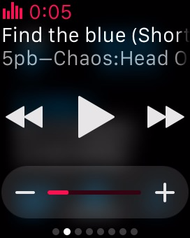
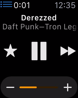
One app that translates much better to the Apple Watch's limited screen size than I expected is the music application. There are really two sides to the app. For most users it will act as a remote control of sorts for the music playing on your iPhone. Since the Apple Watch has a glance for music controls, you can easily access the now playing section of the app right from your watchface. This allows you to pause, play, and go to the previous song or the next with a swipe and a single tap. In addition, you can use the digital crown to adjust the current volume of the audio, which is a great application of the precise adjustments that the crown allows beyond just scrolling through lists.
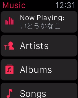
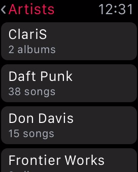
When going into the application itself, you'll notice that it's very similar to the music app on the iPhone. There's not many other ways to lay out a list of artists or albums than a scrolling list, especially on such a small screen size, but it makes the app feel instantly familiar. Swiping on the screen or using the digital crown allows you to scroll through albums or artists, and from there you can go into lists of songs and change what track is playing. I've actually found this to be one of my favorite functions of the watch, because it completely removes the need to pull out a phone, unlock it, open the music app, leave the now playing screen, and then scroll through a list of albums to find the track I want to play.
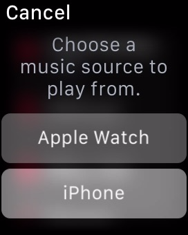
The music app is also one of the few apps that can be used while the Apple Watch is away from its companion iPhone. While it has no 3.5mm headphone jack, Bluetooth headphone users can pair their headphones with the Apple Watch, or alternatively, Apple now sells some of their own pairs as part of the Beats headphone line. In either case, when paired up with a set of Bluetooth headphones, the Apple Watch works as a stand-alone device and behaves a lot like an iPod.
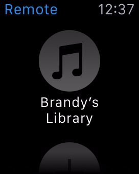
When using the Watch as a stand-alone music player, there are a number of stipulations on the amount of music you can include. The first is that you can only include a single playlist. Since you can customize playlists to your liking this isn't a big deal. However, the amount of space you can use for music on the watch is limited to 2GB, the same amount as an iPod Shuffle. Alternatively, you can select a limit of 250 songs.
Managing which playlist syncs over and how much space you allow music to take is done using the Apple Watch app on the iPhone, which means the music and playlist you send to your Apple Watch must exist on your iPhone as well. Accessing your local Apple Watch music library simply involves force pressing anywhere in the application. Once you do, you'll be prompted to pair your Bluetooth headphones with the watch if you haven't done so by then, as there's no way to play local music via the speaker. After you've moved to your local library, you can use the app the same way you did when playing music from your iPhone, and can switch back to that mode with another force press.
I think the ability to play back local music ties in very well with the fitness aspects of the Apple Watch, as users who are out for a jog can listen to music without having to have a phone bouncing around in their pocket or strapped to their arm. For general users I don't think it will be quite as useful, as you'll typically have your iPhone with you and will have much more space to store music on that.
One Apple app that is surprisingly limited is the iTunes Remote app, which can be installed on the watch if you have the corresponding iPhone app from the App Store. While I expected it to essentially be the same as the music app but for controlling iTunes playback, it ends up being much more limited than that. You're only able to play/pause the currently playing song and go to the next track, along with being able to adjust the volume slider in iTunes. This means you can only continue to move forward through your list of songs, which doesn't give you much control over what song is playing. These limitations seem like a lack of effort on Apple's part to make the application functional, which is a shame because there's a perfectly good template for it in the music application. My guess is that engineering resources have been more focused on the continued development of watchOS and on the apps that pair with the applications built into iOS, with App Store apps being put on the backburner.
In summary, I think Apple has done a good job of integrating notifications and applications on watchOS into an interface that is sensible and intuitive. Some parts of the interface leverage existing user knowledge in order to be discovered and used, such as the notification shade that comes down from the top. Others do require a bit of discovery, but much of it is the natural exploration that any user would perform with a new device such as pressing buttons and swiping around.
The Digital Crown also has the benefit of providing a similar function to that of the home button on iOS devices, and with it having the same functions such as long pressing to access Siri it's easy for users to begin using to navigate and access parts of the operating system. Force touch provides a smart way to access different sections of an application, but in the beginning it does require some random pressing around the UI to figure out what menus it brings up in a certain app or area.
The notifications and applications themselves are also handled well, but Apple's less than optimal interface for multiple notifications for third party apps also creates certain situations where using the watch is actually slower than just taking out your iPhone. Many of the issues with the notifications and third party apps in watchOS are also a result of the current situation for third party developers. At the moment, the number of applications that support actionable notifications on the watch is very small, which means that at times the watch can serve as a communication device, but at others it just ends up being a notification device.
It's clear that at this point in time developers are experiencing a period of uncertainty as to how apps should be made for this new platform. Piled on top of that is the fact that applications have to execute all code on the iPhone itself, and are working with limited or non-existent APIs to access to hardware features like the digital crown and microphone. As developer support for watchOS increases and watchOS 2 brings developers support for native apps and greater access to the Apple Watch's hardware most of these issues should disappear, and Apple's first party applications like messages, mail, and music are great showcases for the potential of the Apple Watch and watchOS.


270 Comments
View All Comments
name99 - Monday, July 20, 2015 - link
Regarding ARMv7k, check out the following story:http://arstechnica.com/apple/2011/09/support-for-q...
Note the date --- Sept 2011. Further evidence that Apple plans these things a LONG time in advance,
(Relative to which, it is interesting to note that over the past month there has been a flurry of activity by Apple people on working LLVM targeting M-class processors. Maybe Apple are planning more IoT peripherals in a few years, or maybe they want to stick a small MPU in every Beats headset for some reason?
Or maybe they are moving from whatever they use today for PMU and sensor fusion on iOS/Watch to an M-class core?)
hlovatt - Monday, July 20, 2015 - link
First, thanks for a great review. Excellent to have such detail.I don't wear a watch so won't be getting one. However I know 4 owners who are all very happy. They all previously owned smart watches, Garmin, Pebble, Fitbiz, etc. and universally prefer the Apple Watch. The tap thing sounds like a gimmick, but just try it - it's really well done.
Gripe: If you hate Apple so much that you can't be rational just leave Anandtech. There are plenty of places were you can have a mutual we hate Apple session. You are spoiling the site for others who want to discuss tech. If you prefer some other product just buy it, don't sling insults at others that disagree with you. Get real the reviewers said they wouldn't recommend the 1st gen device and you go off saying they have sold out etc. Totally unfair to them.
name99 - Monday, July 20, 2015 - link
While investigating the CPU details in interesting (and thanks!!! for doing this) I think it's important to appreciate that the CPU is probably the least important thing about aWatch performance as it matters to the average person.There are IMHO three primary performance problems with aWatch today:
(a) There is far too little caching (in a very generic sense) so that third party apps (and some interactions with Apple apps) require communicating with iPhone. Much of this will disappear with WatchOS2; some of it may be an inevitable fact of life regarding how BT LE works and, in particular, the minimum possible latency when one side wants to talk to the other. But it's also possible that this latency could be reduced in future versions of BT by changing the rendezvous algorithm?
(b) The touch screen controller (I assume to save power) only seems to take initial sensor reading at around twice a second. The result is that the first time you touch the screen to scroll, there is an obvious halting until the system sort of "gets it" and starts smoothly scrolling. This is obviously a touch screen issue because using the digital crown (when that is feasible, so for vertical rather than horizontal scrolling) acts immediately and smoothly. The fix, presumably, is to ramp up the rate at which the touch screen controller does its initial sensing, but who knows what the power implications of that are.
(c) The heart rate sensor is on "full-time" (which means, I don't know, sensing once every 10 seconds?) when you are in the Workout app, but otherwise runs at a really low rate (once every ten minutes?) At least the way I use my aWatch, I'd prefer a higher rate.
I'm guessing that Apple was overly cautious about battery life in WatchOS1, and now that most people understand what to expect, and have about 40% battery at the end of the day, they can afford to bump up the sampling rates for all these different things (touch screen, heart rate, maybe even BT LE) and if that moves the battery life down to 20% battery at the end of the day, that's a pretty good tradeoff.
But nowhere in any of this is CPU performance actually an issue. I can't think of anywhere where CPU or GPU performance affect the experience.
name99 - Monday, July 20, 2015 - link
A few comments about fitness:The primary thing using the Workout app does, as far as I can tell, is switch to ongoing (rather than coarse) monitoring of heart rate and position, which is useful but not essential. However it DOES also give you a nice display of whatever you consider important. My Pebble used to kinda sorta track steps and thus calories, but the fact that the watch tracks and displays heart rate on the Workout app screen is actually really useful. With the Pebble I'd kinda slack off when doing a run or step climbing being that's only natural, but when your heart rate is displayed you have more incentive to keep pushing.
The workout app is also nice if you're trying to hit your calorie burn goal every day. If you get to say 10pm or so and are 150 calories short, you can set a calorie goal (rather than say a time goal or a distance goal) and then just start stepping while watching TV or whatever.
Two useful facts to know (which I don;t think you mention). You can launch Workout (or any app) through "Hey Siri launch workout" rather than navigating to the app screen. (It's also useful to know that Hey Siri as a way to start speech ONLY works when the screen is lit up. If you don't know this, it's maddening at first as half the time it seems to work and half the time it doesn't.
Also double-clicking the digital crown toggles between the most recent app and the watch face. I use it a lot to toggle between watch and workout.
Finally most readers are probably young and think the stand up stuff is dumb or pointless. It really isn't, at least for older people. I've got to the stage where, when I stand up I can feel a kind of stiffness in the muscles, you know that old person sigh when you get up. And I've found that since getting the watch and heeding the stand notices, that has pretty much disappeared --- it really does help older muscles to not get locked into no motion for two or more hours.
(Also if you find the standing irritating, it's worth noting that the watch wants you to stand for a full minute, with some motion. At first I just used to stand then pretty much immediately sit down. That's not good enough and it won;t give you credit for that. But if you stand and pace for a minute or so, it will always give a little ding and reward you with credit for the stand.)
The one thing I wish (there is so much we can all want them to add to WatchOS2 and then WatchOS3) is a data broadcast mechanism. In particular, if the workout data could be displayed simultaneously on a phone (placed near a TV or on a step machine control panel) that would be much more comfortable than having to flick the wrist every minute or so to check one's heartbeat. Oh well, in time...
navysandsquid - Monday, July 20, 2015 - link
I've never seen such a butthurt bunch of people. Almost every review on the internet give the apple watch a favorable review. Maybe you guys should stop letting you hate consume you. Anandtech has done one of the most indepth review of the apple watch. Which they do with most products. If you don't like apple products don't read the reviews. Your pathetic for even comments such ignorant things like "Watch under 9 days of battery life is unacceptable" Like please name a watch device with this much capability that runs longer then a couple days. oh wait you cant. I've had the watch for about 2 months and this review is spot on weather you like apple or not. Anandtech is a good review site. So just look in the mirror and say "Why do I hate them so much" Let me answer that for you. You don't like paying for what you get. Wait let me rephrase that. you do like paying for what you get your just to cheap to pay for quality. so p1ss of and buy yours self a Samsung smart watch for 149$ and let it collect dust lol I'm donename99 - Monday, July 20, 2015 - link
"Glances are well-executed and a useful feature, but I don’t really get the point of integrating heart rate monitoring into a glance or similar cases of app information"The authors appear unaware that you can customize glances. Go to the Watch app on iPhone and look around. You can both hide glances you find unimportant, and rearrange those that you want to use. Once you've done this, you can basically prioritize so that the most important stuff is in complications, while second tier stuff lives in glances, and third tier stuff requires an app launch.
name99 - Monday, July 20, 2015 - link
"Moving on to the saturation test, we can see that Apple has put a huge amount of effort into calibrating these displays, which is somewhat surprising given that one might expect wearables to not be all that critical when it comes to color accuracy."A persistent (and STILL not fixed) problem with the Apple ecosystem is that the faces of contacts display slightly differently on OSX vs iOS. There are outright bugs in the system (.psd photoshop files get incorrectly cropped on iOS, and different gamma is applied on OSX and iOS) but these may be fixed with the new Contacts framework of iOS9/OSX 10.11.
Point is --- your eye is actually remarkable sensitive to these apparently very slight deviations, at least when it comes to faces. So it makes sense for Apple to line up their hardware so that when they (at LONG FREAKING LAST!) get their software act together, the face photos do look identical across the line.
(And BTW how long will we have to keep typing in triples like iOS10/OSX 10.12/WatchOS3? At some point, and I think we're reaching that point, it's time to just refer to AppleOS 2015 followed by AppleOS 2016 followed by ...)
aryonoco - Monday, July 20, 2015 - link
I am not an Apple hater, and I am very curious in the Apple Watch and the whole wearables category. However I agree with those who say that this review was below Anandtech's standards. Overly wordy, with too little information. I don't think I have ever said this about an Anandtech review before, but after reading this, I really don't think I learned a single thing that I didn't know going into the review.whiteiphoneproblems - Monday, July 20, 2015 - link
Without wanting to "pile on," I agree that this review could have been 1/3 the length, and 3x as helpful. I usually look to AT for the "best" review of any mobile device, but I would not say that is the case with this particular review. Most other Apple Watch reviews I've read have been more useful. (I think it comes down to editing.)nrencoret - Monday, July 20, 2015 - link
+1 on that. I think you nailed the fact that Anandtech's succes is after reading an article, you always come out at the end a bit (or a lot in some cases) smarter. This review breaks the trend.