A Look At OS X Yosemite And iOS 8.1
by Brandon Chester on October 27, 2014 8:00 AM ESTNotification Center
Notification Center on OS X has been in a strange situation for a while now. While some features like Spotlight Search transitioned from OS X to iOS, Notification Center went the other way. It has never felt like it had much reason to exist, and it has lacked in features compared to its iOS counterpart. This was made even more evident when iOS 7 and OS X Mavericks rolled out. iOS received the new Today view with new widgets for apps like Calendar, Reminders, and Stocks, while on Mavericks the only change was the removal of the linen texture as Apple began to transition away from their old style of interface design.
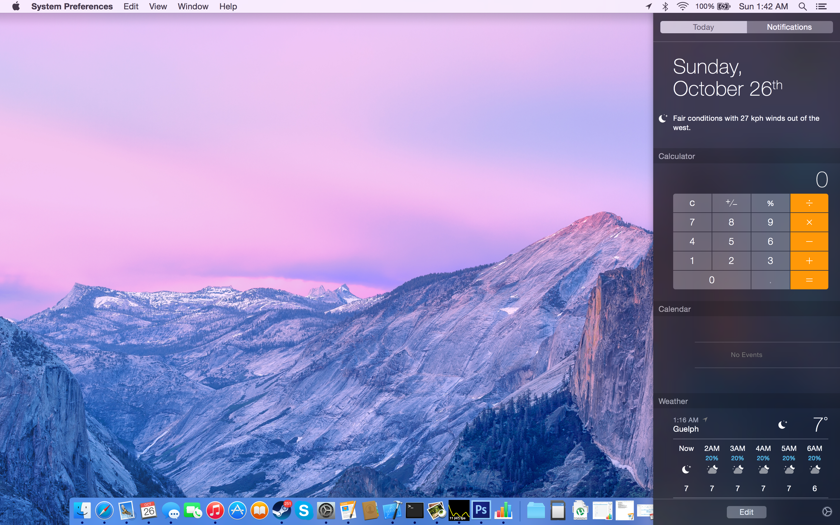
With iOS 8 and Yosemite we receive parity between the abilities and design of the two versions. With the new Yosemite interface being modeled on that of iOS, Apple has been able to bring the new translucent design of Notification Center to OS X, along with the new support for Today view and widgets. Notification Center is one of the best examples of the use of translucency to convey what parts of the interface are on a higher vertical plane than others. While in previous versions of OS X Notification Center pushed the desktop to the left, in Yosemite it simply comes in overtop of the desktop and even the Dock.
Today view gives Notification Center a greater purpose than it previously had. The ability to add widgets allows it to become a hub for getting key information at a glance, or performing quick actions. It's actually even more functional than on iOS because Apple has provided widgets for apps like Calculator which do not have widgets on iOS. A weather widget with a full forecast is also available to make up for the fact that OS X has no standalone weather app.
Because I always keep the dock visible, I can see what applications I need to check based on the red badge. As a result, I still don't use the actual notifications tab of Notification Center very often. But I do use the Today view to check what events I have coming up, what the current weather conditions are, and to do quick calculations using the Calculator widget. Overall I would say that Apple has done a good job with making Notification Center feel useful, and although not every part of it fits into the way I use my computer, I can still find ways to make use of it.
Spotlight Search

Spotlight receives some great improvements in Yosemite. I said in my iOS 8 review that I had never really used Spotlight on iOS because it didn't feel like it offered convenience or features that made it worth using. Apple's improvements actually made me start using it. The same was true of Spotlight on OS X. I had never used it until Yosemite rolled out with the new capabilities that Apple had built in. Spotlight on OS X has an even greater number of improvements than the iOS version, and it starts with the UI. The field for entering your search has gone from a tiny input field in the top right corner of your display to a large window that appears right in the center. This may sound obtrusive initially, but it is done this way because once you begin typing the window expands to the one you see below.
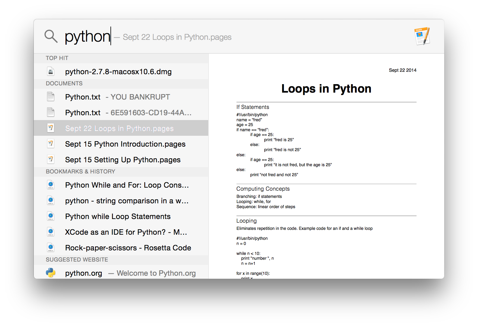
Spotlight now adopts a dual pane design, and it makes it infinitely more powerful and useful than its previous form which was a list of results situated in the top right corner of the display. The left side gives results from Safari, files on your Mac, applications, etc. The right side acts as a preview for what you have selected. This is really useful when trying to find a document when you aren't quite sure of the name, but know what you wrote in it. Rather than having to open every single document that could possibly be the one you're looking for, you can have Spotlight find all the documents with those keywords and you can preview them right in the window without ever having to go into the app itself.
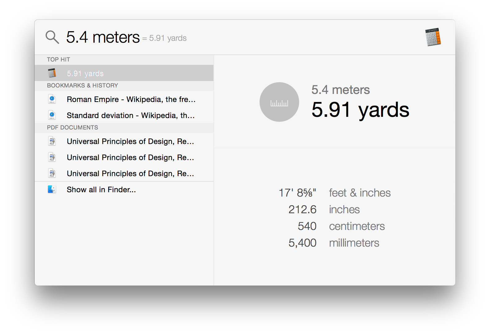
Spotlight can also do quick conversions now. This feature is especially handy, and it's notably absent in the iOS version of Spotlight which shows there's still work to do in creating parity between the features that Apple has on both of their operating systems.
Overall, Spotlight search on OS X has some solid improvements and it's a good feature. It can be hard to get in the habit of using it if you previously ignored it on older versions of OS X, but it's a useful tool to have and I encourage anyone who uses OS X to take a look at it. You may be pleasantly surprised.


173 Comments
View All Comments
metasecdev - Saturday, November 8, 2014 - link
I hate the new look and feel of os x 10.10 and ios 7-8.1. My 15 years with mac will soon be ending.alicebuss21 - Saturday, November 24, 2018 - link
Want to know what is the simplest Apple’s piece of Internet? Well, it is iCloud Drive, providing the cloud-based storage for the iPad. The benefit of this Apple’s feature is to back up the iPad and also restoring the device from the backup. Apart from it, the feature is far beyond backing up. The user can easily store the photos, documents, and videos from applications like Pages and Numbers. As it provides a global storage option, the user can access the same document from several apps.http://customerhelplineaustralia.com/icloud-suppor...
alicebuss21 - Saturday, November 24, 2018 - link
Want to know what is a simplest Apple’s piece of Internet? Well, it is iCloud Drive, providing the cloud based storage for the iPad. The benefit of this Apple’s feature is to back up the iPad and also restoring the device from the backup. Apart from it, the feature is far beyond backing up. The user can easily store the photos, documents, and videos from applications like Pages and Numbers. As it provides a global storage option, the user can access the same document from several apps.https://customerhelplineaustralia.com/icloud-suppo...